After my briefing today, I went to the library to look at examples of posters in a persuasive and aspirational context, taking note of the use of text, layout, and the meaning within visual imagery.
“A poster is a big sheet of printed paper designed to be attached to a wall or vertical surface for the only purpose to advertise or to promote something. The poster includes both typography and graphic elements perfectly mixed together to achieve a message. That message has to be clear and visually communicated direct. The more eye catching the poster, the more likely it is to make an impact on the public. “ (2011) Gimenez Marc, Poster Design.
Wanting to analyse some posters to get a better understanding of their typography, layout, and the meaning behind the photographs used, I looked at Advertising Today (2001) by Warren Bergero, for some examples
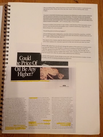
“Could the price of oil be any higher?”
“If you think you pay a high price, consider what our beaches, coastline, wildlife have to pay. Help us save the animals and clean the beaches. Donate what you can to … “ (2001 advertising today, figure 21
This advert is for a charity called the World Society for the Protection of Animals (WSPA), asking their audience for a donation payment to help save animals and clean up ocean coastlines. The advert has a simple yet effective layout conveying a clear message. Splitting the space into halves for a picture, and text element allowing for a small space at the bottom for a tagline directing the audience to their PO.
The larger text element refers to the ever increasing fuel prices, posing a question to the audience making them wonder about the effects that fossil fuels have on the environment, providing a linking to the image. The font used has a serif typeface which allows WSPA to convey a sense of sophistication to their work, letting them have the authority to speak about the problems they hope to fix while being taken seriously by their audience. Using a sans typeface wouldn’t convey similar ideas
The image shows rocks coated in this black thick sludge that consumes every environment it inhabits and is meant to be emotionally triggering to an audience to see this devastation that is being created by the carelessness of oil companies.
The small text echos the larger question, talking to the audience, calling them out directly to think about the impact on the coastal environment and the wildlife that live there, using the pronoun “you” asking them to donate to the organization.
Warren talks about how one ad won’t change the options of the public but a leading series over time will influence their thoughts in reference to antidrug campaigns during the 1980-90s, saying at one point 92% of teens in American had seen “the fried egg” ad, an advert so influential it echos in today’s pop culture, seen in Breaking season 2 episode 10. Even for myself, born after this advert aired, I understood this reference.
A similar shift towards climate change can be seen with advertisements in today’s climate of media, with the increasing awareness by millennials.
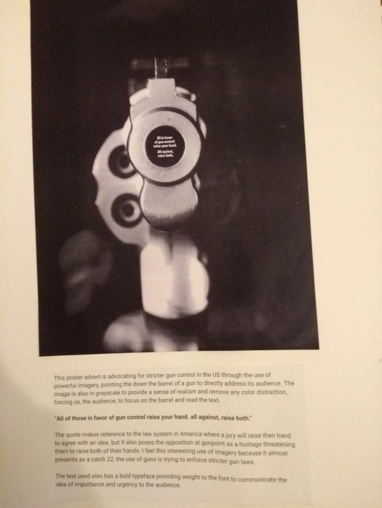
This poster advert is advocating for stricter gun control in the US through the use of powerful imagery, pointing the down the barrel of a gun to directly address its audience. The image is also in grayscale to provide a sense of realism and remove any color distraction, forcing us, the audience, to focus on the barrel and read the text.
“All of those in favor of gun control raise your hand. all against, raise both.”
The quote makes reference to the law system in America where a jury will raise their hand to agree with an idea. but it also poses the opposition at gunpoint as a hostage threatening them to raise both of their hands. I feel this interesting use of imagery because it almost presents as a catch 22, the use of guns is trying to enforce stricter gun laws.
The text used also has a bold typeface providing weight to the font to communicate the idea of importance and urgency to the audience.
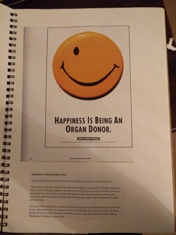
“Happiness is being an organ donor”
“Feel good knowing you can help someone long after you’re gone. Card a donor card “
This advert conveying a simple message to its audience, advocating for people to become organ donors making it appear to be aspirational to become a donor, as people often worry about their life after death and what will happen to their body. Becoming a donor gives people the gratification knowing that after they die their organs will be passed on to help someone else.
The use of the smiley face is welcoming with its easily recognizable features since the ’70s in pop culture as an icon. It comes in the form of a badge with a smile but only one eye to signify the donor aspect of the ad. It creates a link to aspirational the text below saying “happiness is being an organ donor”.
Berger, Warren (2001) Advertising Today, Phaidon, London
Gimenez, Marc (2011) ‘Poster Design’, Monsa, Barcelona
