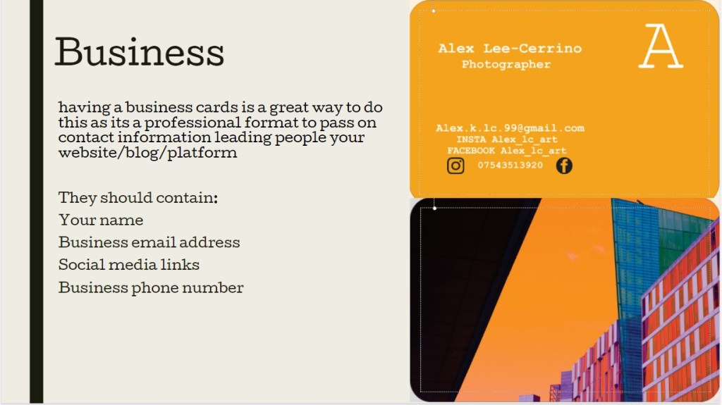
many people in the photography industry carry business cards on their selves as a professional form identification providing a sense of authenticity. showcasing ,
- who you are
- your practise
- your contact infomation
they can be stylised to a persons aesthetic allowing for creative freedom
online services ( https://www.vistaprint.co.uk )
a lot of people who are self employed or have start up companies might source to create a business card using online serviced like Vista print offering price deals on large quantities, making this process quick and effective for smaller businesses to get their practice more widely known
working with Vista print shows a couple advantages, like allowing someone who doesnt have access to design software design their own, they also provide templates and basic tools
like placing images, QR codes, simple shapes, and text with a range of fonts, also showing bleed edged
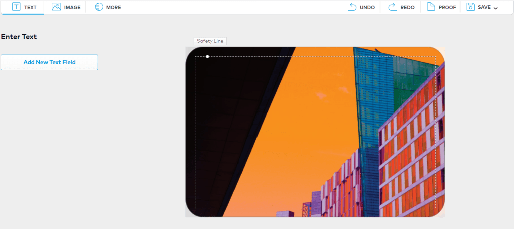
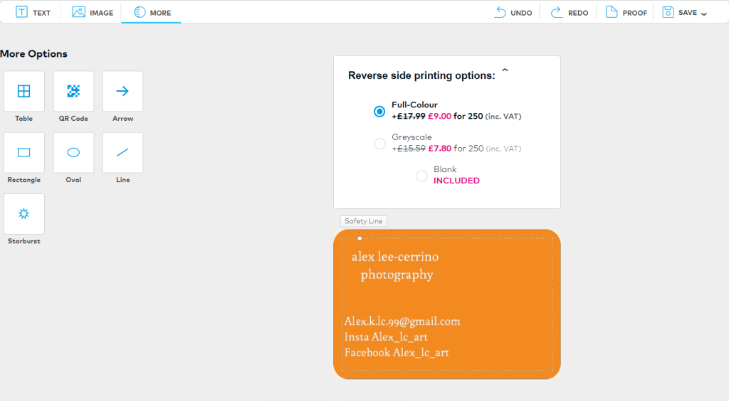
as well as, allowing for the option to have a reviser side instead of a plain white. I’ve added my contact information and my name so people know who I am and can reach me. on the front ive chosen to displays a piece of my own work that i feel represented my work well, i also make prints of this piece. my reserves side is color coded with the image on the front.
after about 30 mintues i was able to refine my card to a design point i was happy with
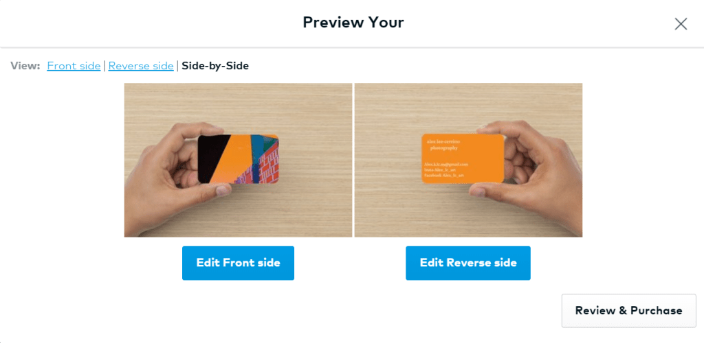
Vista print also lets you preview your card before purchasing.
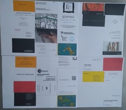
during my time in Paris I attended PolyCopies and collected a bunch of business cards from independent publishers and upcoming artists. This is something I’ve continued doing while since coming back to Bath.
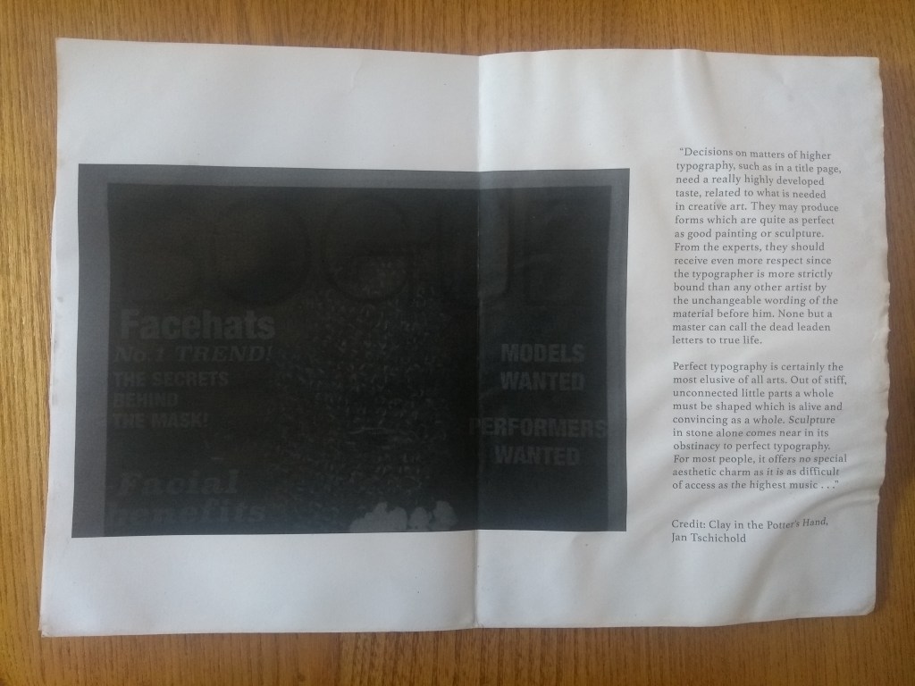
reading color works by Eddie Opara and John Cantwell, they state 8 useful statements for aetablishing color to a brand
“01 – keep the colors for your brand thoroughly consistent so that your products are easily identifiable by consumers.
02 – ask clients if they have already dealt with any consumer or skateholder surveys on color
03- make color symbolize and the brand stand for, and what color give the brand its temperament.
04 – remember that color stimulates emotional sentiment and empathy towards brands.
05- ensure that you know what colors competing brands are using.
06- remember: color is an efficient and effective method for wayfinding and products.
07 – don’t use too many colors in one place as pedestrians and consumers must remember where they are and what product they are purchasing
08 – understand that various cultures and consumers symbolize colors differently.”
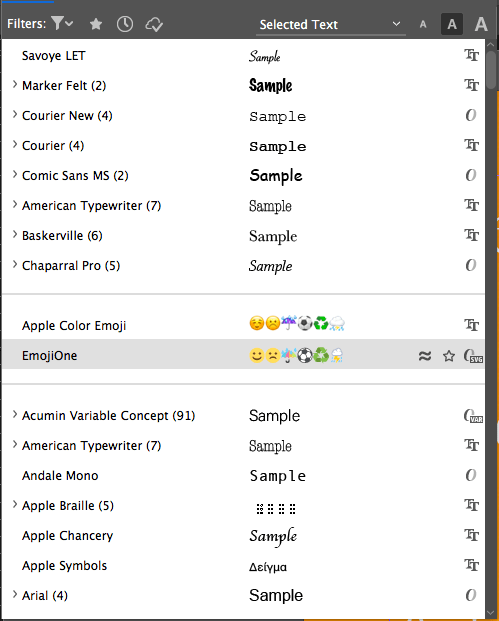
InDesign
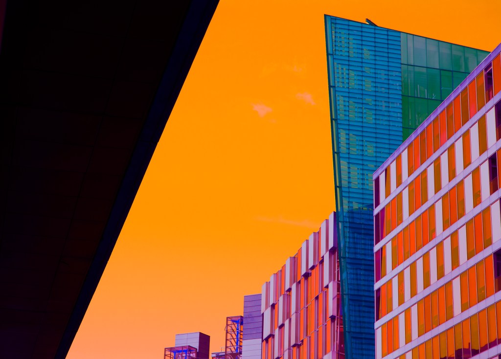
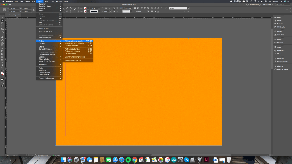
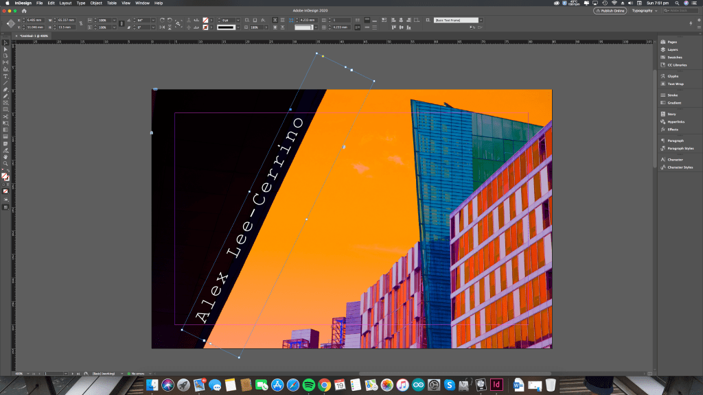
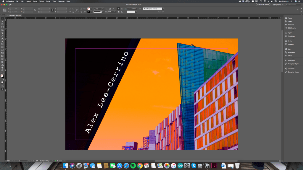
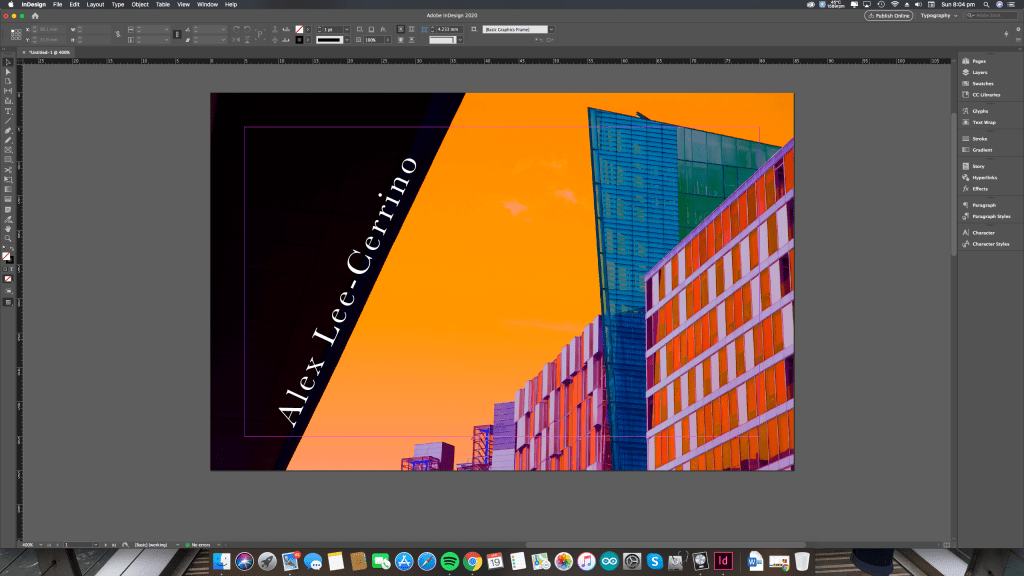
Having access to design software i chose to use InDesign, and chose to use one of my own photos from London for its bright eye catching orange colors and intresting geomatry, im also realting this back the Frank Ocean quote i found on tumblr (but couldnt find a repitable souce for) the idea that orange is a liberating color.
“color is incredibly subjective. i dont think you see color. you feel it. its like music; it goes right through your system. its both indeoedent of memory and deeply connected to memory” brain collins – color works
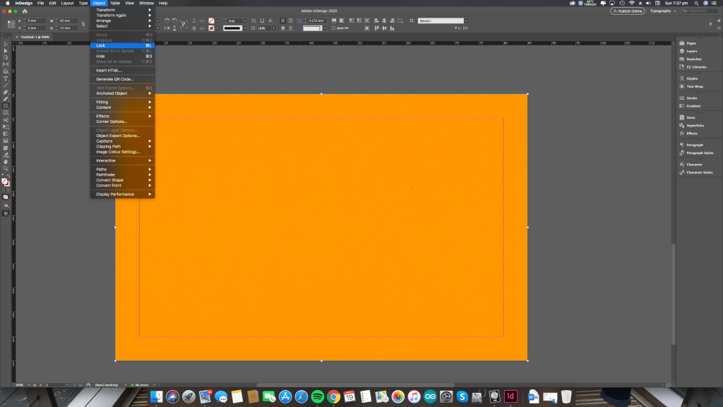
After choosing the photo on the front, I selected my background color by sampling an area within the photo using the eye drop tool. I then locked this in place with command + L so that it wouldn’t move out of place while editing ontop.
after this, i created a new layer for my text to sit top of as i wanted to try out different fonts.
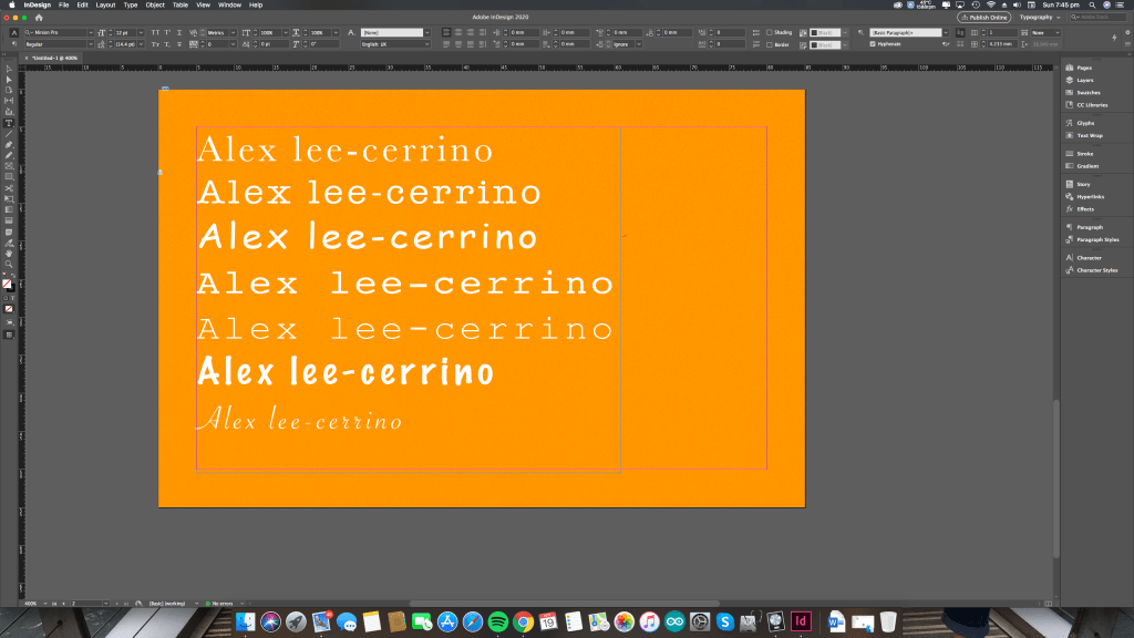
Baskerville – is a serif typeface formed as a result of Caslon, adding elegant stylisation to upper case characters to convey an ornate professional style, showing a contrast between the thinner and thicker marks. it comes with 6 styles like bold, semi bold, italics, ect. having a thicker font might make this more legible against low contrast background.
American Typewriter – is a serif typeface inspired by the type writer invention, converted to a digital format. its old fashion style is meant for a stylised publication, for this reason i feel its not suitable for this application, i also dislike how the serif hangs on the C and R as its too rounded to suit the geometrical style on the front. it also comes with seven different styles within the family of fonts like bold, italics, semi bold, etc offering a wide variety for different purposes
Comic Sans MS – is a sans typeface easily recognisable and widely used in the comic books for its readability, because of this it is also used in the educational system for kids to read, as it make each stroke clear with enough space either side legibility
Courier – is a slab serif typeface and sits very closely to the american typewriter font for similar uses in telemarketing and advertising, it should be noted each letter is given the same amount of space, an I will appear to have the same as an M.
Courier new – with courier comes courier new, an updated thinner more light weight font as Courier was originally made to capture an audiences attention, this makes it easier to use when working with larger amounts of text
Marker left – is a serif font with a lot of weight to it, meant to resemble a marker pen, i feel this one doesnt work for my purpose as its informal and kind of scrappy in its aesthetics, meant for crafts or scrap booking
Savoye LET- is a similar font but in sans offering a lighter weight, hand drawn style, maybe to resemble a fountain pen, offering penmanship with long flowing curves with stylised accents for the A and R, this is maybe close to a personal letter and doesnt suit my needs
fitting the image proportionally in frame (shift, command, C) renders the full images to the 95mm, 55mm dimensions of the card without any weird scaling issues that might occur if it were done by hand
Courier new, slab serif, thin, blocky,
Courier, heavier weight, slab face, awkward spacing in between letters
Baskerville, professional, old typeface, serif

still in love with the slab serif of Courier i wanted this slight variation in typeface, adding interesting, i wanted to isolate it in the top right to catch the audiences eye making use of its intended roots, i placed it on the right so the reader would have context, linking the A initial to my first name, i debated putting ALC but feel this simplicity works better
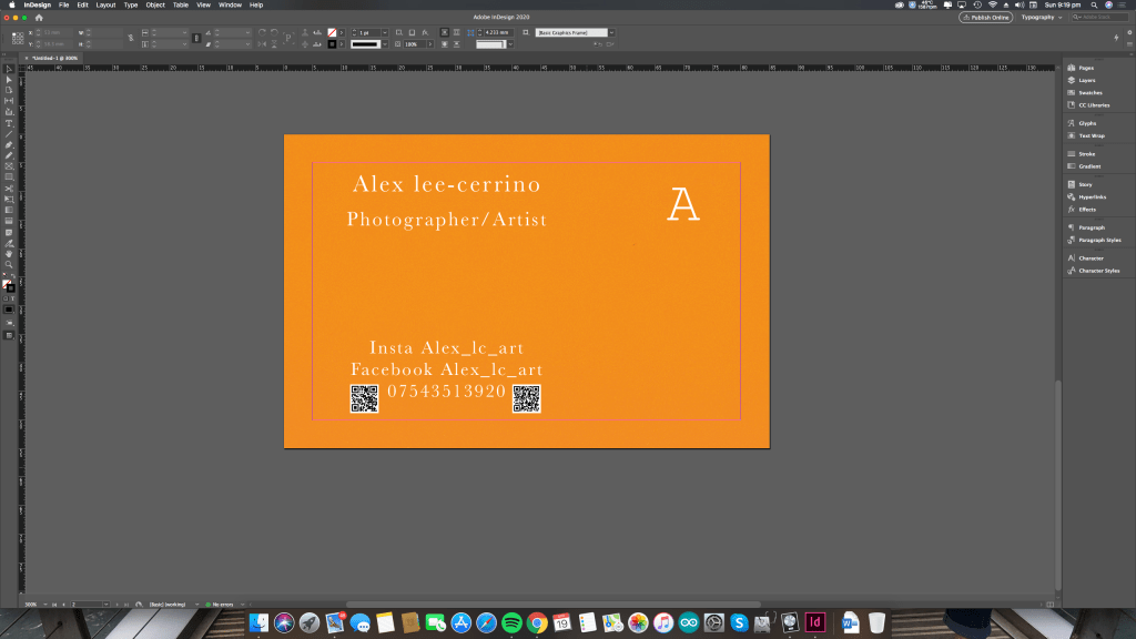
moving the qr codes to the bottom left puts all of the social platforms in a contained area on the card, meaning the readers eye doesnt looking around too much and they know what the information relates too giving it a more unified feel. i think this is the final stage of my card as it presents all the required information neatly and fits a personal aesthetic, also taking advantage of qr codes
i wanted to try baskerville in black to increase the contrast between he background and the fine lined areas of the typeface, however i dont feel this works how i want it to as the text is now quite bold, while it does make it more legible it breaks the in house style and consistency on the front of my card
< Employment >
typography booklet made using indeisgn
Thom InDesign
working closely with thom we discussed fonts and color palletes to represent his brand idenity.
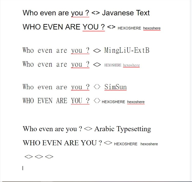
javanese – is an ornate tradional indonesian writing script. “This script is used to write the Javanese language spoken in Indonesia and Suriname. Javanese Text is a document font and the style of the design conforms with traditional Javanese manuscript and metal type models.” – mircosoft
mingLiU – is a mincho style font, close to a japanesse serif with long strokes. both thom and i feelt his font is well suited to his style and will probaly feature within my work
SimSun – similar to MingLiU with long tall strokes but is a chinese font with a mincho serif
Arabic Typesetting – ‘this an OpenType typeface designed as a modern interpretation of the traditional Naskh style […]This typeface is particularly well suited for traditional book typography, an area neglected by digital type. The font provides fine typographic control by marrying the latest OpenType technology to traditional calligraphic and typographic models. It achieves maximum readability by opening bowls and counters, balancing the proportions of stroke and white space in letters that typically cause problems at small sizes, and by contextually differentiating similar forms’ – mircosoft. i feel this is probably less suited to thoms works and for this i probaly wont use it for his promotional work.
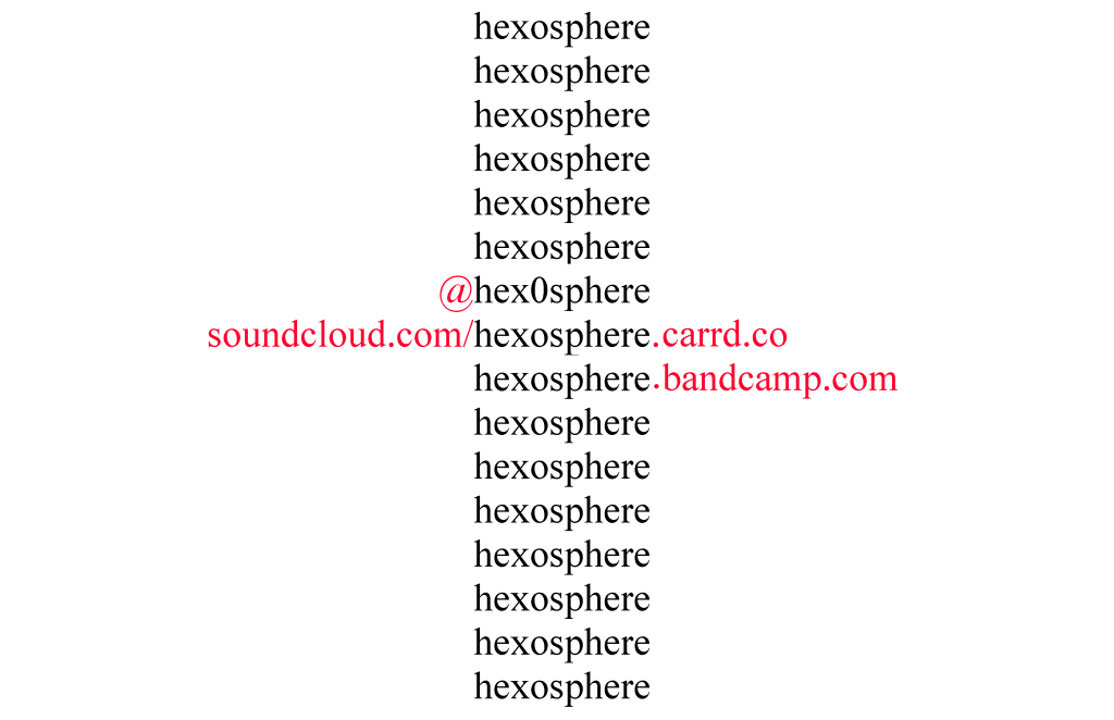
thom wanted a minamal design showcasing profional infomation.
using indesign i was able to create something he was happy with. he let me access his personal assets like png logo files. because its a png its transpareent allowing me to palce addional assets it over.
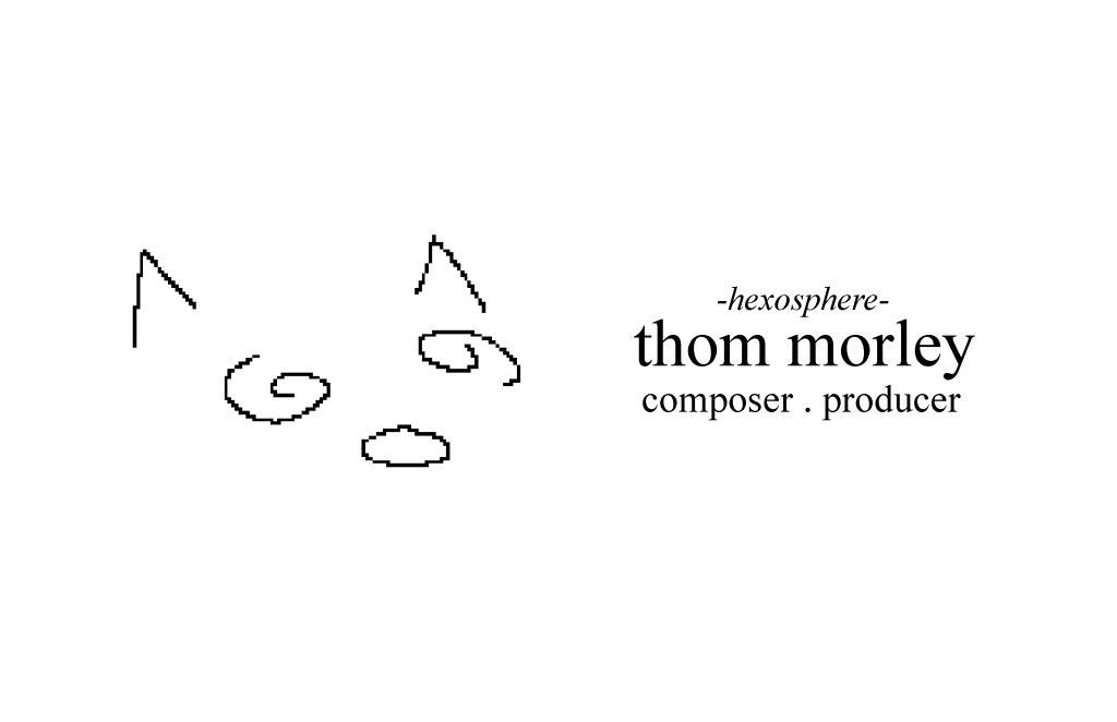
using a minimal font convays simplity allowing the reader to clearly see the relevent infomation. ive chosen to use repition as this is something seen in thoms other art works hes produced. ive used @ symbols and weblinks to direct people to his soical media platforms like soundcloud, instgram, and bandcamp, highlighting these in a pantone Pink 1777 C. the use of lower case lettering convays this soft aesthic thom aims for in his appearnce .
saved as pngs for transferring
https://morganlmurrayims224researchtopic.wordpress.com/2014/06/28/baskerville/
https://www.fonts.com/font/adobe/adobe-caslon/story
https://www.fonts.com/font/linotype/baskerville/story
https://www.fonts.com/font/itc/itc-american-typewriter/story
https://www.fonts.com/font/microsoft-corporation/comic-sans/story
https://www.fonts.com/font/linotype/courier-lt/story
https://www.linkedin.com/learning/choosing-and-using-web-fonts/identifying-a-slab-serif-font
https://docs.microsoft.com/en-us/typography/font-list/javanese-text
https://docs.microsoft.com/en-us/typography/font-list/simsun
https://docs.microsoft.com/en-us/typography/font-list/arabic-typesetting
