screen printing is a widely used production method within the music and art design industries, as it is a quick way to batch produce a lot of material for events. famous artist like Andy Warhol and Roy Lichtenstein have used this production method within their works.
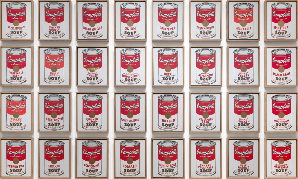
One of Andy Warhol’s most notable works in his 32 Cambles soup cans When asked why he chose to paint Campbell’s soup cans, Warhol offered a deadpan reply: “I used to have the same lunch every day, for twenty years, I guess, the same thing over and over again.” i think the repetitional production method pays testament to the mass production of the soup, even the presentation layout of them is as if they were displayed in a super market.
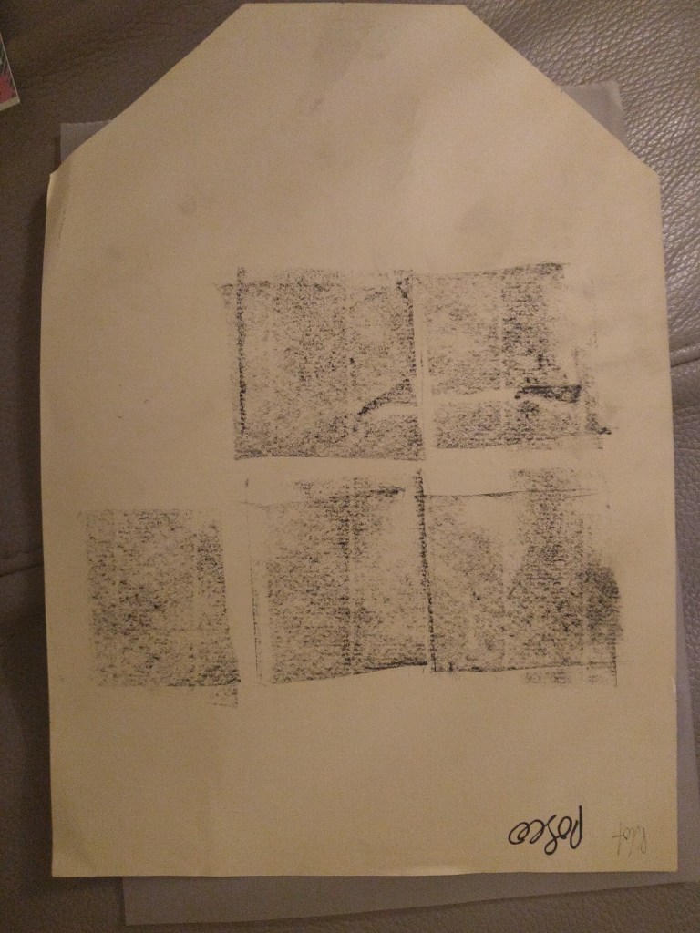
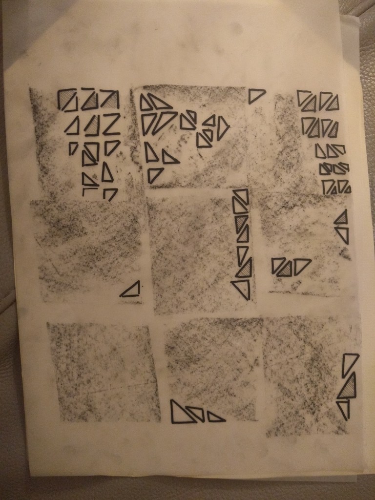
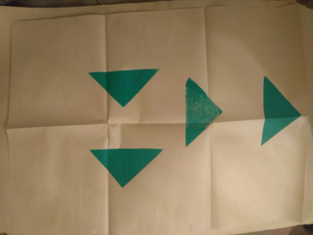
to start creating a design we drew using various implements, i started by dragging charcoal into rectangular shapes to create a texture on transfer paper so that it would be transparent, i really liked the gradient i was able to produce. to this i also used a black possco pen, filling in the small blank areas left be hind by the charcoal with interlocking triangles.
after my doodling my designs we placed them into a curing machine with a metal frame, to cure a light sensitive emulsion painting onto the mesh frame. this emulsion needs to be dried before placing it into the machine.
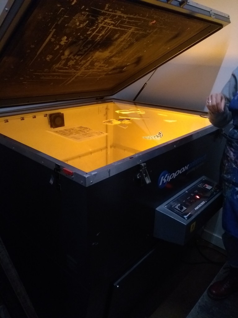
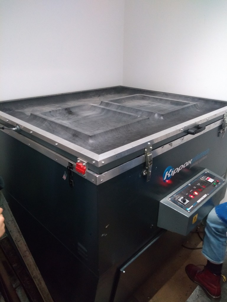
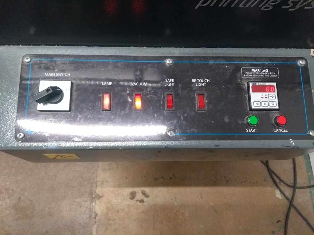
first you need to activate the vacuum to seal the frames in place, then turn of the safe light, this would start the countdown process for the curing machine, this would blast uv light at the designs, curing the emulsion.
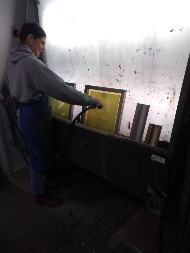
after this we would wash our frames to remove any emulation that hadnt cured,this would leave behind the design
paper pricing list
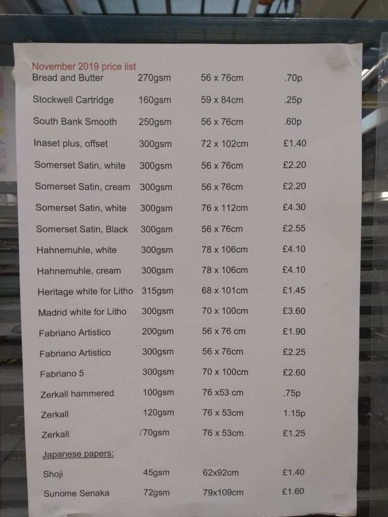
along side this printing list were sample of each of the different types of paper, this was really helpful to visualise the thickness and texture of each sheet, from this i could select which paper i wanted to work with while i take into consideration the price of each.
to begin with i started using news print paper as it was free, allowing me to test my printing process and get a feel for how it works. the news print is a light weight paper that often buckles under large amounts of wet acrylic.
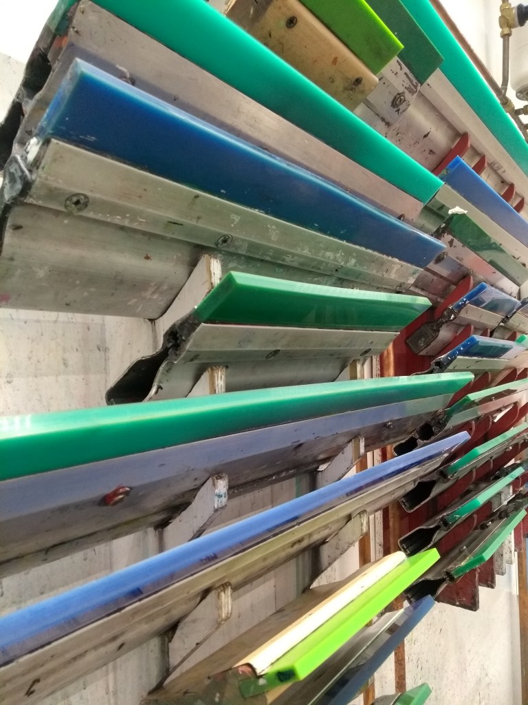
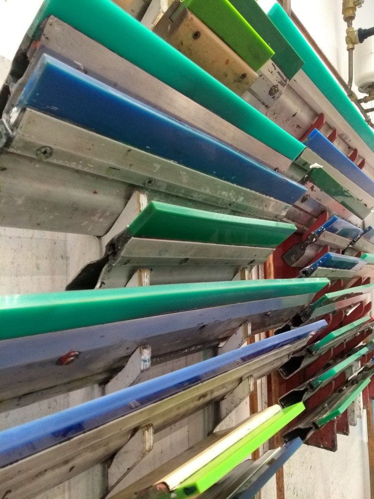
i started mixing acrylic and binding medium to a constancy of “a good viscus yogurt” i would spread this onto one side of my mesh screen and use a squeegee to run over the mesh.
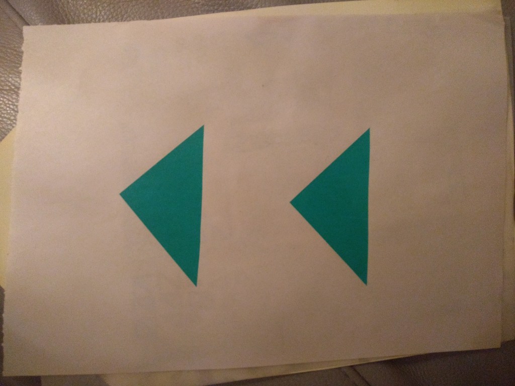
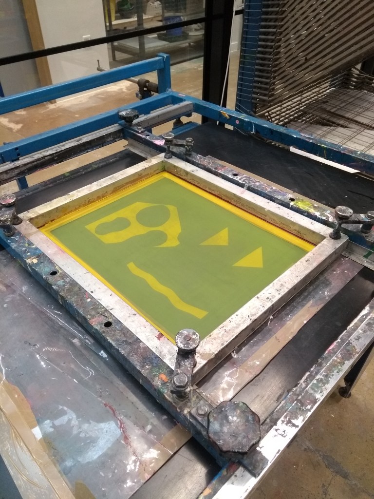
starting with two triangle design and a green pigment i mixed, i would print a few of these as a form of batch production, i then set them to dry on a rack, and use the better ones to process my second screen design- the doodled pattern. this didnt turn out as well as i would have hoped as the charcoal gradient is faint, however i do like this idea and the effect of the smaller triangles, but the weight of the pigment is too different to work together.
i also feel because my second layer is a lighter color it doesnt pop like i would want it to, as the RBG process is additive, meaning the more color i add the darker it will become when layering, if im to do this properly i want to lay my darkest color last. it should also be noted because of the printing binding the acrylic paint becomes more translucent
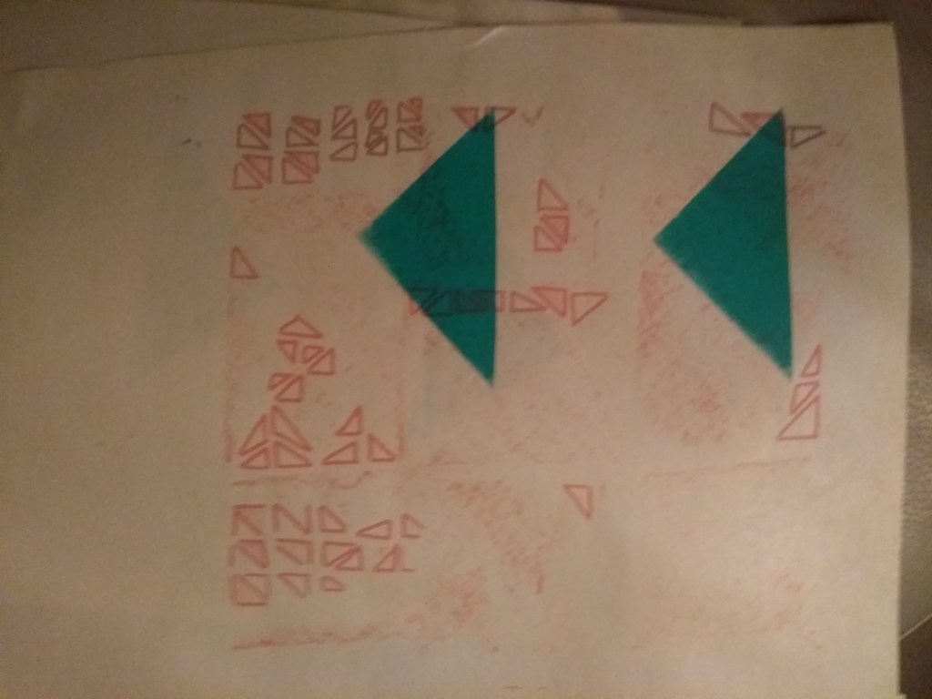
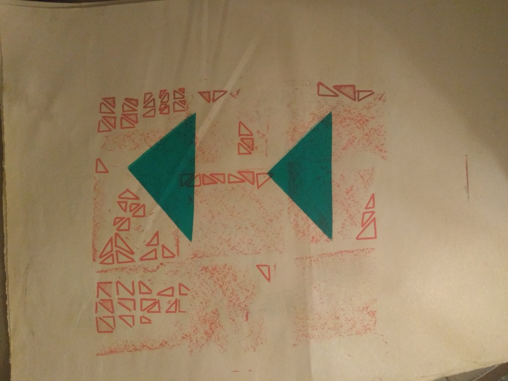
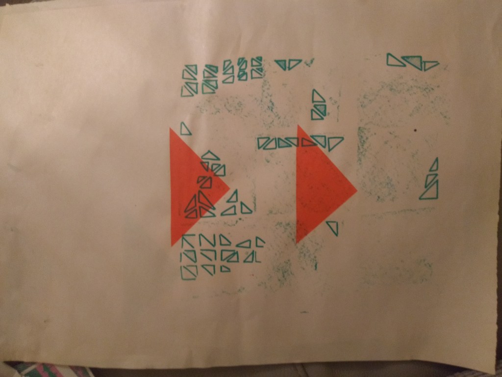
wanting prove myself right in my theory i changed my colors, now using a bright warm orange for my frist layer to which i added a the same green pigment i made, the overlapping layers show areas turning close to black when they sit on top. again i can see how much i dislike this charcoal grain texture as paint cant fit through the holes in the mesh screen
here are some other designs by my course mates that took the workshop with me, i like their use of colors and interesting design patterns. this concluded our screen printing workshop
studio editing
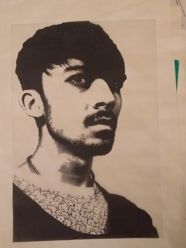
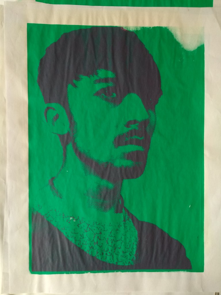
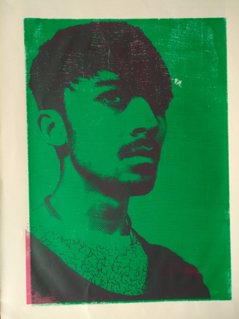
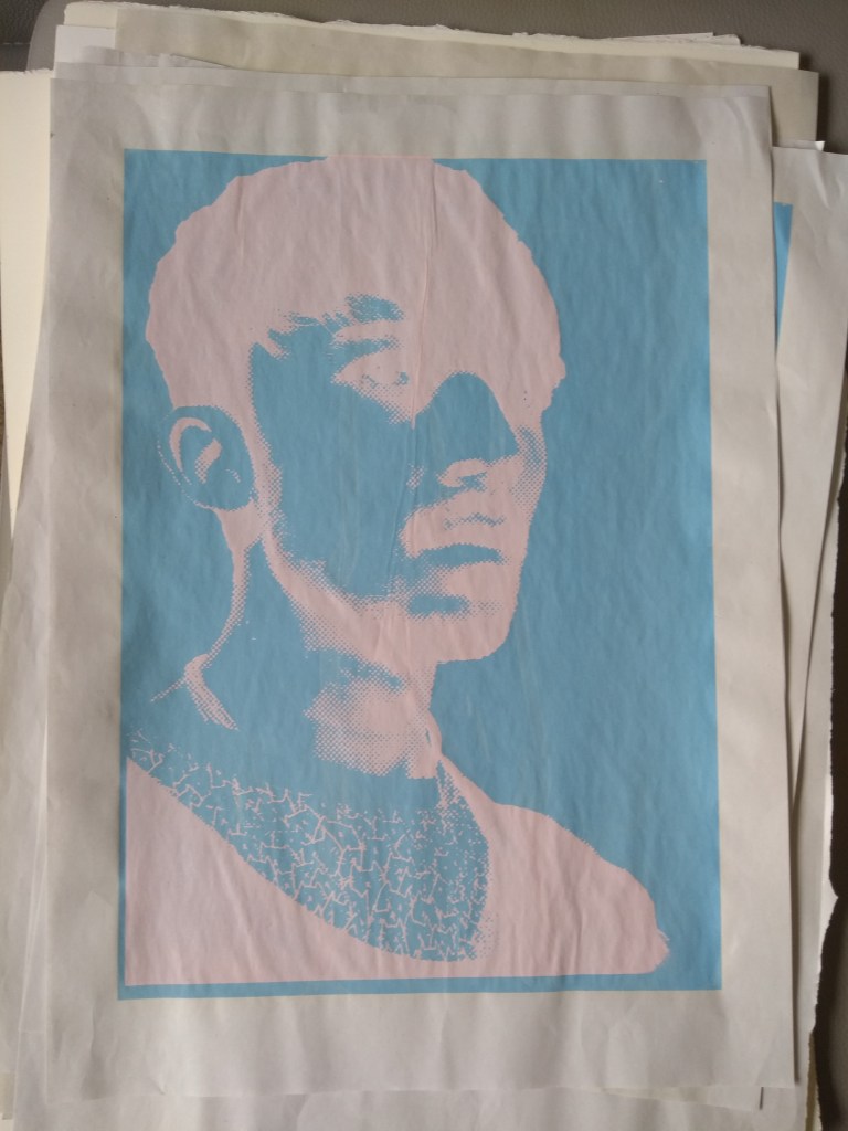
wanting to pursue screen printing further, i took photos from my studio session with thom and edited them in Photoshop to give me a this halftone printed effect. i covered this image into a transparent png file so i could print it onto an acetate sheet, this would act as my template design for the curing machine, curing onto my mesh screen, repeating the process as before
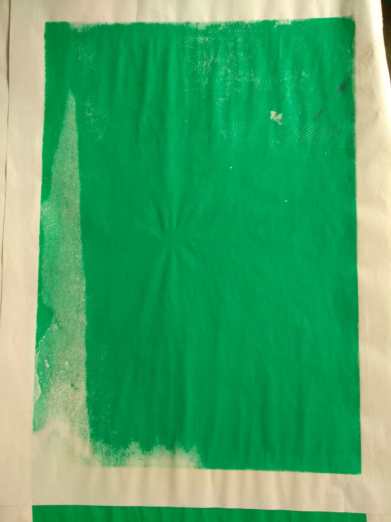
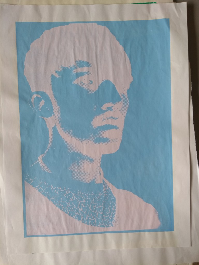
using news print again to test my prints for the same reasons as before, you are able to now see because of the paper structure how it doesnt hold up with such large quantities of paint leading to buckles. on the left i havent flooded my page correctly leading to this misprint.
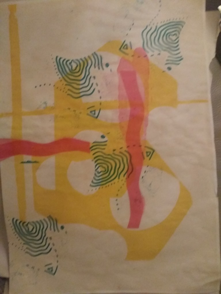
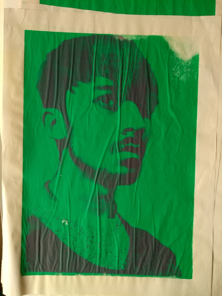
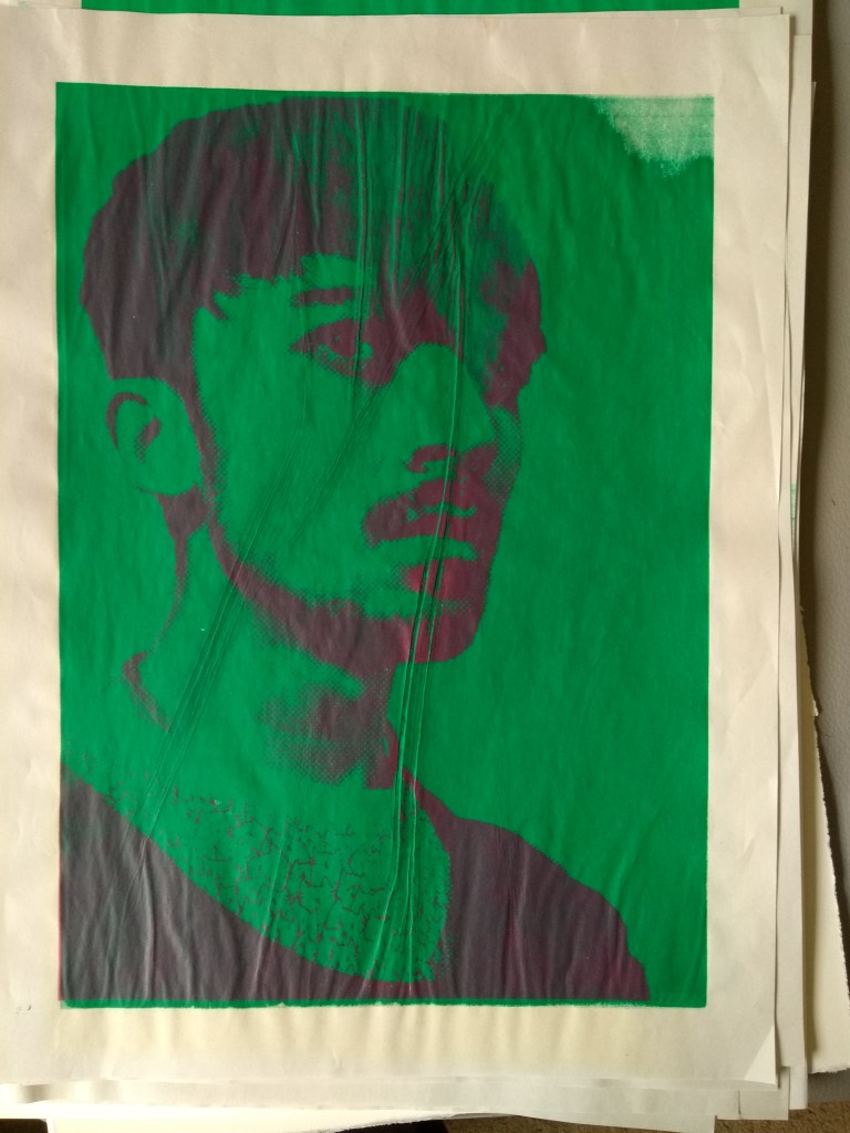
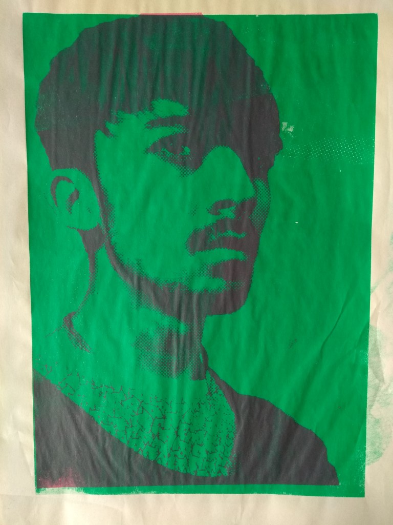
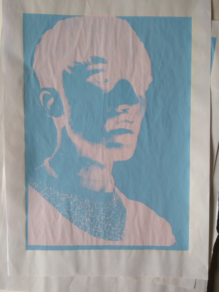
continuing forward, i selected my green and chose to use a bright magenta color on for my second layer however this didnt turn out as planed as i didnt think about the pigment being additive and turning thom black. i feel this still kind of work as he still works in the positive space.
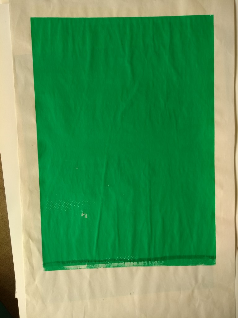
you can see how much the buckling really effects the work here, i also feel this is because the vacuum on my work bench might not have been turned on meaning my print was getting stuck to the screen when lifting it up. i should to to avoid this in the future, you can also see a repeating mark(or lack of) on the top right where the paint hasn’t adhered to the paper, this is probably because i lifted up my squeegee too early in that area, or i didnt flood my screen properly before printing
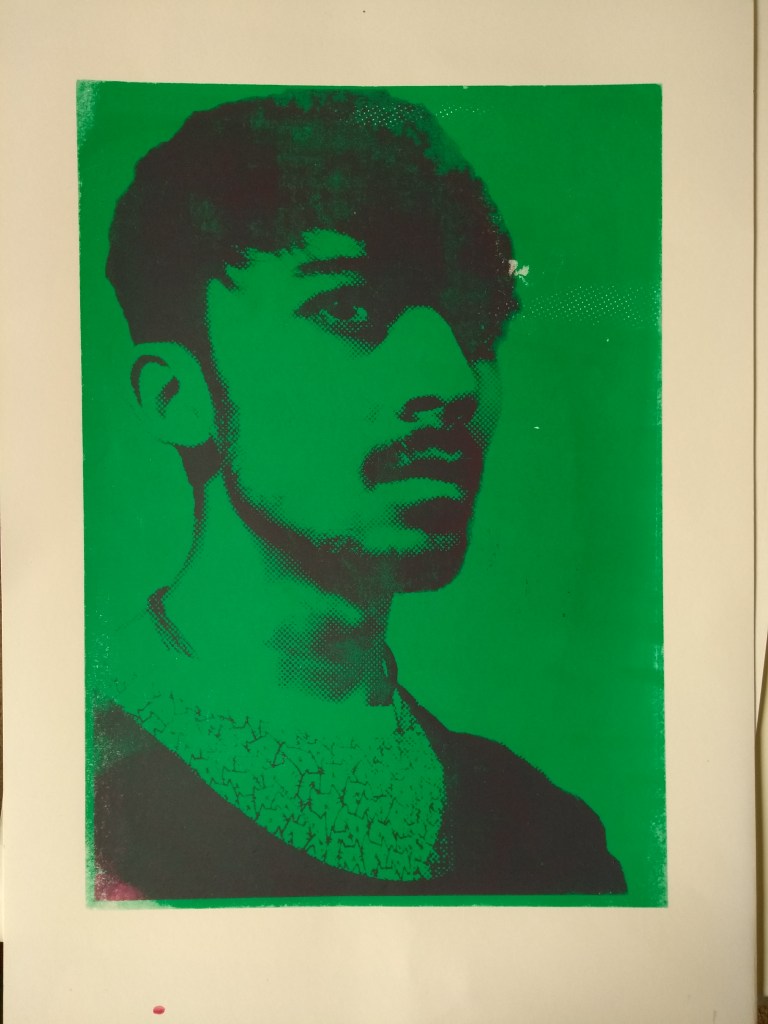
finally mostly happy with my test prints i decided to which my news paper for the good stuff, i selected two sheet each of stockwell cartridge 160gsm, south bank smooth 250gsm, and zerkall 120gsm
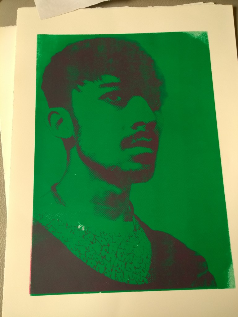
SBS 250, was really pleasant to work with as its weight allowed it hold its structure very well, but might make it heavy to hang in the future, its smooth clean cut edges and smooth finish made it look very formal and professional, it also allowed the paint to adhere well for the most part but still showed some inconsistencies
SC 160gsm, has a tattered edge which is seen as trendy in recent art movements, up close this is really nice to look at in detail, however paint doesnt hold the best tho im starting to suspect this maybe my own doing, in not pressing down my squeegee enough, or maybe i havent flooded my screen correctly. this paper weight is a happy medium between the three offering a nice middle ground
Z 120, shows a really interesting textured surface as the fibres appear to be woven paper fibers,its the lightest i have chosen and this can be felt, i dont know how this will stand up to wear and tear for prolonged periods
“Designed for letterpress printing and woodblock engraving, this smooth paper is mould-made from part cotton rag. It can also be used for calligraphy, bookbinding and traditional ink drawing. It is acid free and buffered with calcium carbonate to provide a resistance to ageing. Internally sized and watermarked with 4 deckled edges, the paper also contains no optical brighteners.” -jackson art
in hindsight it might have been smart to experiment with using the Japanese style paper as this would have fit in with thoms Japanese aesthetics, and woudlnt have been too much more in terms of cost
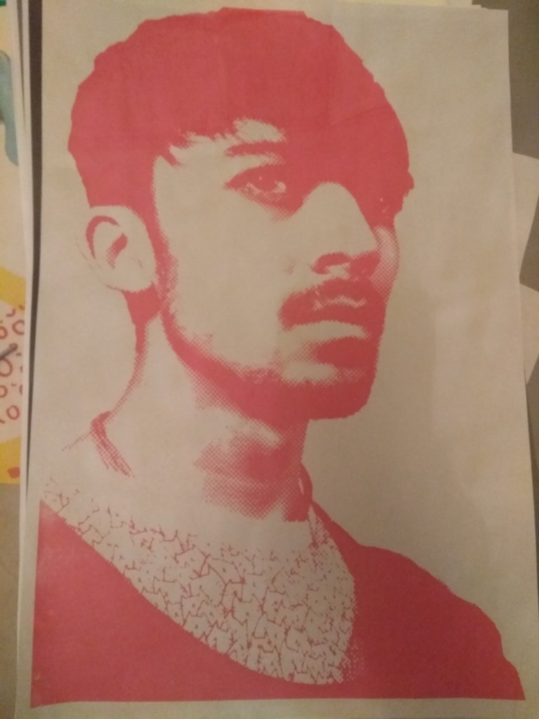
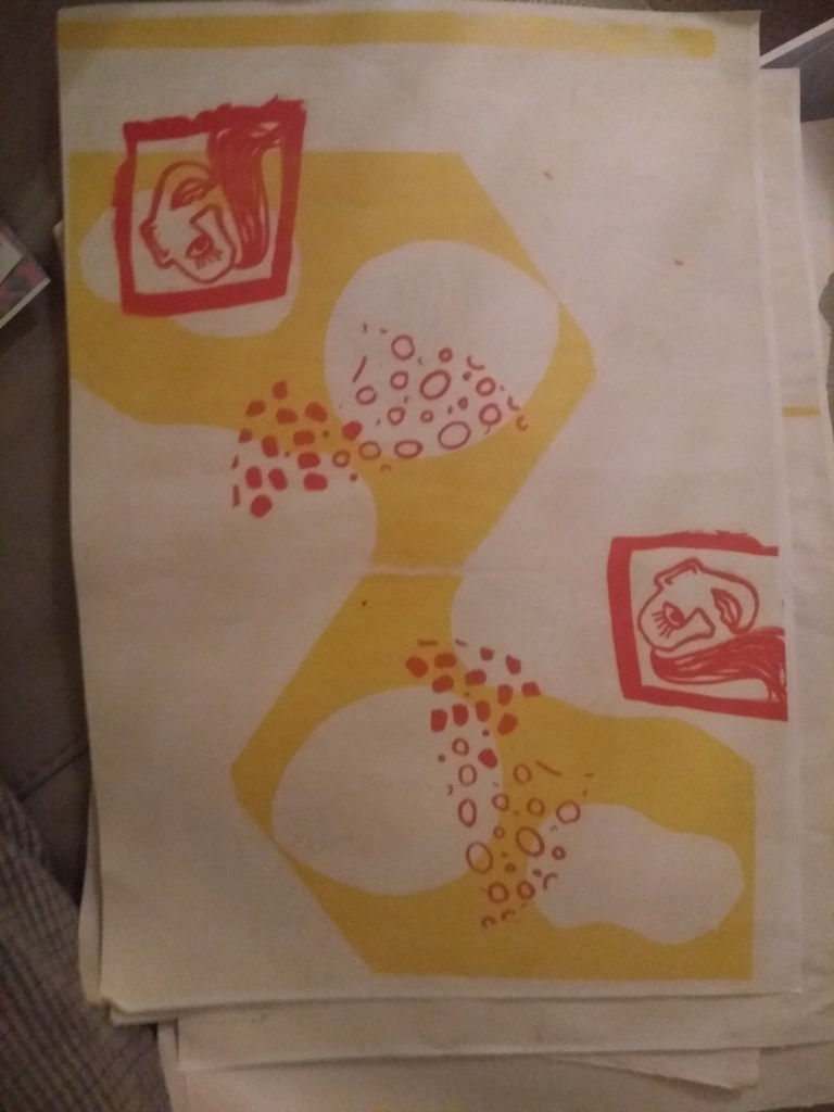
this is what my magenta prints are meant to look like without the green pigment background, i might try to use this as an asset later
following the same process again, i changed my colors once more, this time using a soft egg blue and pink close to Pink 1777 C pantones, linking to the color aesthetic picked out for thom. the lighter color pink sits on top to create a negative image,these were tests on news print, to these i can add vertical text to the right hand side where the empty space is. i like these but feel they dont work as i would want them to

https://www.moma.org/collection/works/79809
https://www.jacksonsart.com/zerkall-printmaking-paper-smooth-53x76cm-120gsm-white-25-sheets
