17.02.20
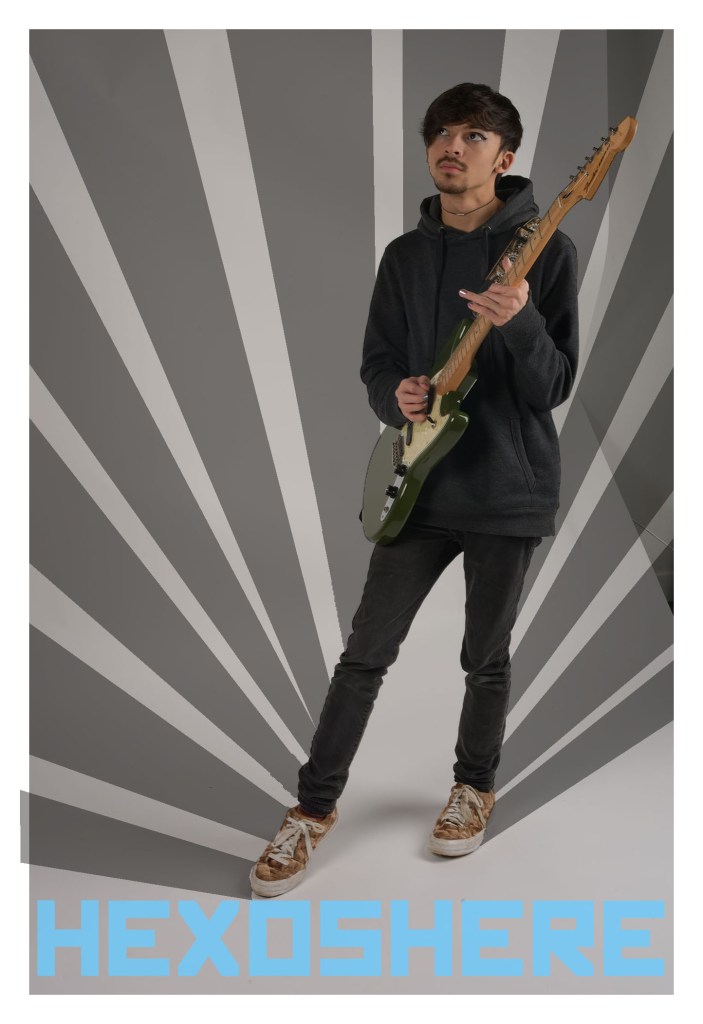
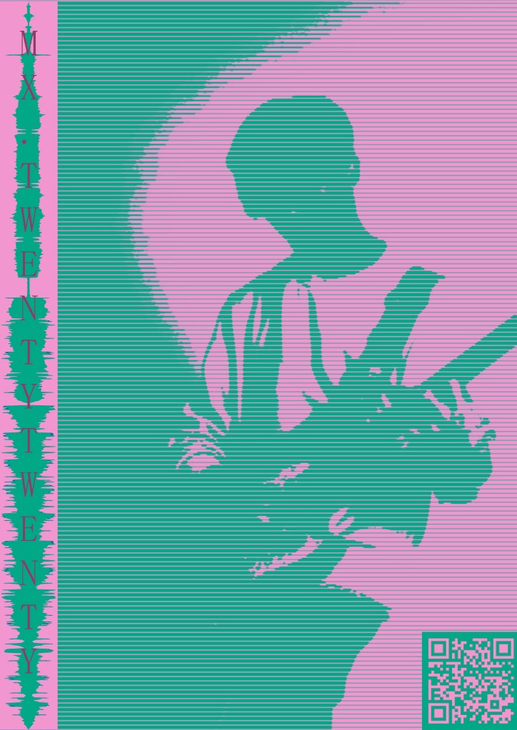
after my shoot with thom i was inspired my the Russian constructive movement for the geometrical patterns and use of bright uniform colors, here ive tried to do a similar thing by choosing to incorporate the leading lines, highlighting thom and his guitar, ive also chosen to use a russian style font to enforce this idea, however i dont feel this really suits thoms brand identity and might need to rethink my ideas. in this photo youre also able to see the back drop and how its buckled, this looks really unprofessional and i might want to reconsider using a different photo
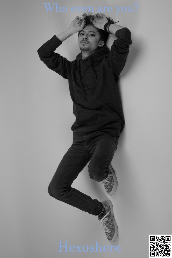
working with a different image, thom and i spoke about different types of fonts to use <fonts> i’ve chosen to use a soft blue to appear calm, however this doesnt shows a low contrast between the background making it awkward to read from a distance, ‘who even are you?’ refers to a song lyric featured in MXtwentytwenty, i then followed this by placing ‘Hexoshere’ to show thoms identity with a QR beside it linking to his soundcloud, this is a compact way of displaying information directing viewers to where they can listen to his music. i also chose to turn thom into grayscale as a way of playing with color however i feel this doesnt work as its too simple and i could do a lot more with it.
02.03.20
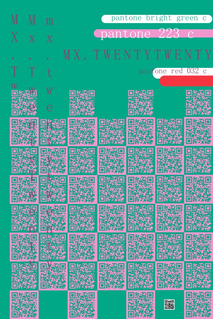
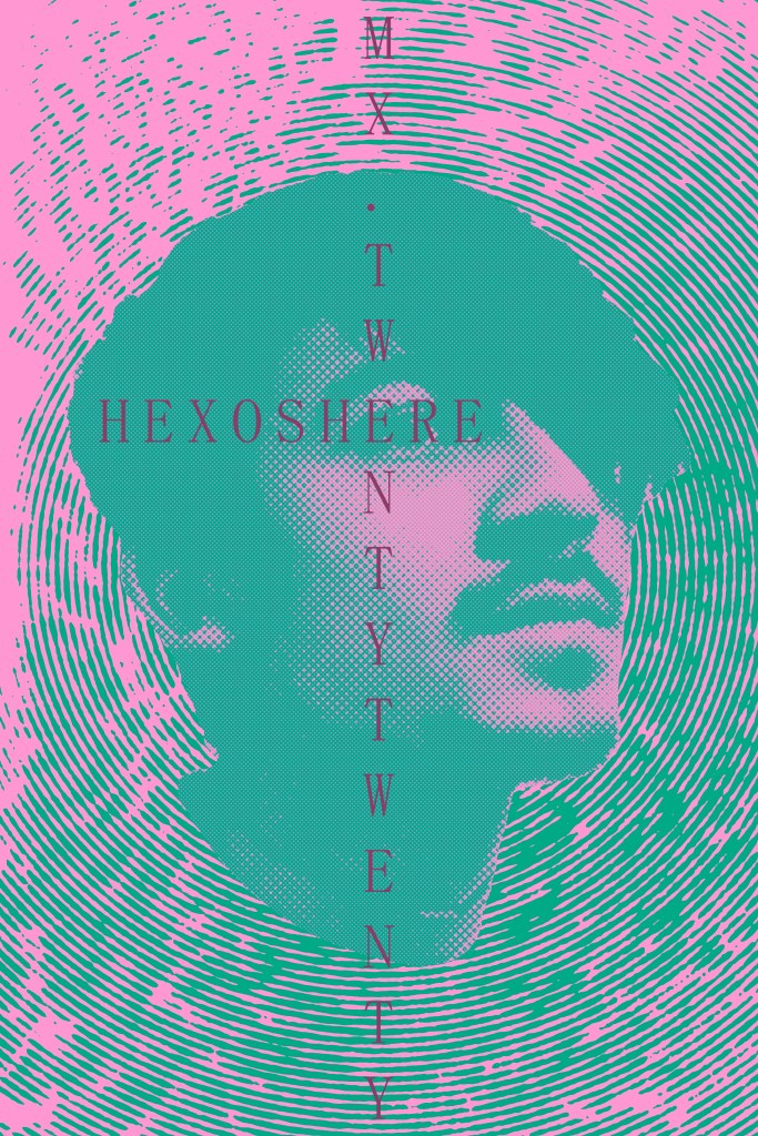
looking more closely to colors with thom ive chosen to use Pink 223 C and Bright Green to complement this. to create the background texture i used thoms fluffy coat because this relates to his personal identity. I put in photoshop with a halftone circular filter connoting vibrations of this are to indicate the idea of music or sound reverberating from thom head. over thoms face is used a similar effect done with dots to create a gradient and definition of thom. to this ive placed text over the image trying to be creative with were they have the same letters making the intersect, MXtwentytwenty is thoms MiXtape coming out later this year
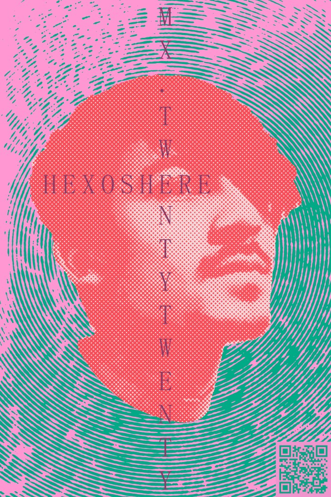
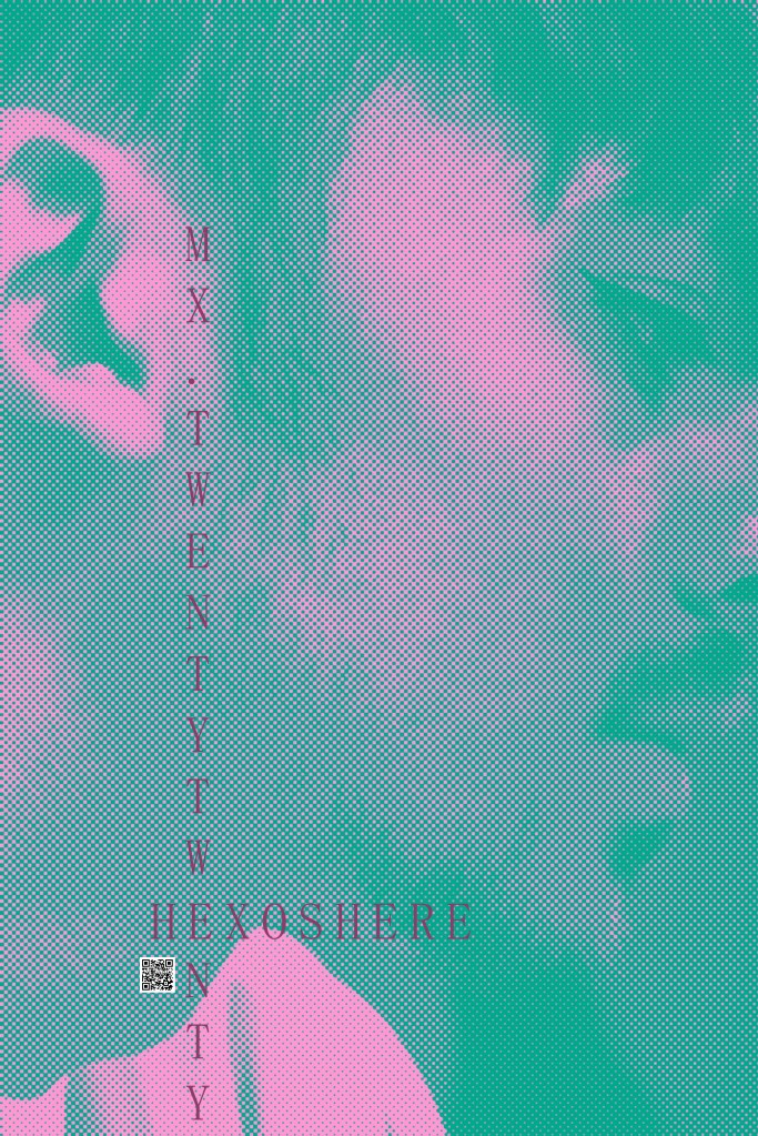
from here i tried to change the colors of thom so that he would stand out more and not get lost in the background, i feel the different textures of the circles and dots do this well but wanted to try and increase the clarity between them. i feel this makes my poster look messy though as there are too many bold colors interacting together, ive also introduced QR codes in the bottom right because this is how the eye reads from right to left. so this is the last thing you see, letting the reader experience the poster first and get the information later, i also altered the colors of this make it fit int with the poster, as a straight black and white this would have taken away from poster, catching the readers eye subtracting from the design. because qr codes work by showing a contrast between the b/w i questioned if the altered colors would work, they do but it takes a moment for phone cameras to read it, so many this isnt the best idea? i like the fact that it does work (most of time) though
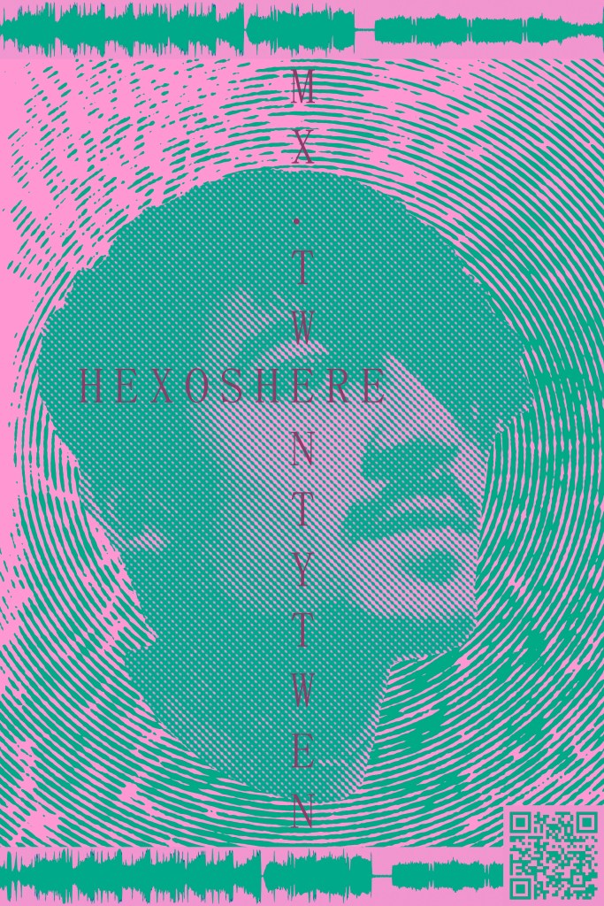
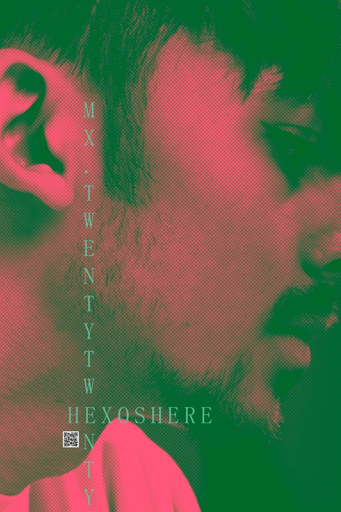
i chose to revert the face adjustments back to their pink and green colors, and introduce wave forms from the feature song on his mixtape, i think this is a cool idea and enforces this idea of music and sound. the text is a little to be desired as it covers thoms face, obscuring his identity
moving around a few aspects of the design i wanted to refine my idea, i moved the waveform from the thom and bottom to the left hand side and layered the MX title over the top, these seemed like a suitable placement as it didnt cover thom, however this didnt leave me room to put the artist name and is probably an issue, however i still fell this idea works. i also inverted the colors for the qr code to increase contrast making it easier to read. its the top layer so there would be no interference with the halftone lines.
02.03.20
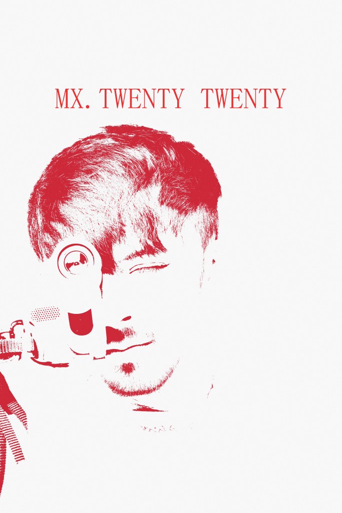
wanting to experiment with a different color palettes thom suggested , i chose to work with this minimal design of red and white, building on the Japanese style i decided to take inspiration from their national flag, i feel this work as it doesnt directly reference and build on those traditions but it tries to acknowledge that style. this poster feels very barebones/uncomplete however as there its just a title poster, theres no additional information or links who this might be
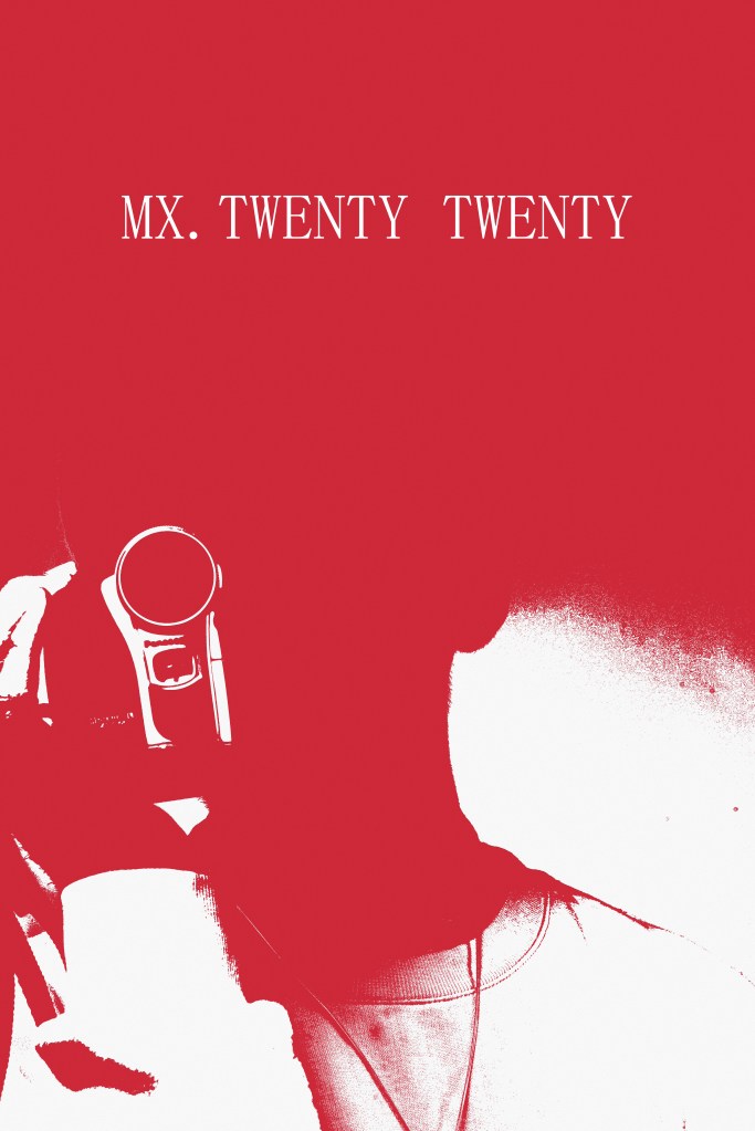
i also made a reverse to the poster above as i was intrested to see how it would look, i like how it turned out as it give a more sinister vibe, because the block color covers his face, even though there arent eyes visible the ring around the camcorder makes it feel like your being watched as if were the ones under surveillance
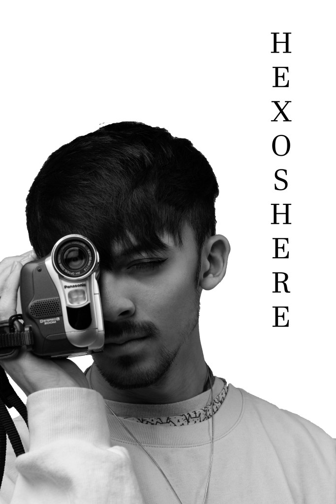
i saved this poster as a png file so that it coiuld be transferred easily onto different mediums, i’ll save this and use it as an asset later, here ive also added text however i feel the stroke of this font is slightly too thick, the mingliU is better
this poster design is different to the rest as its more close up and intermediate, admittedly it seems weirdly cropped though this is just bad framing on my part, i still like this idea though as a personal side profile, it would make a nice book cover.
the text i feel comes down too far, i tried to line it up with the space in his side burns as this felt natural however the height of it doesnt cut correctly. the spacing is uneven between the thom and bottom
inversing the colors, this edit presents darker tones that past posters and i kind of like this over the lighter tones didnt as they work as much? the cutting tones of thoms music feel like they should present a darker color pallete that what i was working with. because of the darker tones ive lost some of the clarity in the half tone stippling effect
om this poster the qr code is nestled between the text kind of subtly but still stands out to grab the attention of viewer if theyre seeking more info without detracting from the visuals of the poster too much
