(figure 1)
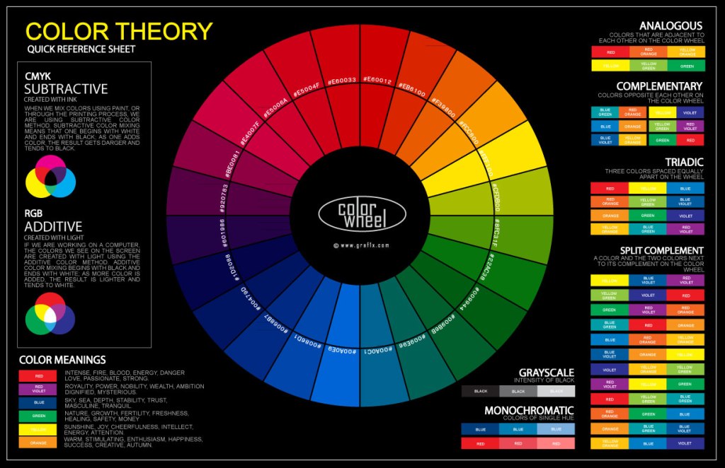
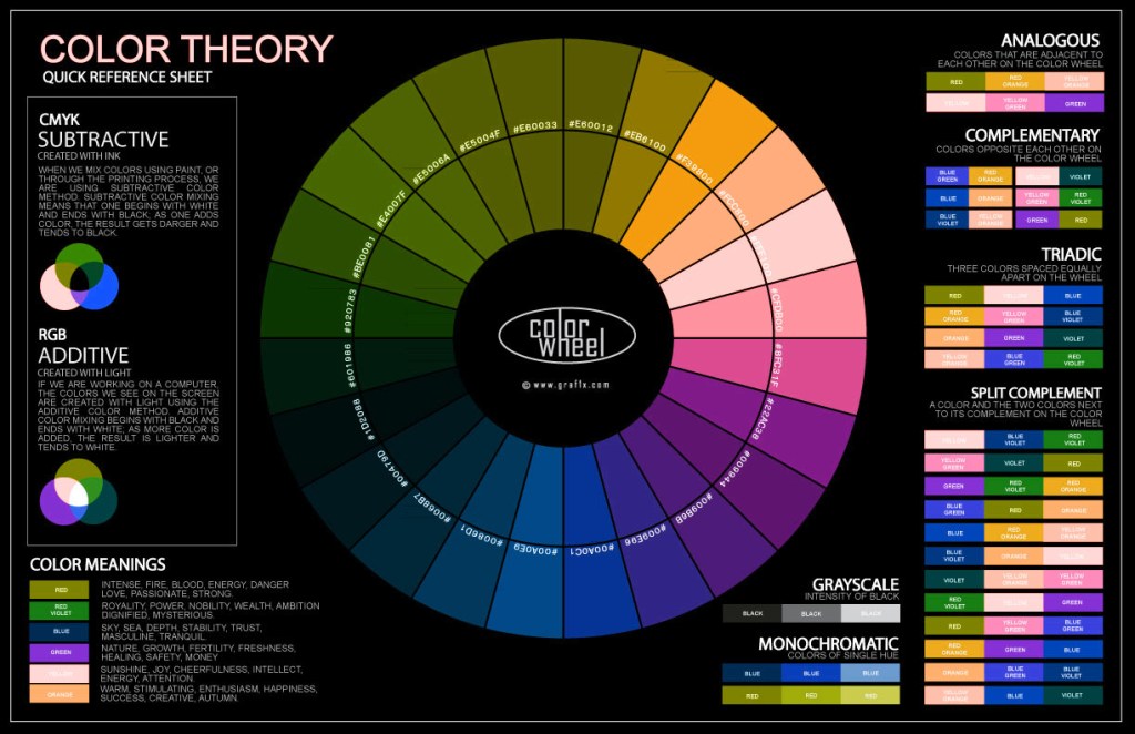
this wheel colors shows us the range of colors which are visible to our eyes, and is something that should be memorised and understood by every artist, learning how each color works together and how it relates to other colors on the wheel, however, these arent the only colors that exist, outside our spectrum of light there is a larger spectrum of light we cant perceive with our eyes like UV or InfraRed.
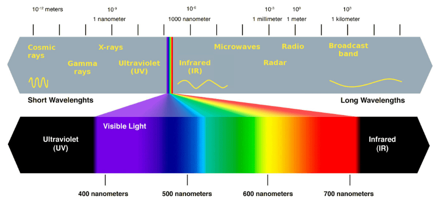
normally with our human eye, we see a spectrum of color known as visible light, these range from violet at around 400nm to red at around 700nm, however, this is only the tip of the ice burg as there are many different types of light not visible to the naked eye
ultraviolet travels at a faster frequency than visible light, ranging from 400nm to 10nm in wavelength. UV emitting lights are often used in labs to sterilise equipment as it is cancerous to living things, it should be noted that tanning methods like sunbeds expose the body to high levels of UV light for prolonged periods of time.
some animals like birds can see in UV likely because of the pigment inside an insect’s body which reflects these wavelengths back to the bird, in turn, providing them with an advantage when hunting prey.
infrared light travels at a slower frequency than visible light it ranges between 700nm and 1050nm, we can not perceive this color, some animals in the world are also capable of seeing in this spectrum like bees, other birds, and many insects. however that hasn’t stopped companies and film developers from assigning color to it- not will it stop me
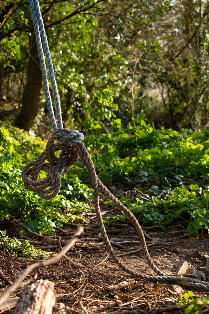
> film <
using the color wheel from before by graf1x and putting it in photoshop, and by pressing Control+J we can double the background layer, and apply an invention layer by using Control+I to flip these colors (figure 8)
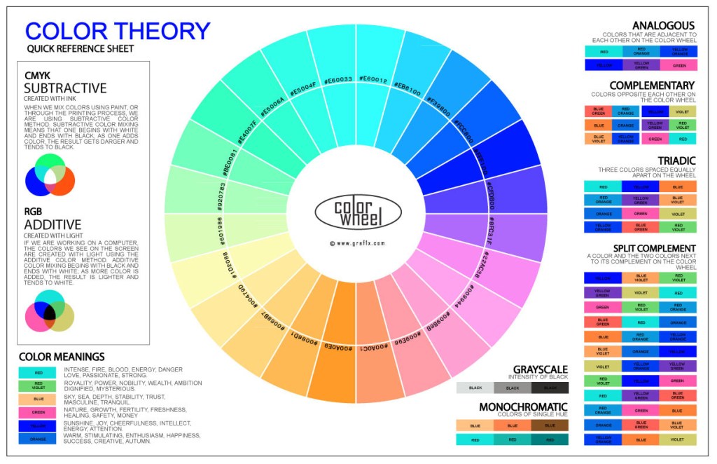
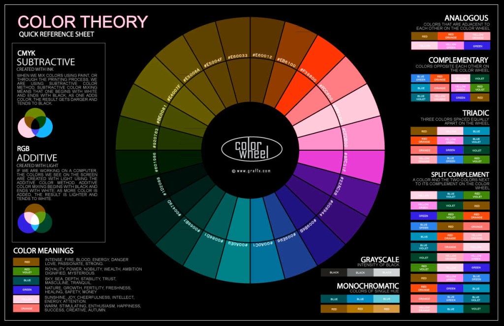
and then by changing the layer type from Normal to Color, it’ll apply these inverted colors over this image, turning our greens to blues and violets. while our yellows turn to lilacs, and our reds turn green (figure 9) in nature like this they appear mostly blue
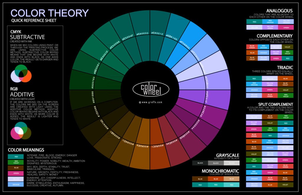
however to this, we can add a channel mixing layer to invert the reds and the blues, this brings us into a pink world of IR (figure 10) and shows a similar a resemblance to Richards Mosses work in the republic of congo
to this i chose to apply a hue and saturation layer to enhance these colors, decreasing the hue to -22 and increasing the saturation by +20 (figure 11) these images shows a vivid color palette with these intense mystical aesthetic
(figure 7) 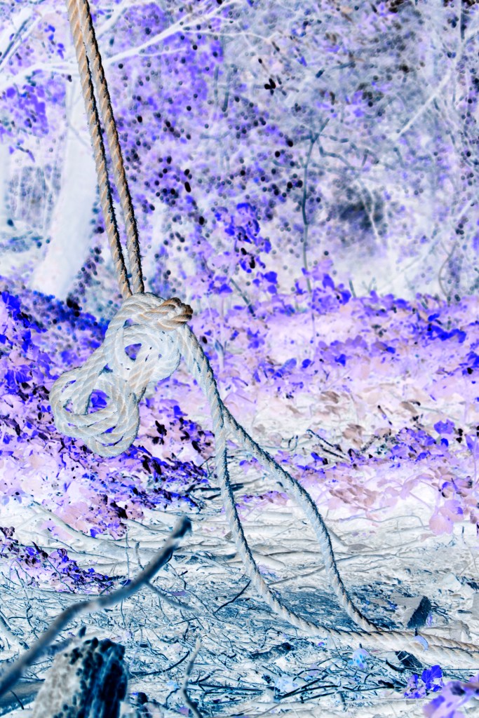
(figure 8) 
(figure 9) 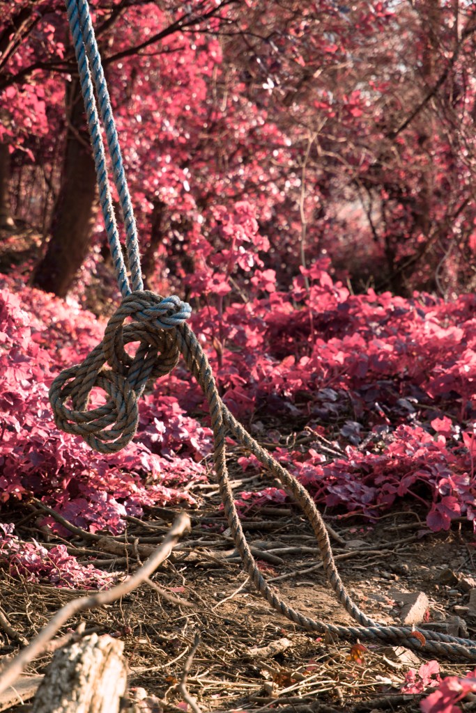
(figure 10) 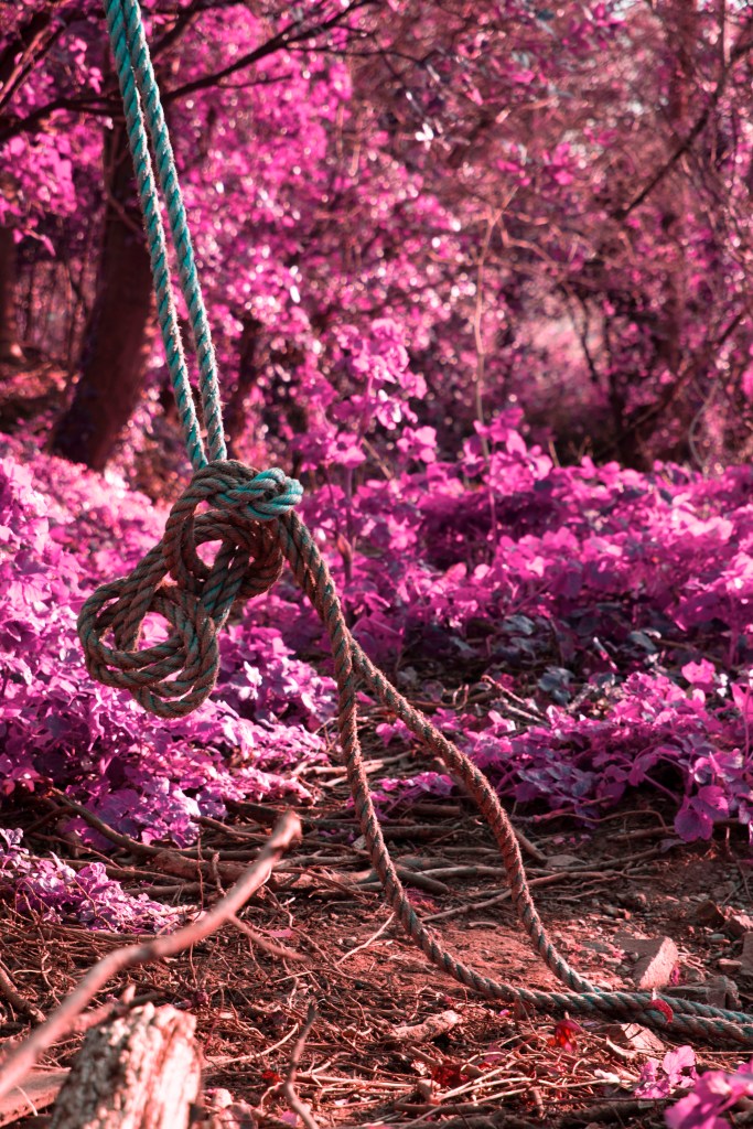
(figure 11)
> styling <
https://www.pngwing.com/en/free-png-pjjvt/download (accessed 18th May)
graf1x.com/the-color-wheel-poster/ (accessed 18th May)
