these photos were taken in central park in plymouth, this is a place use to be a public zoo during 1960’s and is often visit with my friends back home for a smoke break from uni. they were taken on a nice warm sunny day providing me with lots of light, however because i was with friends at this point i didnt feel too obligated to take photos
out of about 267 images i was able to retrieved 5 images, which i’ve cut down to these 4
i felt by this point my project was coming to close and that i had most of the photos i wanted, also with this being a new location, i felt a lot of these photos were maybe unnecessary. i’ve spoken about this before, but these photos show two different editing style, the one on the left follows styling edit 1 while the right follows editing style 3.
i’ve chosen to edit these images twice as i wanted to make sure that the refined approach is the way forward
> Styling <
Hue Sat 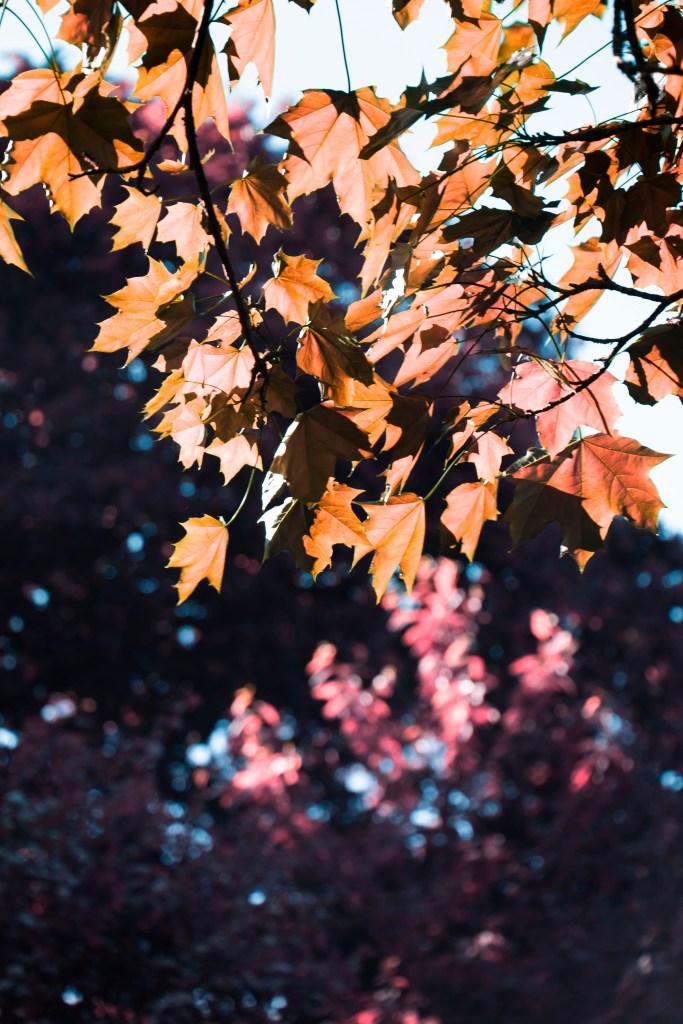
Channel mix
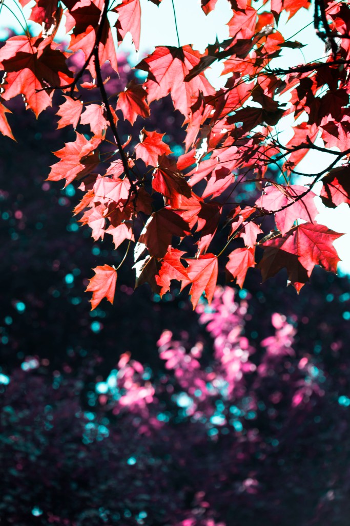
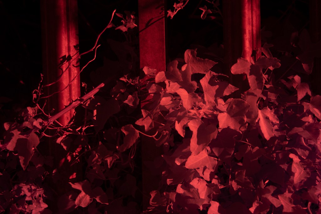
i like these leaves in this photo they seem to drape quite nicely in the breeze, taken from under the tree looking out we get this illumination allowing us to see the vein system within side the leaf, i feel i like the right side more for its stubble composed edit, the red leafs on the left seem harsh to look at
Hue Sat 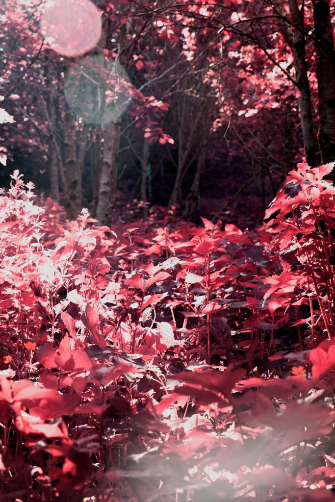
Channel mix
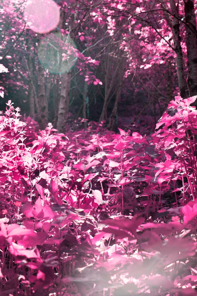
here we look more the weeded undergrowth of this overgrown area. we also see these eyes in the background of a birch tree. the lens flare is also kind of nice as it denotes these ideas of spiritualism from Ram Dass, and i also feel i like the right side for this photo, i feel this calm meditated look just suits better for the atmosphere im trying to convey, however towards the right side of the frame i could stand to burn in sections of the highlights as they appear over exposed

Hue Sat 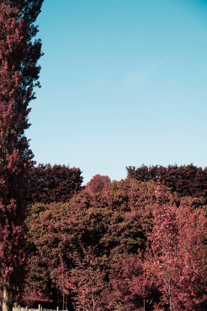
Channel mix
in this photo i noticed the nice composition of these tree lines, a tall poplar tree frames the right side of this image while a small abundance of trees form the bottom third of this image, leaving way for the sky to fill the negative space. for this edit i actually like the left side because of its skyline hue, it appear more vibrant as if it were a different world, compared to the right side looks a little washed out, the same for the trees, having this slight vibrancy i feel adds to the images when part of the sky is dominant, maybe i could create two separate layers and edit the two styles together, but if there are a lot of images i have to do this for it seems counter productive ?
Hue Sat 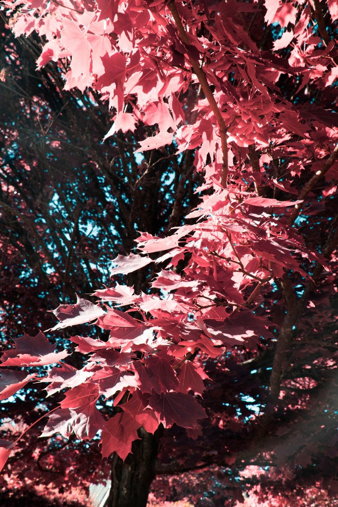
Channel mix
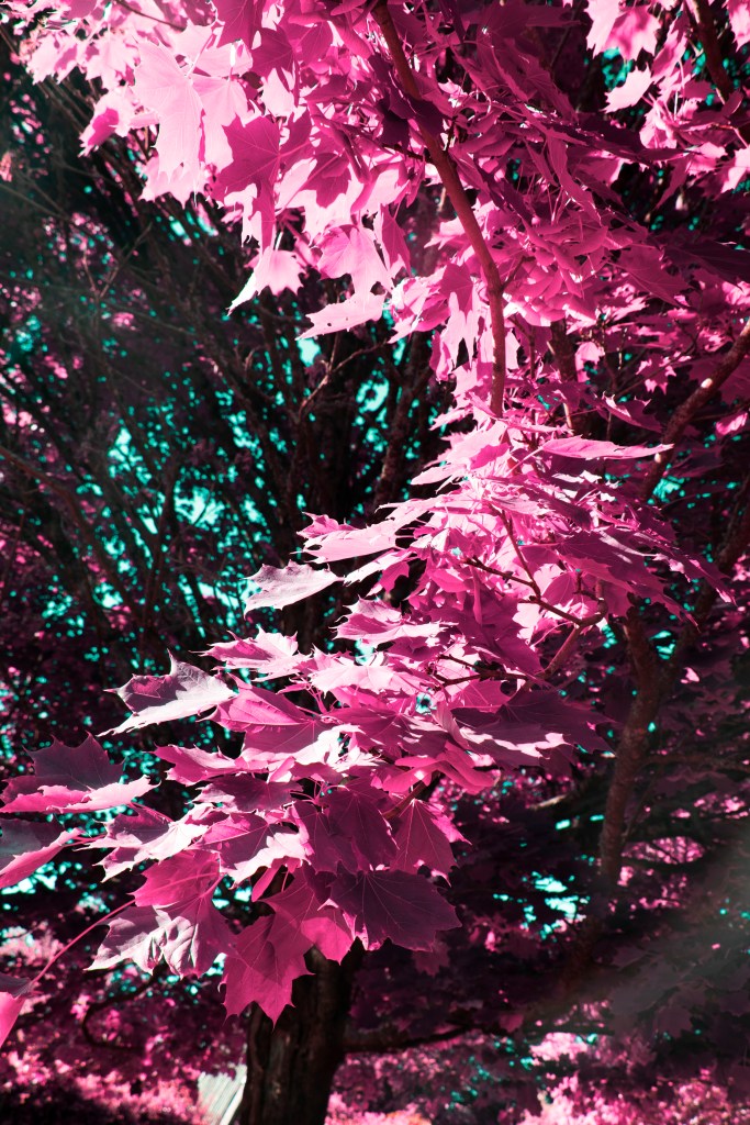
here i like this solar flaring more than the previous photo because its more subtle and in line with the rest of the photos. the same can be said for the hue, though i do like the vivid purples i feel the softer pinks are more comfortable for the eyes to rest on, letting the viewer relaxed as they contemplate these images
in concussion of this photo i have decided that my refined approach is defiantly the one i want to work with, even though sometimes i dont get the hues i want, the ability to print my images at their highest quality is more important to me than the more saturated hues where i often loose information and clarity
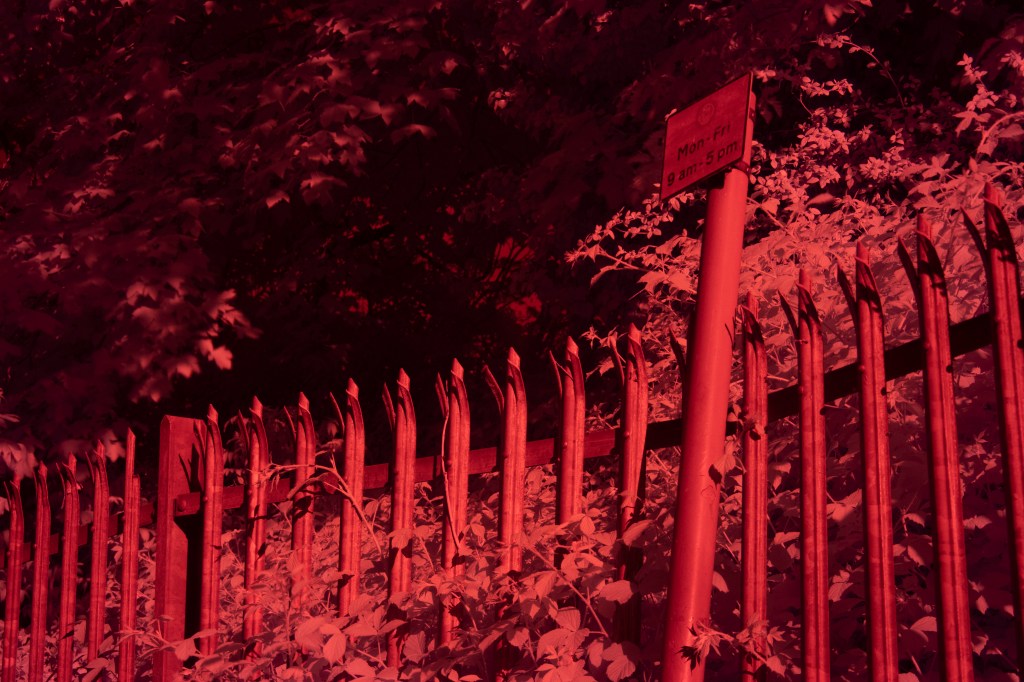
these photos were also taken on this day however i go more indepth about them on my Red filter post
