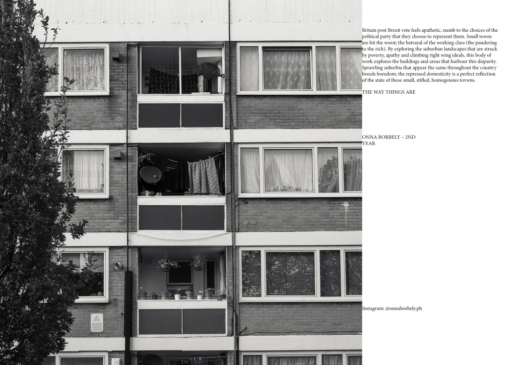
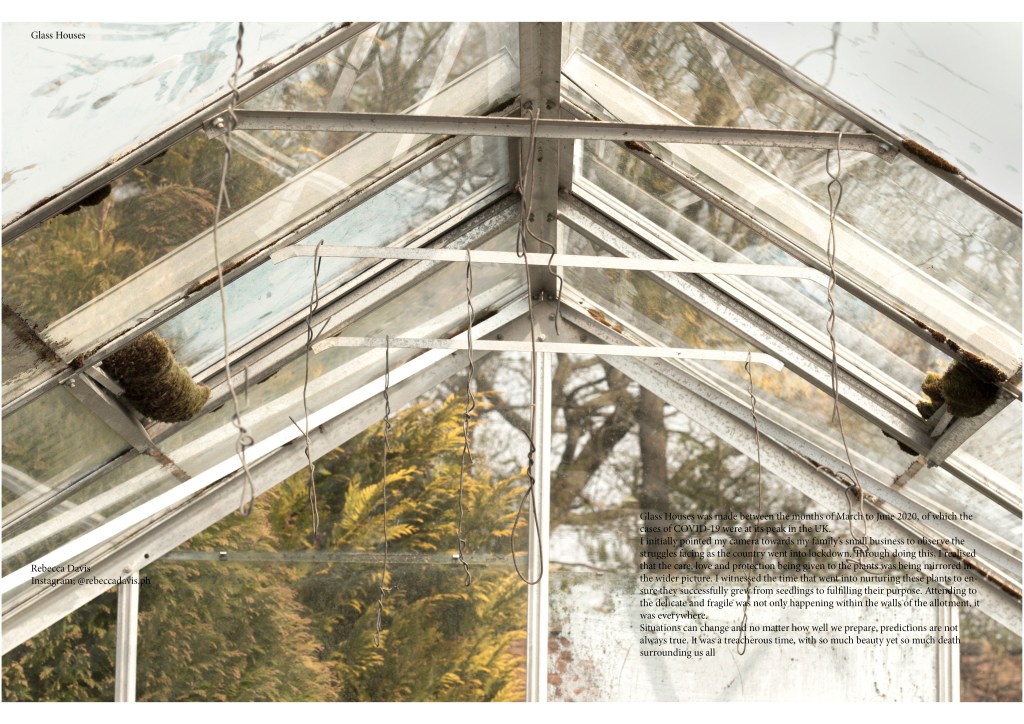
now with the admin section underway we can begin to create the actual magazine, im responsible for: the Front Cover, Myself, Annabel Murphy, Mara Cullara, Onna Borbely, Rebecca Davis, and Stephanie Mensing, along with advertising with other people
looking at front covers i asked my team if there was anyone they wanted to nominate for the front cover of the magazine, i thought about Zuzia R for her work from image and context
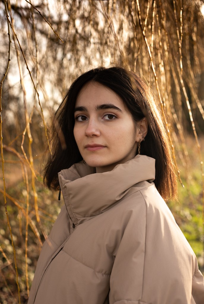
the first time i saw zuzia’s work i noted to her that this image would be great as a front cover for a fashion magazine as it offered a very empowered optimistic gaze while being quite simplistic in its aesthetics allowing for titles to be used, complimented by the beautiful tonal colors and its natural location
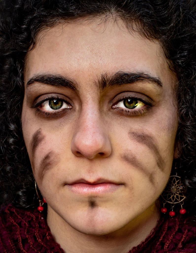
Phoebe suggested Elizabeth’s photo of protesters for their strong captivating green eyed stare, its color pallet is also quite pleasing as its dark red tones bottom corners accent the frame and hint to the lips and earrings, the dark hair helps compliment this, while act as a vignette. however its such a shame because after talking to Elizabeth about this she never get a social consent from her muse meaning she was unable to contact them about our consent form. without this it means we could be liable for ruining someones likeness, for this reason we can not use this image as it could come back to bite us, and as a small start up project we dont want a lawsuit
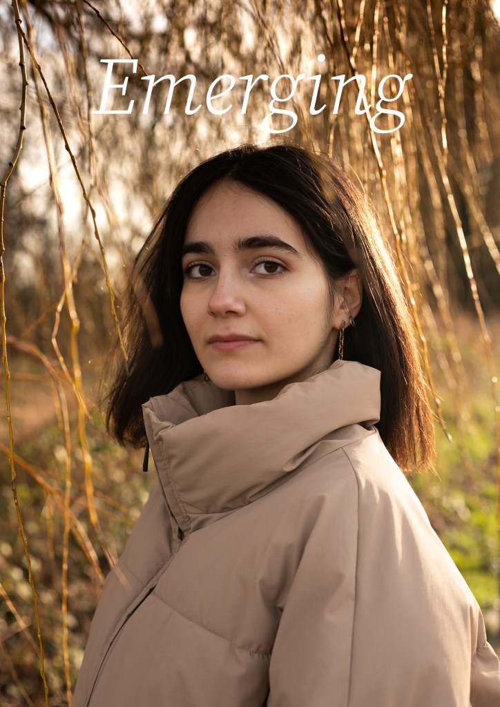
1 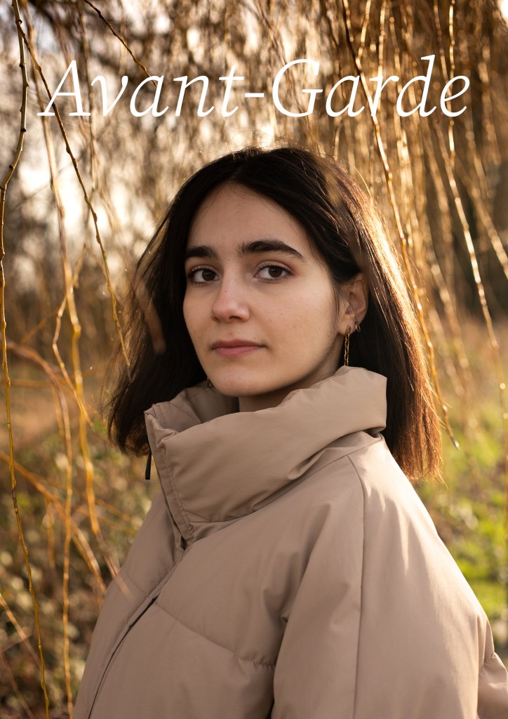
2 
3 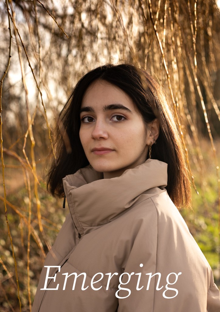
4 (final)
after exporting zuzia’s image from the google drive i loaded it in indesign for it vectorisation of pixels
testing out the name ‘Emerge’ to begin with i asked my team what they thought of the name to a good response but wanted to play around with the idea, i didnt like the amount of E’s and and how it fits with the font, reaching an agreement on ‘emerging’ since it slows better, and doesnt have an ebrupt ending but tails nicely
playing around with the name ‘avant garde‘ meaning a new and experimental idea of art which would describe what im trying to convey with my publication for upcoming artists, however it probably doesn’t indicate to the audience what i want with its french origin, it might seem like its trying to be something more, to this my team also didnt like this word
1 this image with the text above doesnt work to the level i wanted as the white doesn’t offer a strong contrast to the background as i would like, making this text near illegible
2 i noticed this too for avant garde, as i feel if i were to add more weight to the font with the slider it might stand out more since it just doesnt have that contrast to make it readable or pop out against the background
3 trying to separate out my text i went for a top and bottom text approach as there was a lot of blank space to work with, this allowed the garde section to stand out as the flat brown tone can provide more of a background for the text to rest upon
4(final) is our final cover combining what i’ve worked with i went for ‘Emerging’ as a title for its flowing accents as if written by hand, while also having the serif slab on captialised letters, but a standard serif on lower case letters. increasing the weight increased the legibility of this text and places in front of the ground jacket allowed this to pop more
i later confirmed with my team that they liked this image to which they all agreed, giving them the opportunity to compare each of the designs and vote on their favourites, after this i confirmed with Zuzia that she was happy with the design and manipulation of her image as and good artist should do when working with another’s work
in worked hard to get everyone’s work into a vague layout but with everything going on i will admit they got a little neglected before our deadline of june , images and text were fitted to grids but sizing needed proper care and without access to ideisgn after our trial my team and i were unable to make further headway on our layouts. this is something i will have to continue in September when we get back to uni
each double page spread given to artist would have had room for a small piece of text ranging from 50-200 words to summarise their work and practice to the reader, this was something the artists would write and submit to the folder, taking the work load off my team and to which we would fit to the images on a page, along side their social media as this is meant to promote them as an artist, allowing readers to get an glimpse into the artist thus teasing them into checking out their accounts.
the image above places the pages into thirds letting the image take up 2/3rds displaying the work where the text is placed adjacent as not to be over whelmed with text
another layout idea way to have a full page image and have text resting on top of the image, this text would take up a small amount of the image as not to distract the viewer or impede their experience, it should be noted that the legiblility of this page isnt the best and also needs a touch up as the contrast between the text and image is low, maybe moving it into the white out reflection would work better ?
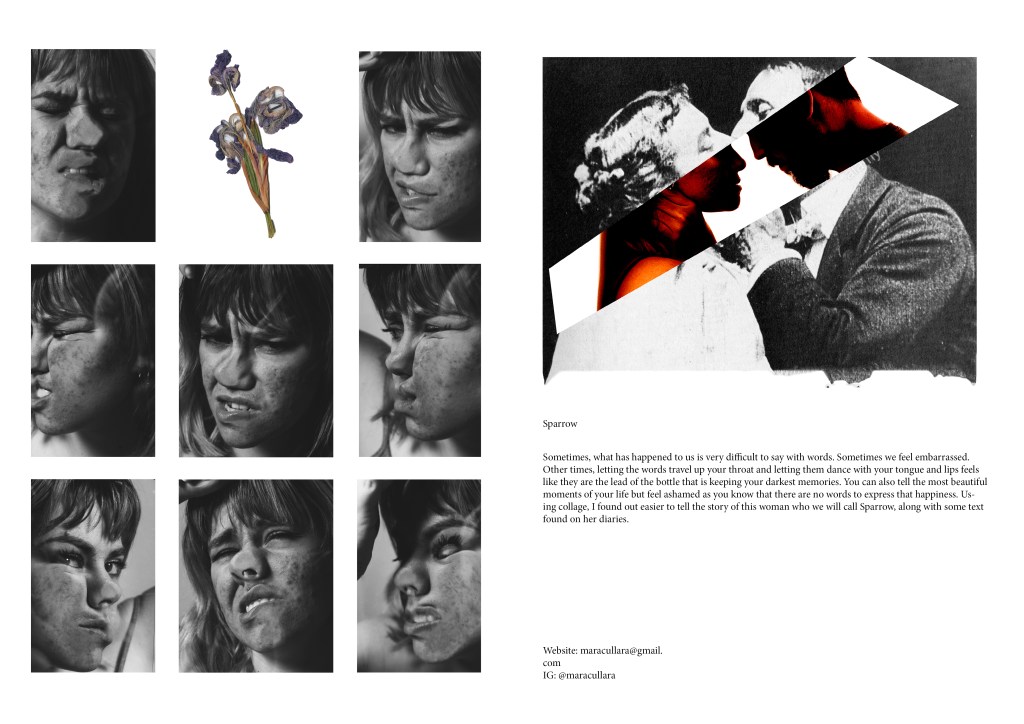
a page featuring work from Mara Cullara was interesting to work with, they provided three different images to the folder, one of which was fairly explicit showing vague nudity, these others worked better and didnt cross this line,
this will be continued in September to give my artists work justice, id hate for this to be the end result as it doesn’t paint their work in a positive light, more of a slap dash fumble
