book compiling

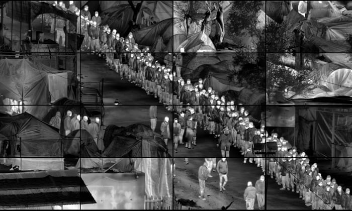
i have made separate drive files for you to look through showing the various editing stakes of my book, this isnt the most secure way of presenting my work but with limited storage on my site without buying more i am limited in my choices

> Edit 1 <

WiP titles

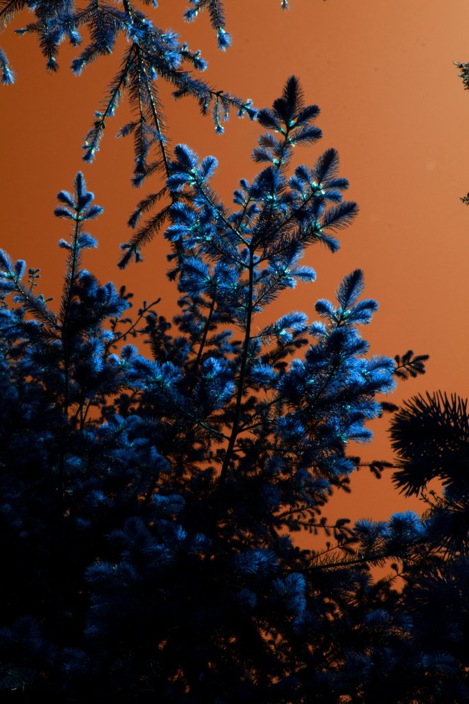
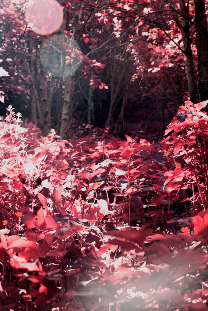
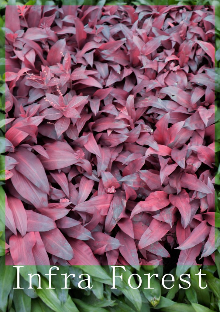
infra forest – building on richards mosse’s title ‘infra’ this takes it to the forest, but leads to a very machinal view of the world focusing on the process rather than the mystery

they’re watching – linking to the eyes and the hashtags used in my posts, i think it work and conveys ominious vibes

watching from beyond – again with ominious vibes, but it doesnt have this noun so it makes us question who is doing the watching

Prosperity in unity – recently i had my post feautred in an acount’s IG page, these used these worlds to distribe my work and i feel its kind of fitting, but think i would want something more original and authentic to myself

Lurking leafs – use of alteration, it provides this ominious vibe while prepping the viewer to be on the look out

walking in pink – seems quite soft and kind of juxtaposes the contents of my book

forest spirits – linking to the studio ghibili movies of my childhood with these spirit ideas incorporating the forest as well

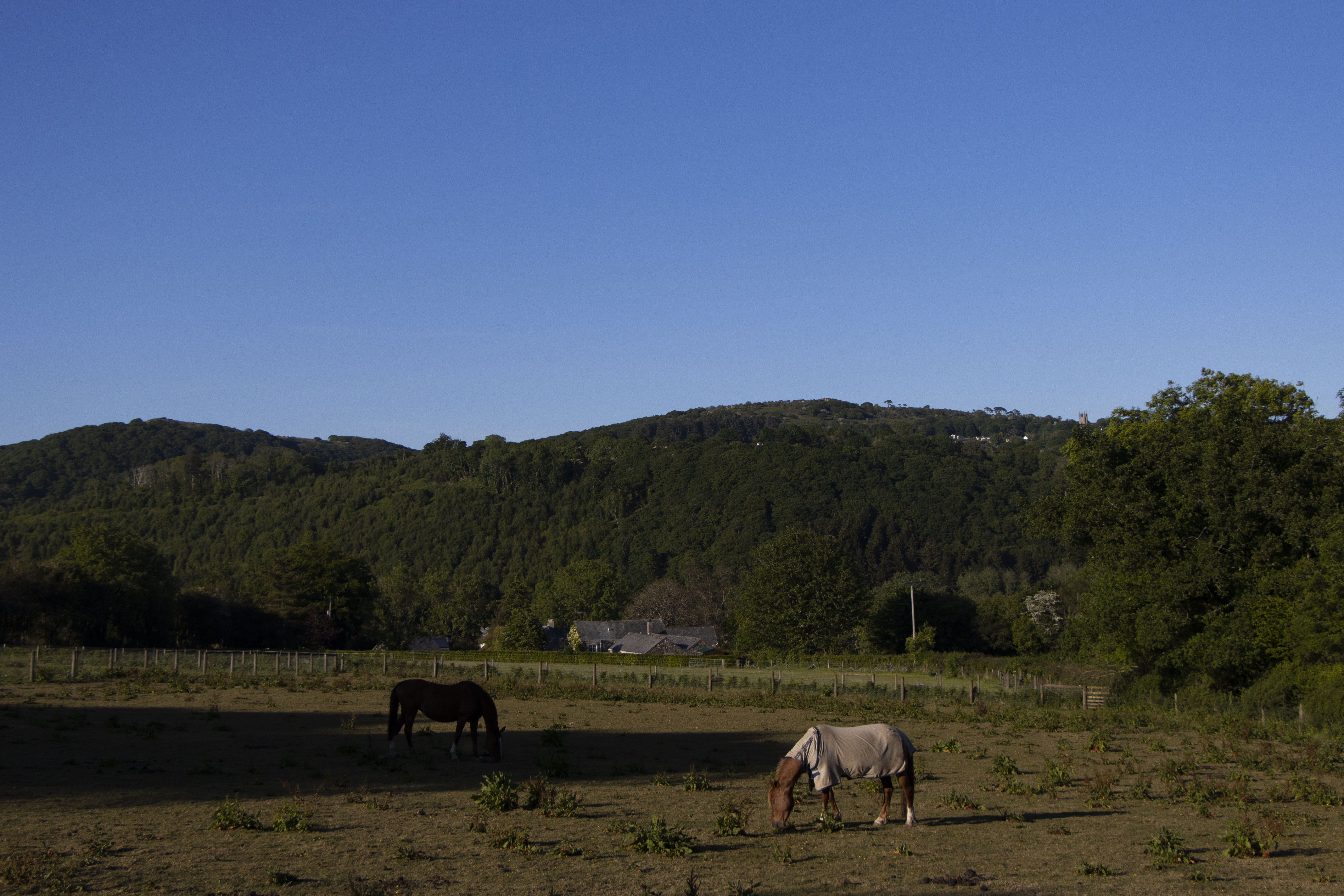
25 miles – this is to signify the distance i walked during 20.05 shoot, but i dont think think it works well

knot what you think – a play on words, i kinda like it but seems gimmicy detracting from the subject matter inside

in forest we trust – linking to the idea of a higher power, but has US connotations which isnt something i have any relations too within my work so this one is vetoed

forest trip – linking to ram dass’s phyco active substances and giving us this jurney to adventure into

judgemental eyes, i feel there arent enough eyes within my book to use this phasing

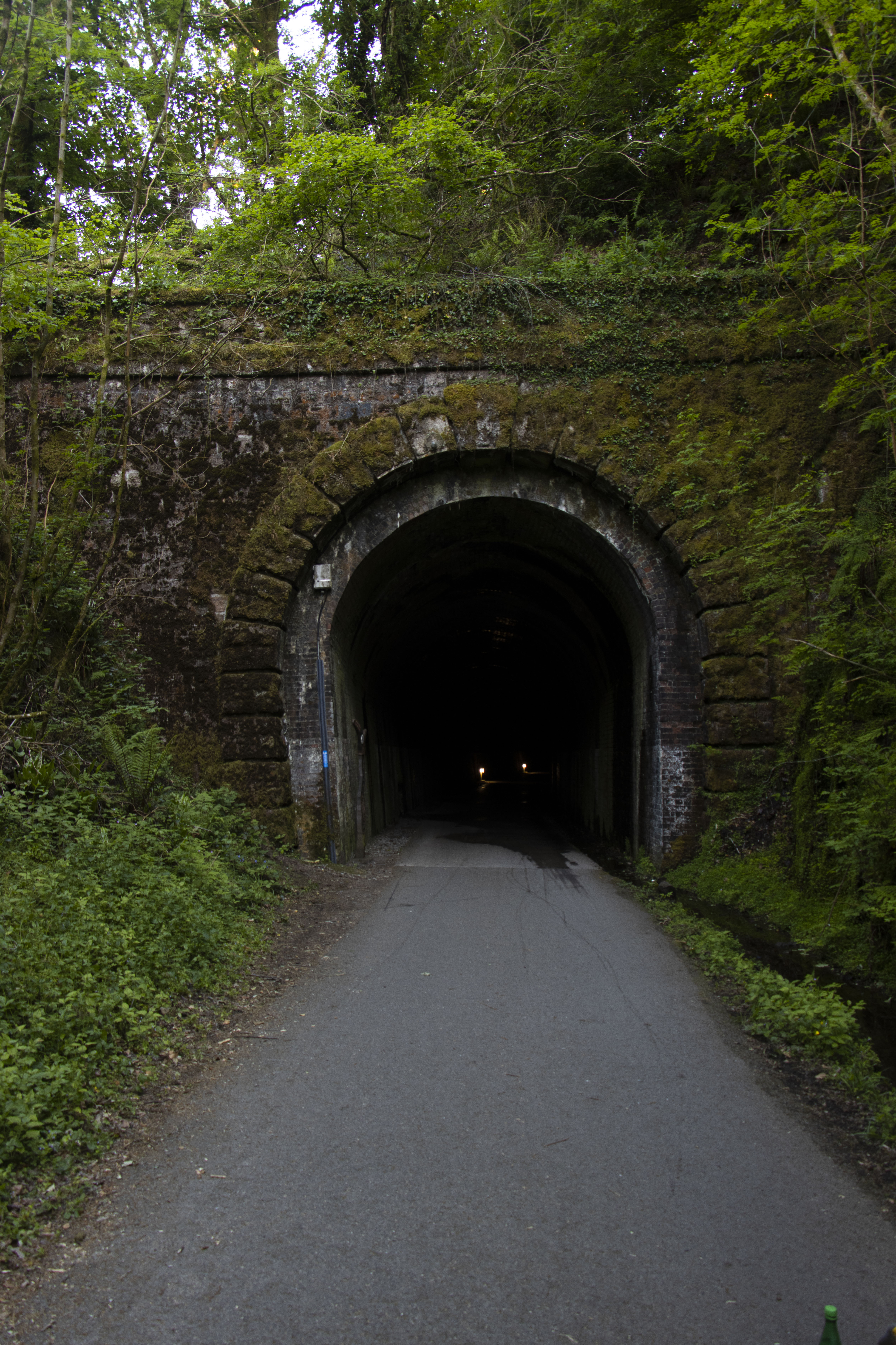
beyond the tunnel – this remind me of a cartoon show called ‘over the garden wall’ where things arent as they seem, and its just out of reach

a trip through nature – this signifies walking through nature as if it were an adventure, also hinting to ram dass, however it only refers to a single trip, where i have combined multipul rips into the narrative of my story

tripping through nature – similar to before but drop that A i feel it works better but with an uneven amount of words it could be hard to organise properly with a correct higher ache

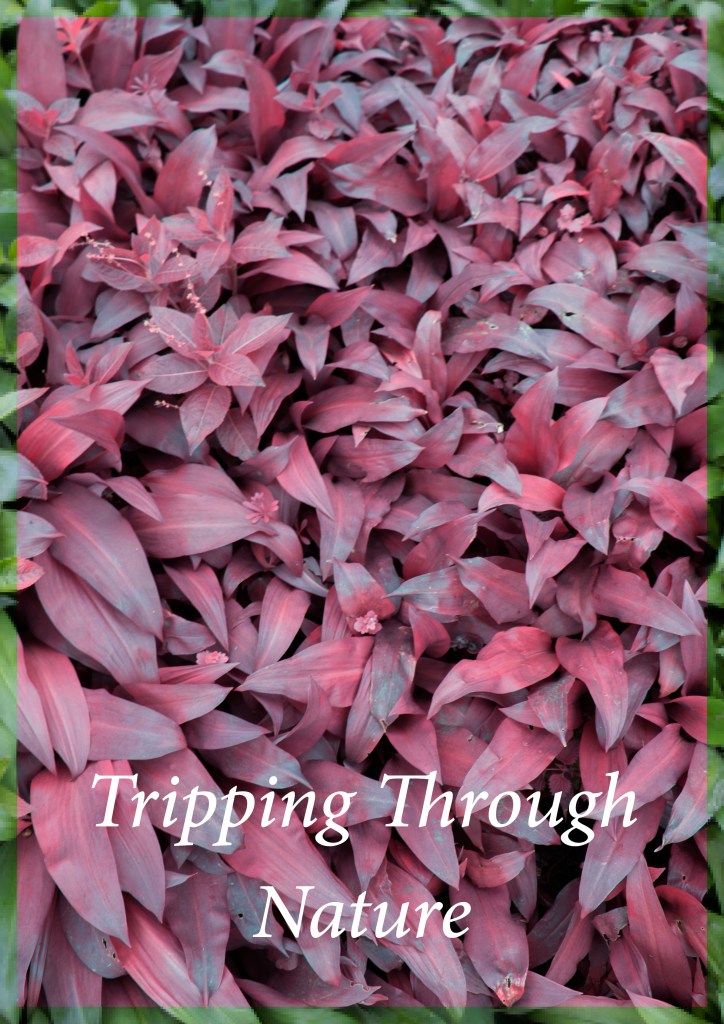
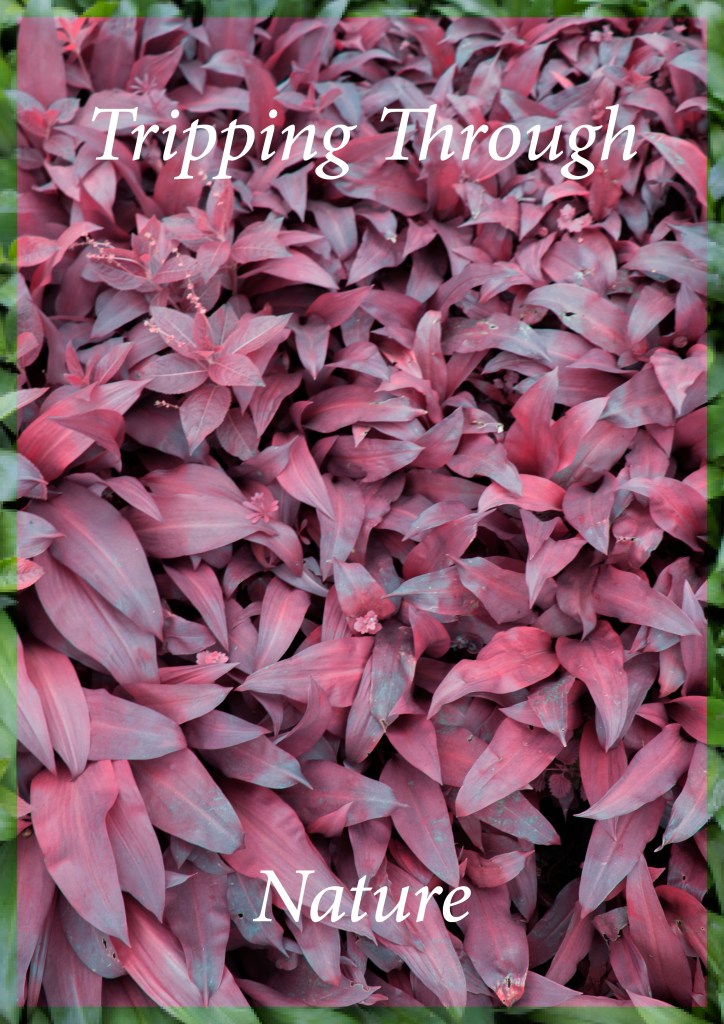
infra forest holds a light weight typeface appearing quite fragile it and ridged with its abrupt slab serifs

using Adobe Arabic font i was able to get something close to my own hand writing, with is calligraphy style and serifs, this also looks like the type of font that would suit a childs book as it has a clear weight to it and flows better and rests nicely on the page, i could add a drop shadow to the text but i feel that ruin it.

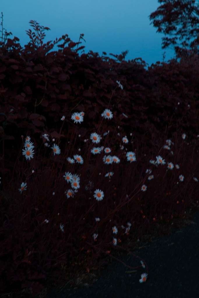
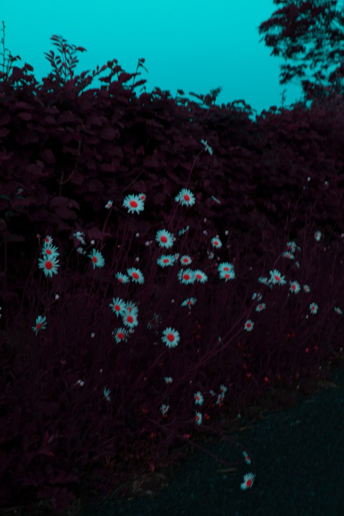
i started by placing it where my old text was but felt there was a lot of negative head space above my text, to adjacent this i looked at the higher ache of my text and positioned my alliteration at the top while our eye filters down the page to read ‘nature’ taking our eye on a journey across the cover an in essence through the nature. there is also an eye dead centre in the page as two leafs cross horizontally and a third points it’s tip between them making a pupil foreshadowing whats to come

front cover

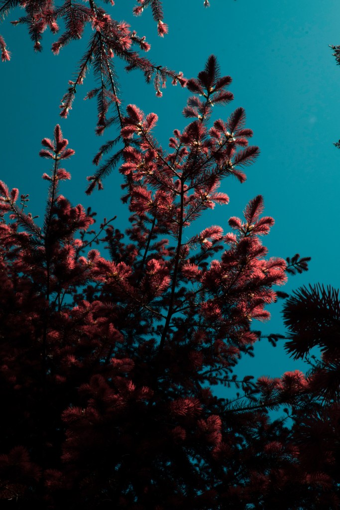
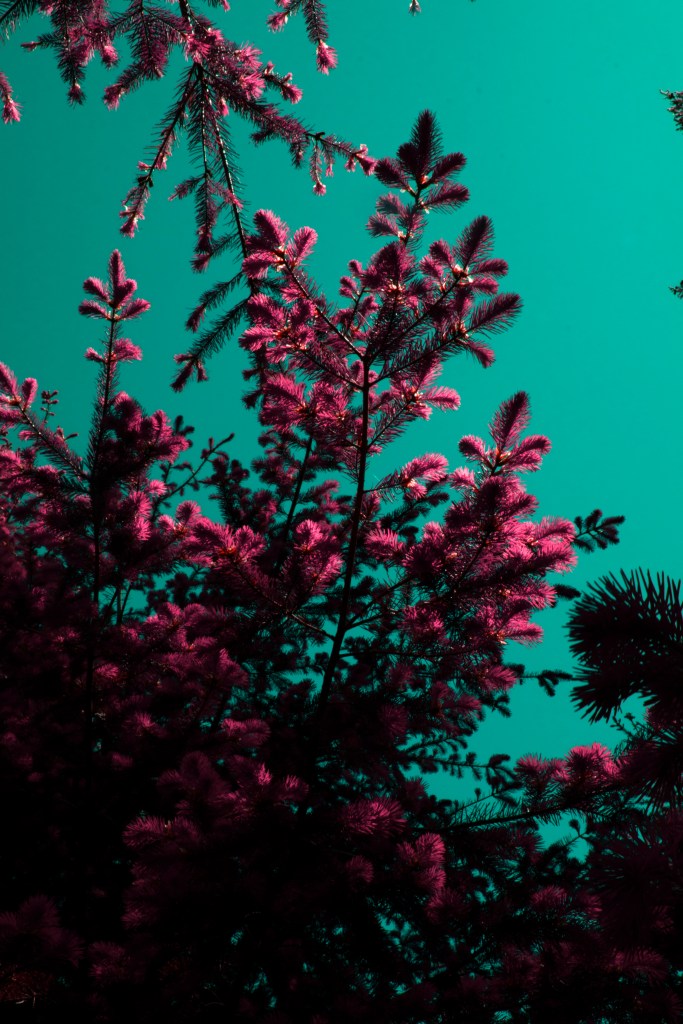
finally i made a smaller edit and chose to adjust the framing of the filter over layer bringing it in just slight so it the green wouldnt get lost

to edit these photos together i used indesign as i could layer two jpegs on top of each other and crop the top layer so they would blend nicely, i really like this effect it used.

> Edit 2 <

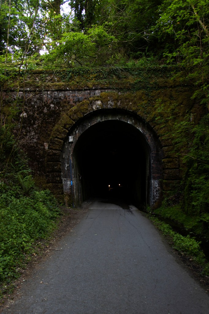
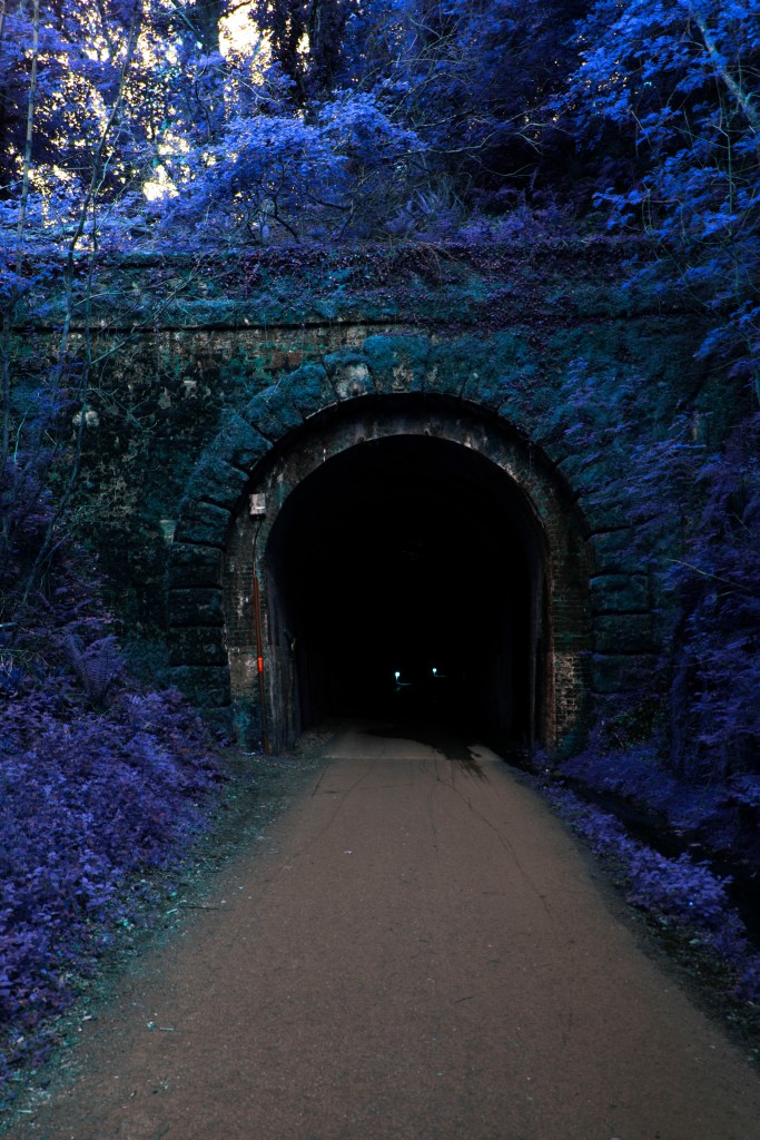
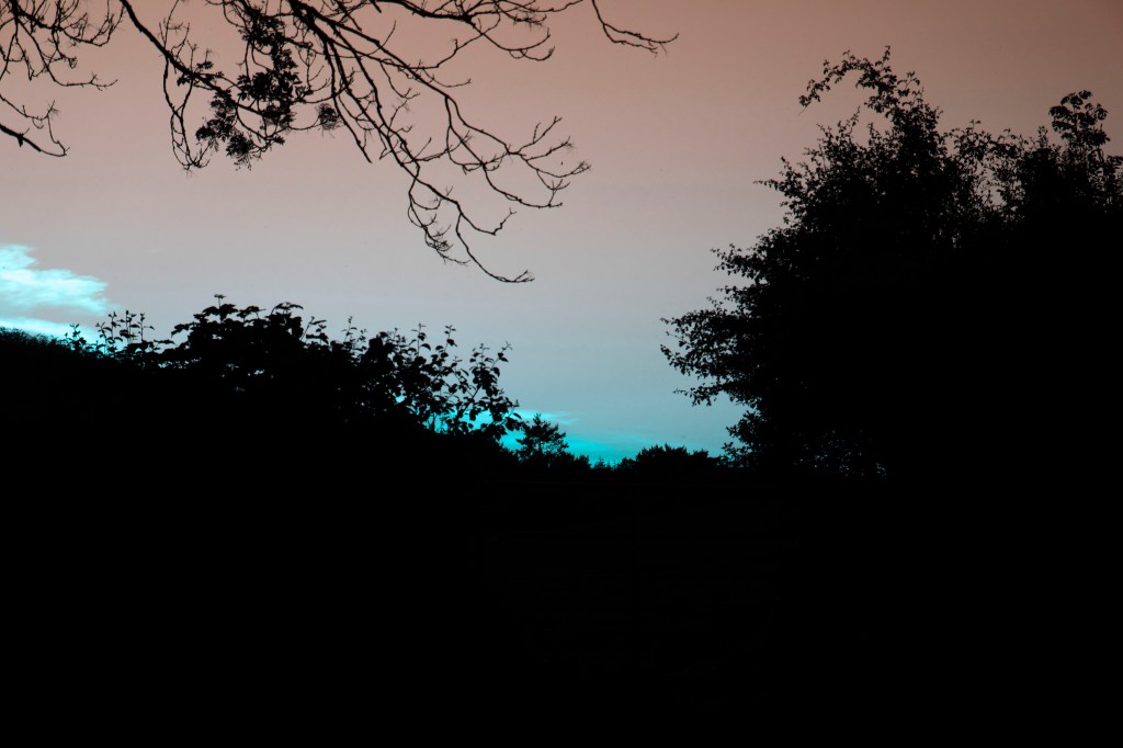
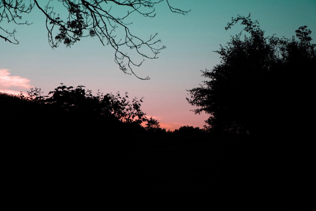
i begin my narrative with my ghibli tunnel as we delve into this world, as we turn the pages we come across the lights with black pages – his will be super awkward to print as a lot of my pages are white, but i love the idea, so many they’ll need to be separate printing runs and then bound toward. three pages of tunnel coney the length of it as i reference an idea by Jem Southam’s book ‘The Moth’ in which he uses a sequince of boats in the begin of his book to convey a similar message of time passing and the distance travelled

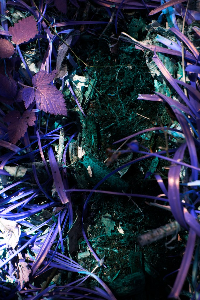
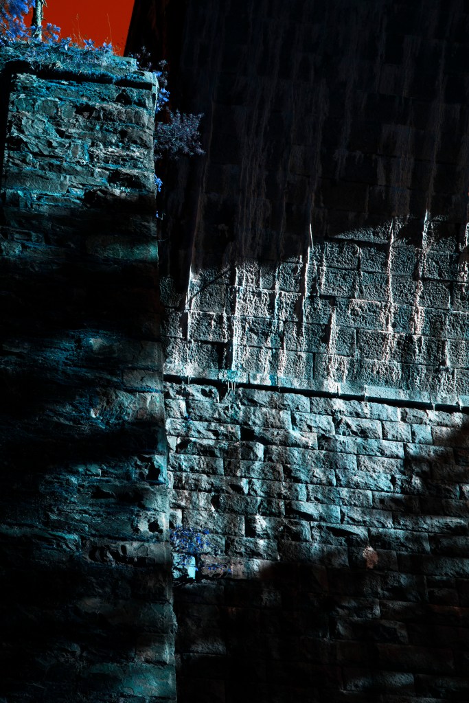
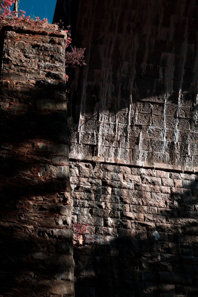
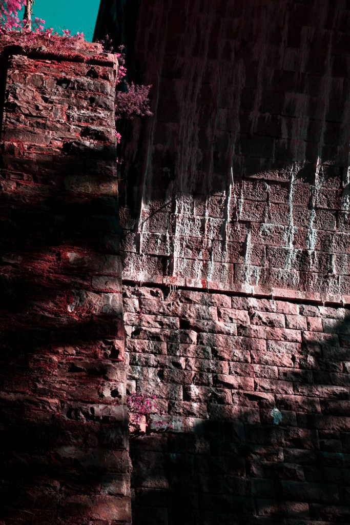
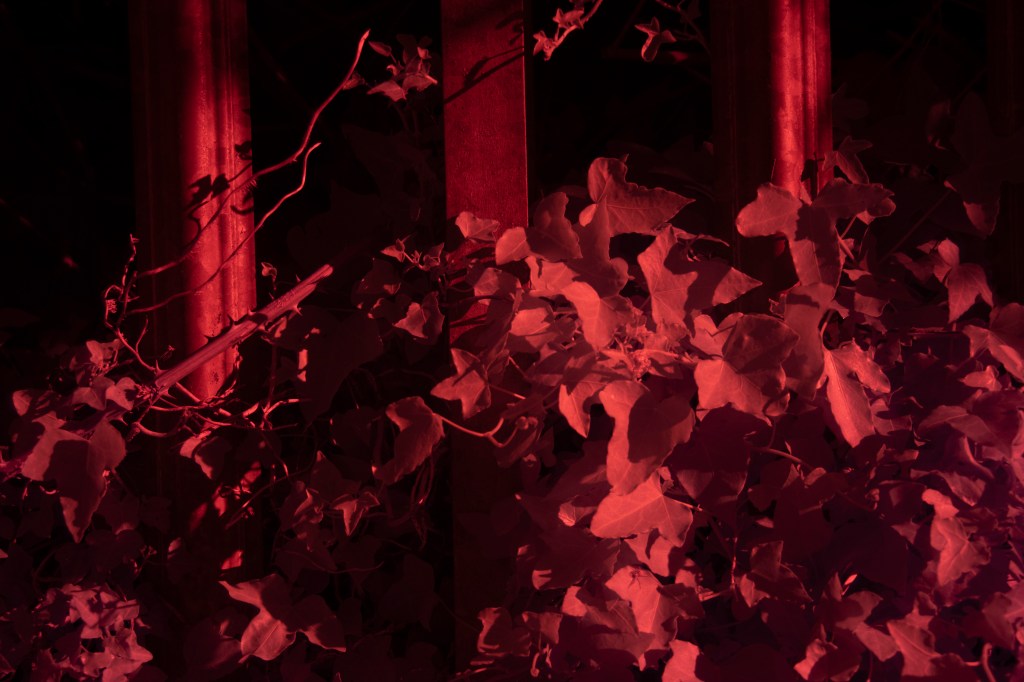
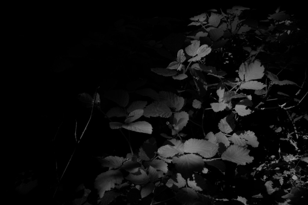
in these photos i also switch from my gray scale IR to my color IR. i used the B&W IR to convey an idea of limo as this is a state of inbetween before we reach our mystical world, like Richard moss did in his series’ incoming’ , i’ve also hand edited a series of photos to make them suit their scenario, like this one below where i’ve used a black briush tool in PS to feather the edges allowing for this to fit nicely without any glaring edges

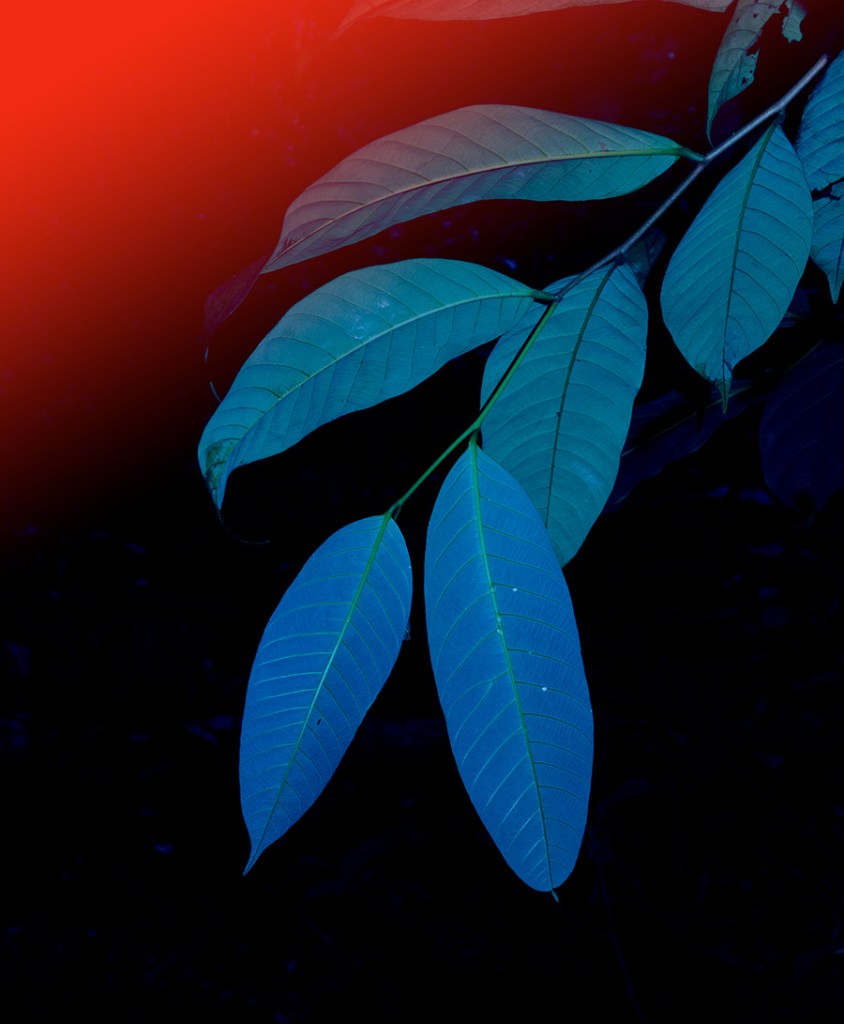
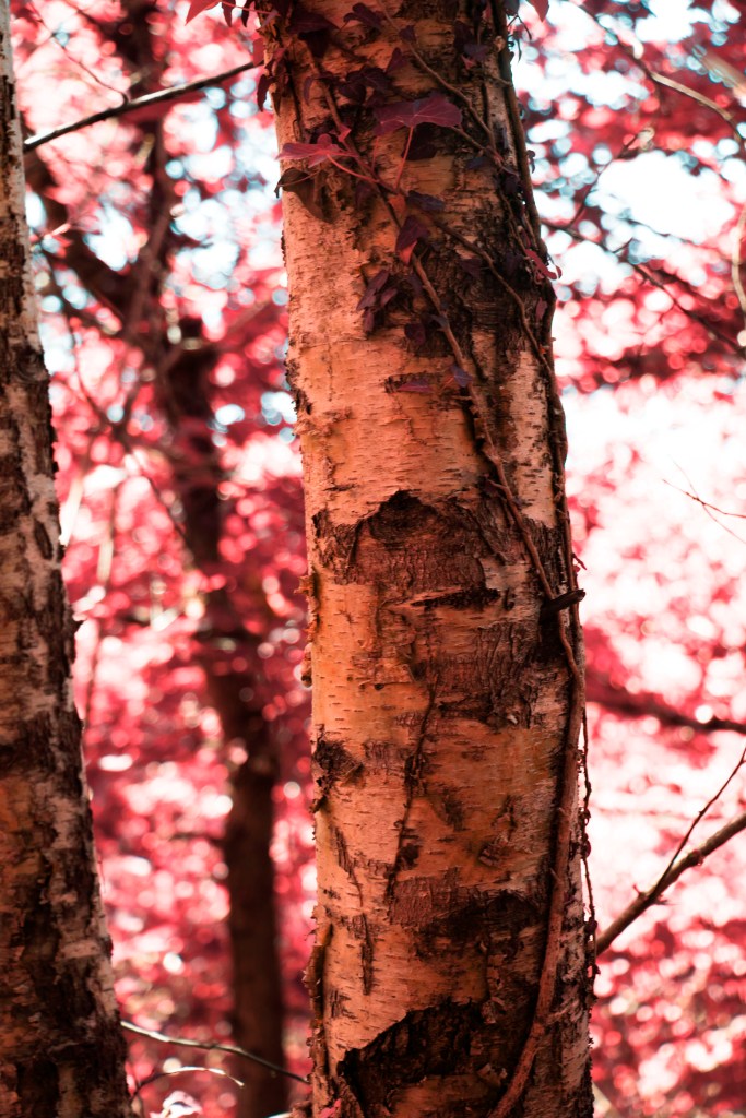
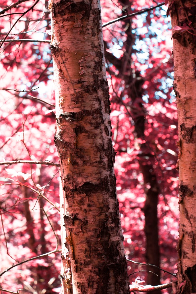
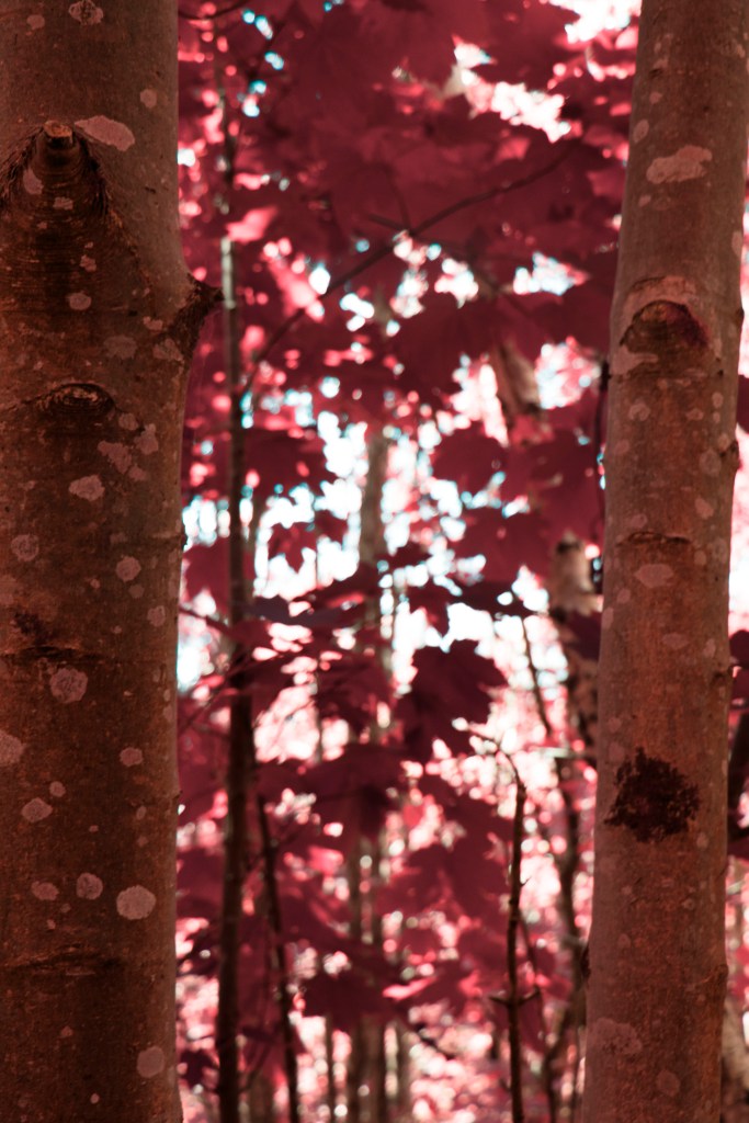
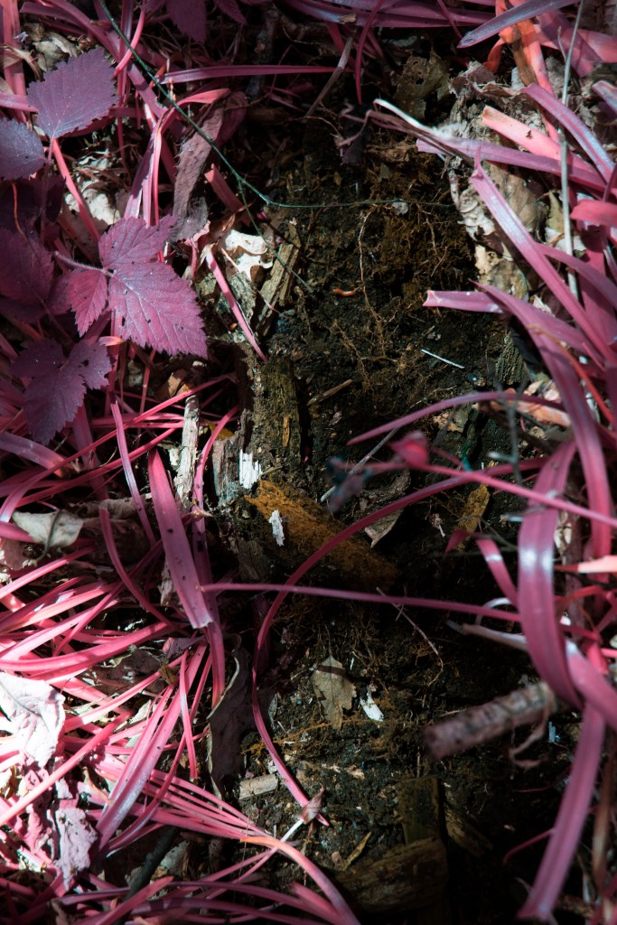
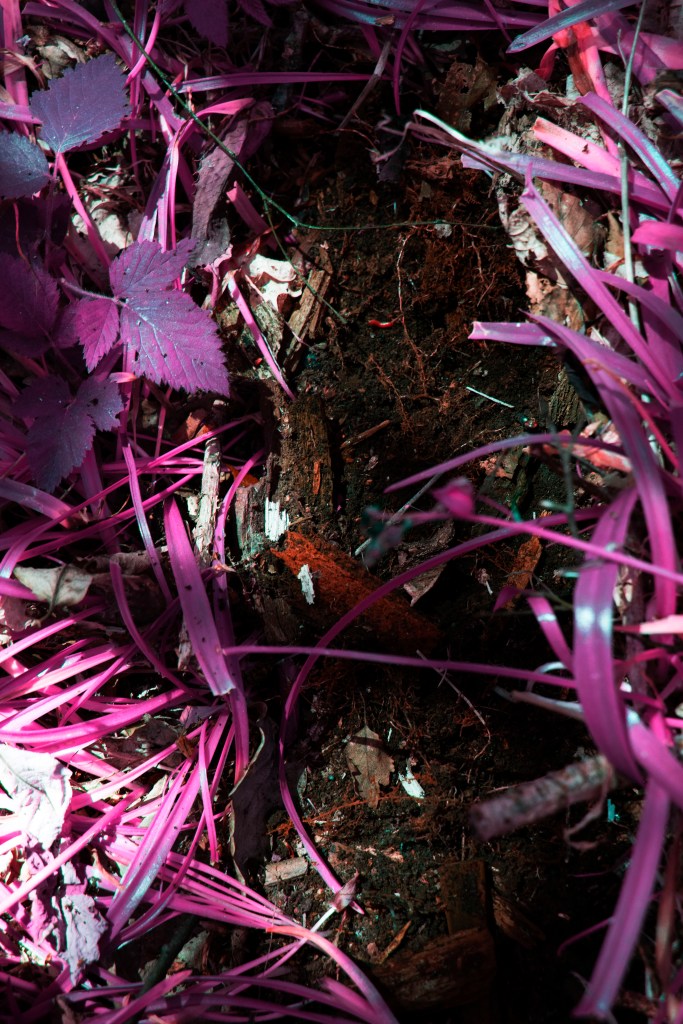
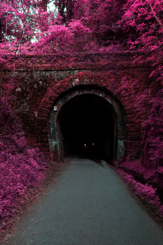
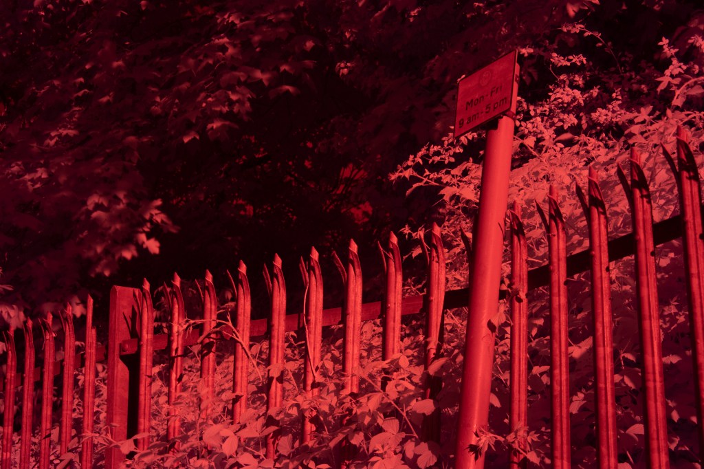
we then come to the red filter wall, the only red filter image not to be edited as we step into the world of color

we then walk along this path further as it starts to transistion from this well worn pavent to this cluttered trail. both of these photos i’ve placed to the right of the page as a sense of progression moving forward

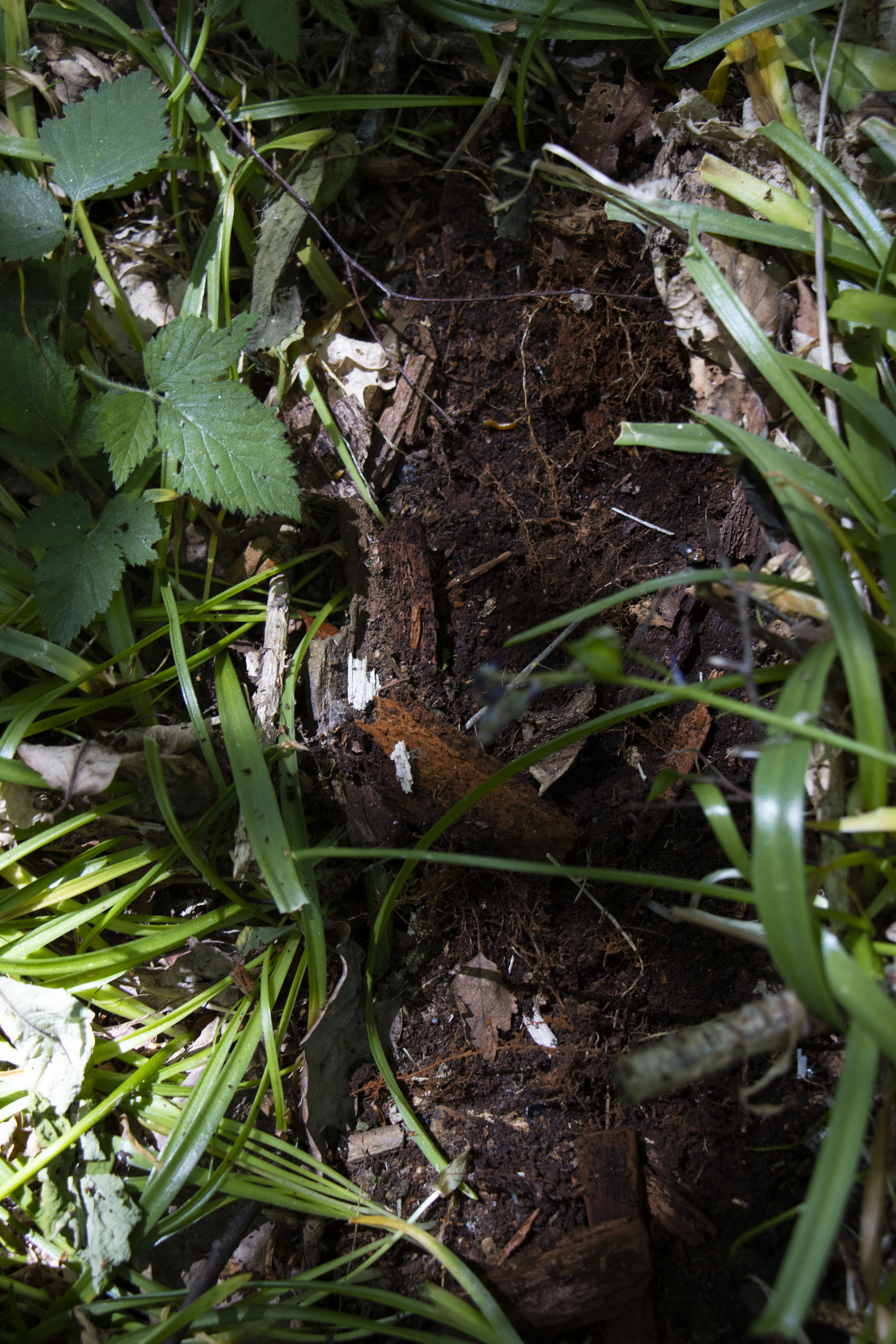
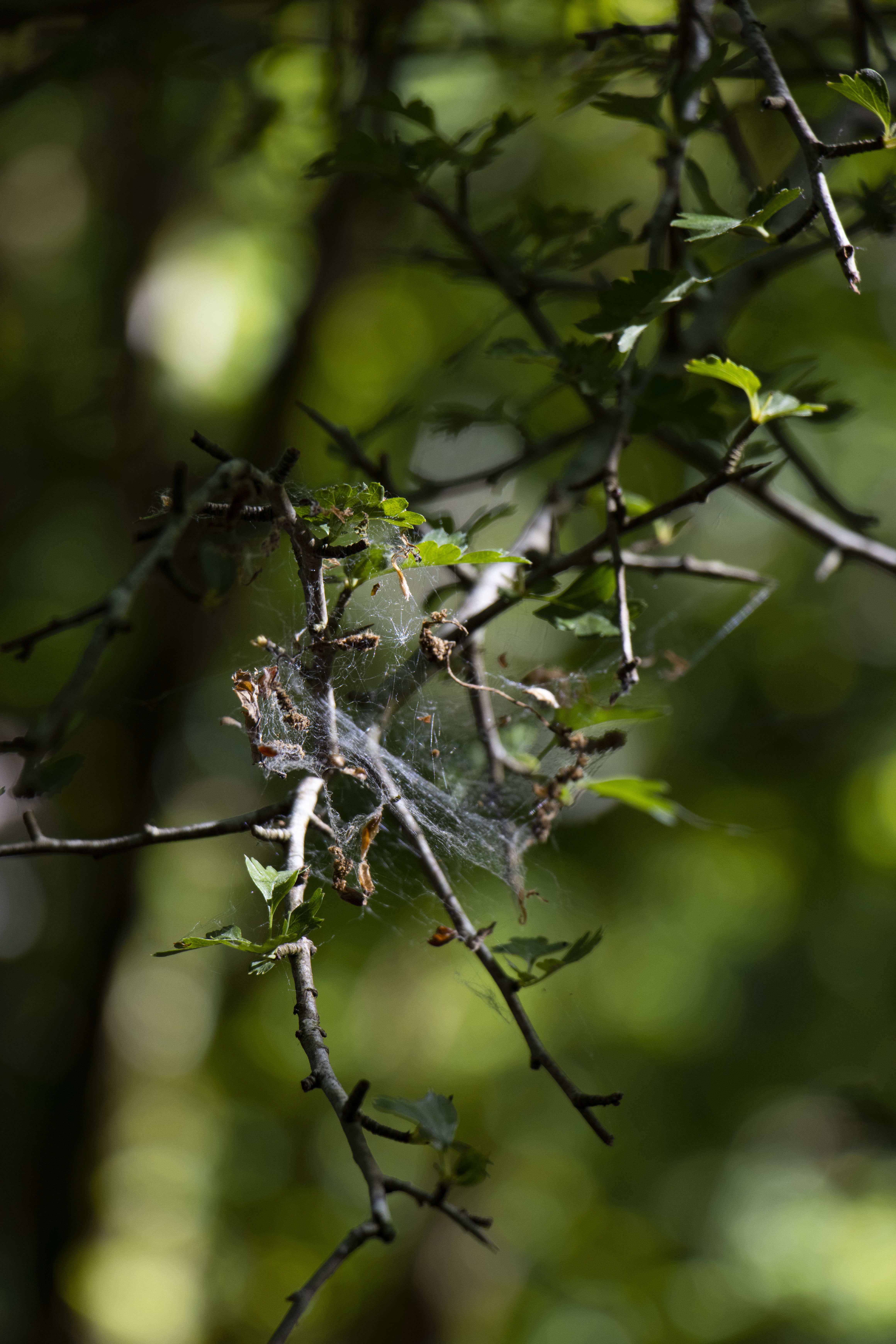
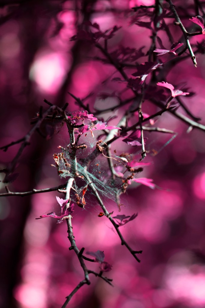
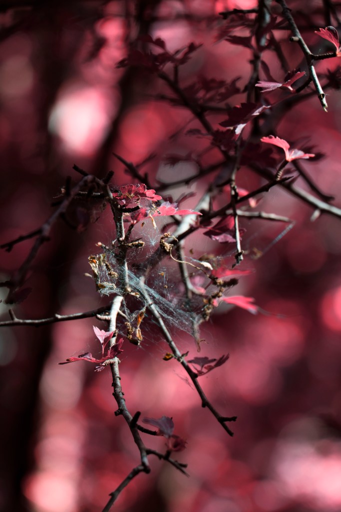
i then show this feature to show this world is alive but it resides on the left a a precursor to a foreshadowed a piece later on

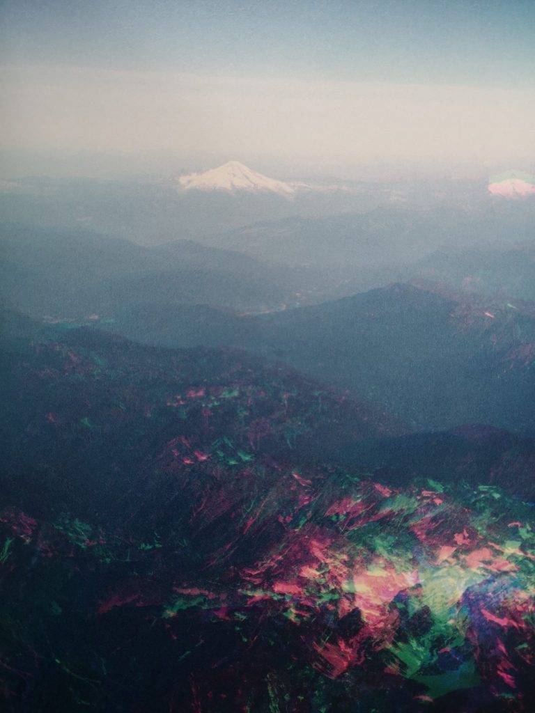
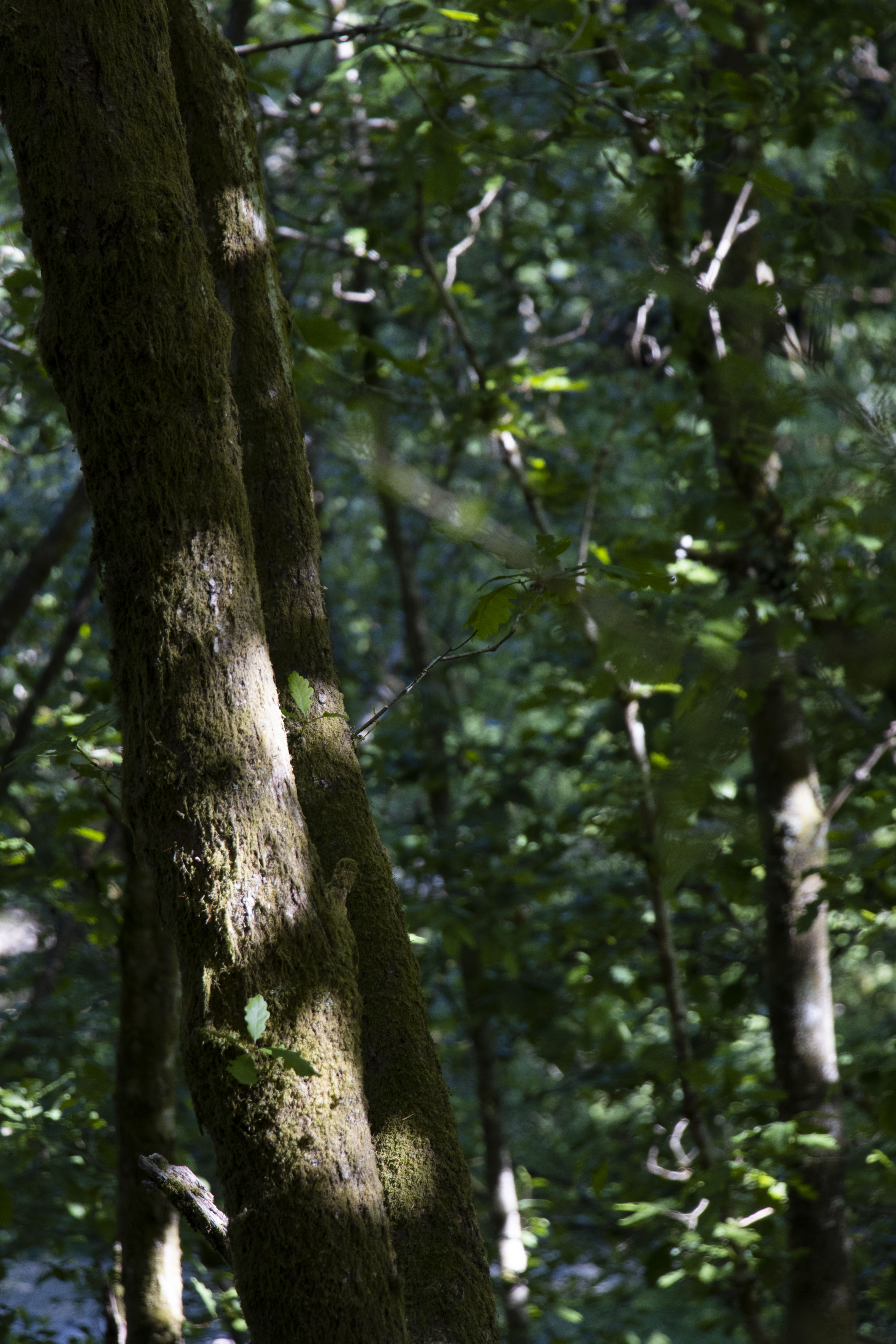
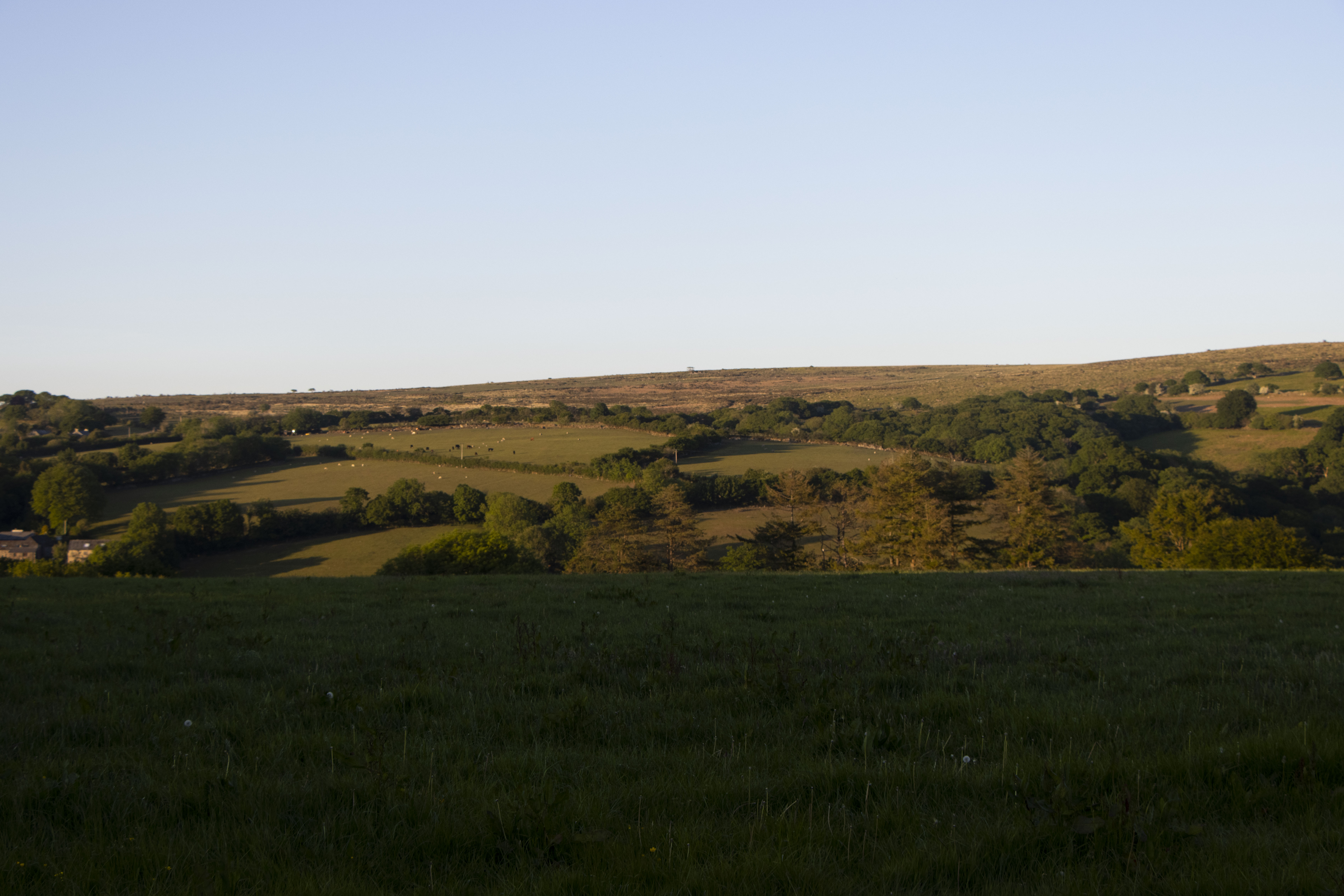
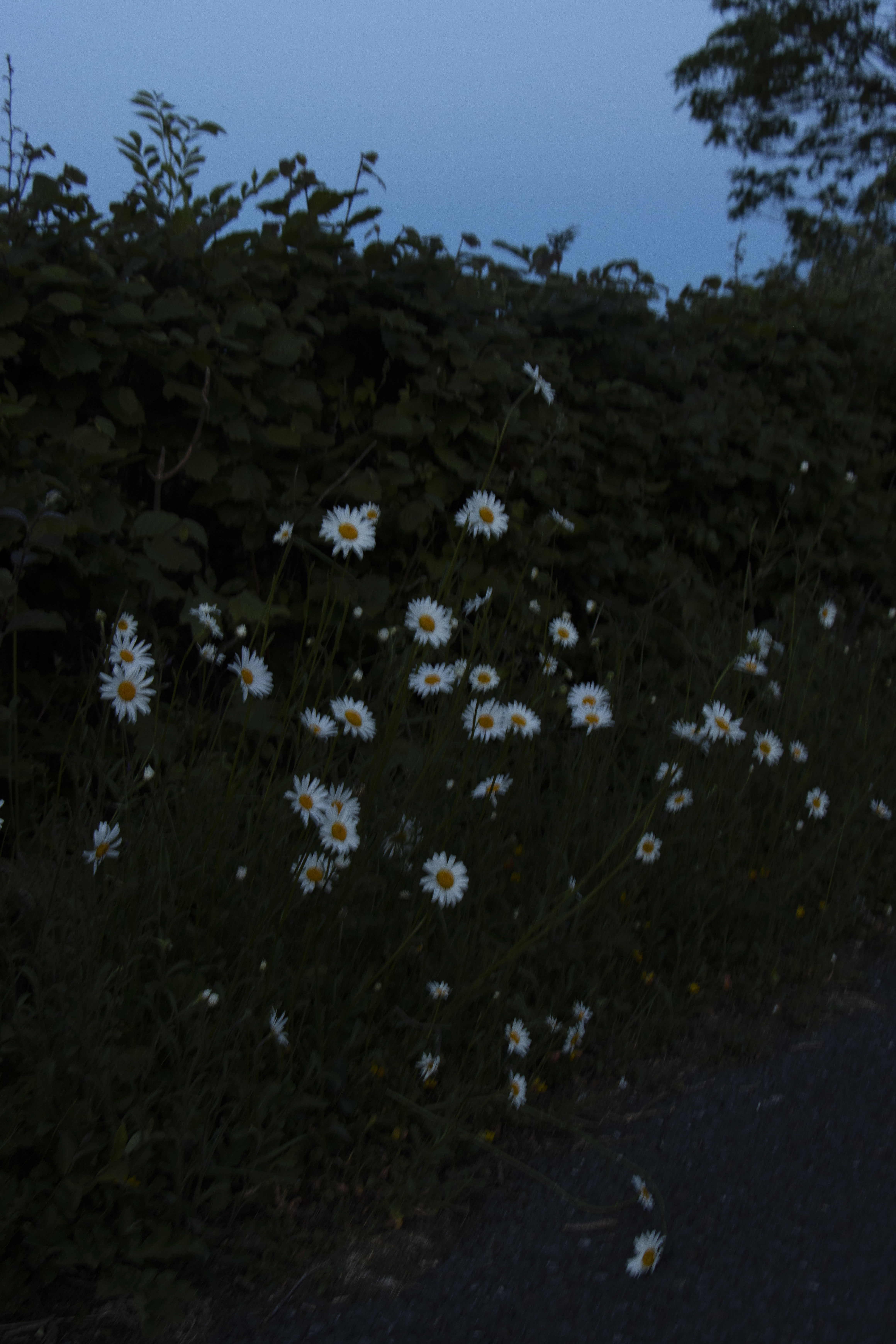
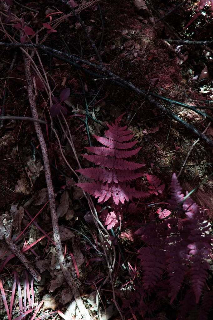
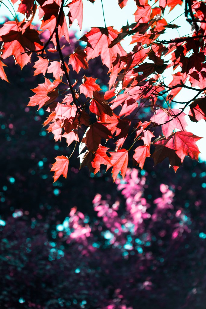
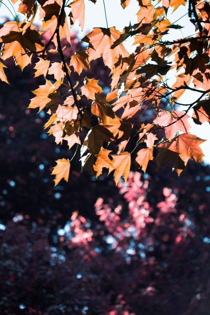
distracted by this feather to skip to the a double page spread of a winter floor taken in December, they present soft and subtle colors as a posed to the darker purple previous, and turna page for a second one, this one shows an eye level image, u there are these markings on the trees that guide us through this now leaf travel, the old pavement has gone and now we are off the path, were not even on the beaten path.

at the end of this small trait we come to a Buddha tapestry in a small spiritual place connoting ideas of spiritualism, religion and mediation, on the right this is a sign of progression,

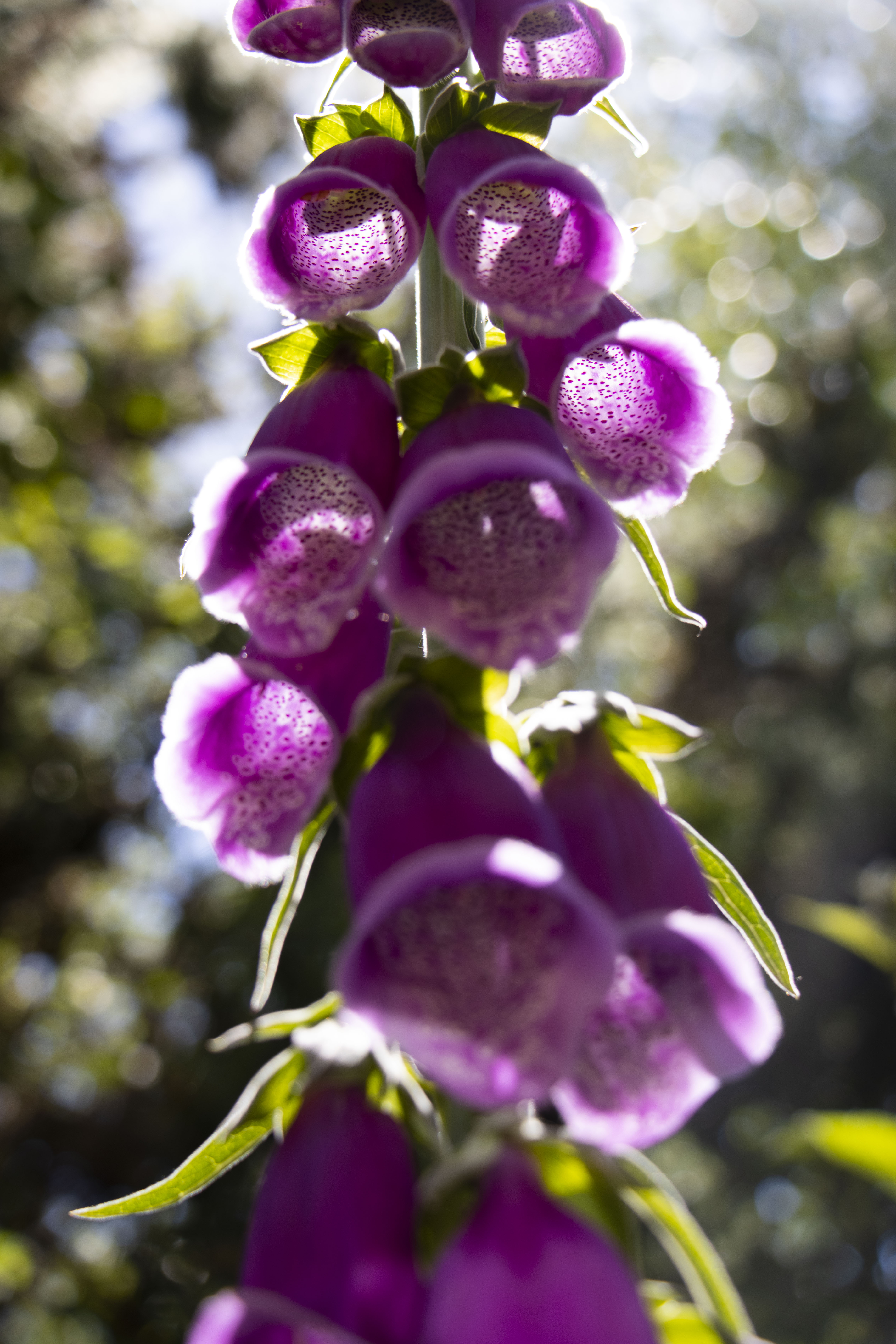
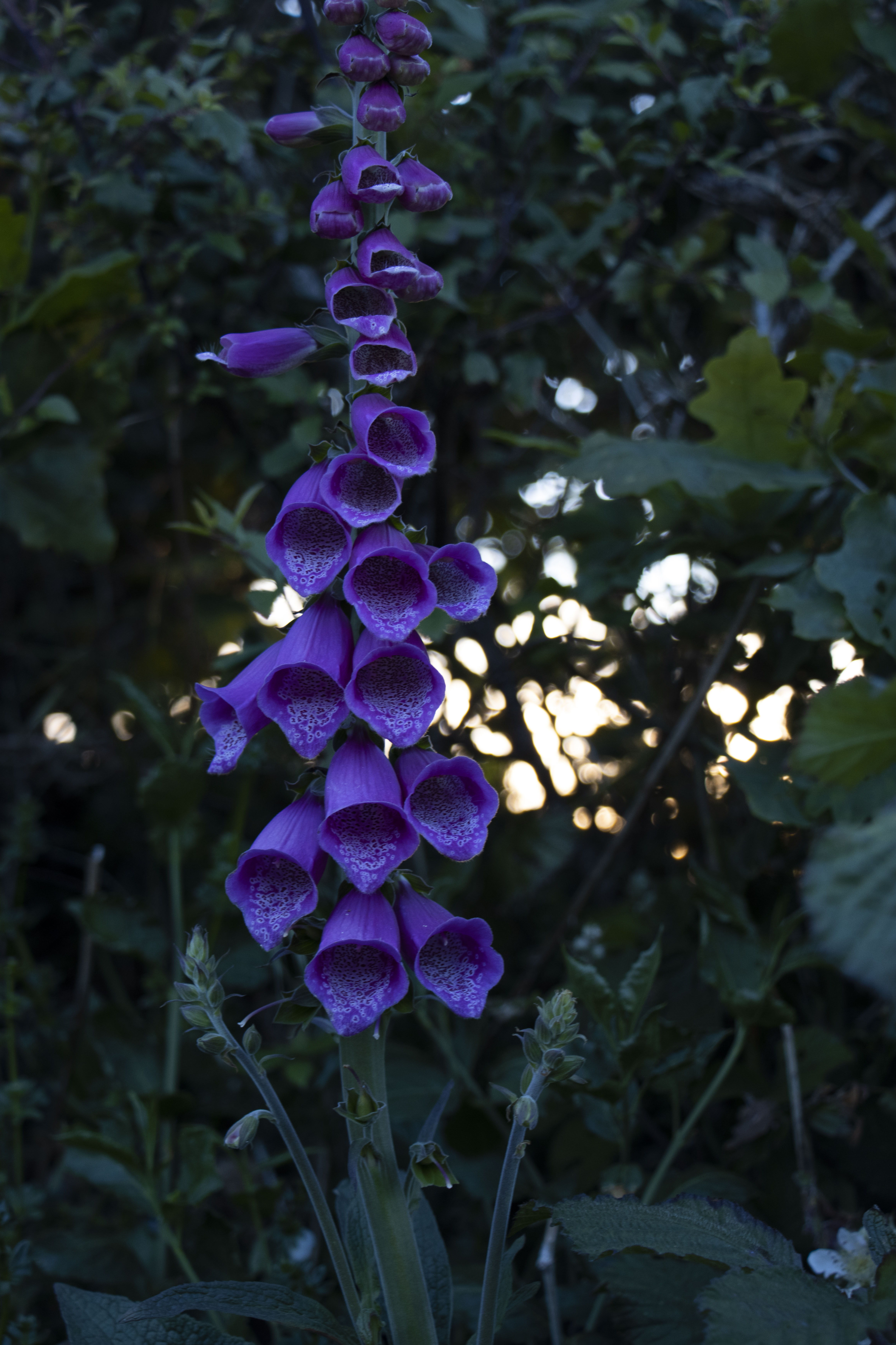
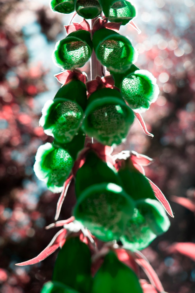
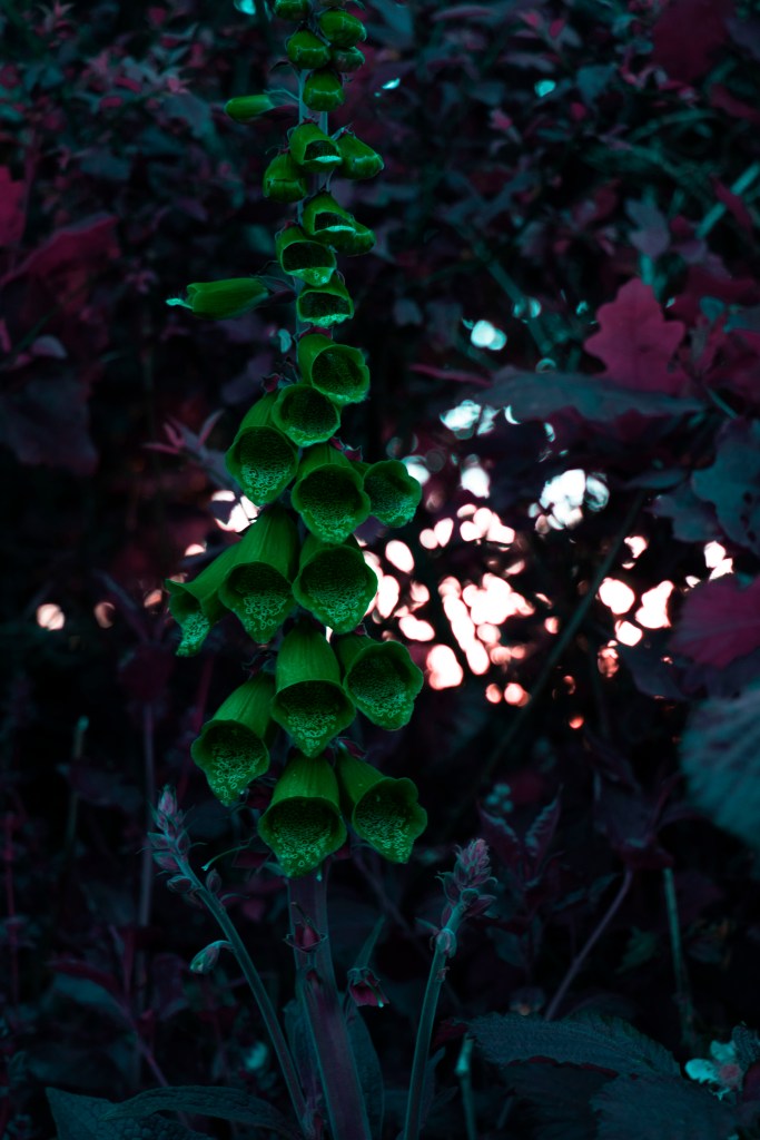
we turn the page and see this hallucinogenic foxglove, that is on the left, connoting a bad relationship as this is also poisonous and also reflects my bad habits while denoting idea of worship as we look up into the bells and sunrays – read my IG post @alex_lc_art for more insight

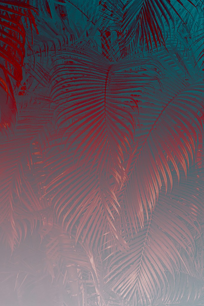
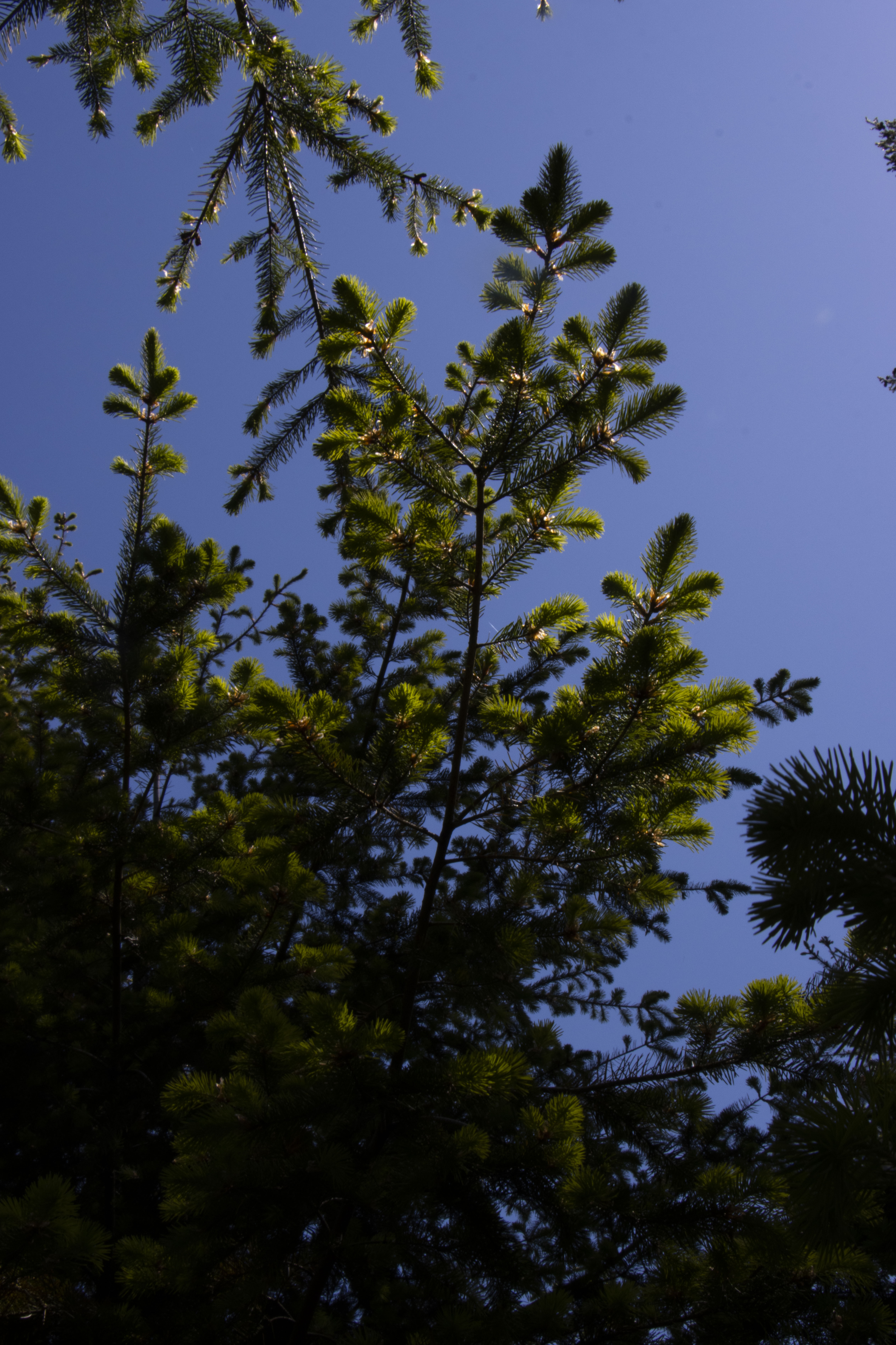
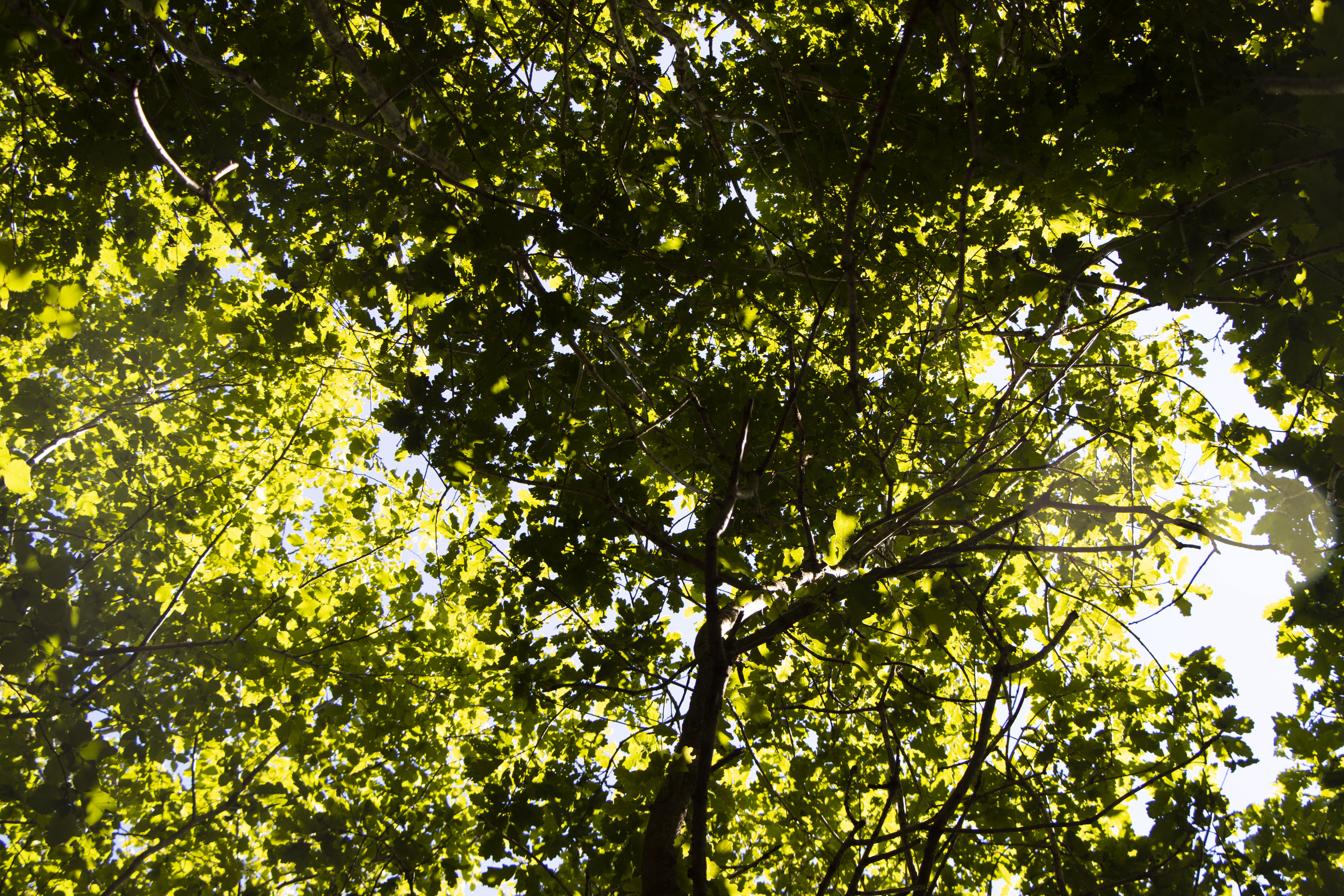
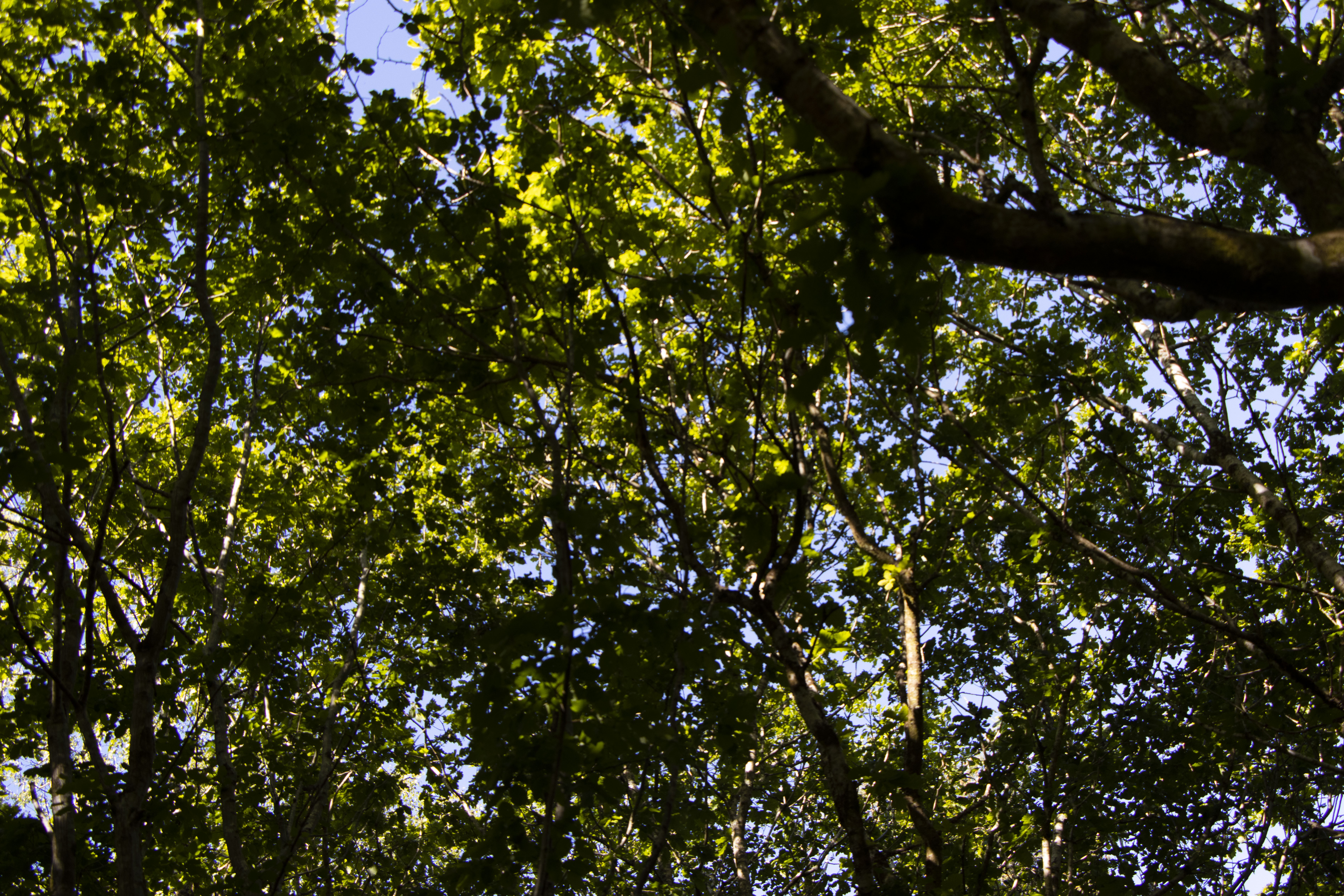
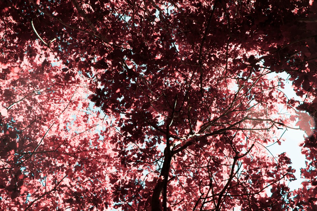
we then look up further from these bells into the sky to see this spiral canape (though i think my editing is slightly cut part of the image detracting from this idea a little)

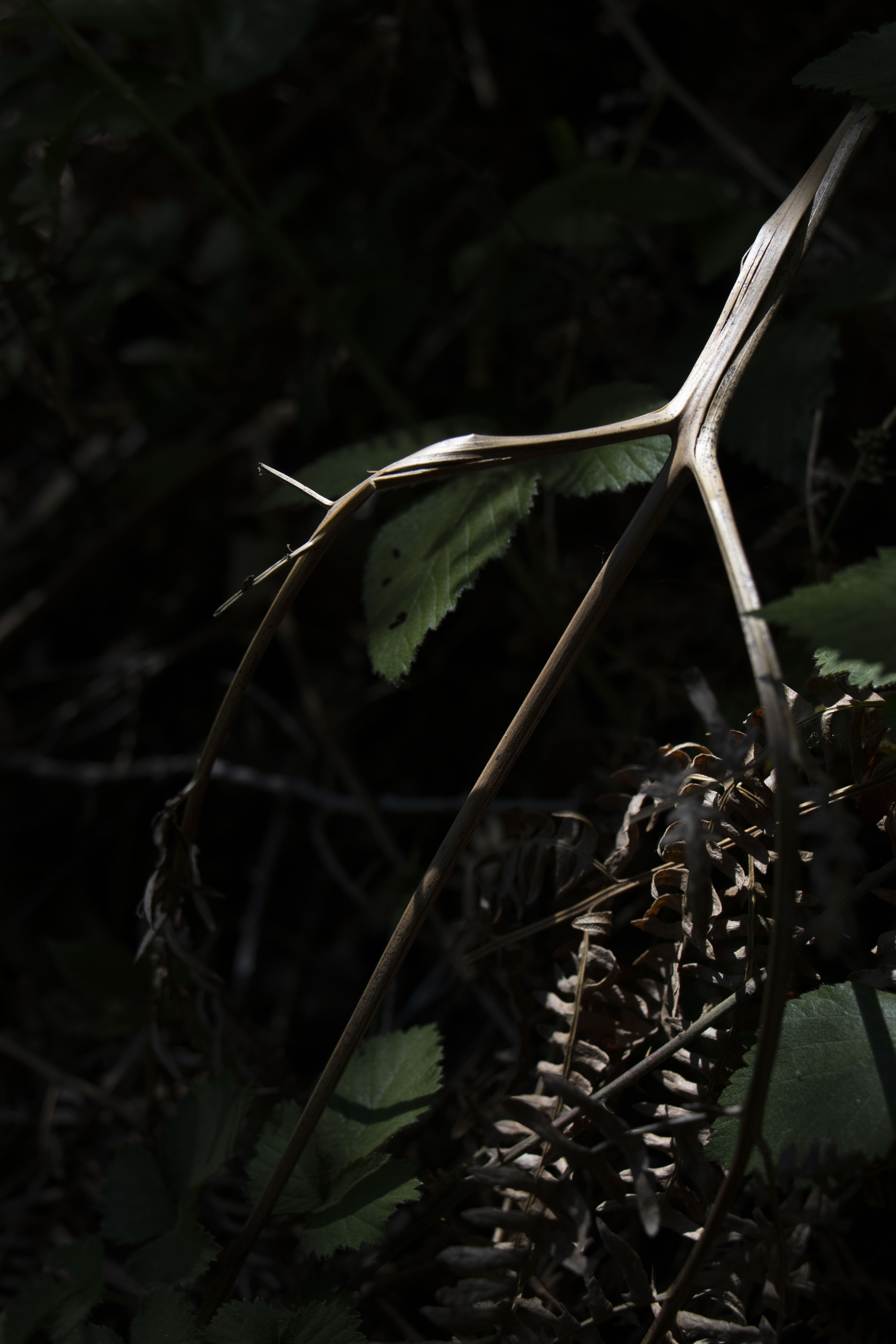
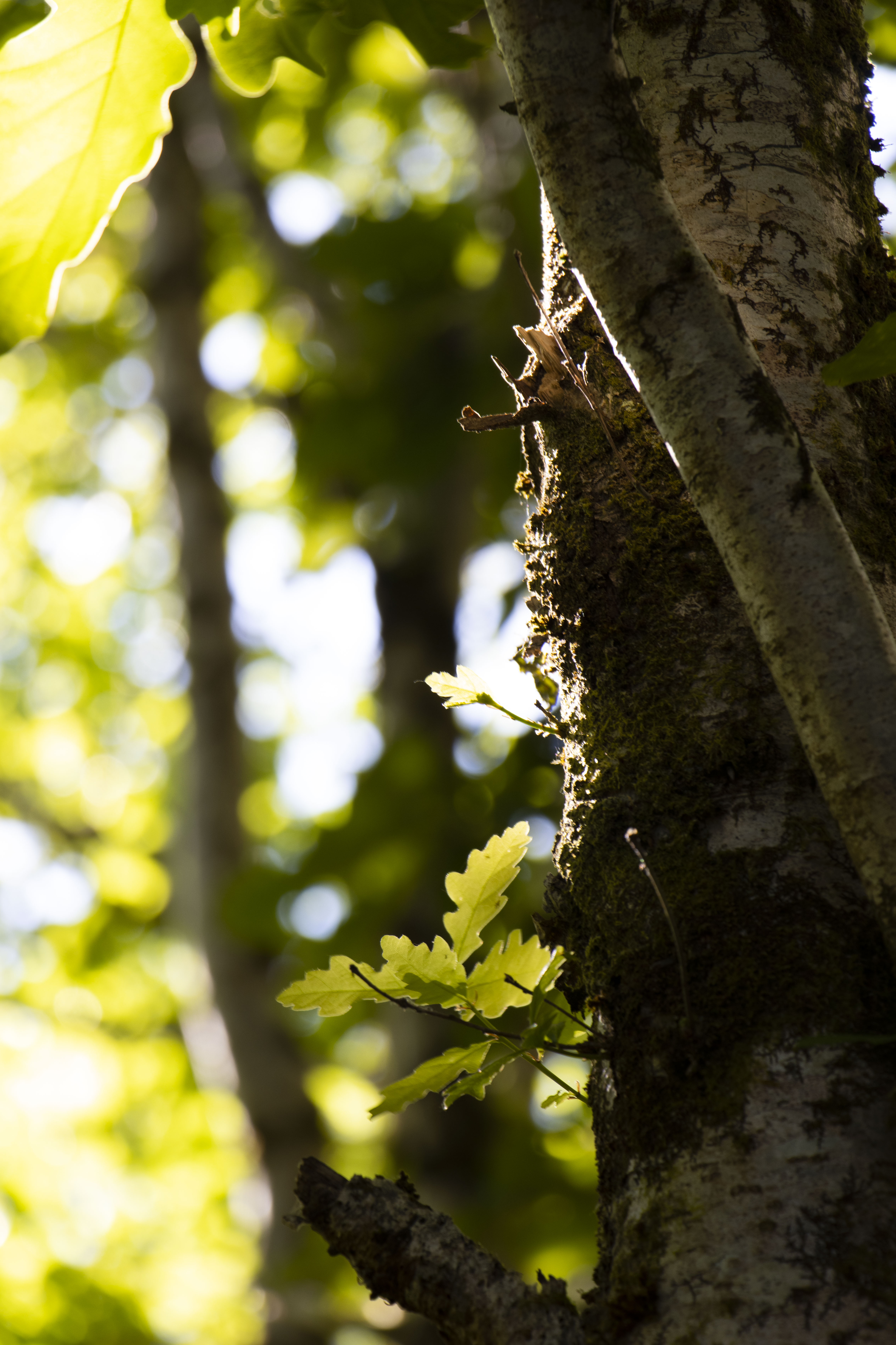
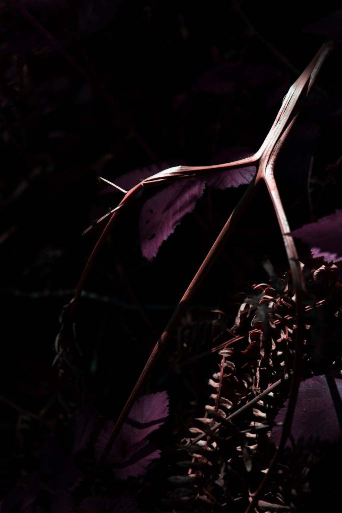
this is where we start to see our first eye, or our third eye of though slightly pocking out of a tree calmly sat in the shrubbery

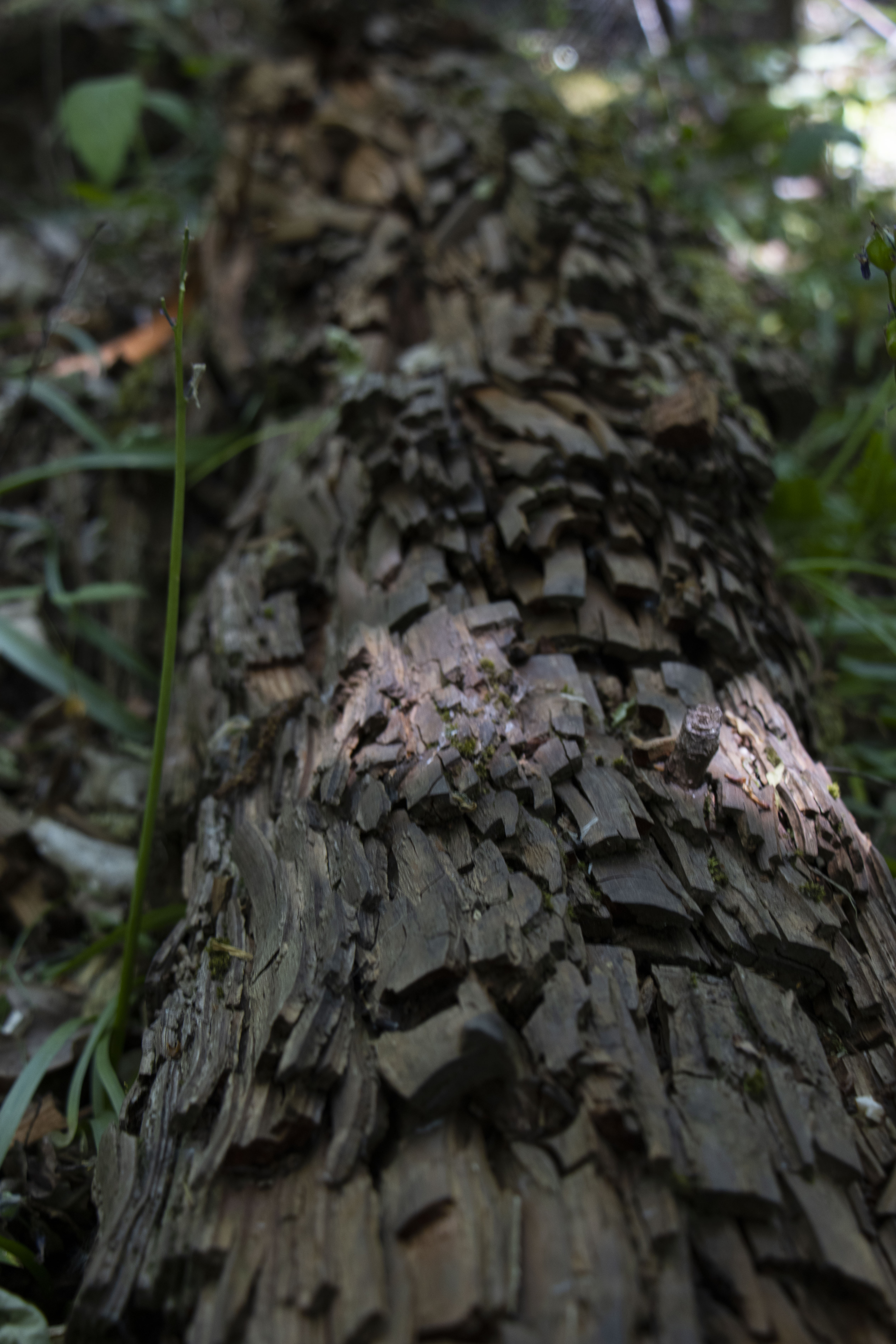
and the we see this magnificent art installation commission by the forest commission of a metallic bug on a bike providing life to this foreign world showing us we arent in the real world any more but this one that is alters

we see another eye peeping out of the leaves, this time larger and more inseight, this is nearing peaking when things start to pick up

now we have some of my favourite accident photos, these kaleidoscope vision double spreads that are internally spun, the trees warp in on each other, they start to create this holy imaginary, and again show this time passage of time as the middle one is the most intense and calmer either side

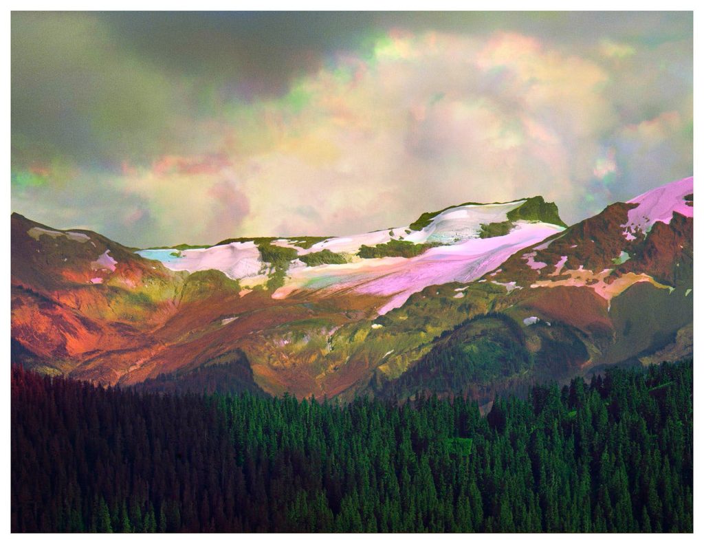
we then switch loacation and come to a fourth double page spread but no longer with kaleidoscope vision, its more refined and a lot calmer

we then return to this idea of spiritalism with this tree but this time without eyes to show thing are diffrent and now starting to be back to normal

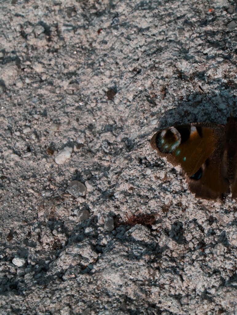
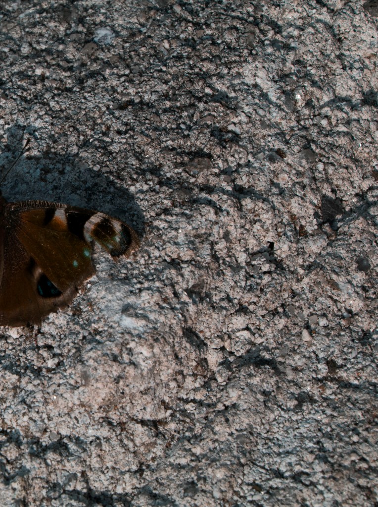
along with this last double page spread of butterfly in IR to represent these eyes one last time but as a simple delicate butterfly , however it has a clip from its wing to idenifttty that cahnged has happned

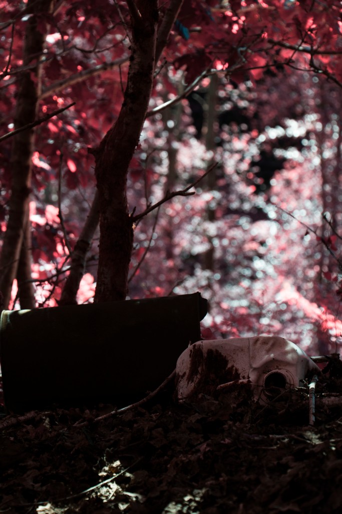
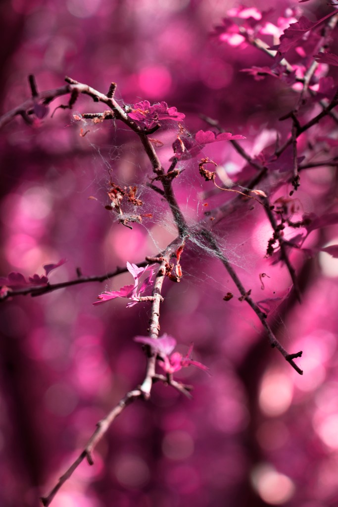
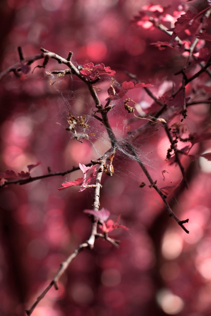
we finally turn to this gore factor image that im not 100% i need, its more to represent this change after showing that things are the same, things are different this time. this is fore showed image from before, but maybe i should have removed the one from earlier and just kept this in its place ??

other images i edited, i wasnt sure how the butterfly would turn out when printing so i wanted to separate this image but realised there would be a white gutter down the middle and i disliked this a sit would brake the flow, however this means the butterflies body will be folded down the spine of my book

Richard Mosse

Richard Mosse (1980-) is a contemporary documentary photographer well known for his work in the infrared spectrum through the use of analog film. He likes to tackle controversial subjects like the unfolding refugee crisis in lesbos and the ongoing wars of corruption in the republic of congo through this alterative lens offering a unique perspective on the subject matter

With an extensive exhibition list, Mosse has become world renowned artist, being featured in places like; Kรผnstlerhaus Bethanien, Berlin (2012), Photographers Gallery in London (2014), and Museum of Modern Art in Japan (2016) alongside other artists like Mariah Taniguchi. And has won such awards like the Prix Pictet (2017) for his work titled โ€˜Heat Mapsโ€™ 

His most notable work is probably โ€˜Infraโ€™ (2012)  and โ€˜enclaveโ€™ (2013) in the republic of congo, by using analog aerochrome film, produced by Kodak in collaboration with the US military during 1942 and was discontinued in 2009, however, Mosse saw this limited opportunity to capture a hidden world and revealing these complex conflict that is still unfolding to this day. This denotes ideas of the sublime because this conflict is so large and gone on for many years itโ€™s even hard for journalists that have been entrenched there for decades to begin to unpick, making us feel so small and helpless to do anything as there no good tribes in this, Its often said sometimes to win the game is to not the game, And theres not even an easy way to present this subject. even as i try to write about this subject i know i only scratch the tip of this ice burg.

Aerochome is a false color IR film that presents beautiful pink and red hues that reacts wells with the green foliage of fauna because of the chlorophyll in the plants which give them this green pigment. However, these altered hues we see were selected by the developers who made the film

Originally designed for aerial photography during wartime in world war 2, this film would allow piots to identify camouflaged troops among the dense shrubbery they were scouting, showing a very practical use for this film, even today it holds many applications within a real world environment like forest surveying or pollen monitoring as it can help identify deciduous and evergreen trees, among other plants, as they have high infrared reflectivity. Another more creative application can be seen within the art world, for instance in the music industry where aesthetics are highly valued allowing these vivid hues to intrigue their viewers, as they are eye catching and stand out against other more conventions mediums. A good example for this that Mosse points to is Jimi Hendrixโ€™s album โ€˜are you experiencedโ€™ for its album cover where this film is featured for its psychedelic connotations of the 60sโ€™ and 70sโ€™

Fascinated by the invisible spectrum Mosse doesnt really subscribe to the conventional ideas of warscape photography, like Robert Capa might have done during his time with black and white film of the D day landings that appear blurry in parts and grainy telling a horror story through photojournalism, where as Mosseโ€™s photos offer a more composed and aestheticised nature

Richard Mosse, Remain in Light, 2015, 40 x 50 in


But it is this aestheticisation that brings up interesting ethical questions regarding his work as it seems to glorify these warscapes where horrific tragedies take place, as our mind doesnt seem to acknowledge these because of the pleasant colors that we often contone to a soft gentle atmosphere. And he recognises this within his work but argues that โ€œbeauty is the sharpest tool in the boxโ€ saying โ€œif you can seduce the viewer and make them feel aesthetic pleasure regarding a landscape, in which human right violation happen, they feel ethically compromised and that moment of self awareness is a powerful thing because the viewer is constructing their own opinions and taking their own ethical positionโ€    and i agree with him,Moose pushes to help this and embrace this aestheticism to produce surreal color pallets and encourages the viewer to take a longer lookto take a moment and reflect on this images and even though their arent dead bodies within these images, it brings awareness to the surface without being too graphical for some viewers which might make them shut off from this. I think this moral positioning is what caught myself when first looking at these images in Paris, this beautiful hues drew me in with their seductive color pallets making me interested in the subject matter and to learn about the conflicts that are happening here, even though i may not understand the full picture its this awareness around the subject makes this work hit so much harder.

Richard Mosse, Suspicious Minds, 2012, from The Enclave (Aperture, 2013)

In Mosseโ€™s more recent work โ€˜incomingโ€™ (2017) and ‘heat maps’ (2017) about the refugee crisis in Lesbos, Greece, he uses a different kind of IR, which uses a US military thermal imaging camera capable of seeing 10km away often used to spot people crossing the boarder.

makes reference to migrant mother Dorothea Lange, but provides an anonymous portrayal for these refugees, both as a artistic device for the safety of these people who are seeking a trying better life here

i love the tonal values of these images and might try to recreate something similar within my won work

http://www.richardmosse.com/

http://www.artnet.com/artists/richard-mosse/

https://aperture.org/shop/infra-2765/

Brendan Pattengale

Words by Erik Vroons

Brendon Pattengale, San pedro de Atacama, Chile, (2016) – Gup Vol 61 exert (2019)

“Brendon Pattengale (1984-) express a desire to work side the landscape traditions while utilising an unorthodox set of tools to capture the overly fimiliar panoramas of mountainous landscapes, as once captured by both the Pictirialisys and the Realisys. Considering the camera as a glorified paintbrush, Pattengale’s Color of Love, revives historic photographic processes but also makes use of innovative techniques and unconventional equipment and chemistry. he manipulates materials the distinction between observed and constructed imaginary

Pattengale developed an interest in landscape photography as a child when backpacking with parents as a child, when backpacking with his parents (and two older brothers) in California’s eastern Sierra Nevada mountains. now that he is able to match his ideas with what is coming out of his camera, Pattengale is not willing to fully explain his methods. But it can also be said that he makes use of full spectrum photography, an imaging process whereby the camera os modified to capture everything in from ultraviolet to infrared light

these landscape photographs might maintain a certain realism in the way that they vividly depict valleys and vistas as once painted by the famous American modernist artist Georgia Oโ€™Keeffe(1887-1986). indeed, this is no coincidence that Pattengaleโ€™s passion for landscapes, particularly the American west, really took off after the trip a few years ago to ghost ranch, Okeeffe’s former home in New Mexico

known as a loner, and wishing to escape the hurlyburly of new york city, Oโ€™Keeffe explored the land she refers to as the “the faraway’. on her first visit to New Mexico in 1917, she was instantly drawn to the stark beauty of its unusual forms, in both the architecture and the landscape. she constantly departing from the overall shape and form. it is exactly this of phenomenological reduction that we can now see in the strikingly abstract, or even psychedelic, landscape photography of Pattengale – who also visited California, Bolivia, Chile, and Iceland for his Color of Love project.

is it still “photographic”, though? palatinate’s choice of perspective and colour scheme results in images that appear deceptively more like drawings or paintings than photography. yet, before anything, what seems to be of concern here is a conceptual evaluation of the landscape representation. the medium of photography matters, but mostly in the sense of it having its own art-historical history with regards to the transcendence of majestic scenery such as the American west

aesthetic ideas such as the picturesque and the sublime have informed thinking about what a landscape is and how we look at it, and this new attempt, to seek alternative aesthetic approaches and, with that to escape the cliched depiction of nature encourages the viewers to reconsider the beauty if seemingly untarnished landscapes with fresh etes.

alongside serverak other arists of his generation who are concerned with creative approaches to lansacpe photography (such as Cody Cobb, Douglass Mandry, and Matthew Brant), Brendan Pattengale- awoken to wonder by following in the footsteps of so many great creative minds that once roamed this planet- is passionately searching for the subliminal effect by way of a new visual language.

trying to present an unanticipated and captivating visual experience is something that should be appreciated, of course, but the question remains: how abiding is the avant garde pictorial approach? will it indeed result in an enduring escape from our mundane way of seeing, or will it lose, over time, its initial ability to overcome the force of the canon? alas, such been the tragedy of so any artists. ” Gup Vol 61, pp 14-21 Xpublishers (2019)

Brendon Pattengale, SouthWest (2017)

Mood Boards

to gain visual inspiration for my photography shoots i follow a lot of art and nature accounts on Instgram which might be thought provoking for myself. however it should be noted that this isnt the best best way to find reputable sources of work as many accounts like ( @prairie.fae or @fairies_and_frogs ) are often fan pages rehashing other peoples posts, not necessarily claiming them as their own but often not crediting a source for the work they use. which when doing work for uni can be hard to justify using, sites like Pintrest hold a similar issue. however these are just some posts that have been in my mind throughout this project as i’ve continued to update this post by using indesign to create this 3×3 grids to display these works

@marcwillsonphotography ‘s photo shows a set of wooden stumps cascading into the distance as they mark a line through this forest, i like this because of its idea of repetition

@matttruslovegallery ‘s photo using this small light pool that filters through the trees cutting up the photo and lighting up this small patch of ferns, i like this idea and might try to incorporate this into my work by using fast shutter speeds focused on my subject matters

@justinecollins_ ‘s photos are really pleasent to look at as they almost aims to abstract what were looking at by taking an extreme close up of her subject matter to amplify the scale of this daniloin, it also appears hazy to give it this dream like state

@matteresslovegallery ‘s post show us these lushes green ferns from an over head preservative presenting an interesting observational viewpoint

@magnumphotos ‘ post is one i love for its uprooted tree and dark setting, providing a eerie atmosphere, along side all the other trees that loom over head with their slender nature, linking this to my work this provides a sombre moment as they more the loss of their friend while they dress in black

@davidgkey is a local photographer i’ve been following for a while, taking lovely photos in and around Plymouth of these nature landscapes, they offer these magical/cottagecore vibes that the fan accounts try to aim for but with a sense of professionalism, even going as far to captioning one of his photos with “fairy gifts” i also like the little sorties he puts with his works to provide context and put us there with him so we can experience what he does

@sarahridephotography ‘s post is something that really appeals to me because its a photo that tries to be something else by using these effect layer which provide a trippy 2CB atmoshere, almost connoting to a VanGogh style with these flowing brush strokes.

@m_l_robbins ‘ is a photographer taking photos in Wistman’s woods, with these winding trees that twist in every which way, they provide this scary cold atomoshere enforced by this rolling fog. in this photo as well theres a small boy in a yellow rain coat which is often a mortify within horror culture

@skullbeetles ‘ is another one of these fan accounts that i find aesthetically pleasing, i like this simplistic nature, with the sun rays beaming through the trees and this vacant swing that reminisce on childhood memories.

@littlegemphotography.uk ‘s photo does what many people do when noticing a long stretch of clearing which presents great photo opportunity, the central composition leads our eyes from the edges of the frame towards the centre through this natural corridor of plants, and is something im guilty of myself

@justinecollins_ more of justines photos show a similar aesthetic as before with is close up nature of an orchid, seemingly abstract but still composted with context, in doing this shes able to show a lot of the fine details within the image allowing us to appreciate the smaller things

Blidworth

Blidworth is my home town near Mansfield (east-midlands) and is a place i have fond memories of as my brother and i would often go out and adventure in the woods all the time, making forts, riding bikes, and playing with the neighbours. these photos are from old family photo albums taken when we were very young

our back garden leading to the forest

here we see my back garden with this huge glass green house, towards the back of this we had a gate the lead directly into Sherwood forest, where my brother and i would have our adventures

my dad, my brother, and i

heres this gate i was saying about above, theres not even a fence here, this must have been when we just moved in. before this we lived in a council refuge, one i dont even remember and doubt my older brother does. its funny seeing these photos and my dad with hair still- or what of it there still was. looking back at these has been really nice as this images show a happy new family with three kids and two married adults, at this point in time my parents are divorced, my sister and i arent getting on, my mom and i are distance, and my brother is living in brighten, its funny how time changes things

myself, my cousin, and my brother

i love these woods, you can see how dense and over grown it is with so many pine trees in the background, these ferns that over populate and weed out many other plants, i wish i could go back there to get photos for this project but at 267 miles away and lockdown in effect i dont think this will be possible, however within my photos i aim to achieve a similar idea with the dense forests in plymouth- another place where i grew up from 8-18, so it still holds a lot of sentimental value, providing me with a lot of knowledge of the local area

during this time i’ve been moving house a lot and i feel this longing for the past, or a settled life when things were simple.


through out this project i’ve used three camera, my own Nikon D3500, my friends film Agfa Synchro box, and my dad’s Canon D90.

i like the idea of using my dad’s camera as it added this essence of family, or this child like idea of stepping into his shoots as a photographer

20.05


> styling <


i feel this is one of my more successful shoots but also one of my more dumber shoots as i accidentally walked 25 miles this day along the drakes trail in plymwood. i was outside for 12 hours getting home at 11:30pm, taking over 700 images i ranged them through Adobe Bridge using the star rating system and edited them in Photoshop. i probably didnt need to stay out this long as i lost my light around 8pm making it very hard to shoot without proper equipment like spot lights or flashes, i kinda refuse to use an onboard flash because more often than not it is very unflattering and flat lighting, however staying out this long did sort of serve my desire to go camping and study the light as i realised my lighting issues. morning sunrise is still in my mind though

i also feel these photos link closely to Ram Dass’ use of psychoactive substances and his ideas of unity as often these images dont often present a straight forward angel, sometimes taken from above or below, as well as other reasons

taking obligatory eye photos, i dont know how well these work as the knots in them are quite small making it harder for us to interpret this idea, i’ve also tried to incorporate more of the background of these photos to give an idea of the place were in

looking up at the bristles of this tree, i’ve shown to show three different editing stages of my work as they each show different atmospheres, the first is a color inversion layer presenting these strong orange and blue hues that compliment each other nicely, in the past i’ve described these as night times edits because we often connote these orange skies to signify sunsets

but that wouldnt explain why the leafs would turn this blue hue as well?? i realised later in my shoot this would actually happen in IR during a sunset, the pink hues start to fade with the absences of that green chlorophyll for the light to reflect off of, causing blue hues start to show instead, thus making these valid edits for IR even though they dont have the channel mix layer applied to them

i’ve also placed these along side each other as i feel they would make a great set of prints as they’re reminiscent of Andy Warhol’s screen printing techniques of Marilyn Monroe piece

with more of this multiple edits im able to say i dont need to go camping to see this full light cycle as i try to deal with these limitations of being outside due to the virus, i feel these make a good substitute, i’m also able to reduce the exposure time to 1/1000th of a second to create these dark settings, i really love the lighting im able to convey with these shutter speeds, though maybe this photo could do with a slight levels adjustment/ burn in sections where the highlights are too white

another image i like is this one of a discarded water container as this conveys this human existence but it has been long forgotten and abandoned, noted by the wear on the container along with the slow growing moss. behind this with have the bokeh effect thanks to the depth of field focusing on the container and blurring out the background in the distance

channel mix

taking more over head photos with a central prescriptive, i liked the way the light hit this fern plant on this cluttered woodland floor

channel mix

this is one of my favourites from this shoot as it links to ram dass’ ideas of spirituality through the use of lighting, in the past i’ve used lens flares to get this approach but shooting through these poisonous bells as they allow the light to disburse, to this i’ve used low angels so that we are looking up at this subject matter allowing for this idea of a higher power, to which i’ve noted in the text posted along side this piece, to which i also added the appropriate hashtags. i wish i got more of the plant in focus and in frame but i think it does a really good job of conveying this message i hoped for

“We venture this world looking for a higher power to guide us through this life, to hold our hand, but it is often this hand that feeds us that we bite”

#nature#hallucinations #otherworldly #forest #trippy #religion #plant #foxglove

channel mix

i like this one too as it builds on previous ideas by trying to look up towards the sky in search for this god like figure however it is shrouded by the canapes above that let through these select light rays, i also feel theres a slight golden ratio within this photo reaching from right of frame spiralling towards the centre of frame through the use of shade in the leafs, i dont know how much i believe myself here though

these images show the parallels between the IR filter and my editing style above with the hue saturation edits and below the channel mix edits without this hue saturation layer, here i still lean towards the channel mix layers particularly the bottom left as the light catches the blue cobweb on this branch, the depth of field helps amplify this drawing our eye to he cobweb

i love this idea of going through a tunnel to enter this mystical world of IR as it feeds into my childhood memories of studio Ghibli movies like Spirited away, where a family travels to a new city in Tokyo but get lost and travel to this Japanese spirit world. these movies hold a place in my heart for their animation style and use this narrative within Japanese culture building on folklore. i might try to incorporate this idea within my final publication as we leave our own world to take this journey into the Infrared spectrum

channel mix

more mulipul edits to showcase the manmade structures that blackout the sky and dominate our own world, compared to the natural world featuring these wild daisy against this darkened hedge. this is on my way back as the light starts to fade

here we see a sunset through the trees, though im not to sure i like this photo as this transition from evening to dusk isnt conveyed well, and im not really sure how to show this transition period, maybe a wider landscape could convey this idea better ?

channel mix

here we see another foxglove plant, but without this intense sun its loses a lot of its luminosity, appearing blue in hue as apposed to the vivid limes and pinks. i’ve captured the full length of the plant to showcase its beauty as we conclude this trip the bells now start to close, juxtaposing the previous image as less intense version

15.05

these photos were taken in central park in plymouth, this is a place use to be a public zoo during 1960’s and is often visit with my friends back home for a smoke break from uni. they were taken on a nice warm sunny day providing me with lots of light, however because i was with friends at this point i didnt feel too obligated to take photos

out of about 267 images i was able to retrieved 5 images, which i’ve cut down to these 4

i felt by this point my project was coming to close and that i had most of the photos i wanted, also with this being a new location, i felt a lot of these photos were maybe unnecessary. i’ve spoken about this before, but these photos show two different editing style, the one on the left follows styling edit 1 while the right follows editing style 3.

i’ve chosen to edit these images twice as i wanted to make sure that the refined approach is the way forward


> Styling <


i like these leaves in this photo they seem to drape quite nicely in the breeze, taken from under the tree looking out we get this illumination allowing us to see the vein system within side the leaf, i feel i like the right side more for its stubble composed edit, the red leafs on the left seem harsh to look at

here we look more the weeded undergrowth of this overgrown area. we also see these eyes in the background of a birch tree. the lens flare is also kind of nice as it denotes these ideas of spiritualism from Ram Dass, and i also feel i like the right side for this photo, i feel this calm meditated look just suits better for the atmosphere im trying to convey, however towards the right side of the frame i could stand to burn in sections of the highlights as they appear over exposed

in this photo i noticed the nice composition of these tree lines, a tall poplar tree frames the right side of this image while a small abundance of trees form the bottom third of this image, leaving way for the sky to fill the negative space. for this edit i actually like the left side because of its skyline hue, it appear more vibrant as if it were a different world, compared to the right side looks a little washed out, the same for the trees, having this slight vibrancy i feel adds to the images when part of the sky is dominant, maybe i could create two separate layers and edit the two styles together, but if there are a lot of images i have to do this for it seems counter productive ?

here i like this solar flaring more than the previous photo because its more subtle and in line with the rest of the photos. the same can be said for the hue, though i do like the vivid purples i feel the softer pinks are more comfortable for the eyes to rest on, letting the viewer relaxed as they contemplate these images

in concussion of this photo i have decided that my refined approach is defiantly the one i want to work with, even though sometimes i dont get the hues i want, the ability to print my images at their highest quality is more important to me than the more saturated hues where i often loose information and clarity


these photos were also taken on this day however i go more indepth about them on my Red filter post

> Red Filter <