03.12.19

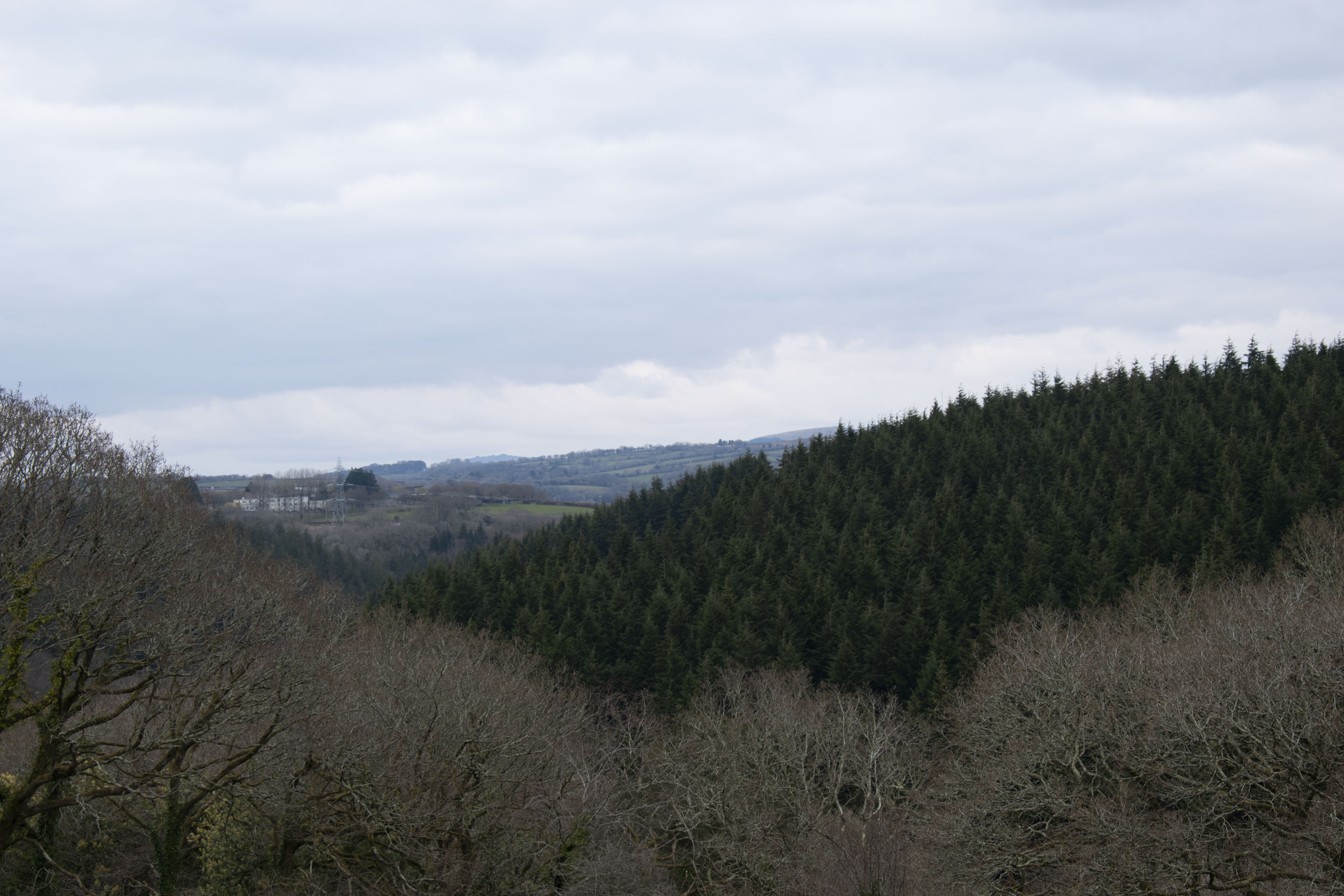
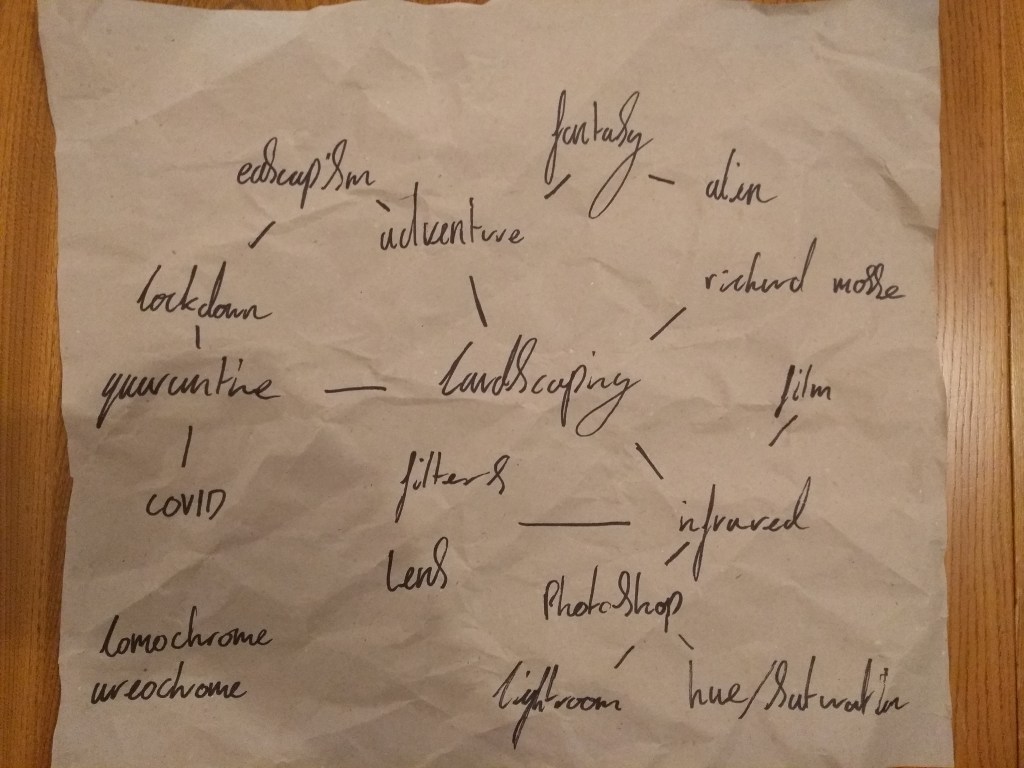
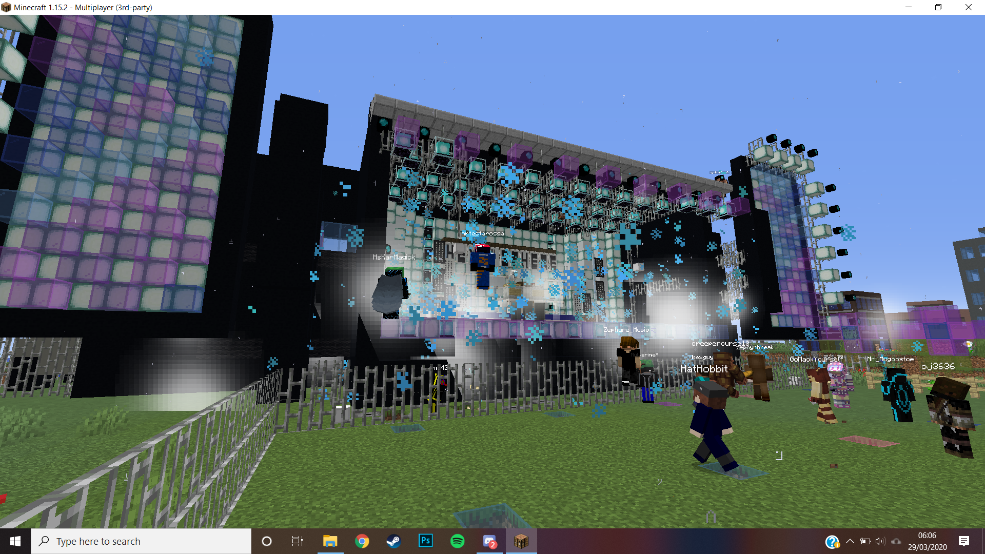
before this project began i had thoughts about the future landscaping brief, these photos were taken in bath before the virus hit, they show an old forgotten landscape over grown with trees.

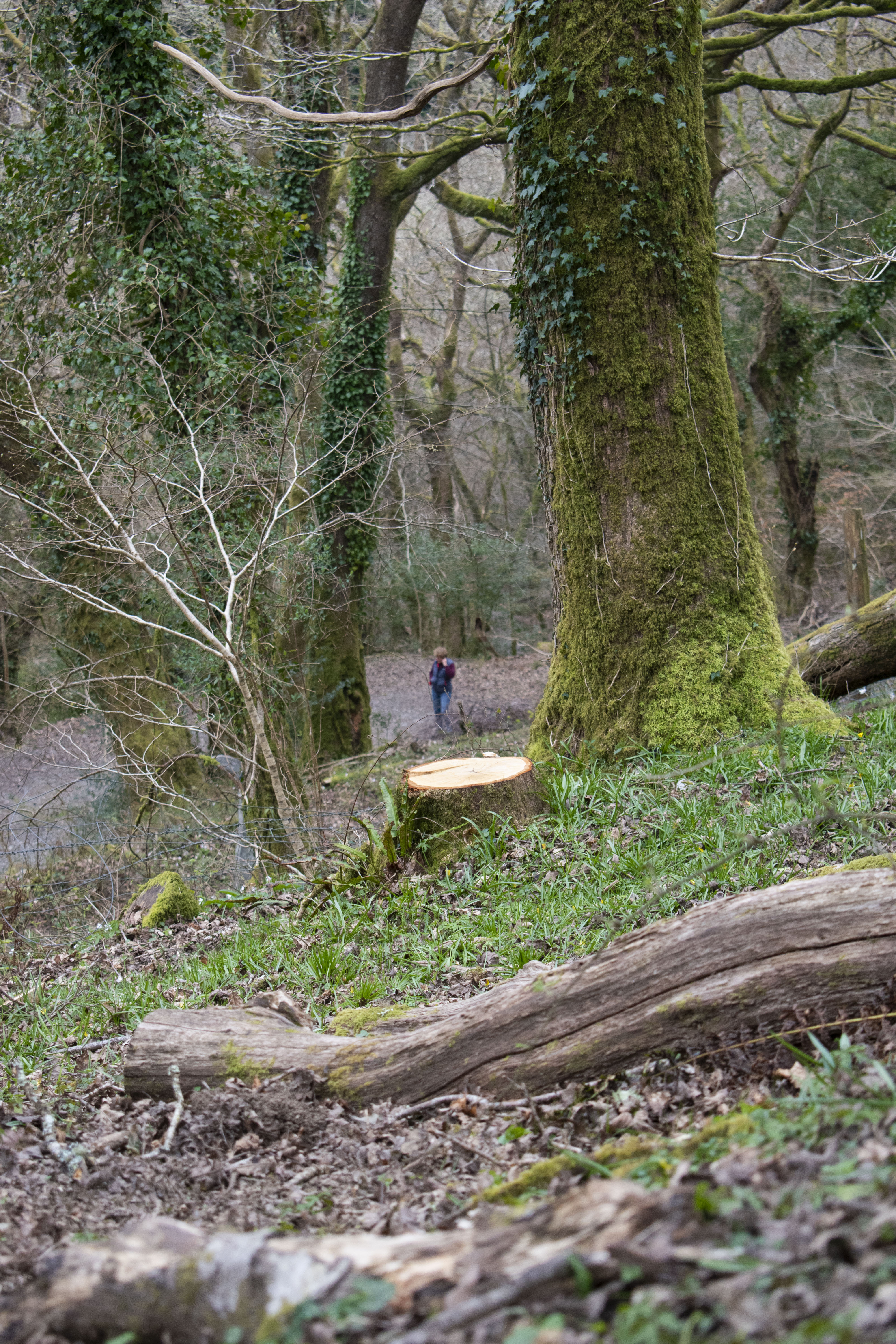
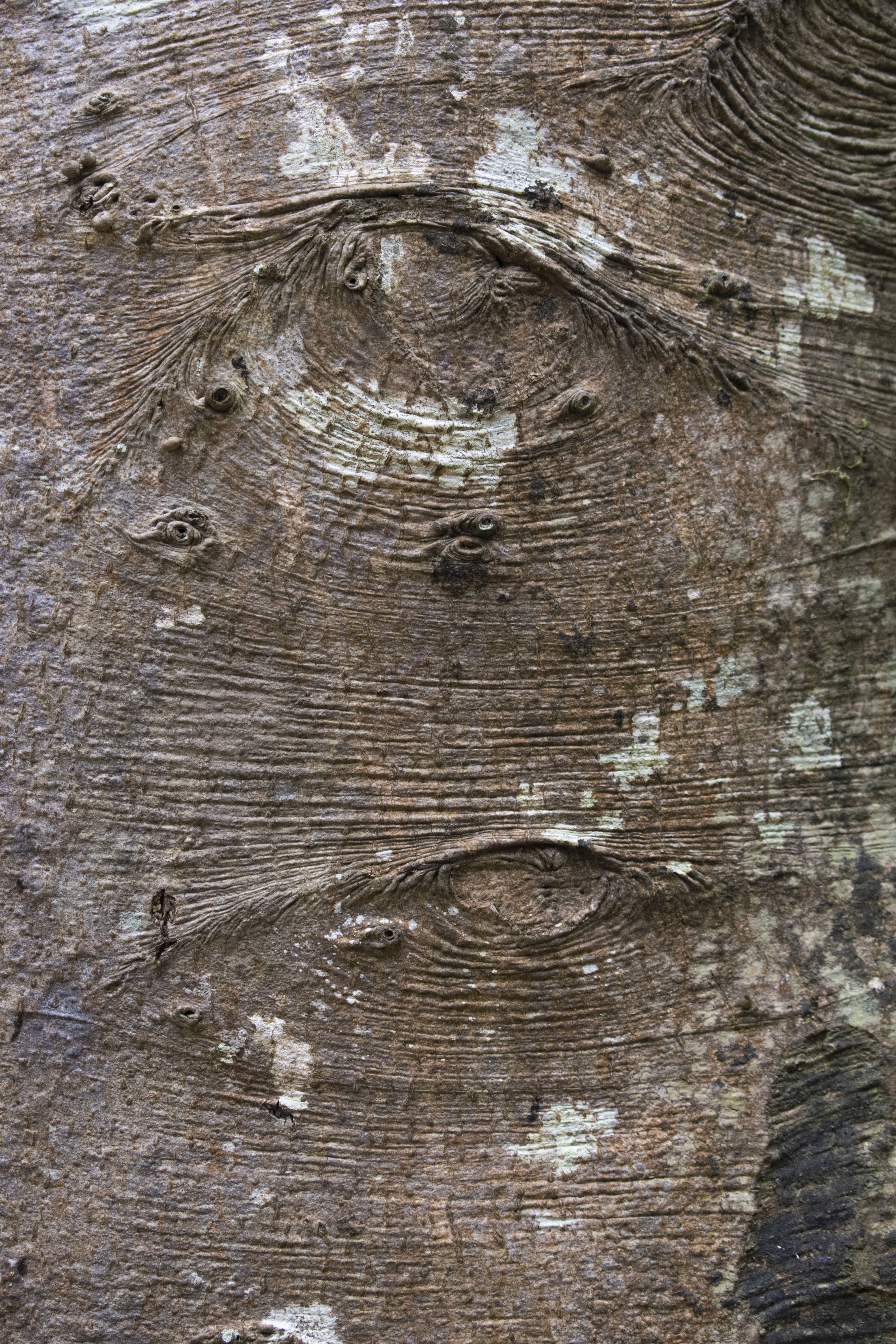
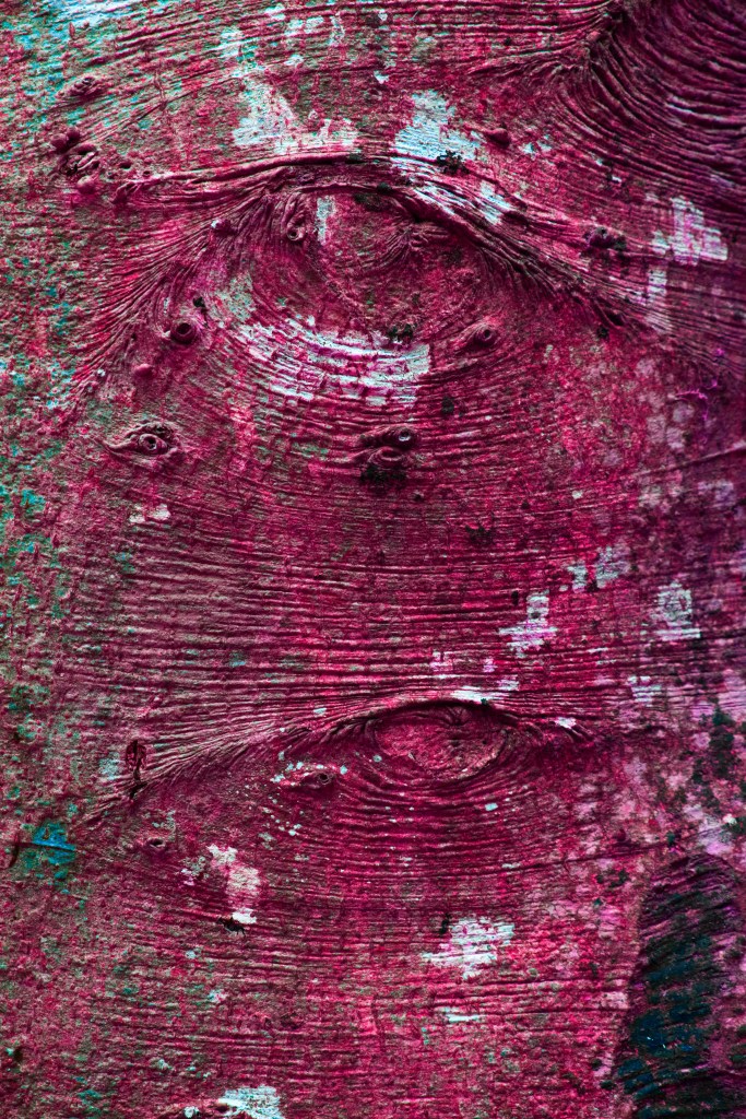
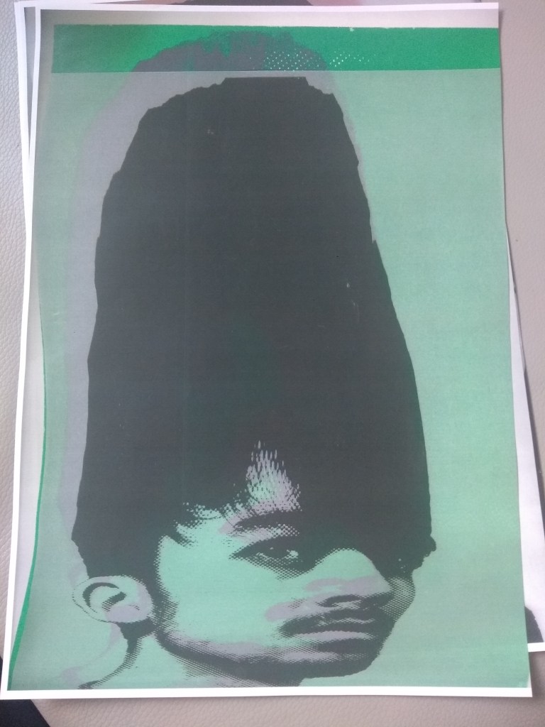
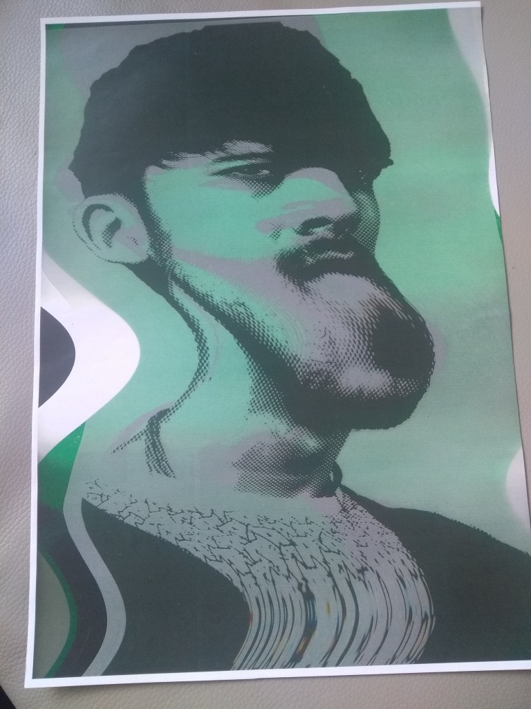
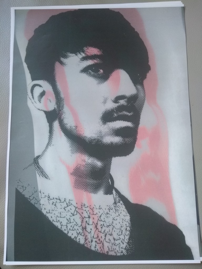
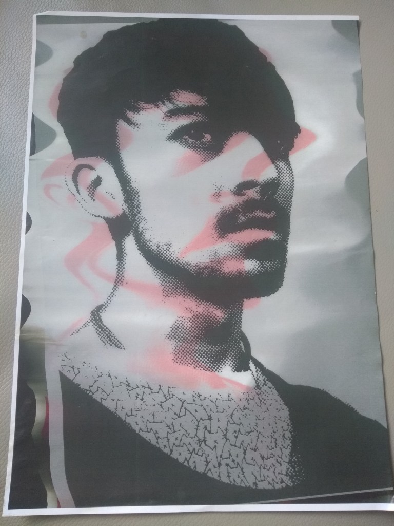
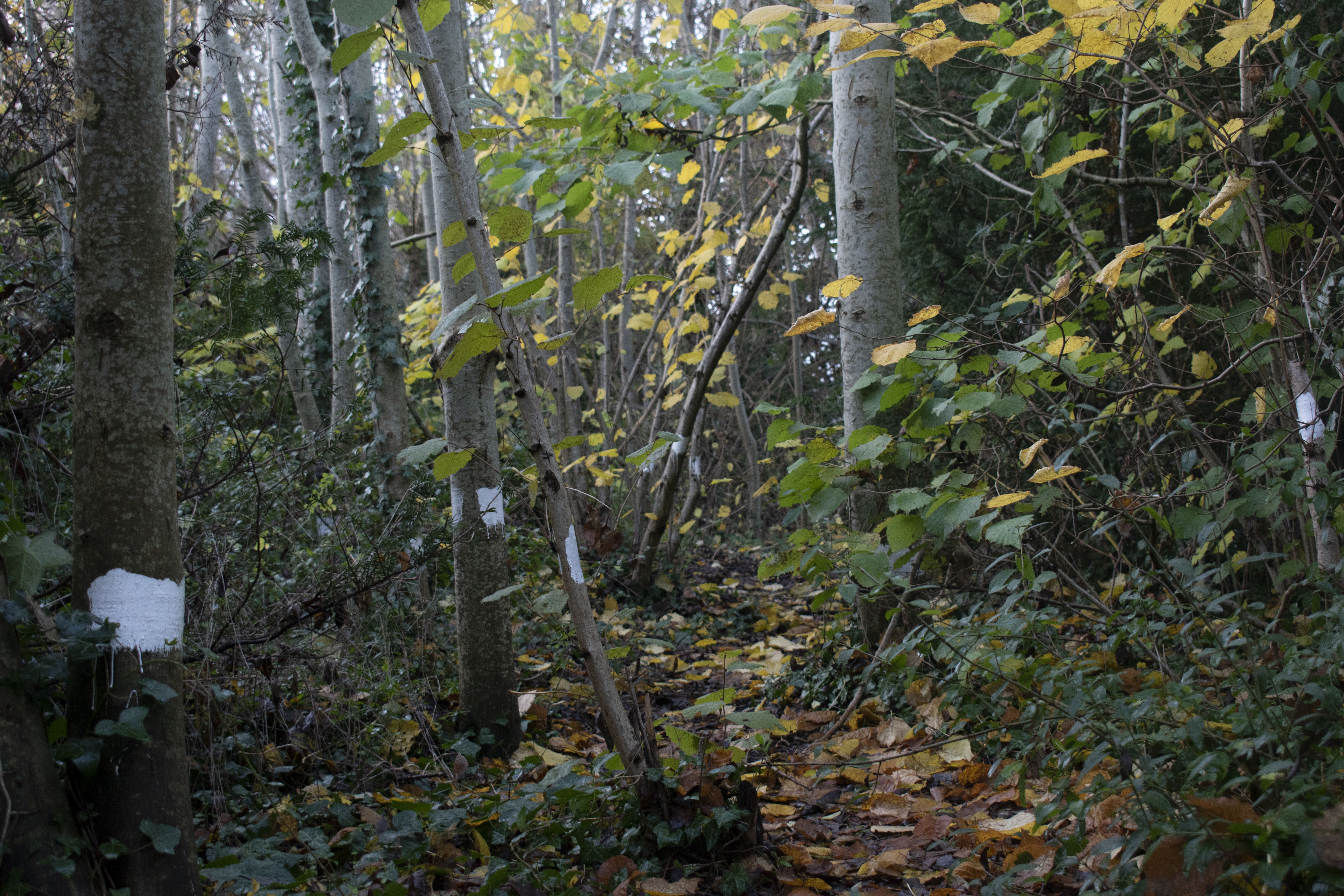
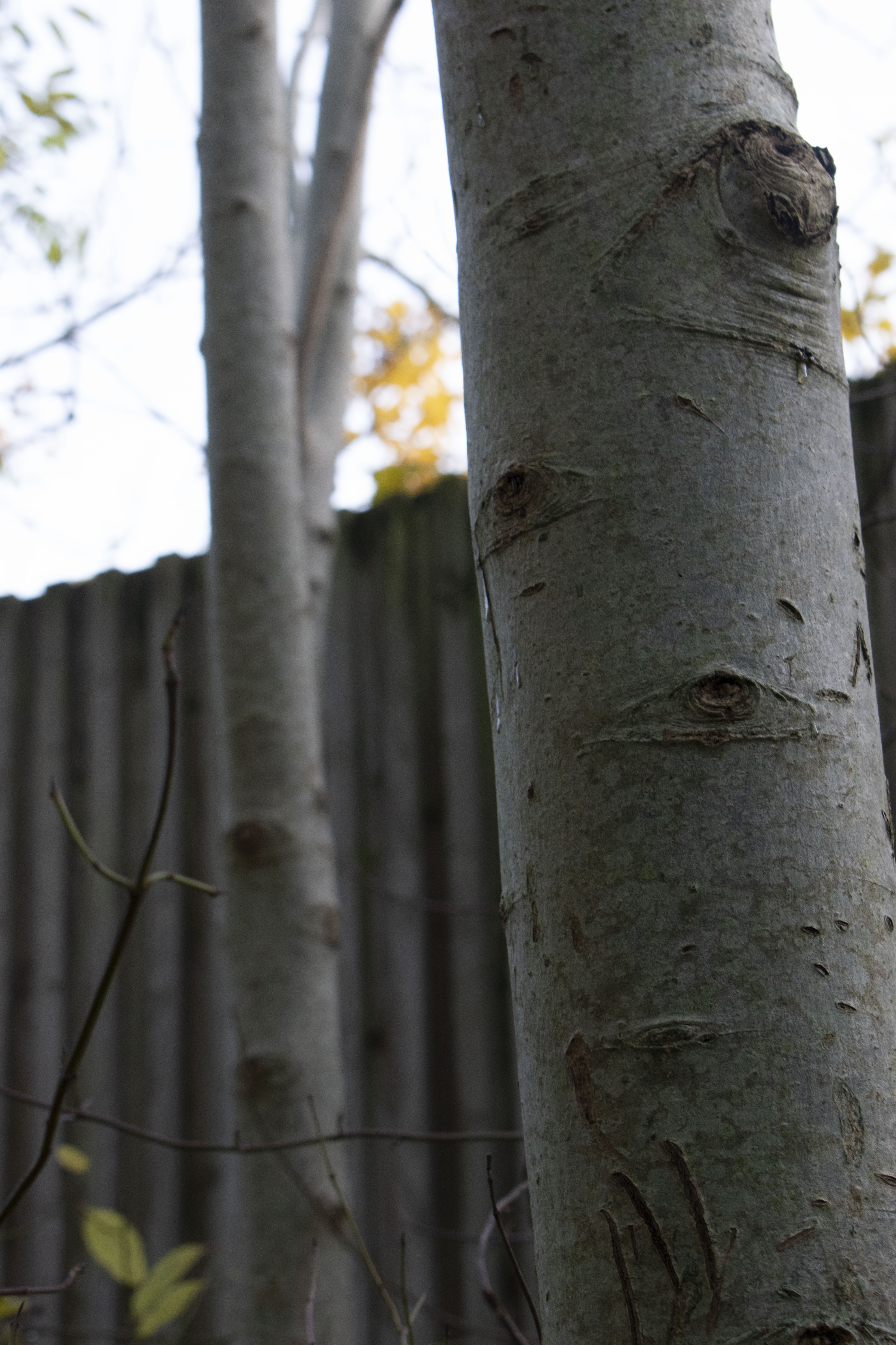
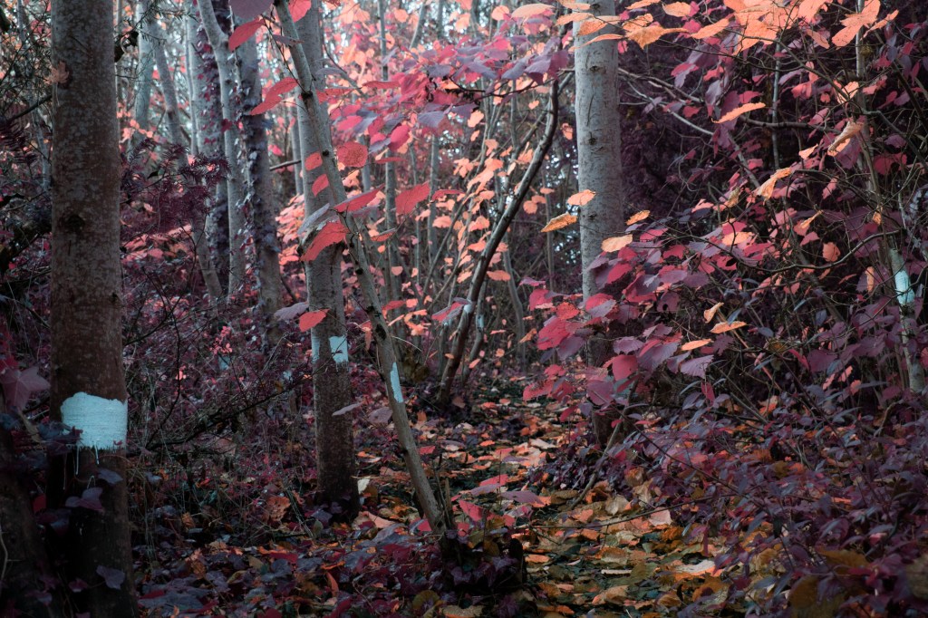
this area is a place i offend visit with my friends to smoke and escape our burdens of uni for a moment, allowing us to immerse ourselves in nature. one day we noticed theres a small trail noted by the white paint markings on the trees, they lead to an opening behind the bus shelter near the student accommodation. this was following our portrait project, i titled this folder “the trees have eyes” because i noticed the knots in the trunks, to this is could project personalities to them making them seem like they are alive as if they were watching us.

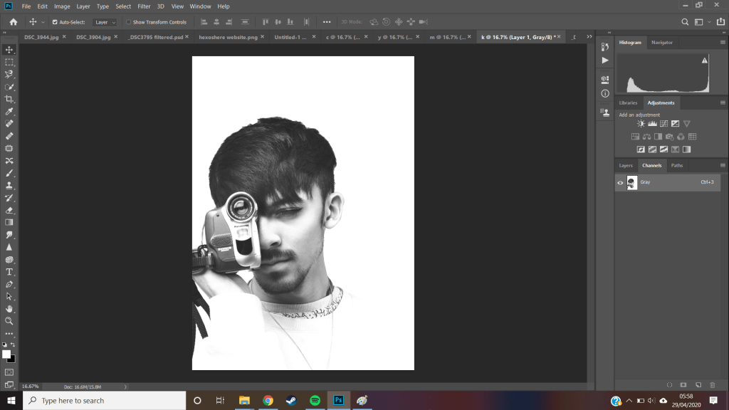
from this i didnt really look at the photos too much more other than filtering them down as i had to continue my portrait project.


maybe not take time to read other posts and return to the analysed of these photos as they were edited with new knowledge


coming back to these photos with fresh eyes and sights on my landscaping project i was able to look at them in a new context in mind

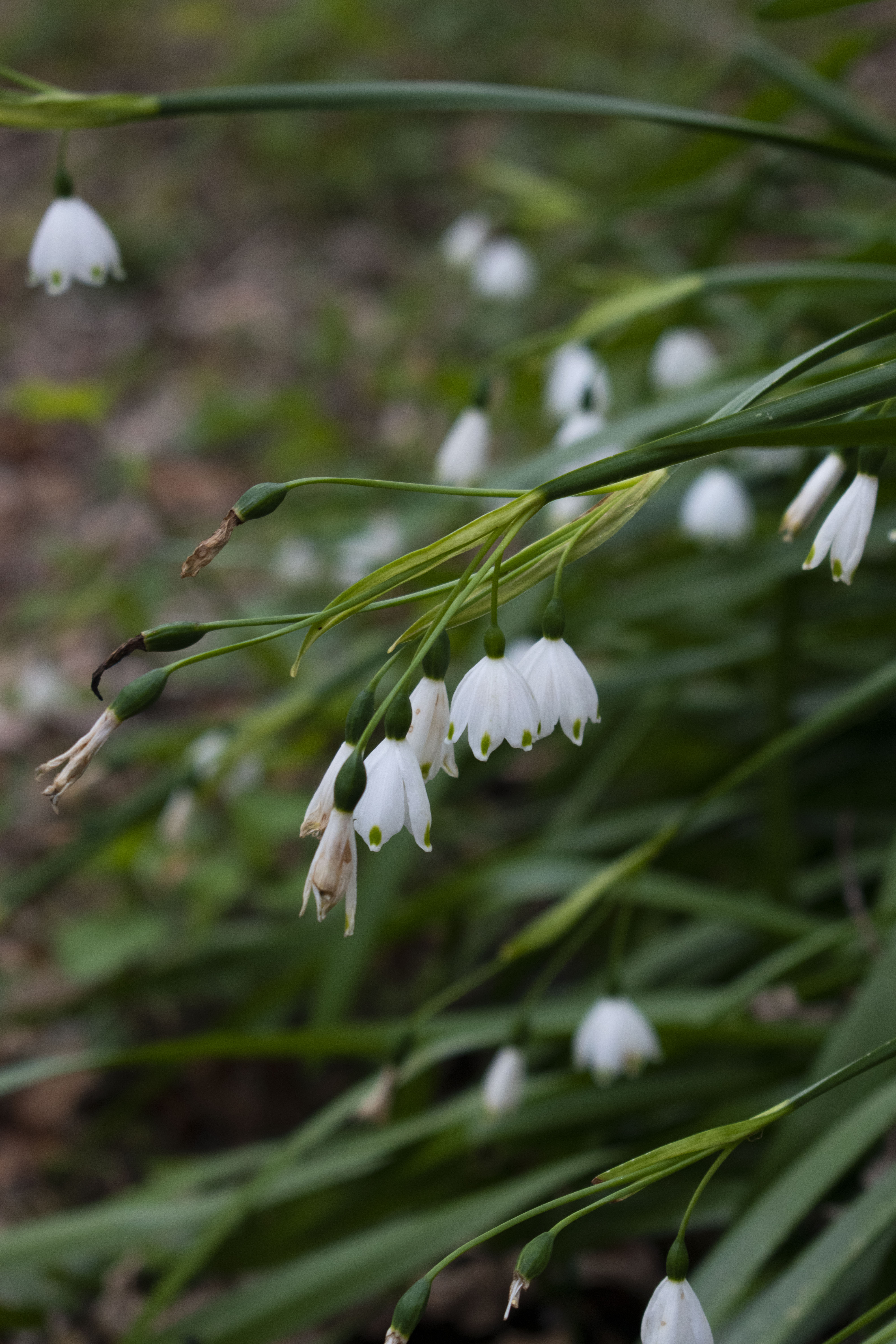
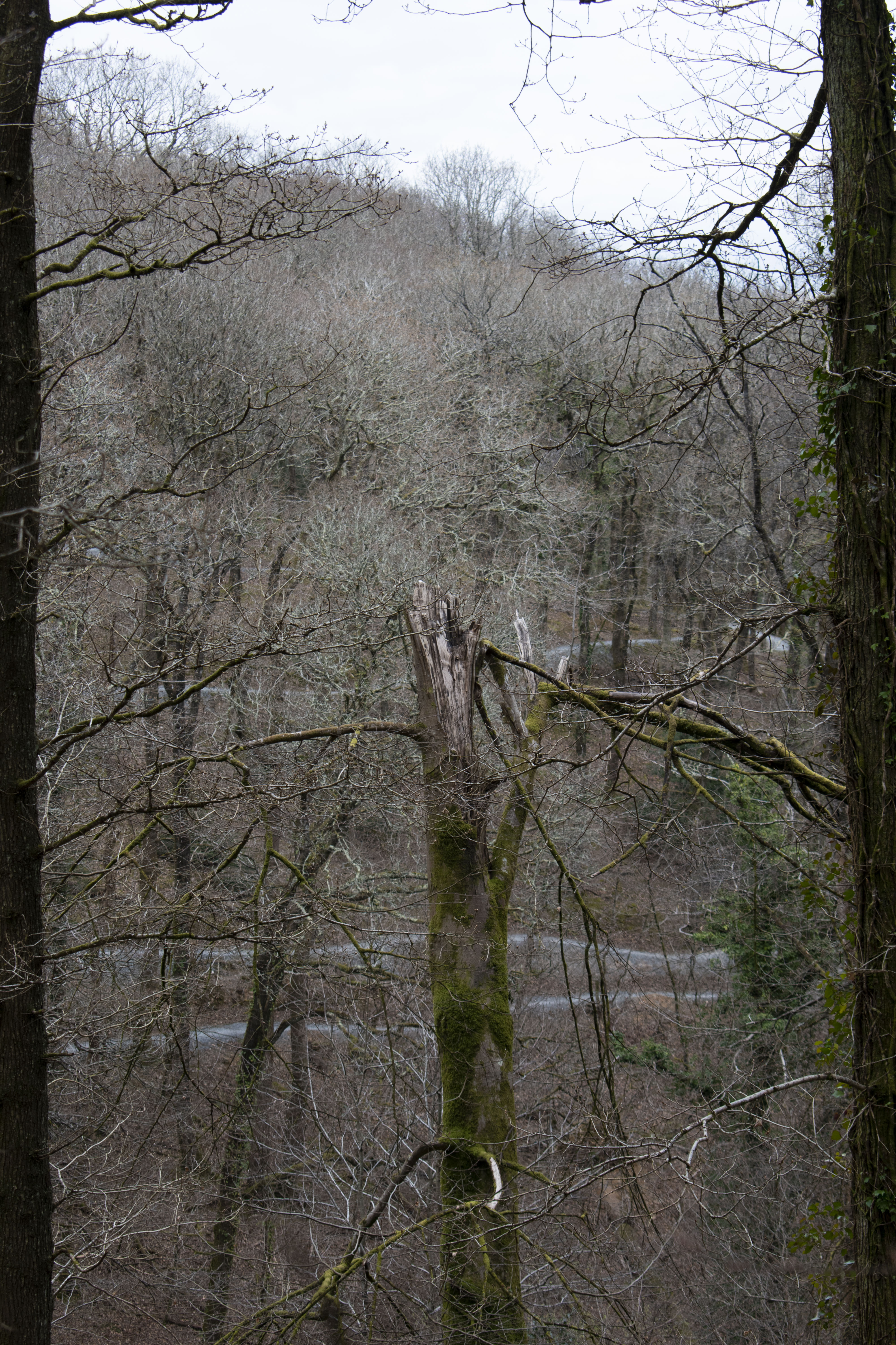
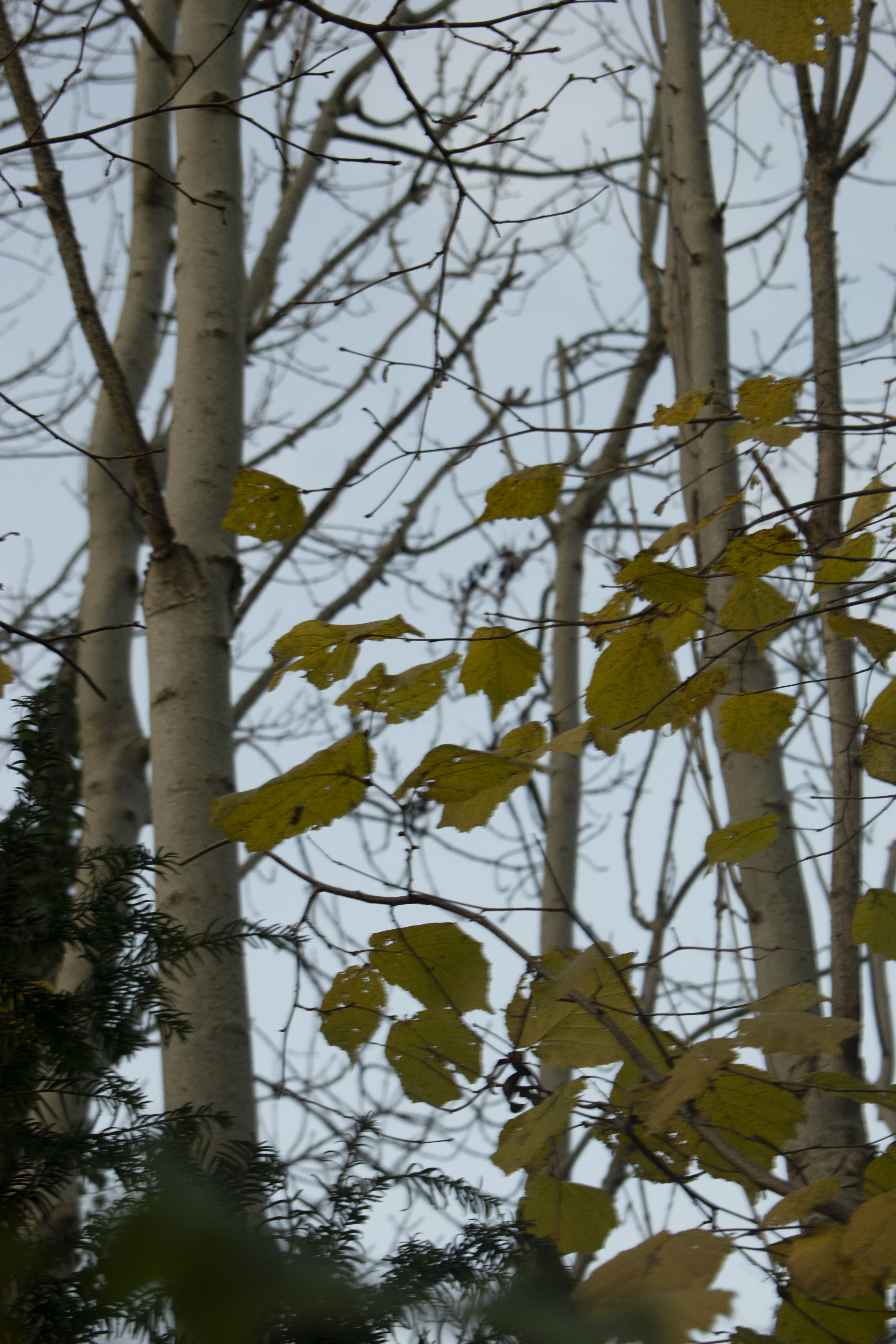
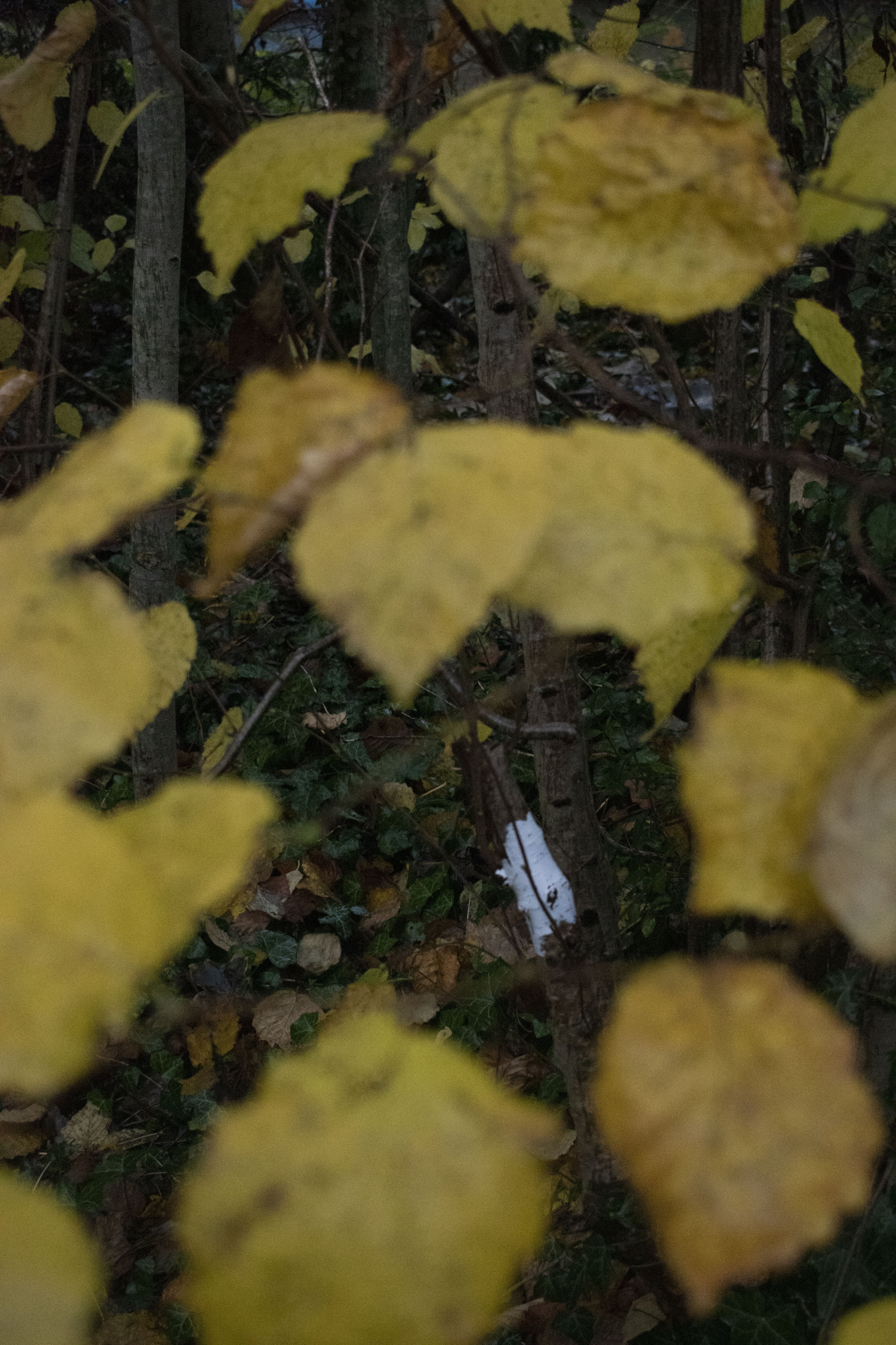
because these photos were taken in December they provide a different atmosphere to the photos taken proceeding this, as well as presenting lower light value with a lower sun, making them appear softer without the strong sun rays bleeding through the foliage above – since there is very little foliage above

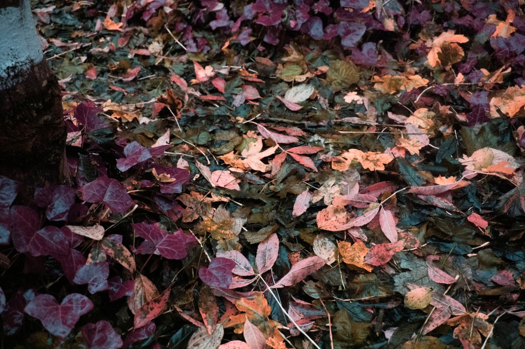
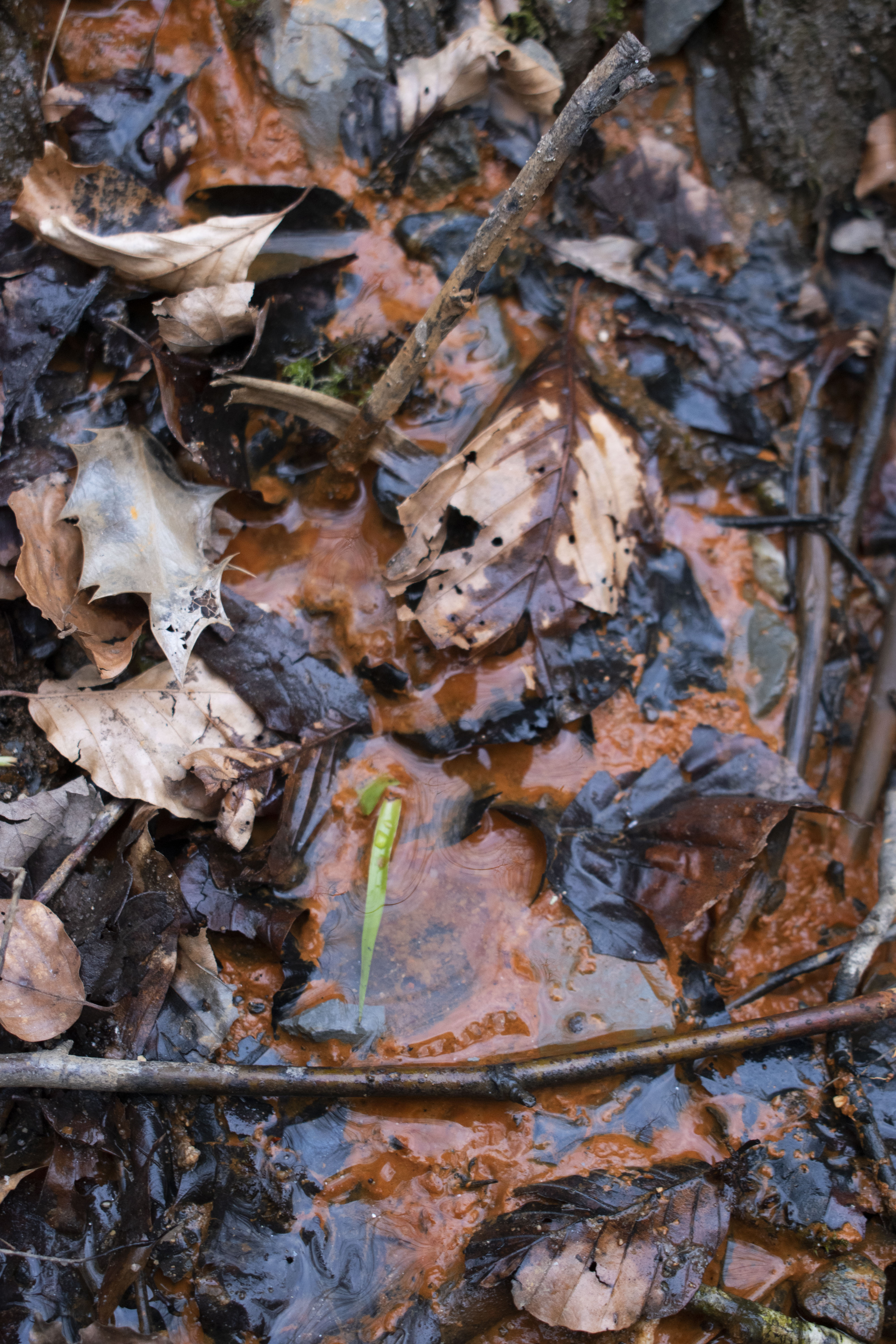
the trees shed their foliage, allowing their leaves to fall in the cool air of December, covering the floor in their confetti as they begin to celebrate the winter solstice (22nd of December)

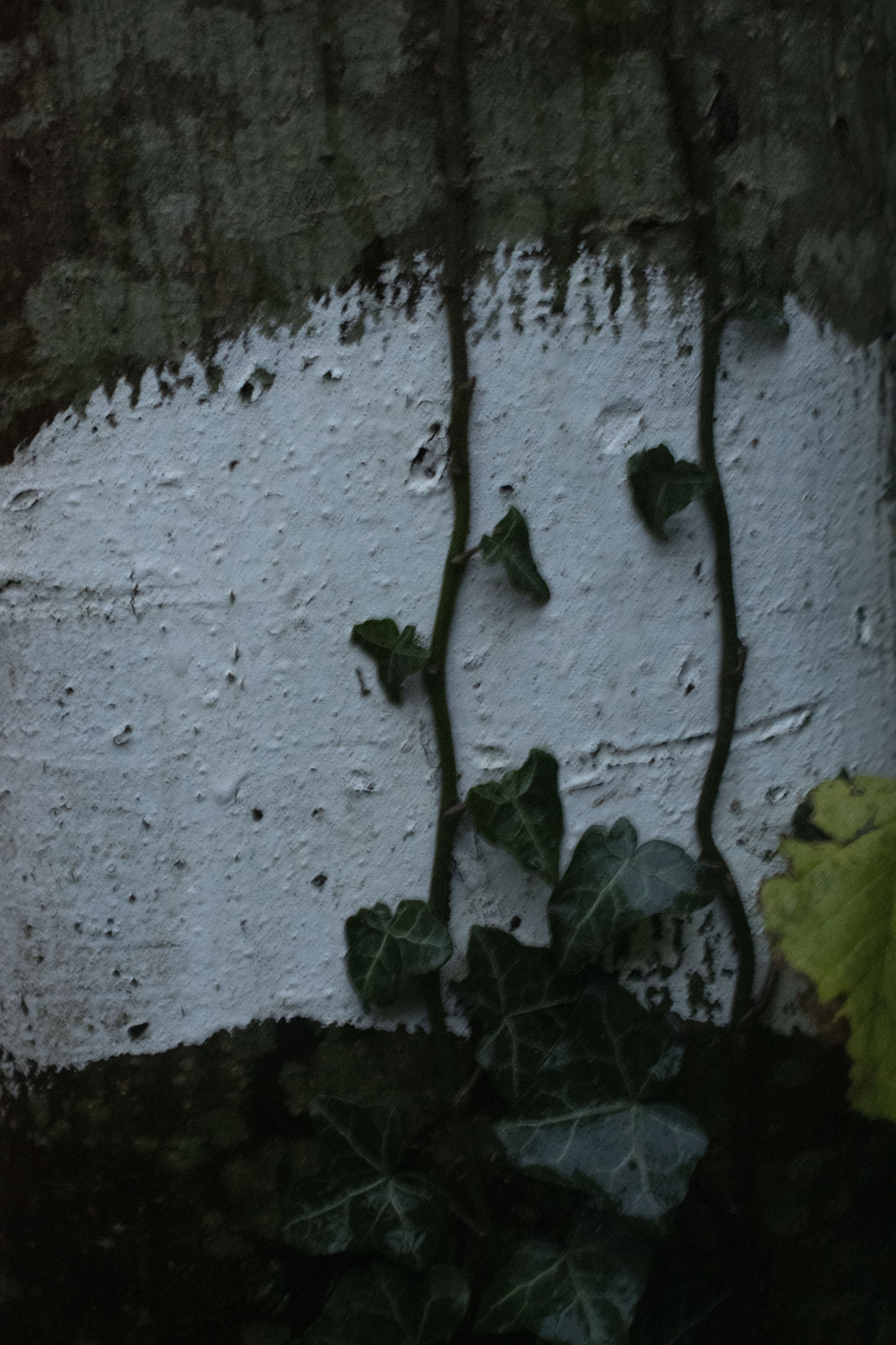
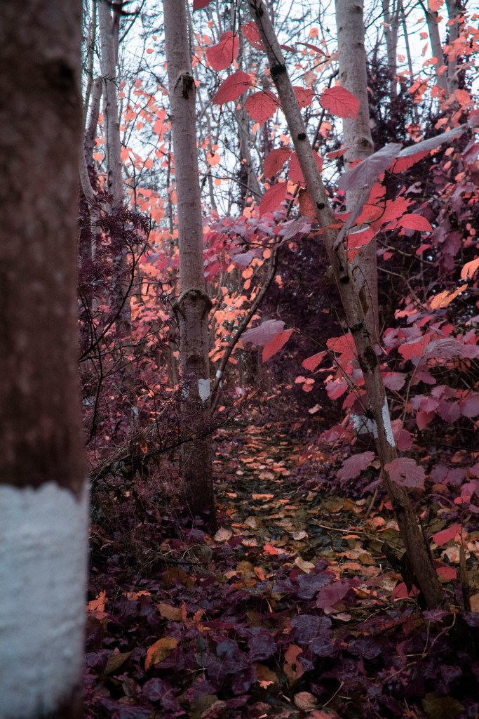
i really like this painted trail as its not walked very often by many people, they show a guide through this secluded so that one may return the way they came, maybe this coneys ideas of children’s story books like Hansel and Gretel

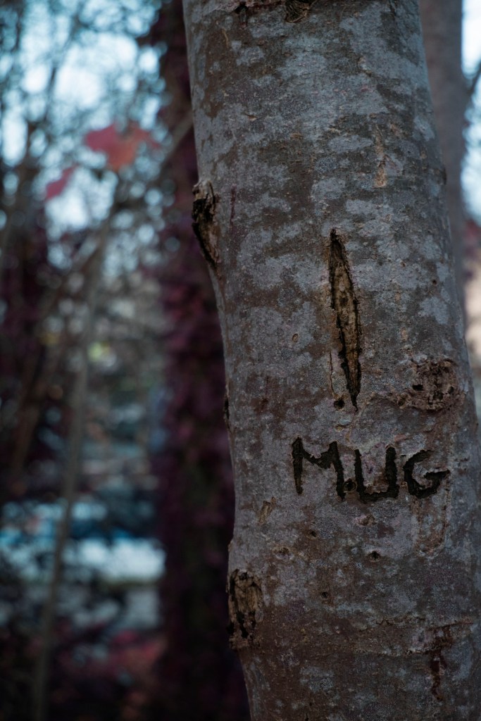
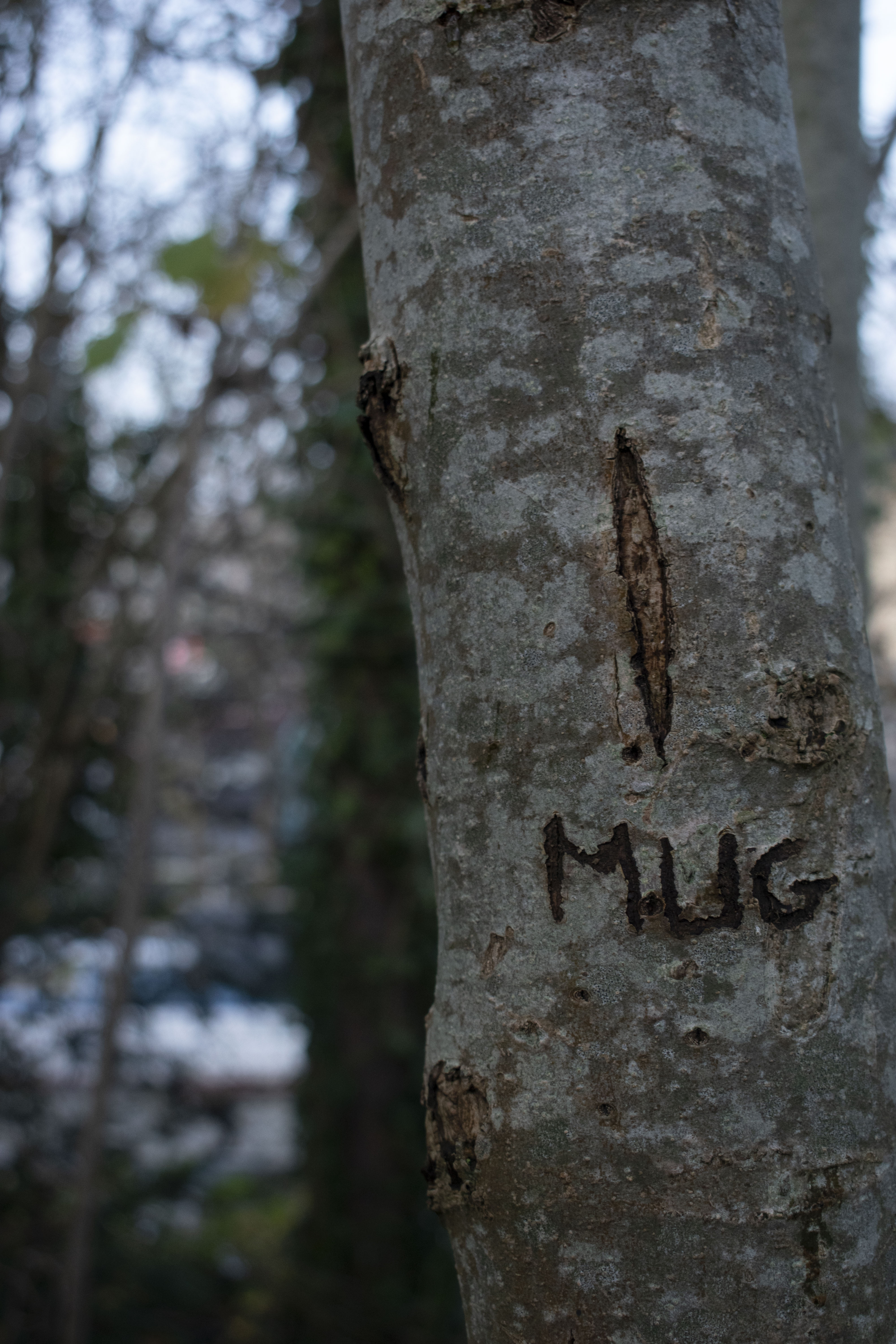
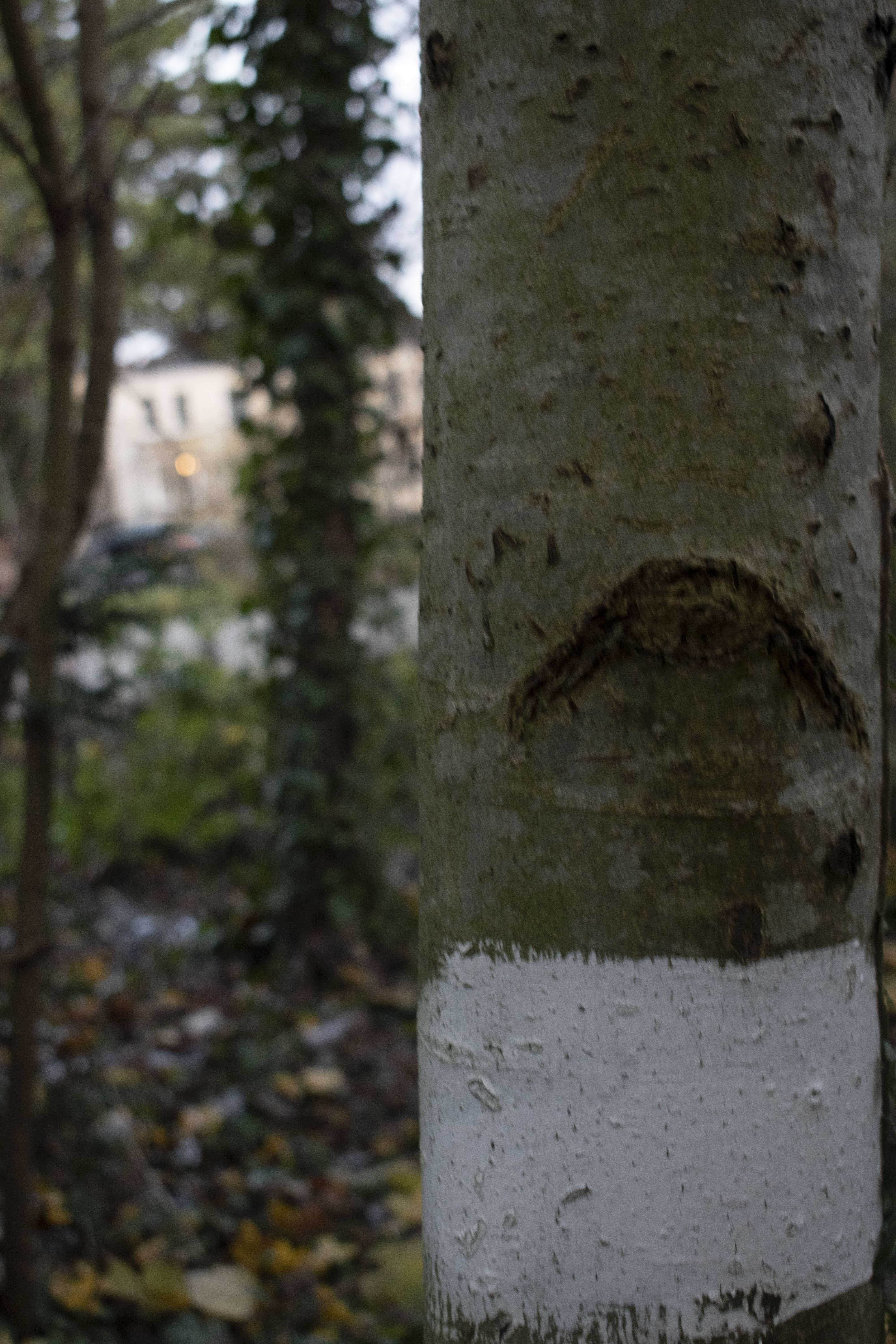
as you walk through this trail, you start to feel as if someone is watching you, as if there were eyes observing your every move, some watch and stare at you making sure you dont disturb their peace, while others are malevolent, name calling you as you walk by. a lot can be gathered and understood by these trees as each other them convey different ideas in the form of they present.

some are neutral and passive, some laugh with their tort knots warped upwards, others snarl with their vertical slits

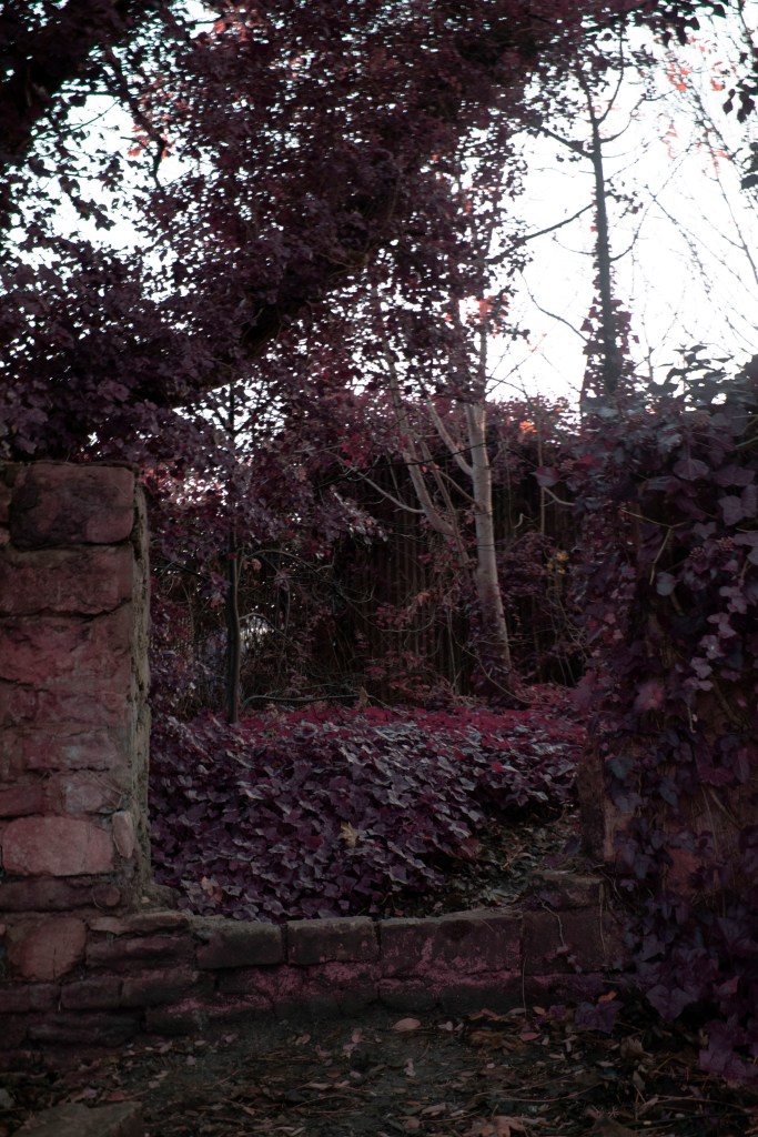
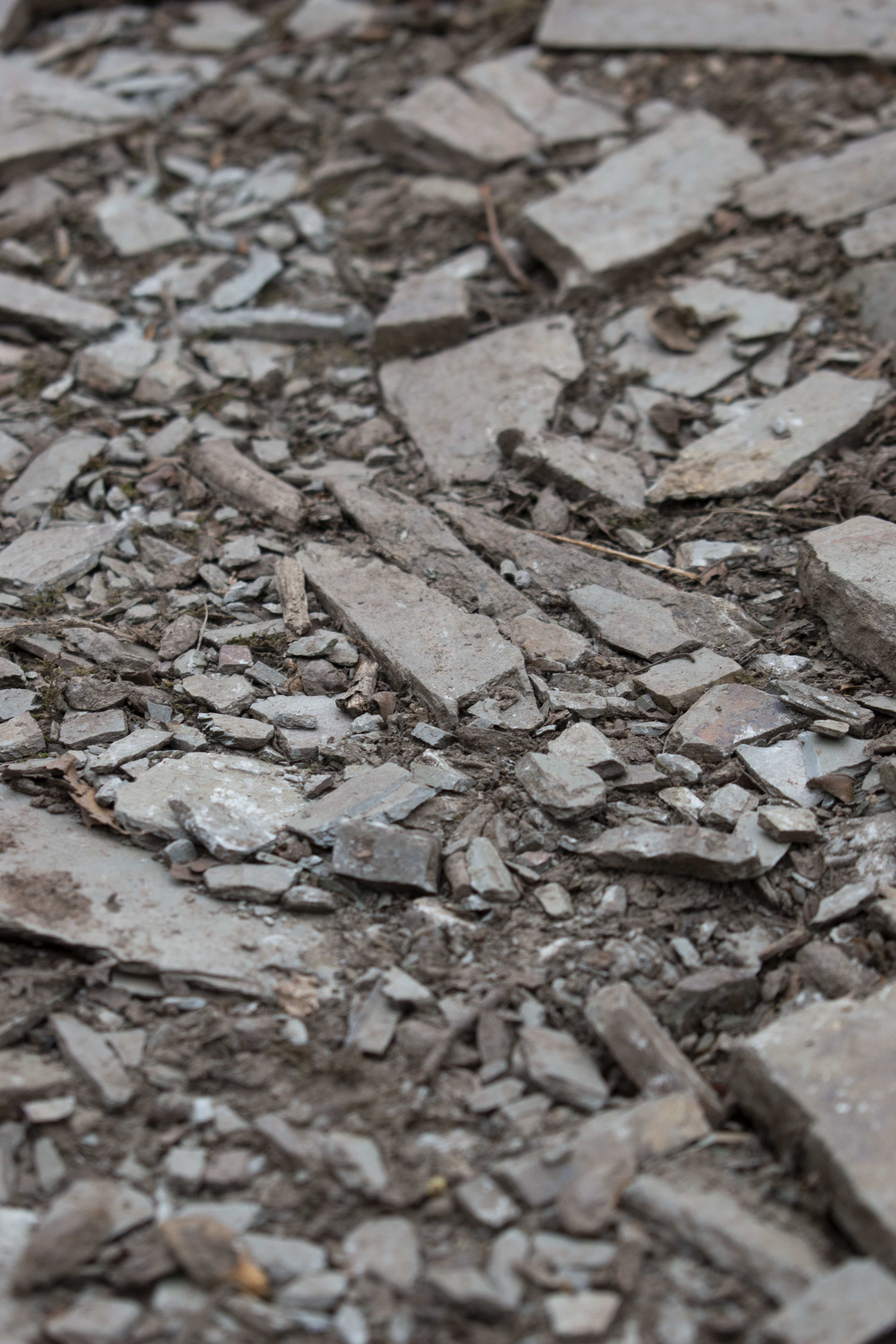
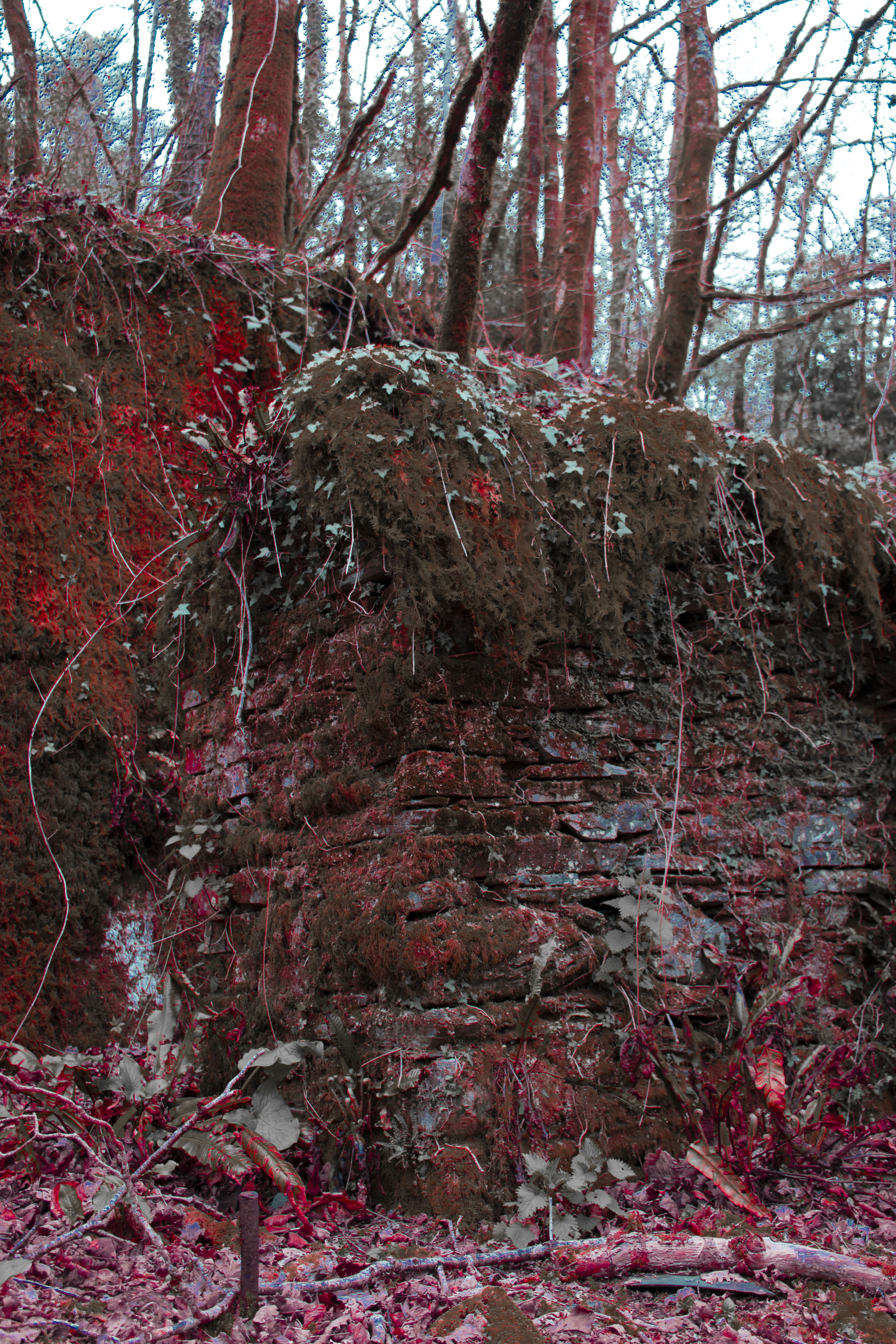
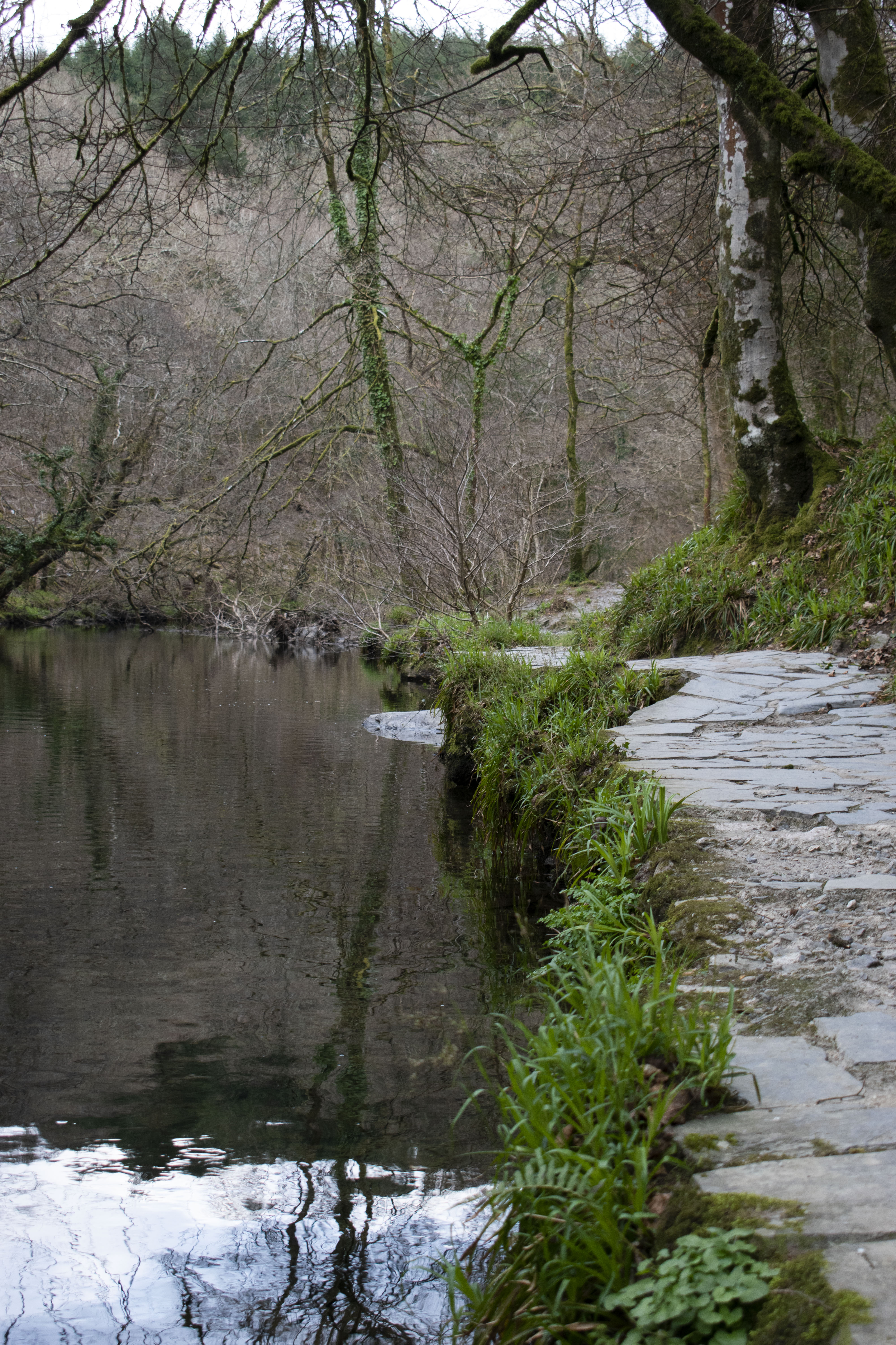
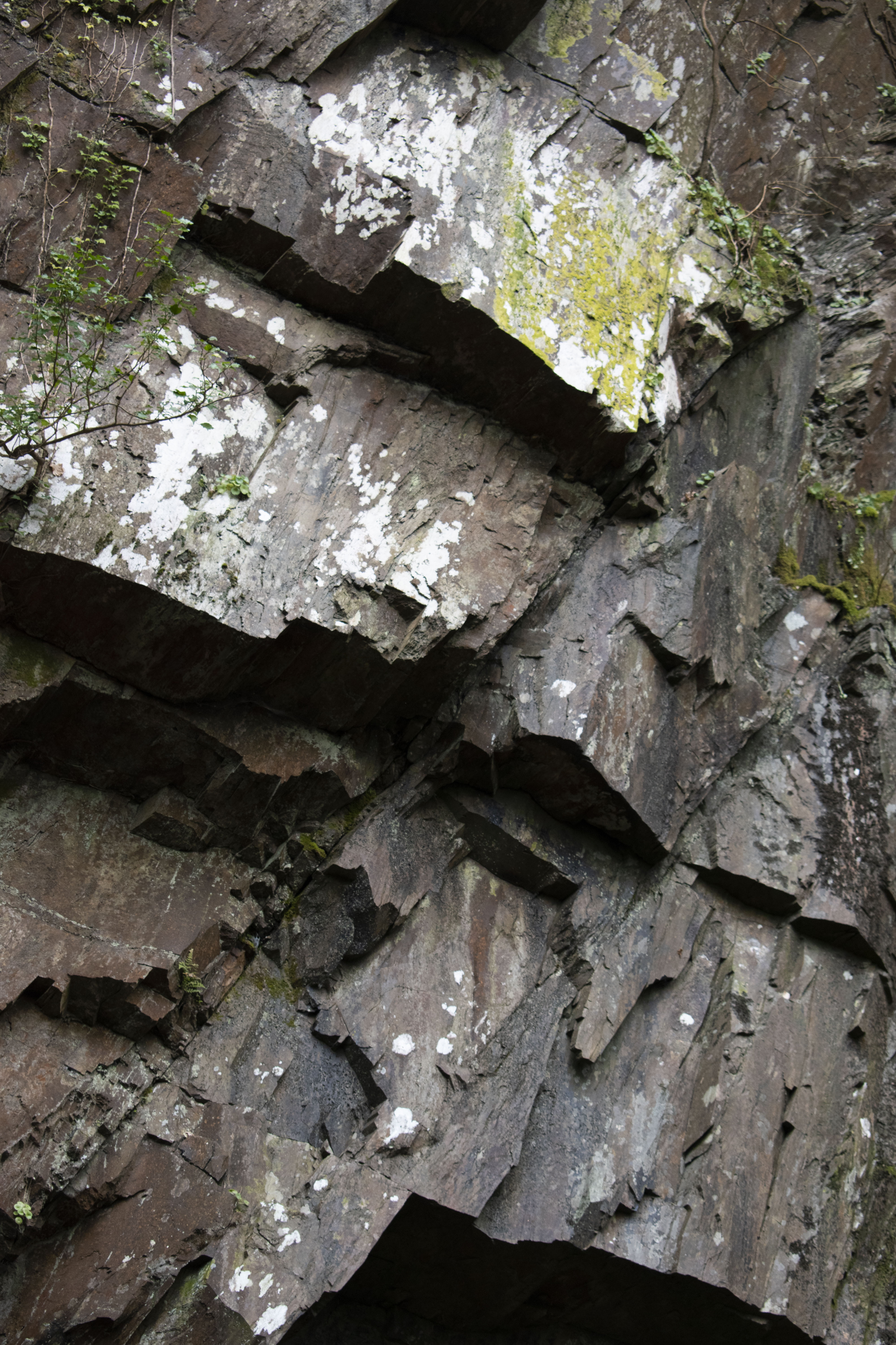
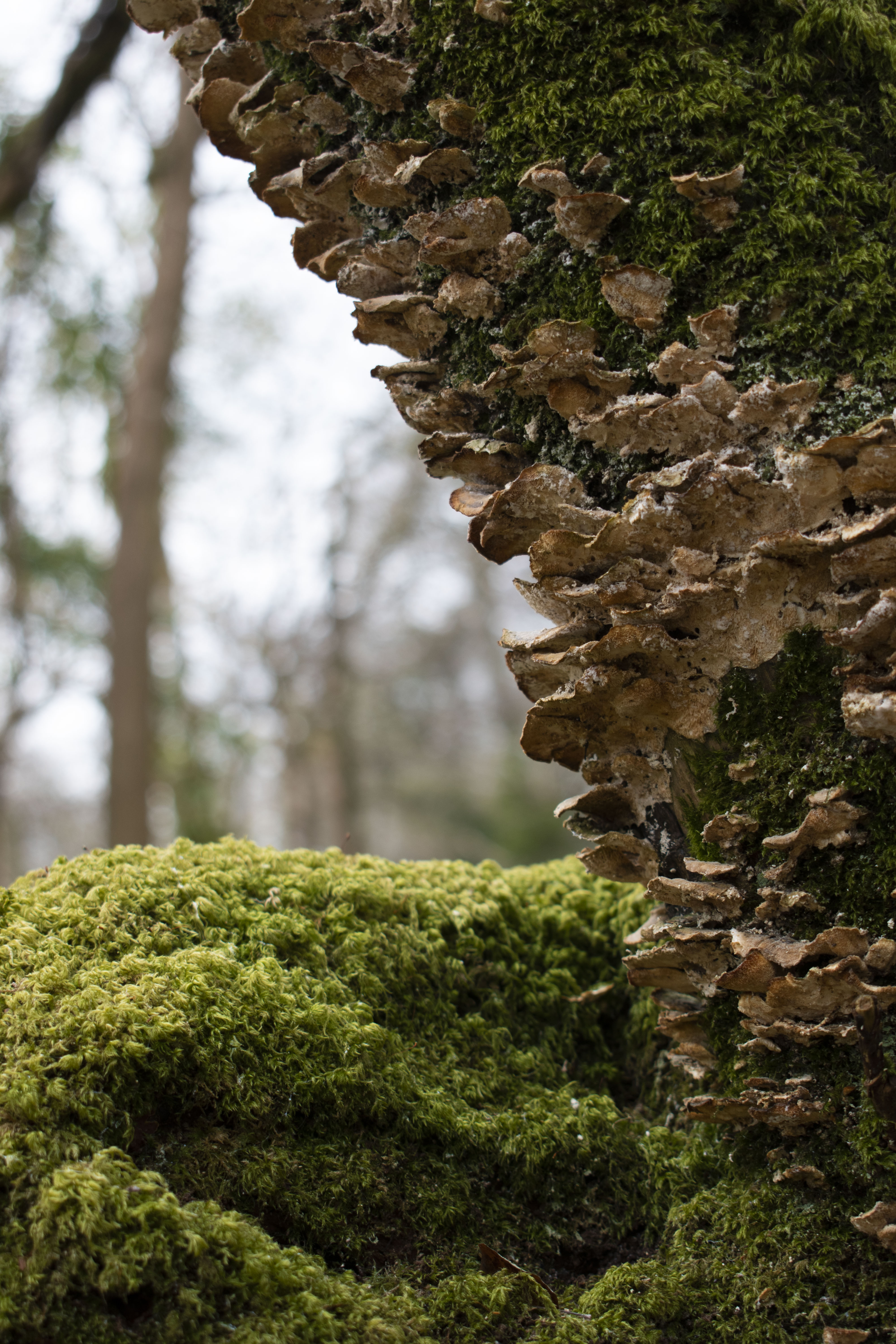
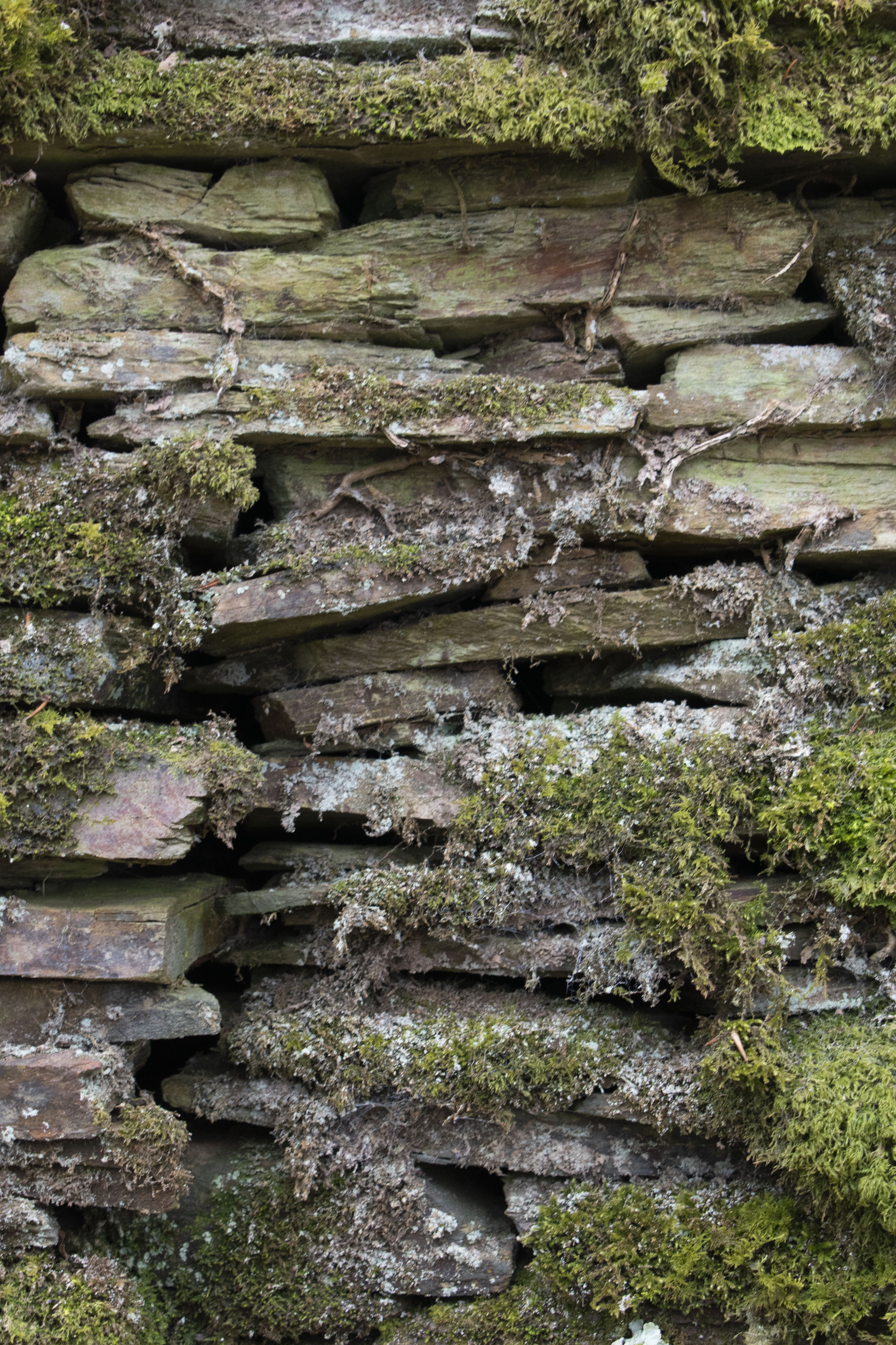
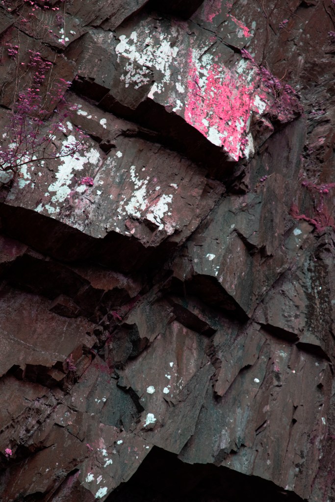
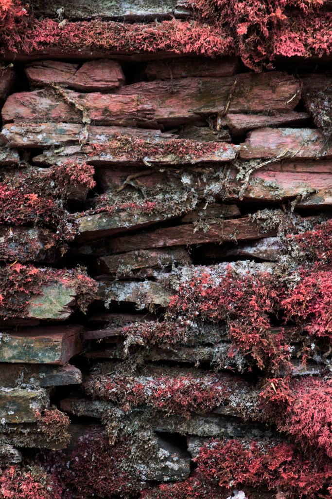
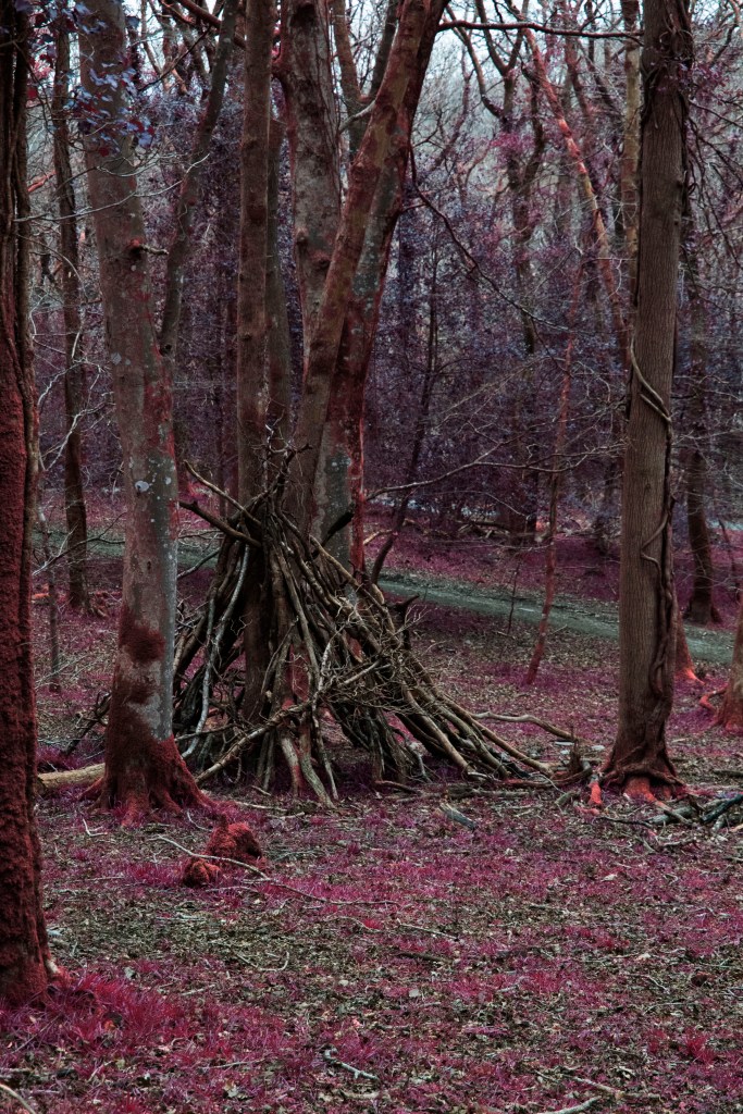
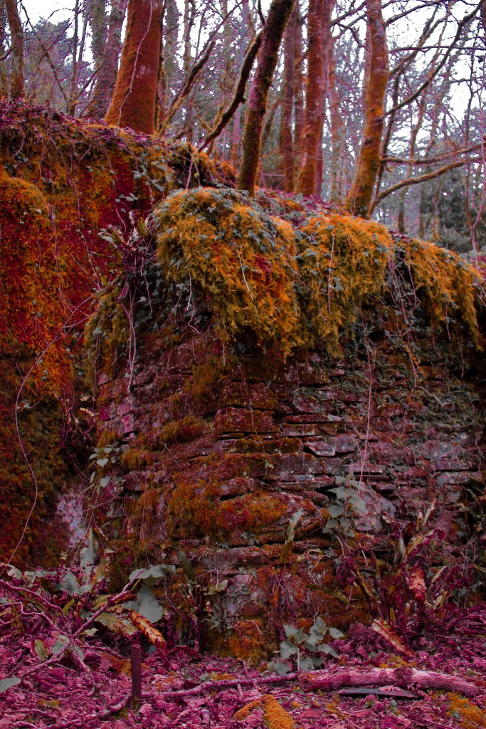
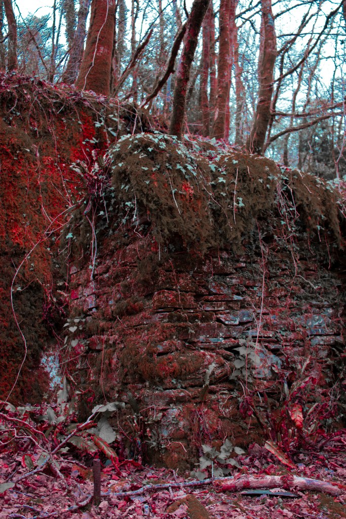
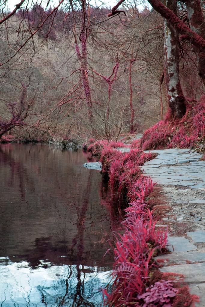
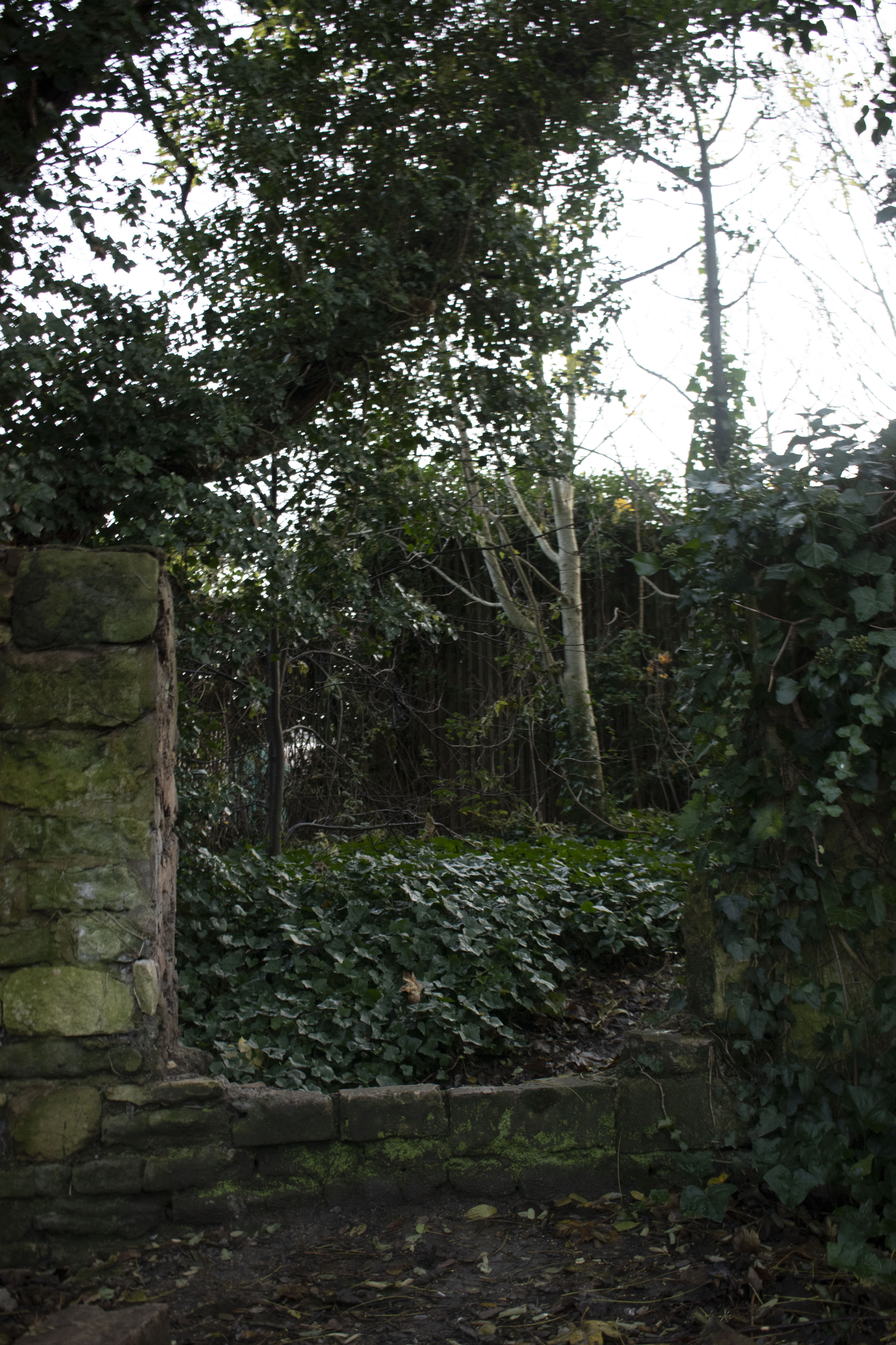
as you walk through this decapitated wall you enter this trail, it use to be apart of an old mill in bath, that probably used the river adjacent for hydro power, taking adventage of the early power generation to turn big wheels. since then the building is no longer stands there, and all that reminds is this broken wall. parts of this wall are now used as chairs to sit on

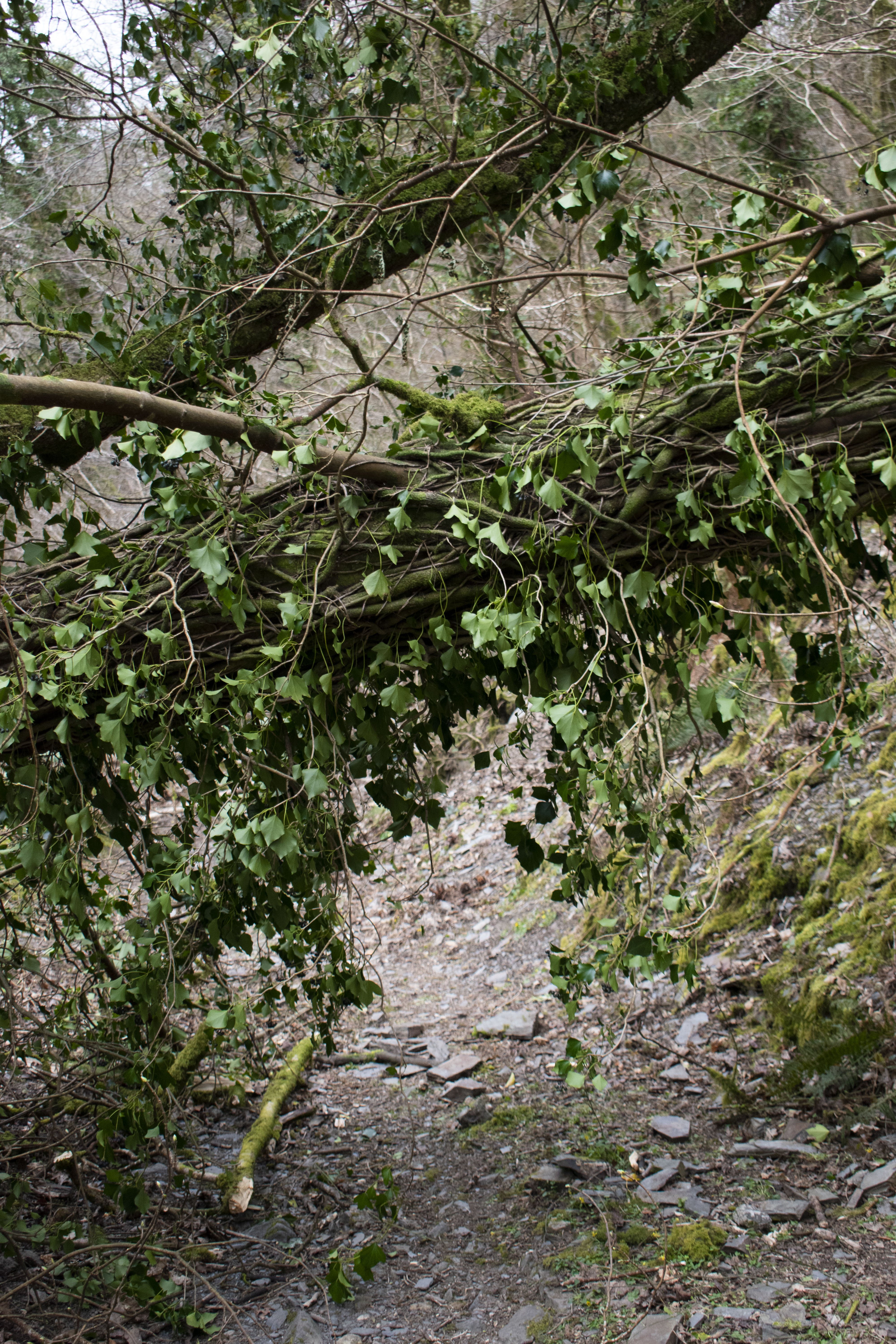
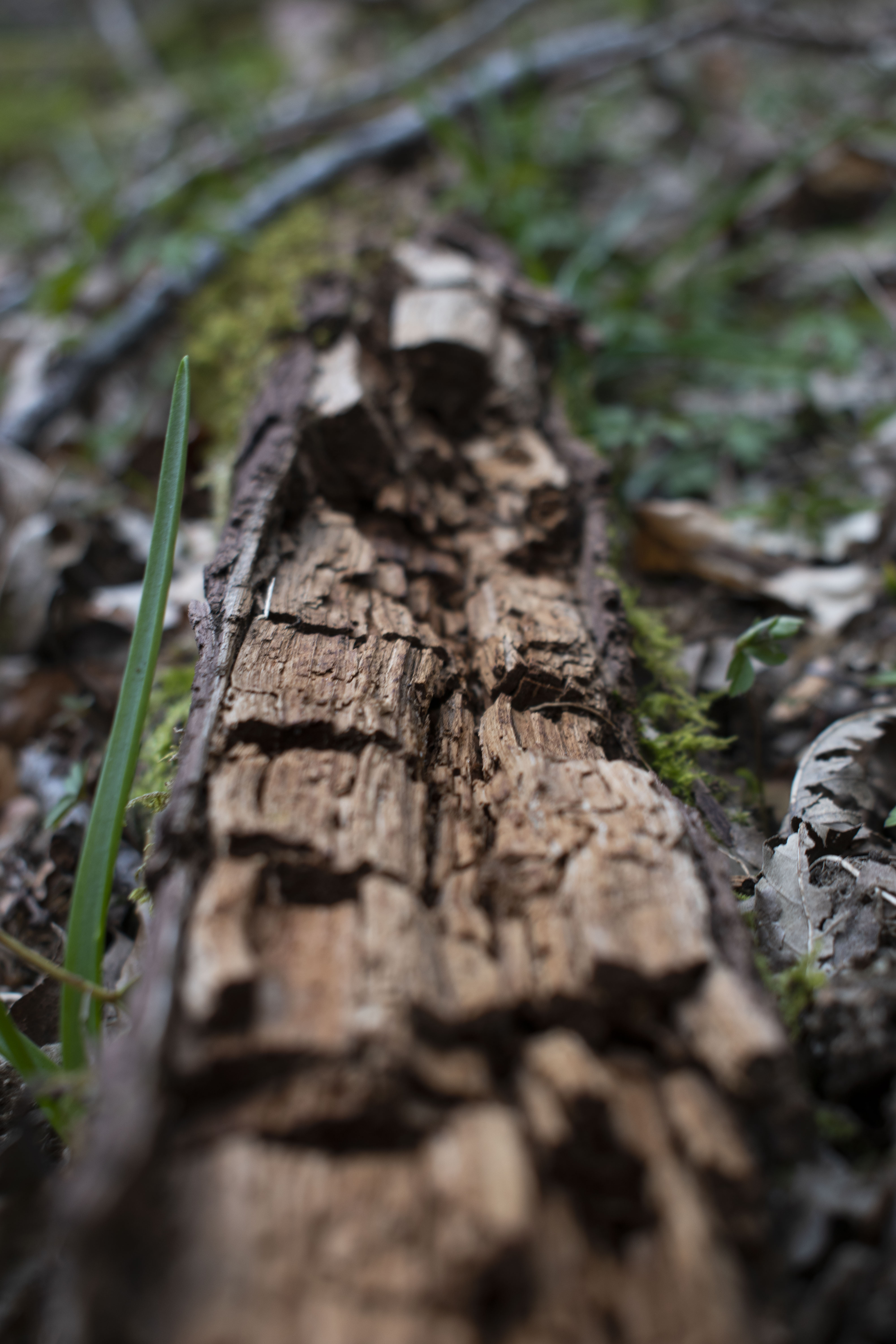
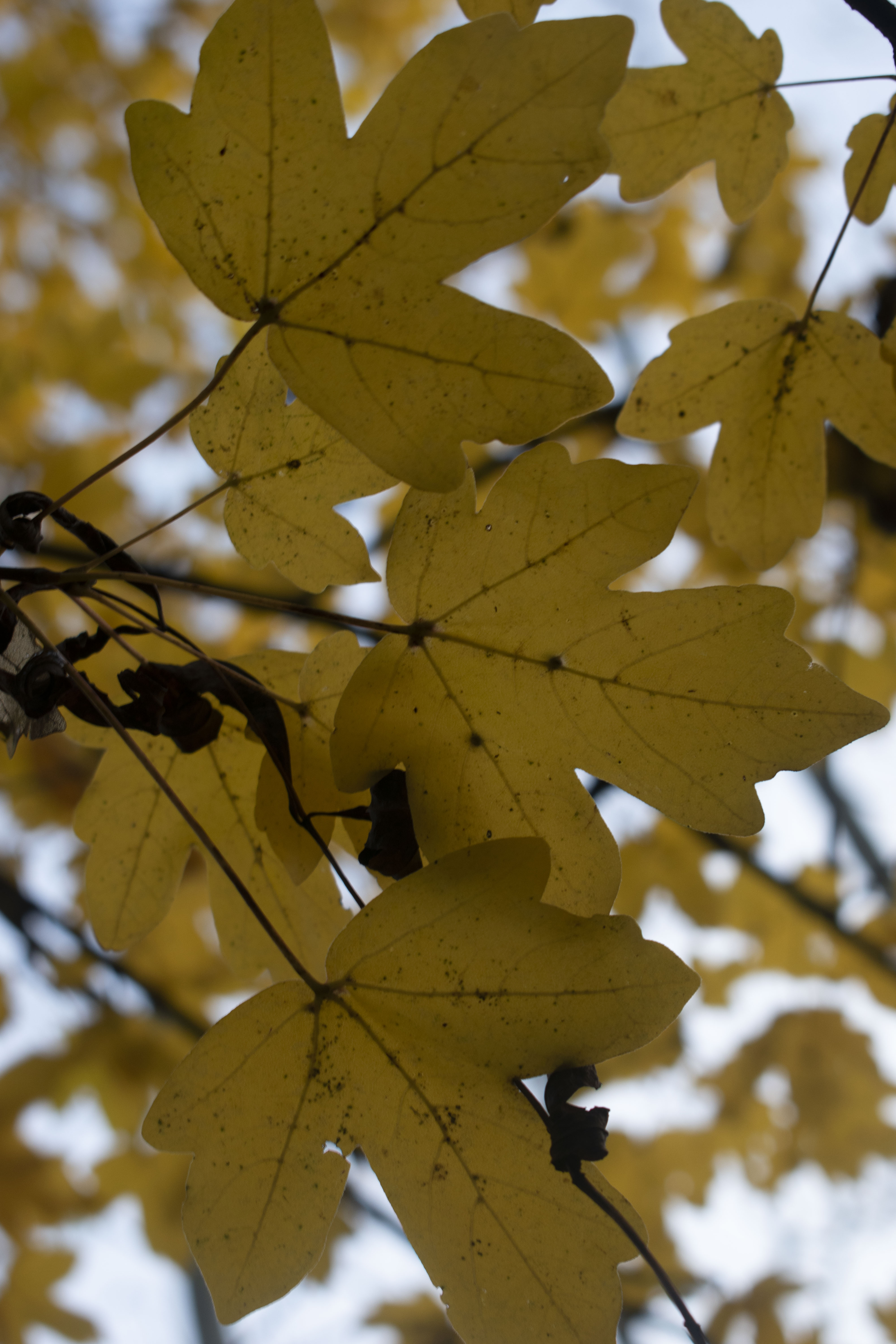
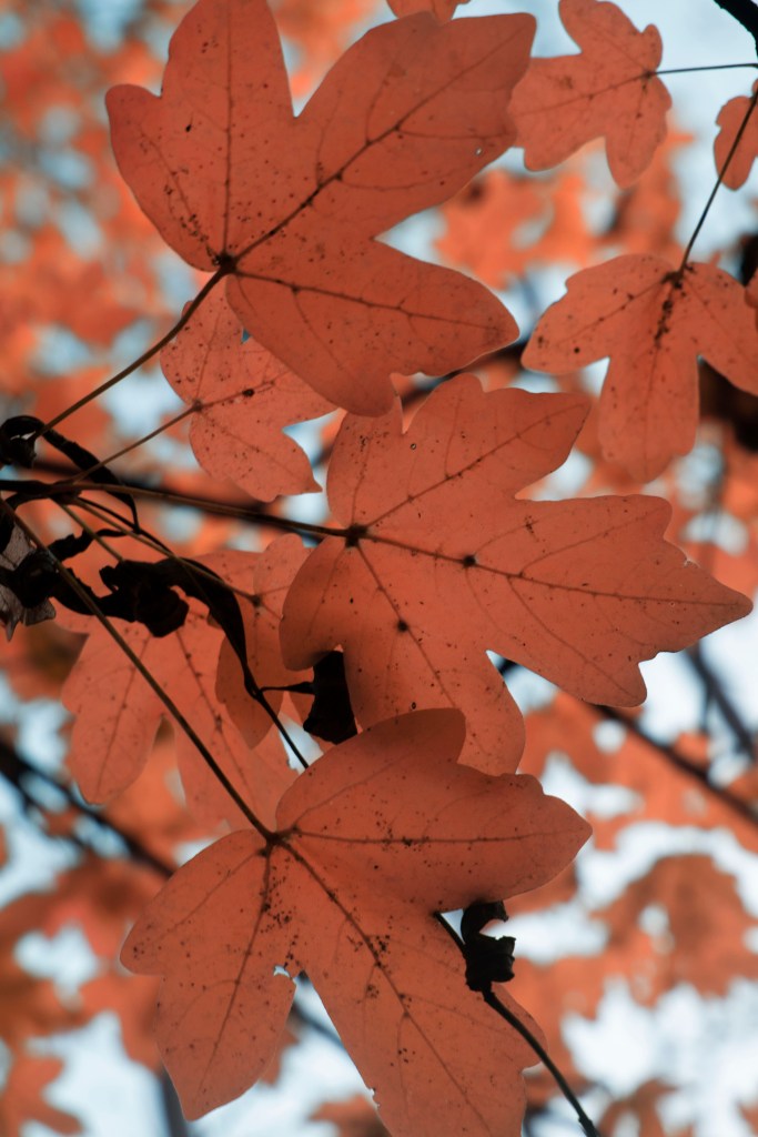
i love the foliage here and wanted to showcase this in a close up looking through the leaves and up to the sky allowing the light filter through and highlight the veins that supply tree with nutrients

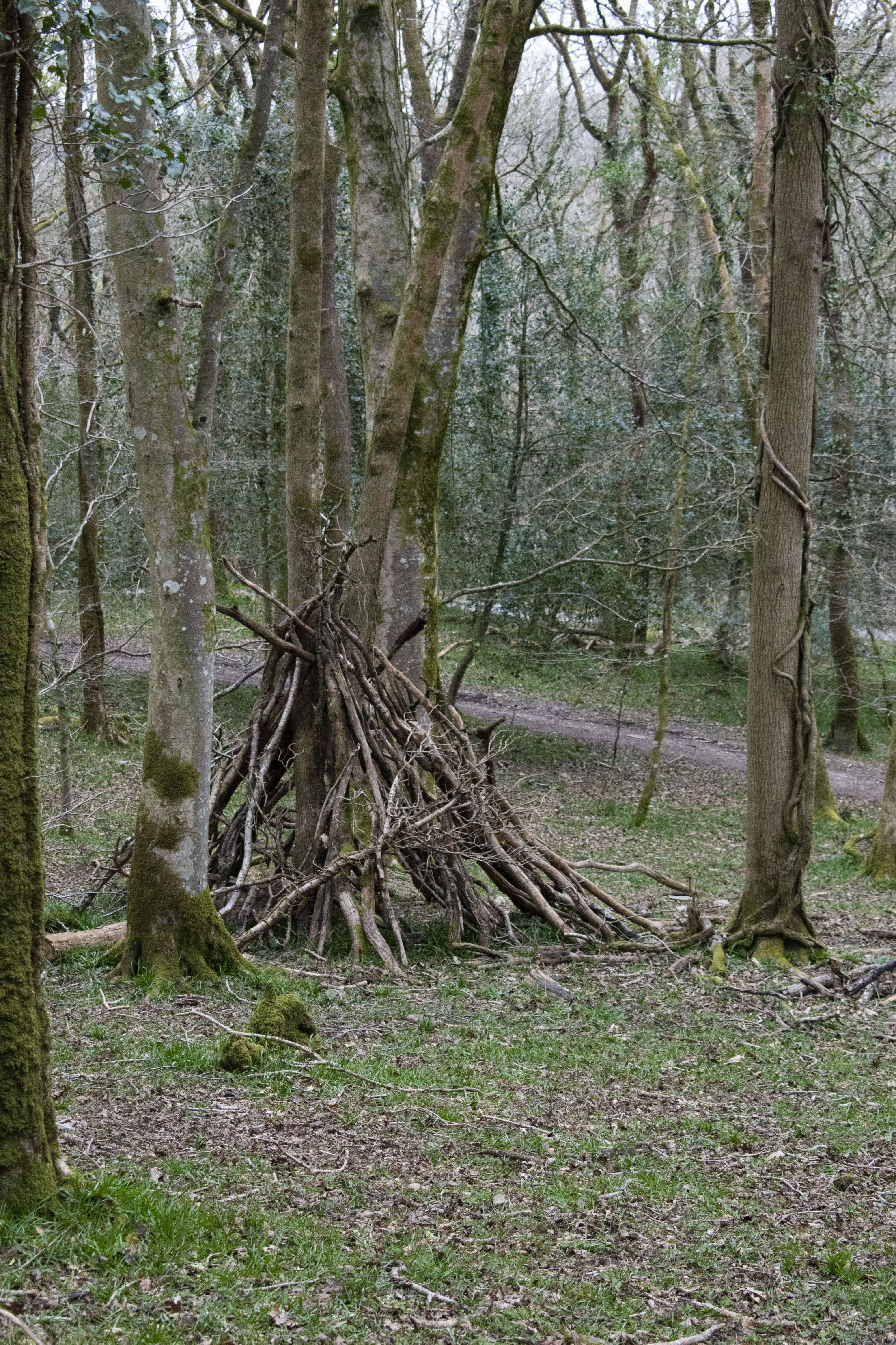
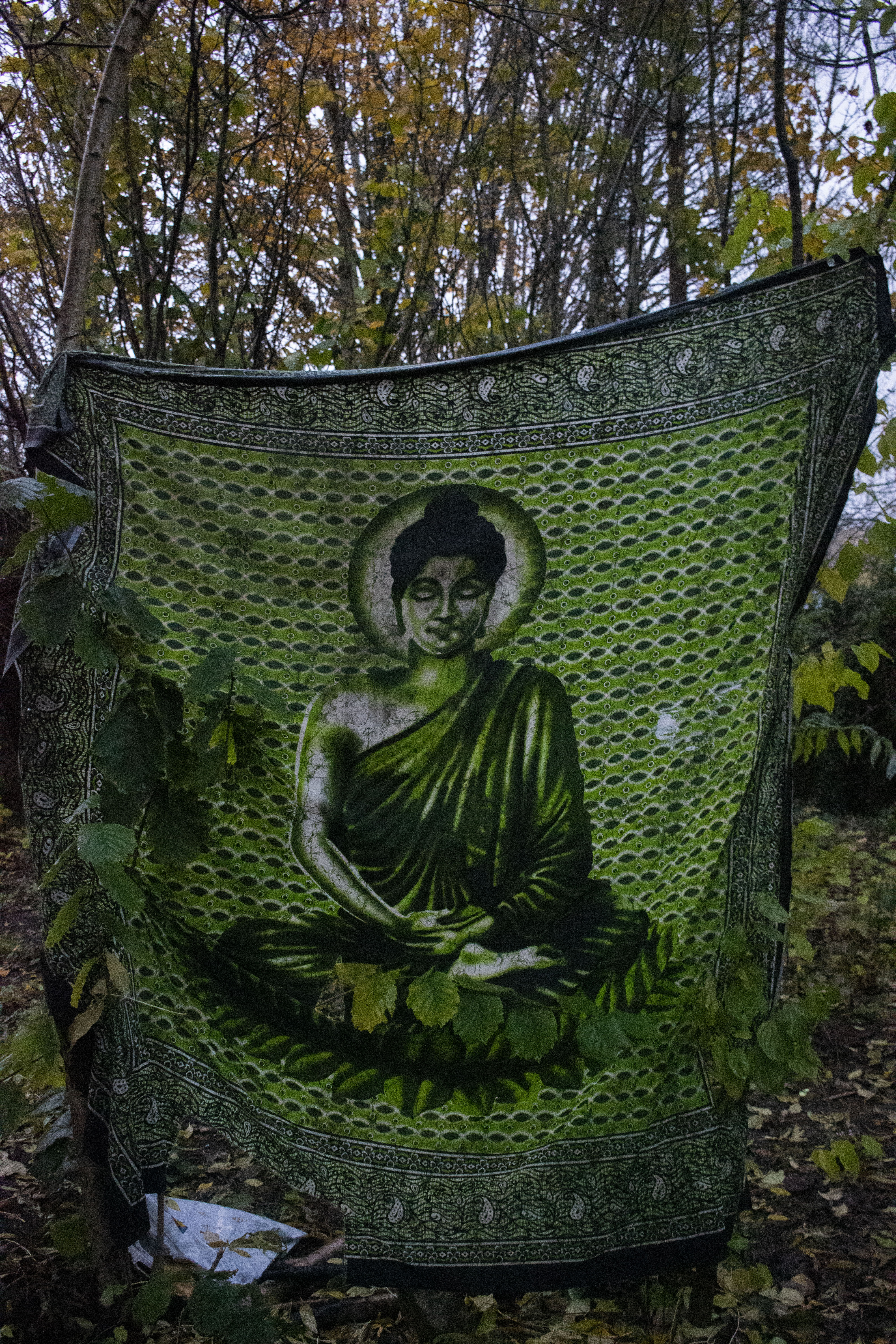
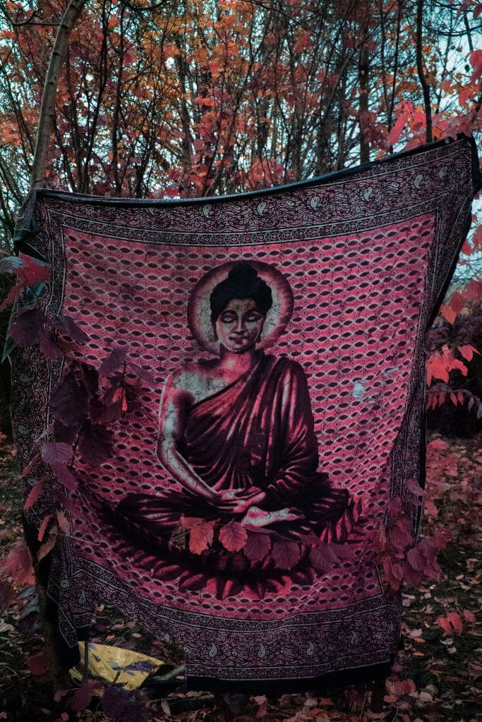
as you walk through this trail you come to a small opening filled with broken chairs and old discarded bbqs, a key feature of this opening is a green Buddha tapestry, giving it this spot an ethereal meditative aesthetic, – though talking unprofessionally this place looks like a gross drug spot you really wouldnt want to be caught in. i like the energy it provides tho, as it makes this link to the trippy eyes

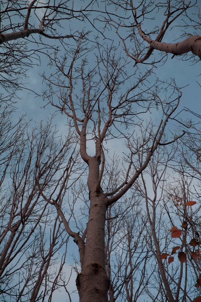
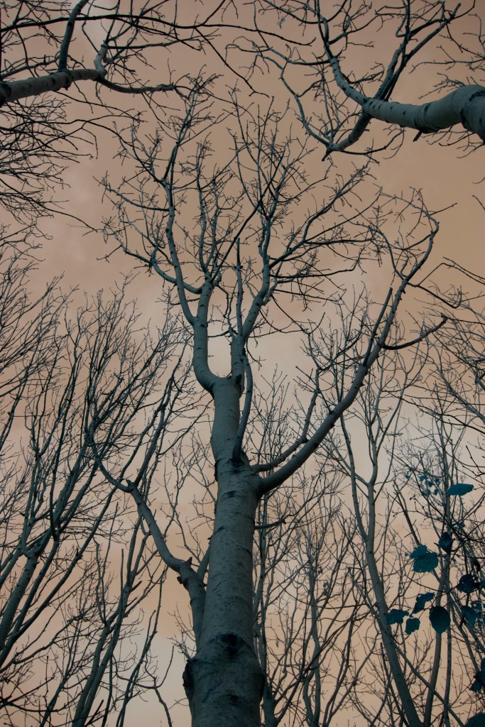
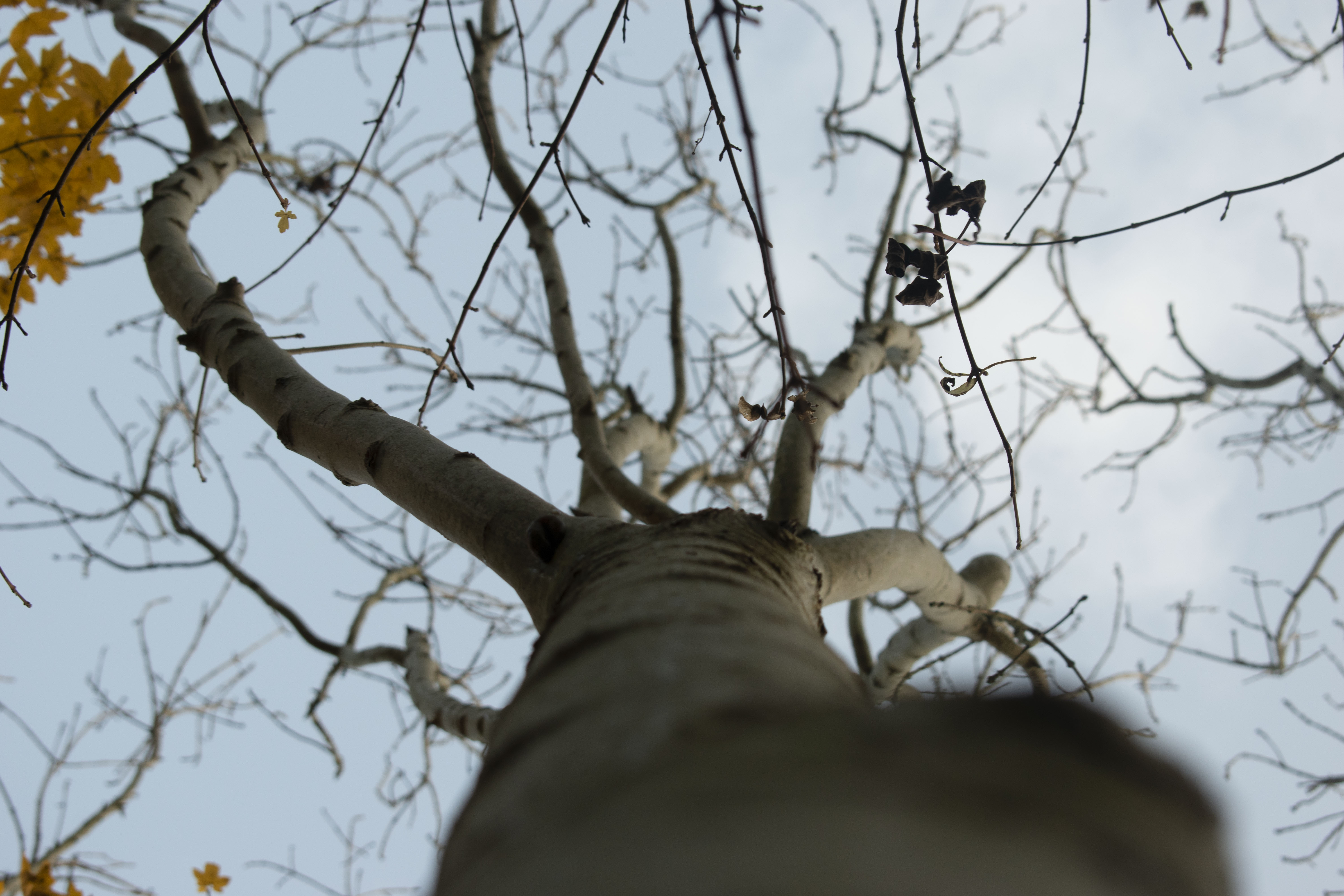
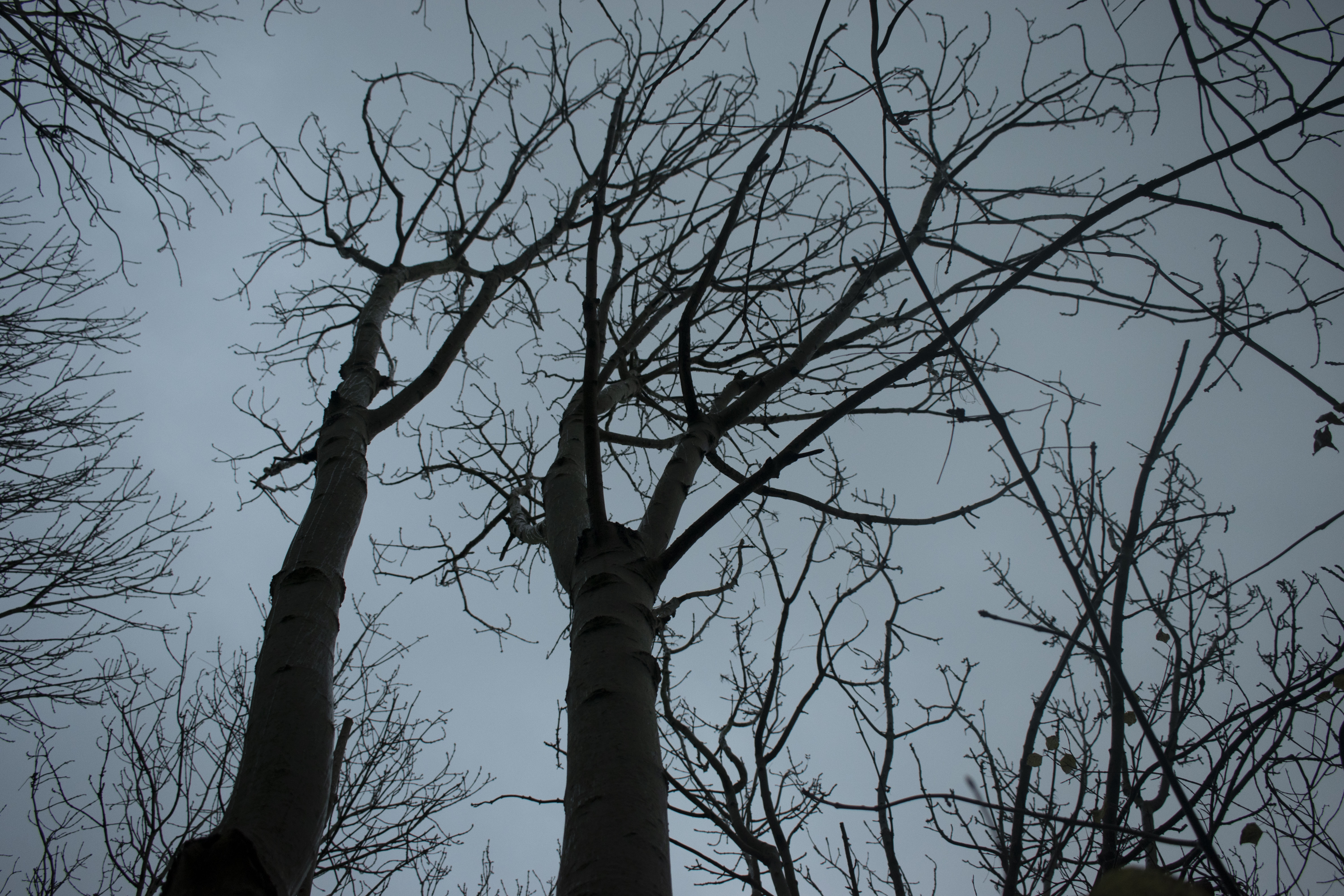
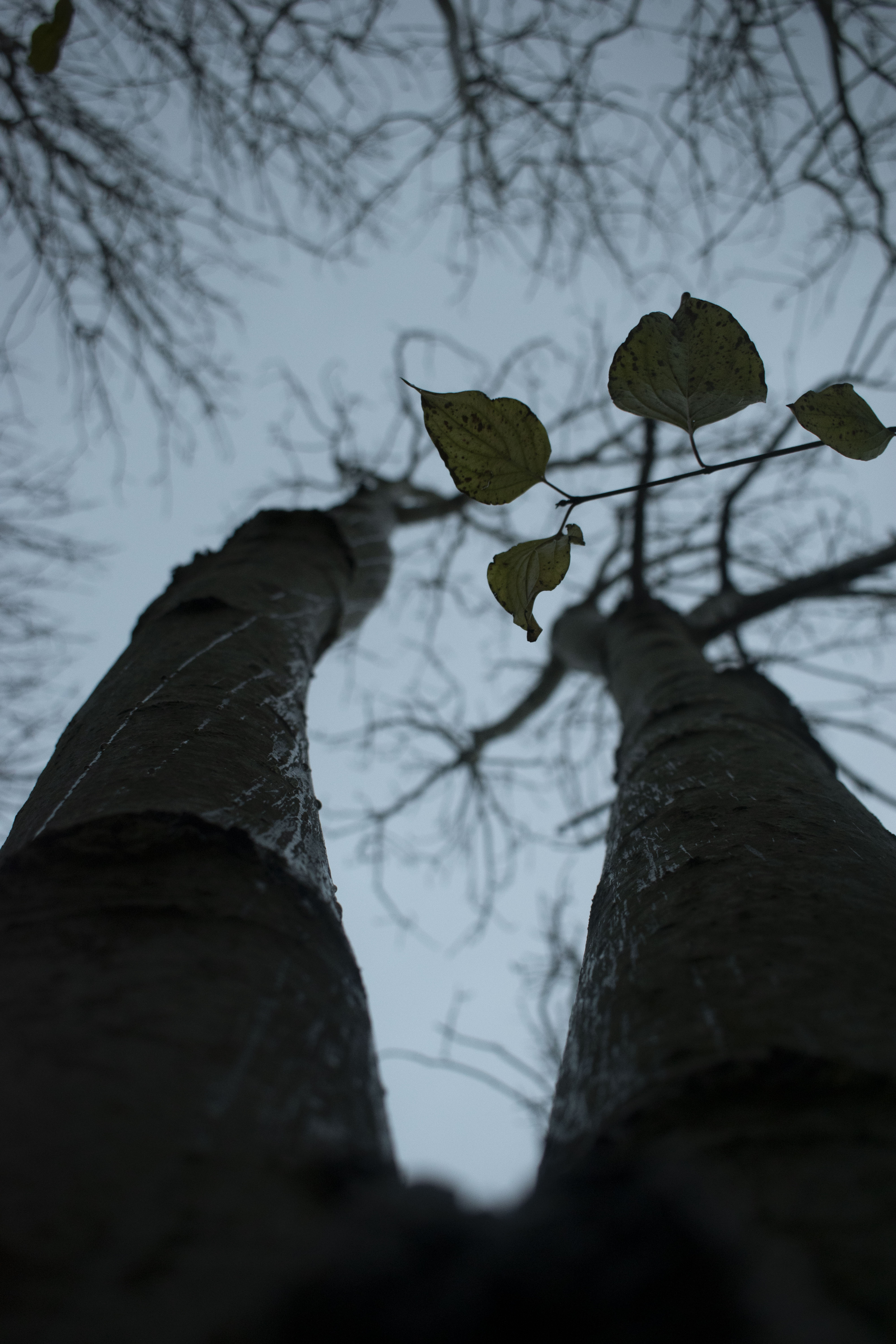
taking this view above eye level i started pointing my camera to the branches above because i heard them twisting in the breeze, they make a gentle clacking noise as they brush up against each other. subverting this prospective provides different denotations, as we look up we look for this higher presence, it looms over our heads

using my refined Japaneses style filter for the photo on the left, it presents a soft presence. while my second edit removes the color channel mix giving it a more sinister presence that looms over, i opted to call these night time edits because of its sky alterations

02.04

Nikon d3500

walking adventure in the forest taking 540 photos captured in a Raw Nef file

39 refined photos saved as raw files

refinded down to 16 jpegs

refined down to 12 edited photos and saved as jpegs for posting to social media and presenting

1 shows the infra color spectrum as it is meant to be perceived with reds turning green and not so much happening to the earthy tones of the rocks and leaves on the path

2 shows a saturated hue of +20, enhancing the earthy tone to present a more pink hue, however i dont think i like the green blood on the wing as it seems too alien, looking too unnatural compared to the recognisable wing, with this green hue it gives into a more fantasy atmosphere thus taking away from the gore and shock factor, presenting a more childlike appearance

3 shows a futher edited photo increasing the pink saturation , allowing the earthy tones appear more vibrant, too this i’ve removed part of channel mixing layer that focuses around the blood to make it more recognisable,

4 shows a refined final edit however the hue saturation layer, this tone down the intensity of the image, but also i noticed in previous edits i was starting to loose information because of the over saturation, this edit aims to combat this, helping me when coming to printing as ill have a higher quality photo

these rocks provide a unique texture, offering a solid foundation for the world to be build on, they dont offer much hue alteration but these huge exposed slates showcase the metaphoric rock shelf that has formed over the millions of years

from this we can look at the surroundings of plywood, there are often walls formed from the loose slate placed many years ago to show a train or fenced off an area, here the moss grows up the side indicating it has been some times since they were originally layed down, connoting to the passage of time

1 shows the same reduced and refinded edit that the bird wing had, keeping only a channel mixing layer and a contrast and brightness added

2 shows this but more enhanced with a hue saturation layer to increase these bold colors, i really like the glow of the wood tone and the saturation also helps with the contrast of the image making it pop more, i really like this introduction of the redder and purple hues, but it’ll be interesting to see how it relates to other images

this hut is a manmade structure by using sticks and branches to prop itself up against a tree using the tension and gravity from the other sticks to hold its place, it proves shelter from the elements of this world, allowing people to rest in a moment of thought. a structure like this other might be linked to a childhood memory of a parent helping a child build their tree house

1 uses all of the layers in photoshop, taking advantage of hue saturation, channel mixing, brightness and contrast, and an increased curves for added contrast, all of this allows for this altered world perspective im aiming for, however there is some clipping of information in this image because of the high station, maybe in alter edit i should bring this back to be more refined

2 offers a similar idea but totally different at the same time because here the curve is so far exaggerated it ruins the image, we loose a lot of the beautiful hues making the foliage appear dead and is just a bad edit personally

1 shows a unedited photo with no altered hues, alot of this photo is out of focusand doesnt present much clarity in the image, in the future i should try shooting with a wider AP (aperture) to get a wider DoF (depth of field) allowing more of my photo to be in focus

2 the edit shows strong red hues as this has hue and saturation layer added to it providing this crimson blood hue

i like this composition of this image as it splits the image, offering a water element with reflections juxtaposing the solid matt pathway that allows us to move forward

this image offers a close up of the foliage seen at plywoods, this is blossoming garlic flowers, in IR they offer beautiful purple hues. in this photo you can see the various stage of the plant, from dried out and dying to in full bloom, they give off a pungent aroma that smells divine personally, to this the petals have altered slightly, now with a subtle blue nature to its hue, it compliments the purple nicely because they are analogous colors,

i like this image because of the contouring lines seen within the tree, they are enhanced by the altered hues, popping more vibrantly than they would have. the contours offer an idea of wiggles connoting to the idea of ageing, maybe this is an older tree with these judgemental knotted eyes apposed to me taking their photo

this mud puddle is by the river seen above, without the color channel mixer layer, its orange hues come from the high iron minerals that run through the land, saturated they really pop from the browner earthy tones of the mud, in the first photo it seems to glimmer as if it were refined gold, this image appears very observational as it is from above looking down, the leaves provide detail and warning with their sharped points

week one

30.03 – 06.04

after some quick initial thoughts i created a mind map by brainstorming ideas and jotting them down

during this time it is imporant to think about quarentine and how it might effect my project because of current restrictions of being outside. lock down will prove interesting when thinking about landscapes ideas

this brings me to ideas surrounding escapism because in these times we might search for a way to escape this reality as we cant faffem what is happening around us as invisible viruses infecting our loved ones and friends. for these reasons we might seek an alternative reality to immerse ourselves in

from this we might extrapolate this concept to thoughts of a childhood adventure or fantasy imagination, allowing us to identifying a genera for this environmental world

While at Paris i attended PolyCopies event, where i saw a book by Richard Mosse titled ‘infra’ which captured the landscapes of republic of congo in beautful hues of pinks and reds by using Areochrome film, and has inspired me for this project. these altered hues proide a new contect to the world we preceive making us take longer to observe and think about the landscape. Areaochome has since been discontinued by Kodak with limited supplies being bought up by other photography fanatics and collectors. though some are still available due to the high demand and now rarity the prices have inflated.

however this does not rule out the potential use of different mediums, maybe companies offer alternatives that provide a similar effect with hue color shifts.

one medium to be explored could be digital as applications like photoshop might offer a way to enhance the aesthetics of a photo through digital manipulation. this would proboably be one of these easier and cheaper methods for altering my photos

another method could be using a red filter for a digital camera providing photo void of yellows and blues by letting in only red light through the cameras lens, this will provide a red photo to be digitally altered to a black and white photo, this wont give me the strong hue shifts like areaochrome but will provide a different connotations to my work, allowing the viewer to focus on form and composition, rather than the color

other ways methods might using analogue film, which might be interesting to get a hold of outside of uni

another medium like this to use would be like lomochrome purple film as it provides these trippy purple saturated images that convey an other worldly idea, fitting into my initial ideas and at a lower price

Rollei Infrared Film 120 would provide a black and white image that would focus on the infrared color spectrum reacting to the bright greens of nature, resulting in a strong white

Ilford SFX Film 120 B&W produces a producing high quality and contrasting black & white image, similarly to the rollei infrared film, its recommended by Analogue Wonderland to point this film at vegetation to the full effects of its potential

data editing

made using notepadd ++

following a youtube tutorial i was interested in glitch art and how directly editing a photo file might alter the photo, however this largely make the file unuseable so many this isnt the best way to be working when trying to make glitch work

next i wanted to expirment using photo copiers with some of my a5 posters, these shows varied results as it wasnt very predicable how they would come out since the paper would be face down when i moved them.

trying with larger images i used my acetate sheet, i combinded some screen printing background

to start with i dragged the acetate, im not sure i like these results as they kind look goofy and not very professional


real world examples

foldable inforative poster with art on one side, information and text on the other with a small activity for entertainment reaching a younger audience


trippy promotional poster found inside a promotional advert booklet, interesting design and way of displaying information, look kind of crowded though


informative free handout found in london with relivent information, large map on one side with a smaller tube map on the other, it also shows adverts and points of interests in the local area, pocket side and foldable for conveniences

second aether discord

official second asether poster, not my work, i couldnt find source

thom was given a half hour slot to play at 6am GMT, and played along side other artists inspired by porter robinson during this lockdown. thoms music would be streamed through a discord channel while he played in a lobby and acted as a public figure for his music, there were quite a few people at this even. i even was able to ask the admins of the server for flight permissions but didnt get them granted to me. treating this like a real shoot i took screen shots of the game, while thom as on a stage that he built, i was able to get diffrent angles and talk with people in the community


it wouldnt let me post the link so ive taken a screenshot, this was only meant to be a small event but got quite a bit of media attention and a following

PP3 Evaluation + Final Submission

as i write this at 4:35am 29/04 my printer is out of ink and i have ordered the wrong cartilage to change it, i needed a 302, i ordered a 301. this seems like a small difference but one that is pissing me off because it doesnt work and wont let me print my work. because of this i will have to use photo approximations of what my work should look like rather than having a physical copy to present.

this process would have been a lot easier to display and put together as my multi layer physical object rather than recreating it through photoshop showing different layer

before this took place, i ordered supplies online to print my work from amazon. my idea is to produce a dual layer poster combining all of the things ive learnt during this project. i hope to print a background base image onto the gloss paper and have a transparent overlay of thom, coupled with text and a qr code to suit

before running out of ink i was able to produce a lower quality piece but i feel it well precedents the concept for my final idea, minus text and qr code however ignoring the color as my printer at home isnt able to produce the same quality as the inkjects at uni.

before leaving uni i also played around with the transparency of my images by creating an a3 print sheet of thom on acetate while screen printing, i layered this over one of my glitched background textures and liked where it was going however the acetate was too opaque for the background to shine through, this is where my OHP film came in handy

here is two of my samples testing out the products i bought with an poster made earlier, i was happy with this bench mark, this is also the same image i want to use for the transparent film

knowing i wanted a qr code, and dual layers i decided to separate the black from the white to make it more visually interesting as a small detail, to do this i took the code and seperated the layers with the magic wand tool and made two layers for the white and black respectively. the black part would fit on the transparent film where as the white would just be a small blank square on the bottom right of the poster.

<texture>

< CYMK Printing >

< 02.03.20 >

adding them together you can begin to see how they might work together, along with all the layering done in photoshop to create these two images, ive intentionally left out any text in from photoshop as it uses pixels to generate its images which could fuzz the lettering, there are better soft wares to do this and i’ll transfer it when time comes

however that said, i want to text them out before transferring,

< fonts >

MX TWENTY TWENTY is in a Javanese font and presents itself to be a thicker stroke and tightly packed together

HEX0SHERE is in a MingliU font, appearing more slender, both thom and i in the past have agreed we like this one more and i feel this is still the case, i just wanted to confirm, i then saved each layer as a png so that they would have transparent backings

opening my poster into indesign i created a A3 document with plain white background and layered my two pngs on top. using control+shift+alt+E i was able to fit the poster to my designed frame as the Photoshop file was bigger.

i was then able to introduce the MingliU typeface, i oppted for white as this had a higher contrast from the background than a black font, this helped provide clarity between the two making the words more readable. i set the MX to a font size of 80 to create a higher archy compared to the 65 of HEX0, this made it more domian as it hangs over the text below since this poster is meant to advertise the mixtape, thom already has a small fanbase and is kind of known within his community so this became less important. this also works as the eye reads right to left, top to bottom, HEX0 the name becomes less important

the MX also snapped to a grid allowing me to centre the text and then use that as a guide line to place hexo at the end of the text. this sizing difference also helps separate the two them as individuals so that the reader doesnt confuse it as YHEX0-. it makes it flow a lot nicer, as well as framing thom to be the centre of the of the picture even though he is off centre

using control+E to export my final decided to make it a jpeg so it was widely usable on social platforms

over all i dont feel ive fully achieved all the goals i set out to do for my client, and i probably realised this early in the project.

thom has a such clear idea on his personal branding and identity because it comes from his own mind he has full creative control over his identity and knows where he wants to take his own work. this body of work is an interesting look into how two minds come together to produce new ideas. a lot of thoms work is digital and i tried to produce something that was physical, this meant it might not have reached thoms wider audience and only really hit locally. however because of my printer errors i know have a transferable file rather than a one of production material

during this project ive produced a lot of practical work however i have been dealing with a lot of behind the scenes stuff because of this my written work has suffered by the sidelines and isnt where i would hope it to be, there have also been a range of hiccups that cant be ignored like covid 19, and needing to move multiple times within this.

however in terms of creatively i am happy with the product i produced even though so much more could have been added and worked into it.

‘ I think the colour scheme works great by removing all colour from the foreground, but maybe some blending could have been done to make the photo and background feel more connected ‘ – thom morley – hexoshere

Poster design

17.02.20

after my shoot with thom i was inspired my the Russian constructive movement for the geometrical patterns and use of bright uniform colors, here ive tried to do a similar thing by choosing to incorporate the leading lines, highlighting thom and his guitar, ive also chosen to use a russian style font to enforce this idea, however i dont feel this really suits thoms brand identity and might need to rethink my ideas. in this photo youre also able to see the back drop and how its buckled, this looks really unprofessional and i might want to reconsider using a different photo

working with a different image, thom and i spoke about different types of fonts to use <fonts> i’ve chosen to use a soft blue to appear calm, however this doesnt shows a low contrast between the background making it awkward to read from a distance, ‘who even are you?’ refers to a song lyric featured in MXtwentytwenty, i then followed this by placing ‘Hexoshere’ to show thoms identity with a QR beside it linking to his soundcloud, this is a compact way of displaying information directing viewers to where they can listen to his music. i also chose to turn thom into grayscale as a way of playing with color however i feel this doesnt work as its too simple and i could do a lot more with it.

02.03.20

a public test board shared with thom, sampling typography, qr codes and color palette

looking more closely to colors with thom ive chosen to use Pink 223 C and Bright Green to complement this. to create the background texture i used thoms fluffy coat because this relates to his personal identity. I put in photoshop with a halftone circular filter connoting vibrations of this are to indicate the idea of music or sound reverberating from thom head. over thoms face is used a similar effect done with dots to create a gradient and definition of thom. to this ive placed text over the image trying to be creative with were they have the same letters making the intersect, MXtwentytwenty is thoms MiXtape coming out later this year

from here i tried to change the colors of thom so that he would stand out more and not get lost in the background, i feel the different textures of the circles and dots do this well but wanted to try and increase the clarity between them. i feel this makes my poster look messy though as there are too many bold colors interacting together, ive also introduced QR codes in the bottom right because this is how the eye reads from right to left. so this is the last thing you see, letting the reader experience the poster first and get the information later, i also altered the colors of this make it fit int with the poster, as a straight black and white this would have taken away from poster, catching the readers eye subtracting from the design. because qr codes work by showing a contrast between the b/w i questioned if the altered colors would work, they do but it takes a moment for phone cameras to read it, so many this isnt the best idea? i like the fact that it does work (most of time) though

i chose to revert the face adjustments back to their pink and green colors, and introduce wave forms from the feature song on his mixtape, i think this is a cool idea and enforces this idea of music and sound. the text is a little to be desired as it covers thoms face, obscuring his identity

moving around a few aspects of the design i wanted to refine my idea, i moved the waveform from the thom and bottom to the left hand side and layered the MX title over the top, these seemed like a suitable placement as it didnt cover thom, however this didnt leave me room to put the artist name and is probably an issue, however i still fell this idea works. i also inverted the colors for the qr code to increase contrast making it easier to read. its the top layer so there would be no interference with the halftone lines.

02.03.20

wanting to experiment with a different color palettes thom suggested , i chose to work with this minimal design of red and white, building on the Japanese style i decided to take inspiration from their national flag, i feel this work as it doesnt directly reference and build on those traditions but it tries to acknowledge that style. this poster feels very barebones/uncomplete however as there its just a title poster, theres no additional information or links who this might be

i also made a reverse to the poster above as i was intrested to see how it would look, i like how it turned out as it give a more sinister vibe, because the block color covers his face, even though there arent eyes visible the ring around the camcorder makes it feel like your being watched as if were the ones under surveillance

i saved this poster as a png file so that it coiuld be transferred easily onto different mediums, i’ll save this and use it as an asset later, here ive also added text however i feel the stroke of this font is slightly too thick, the mingliU is better

this poster design is different to the rest as its more close up and intermediate, admittedly it seems weirdly cropped though this is just bad framing on my part, i still like this idea though as a personal side profile, it would make a nice book cover.

the text i feel comes down too far, i tried to line it up with the space in his side burns as this felt natural however the height of it doesnt cut correctly. the spacing is uneven between the thom and bottom

inversing the colors, this edit presents darker tones that past posters and i kind of like this over the lighter tones didnt as they work as much? the cutting tones of thoms music feel like they should present a darker color pallete that what i was working with. because of the darker tones ive lost some of the clarity in the half tone stippling effect

om this poster the qr code is nestled between the text kind of subtly but still stands out to grab the attention of viewer if theyre seeking more info without detracting from the visuals of the poster too much