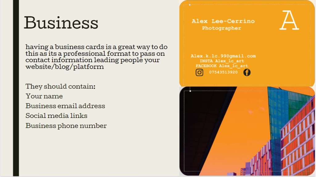
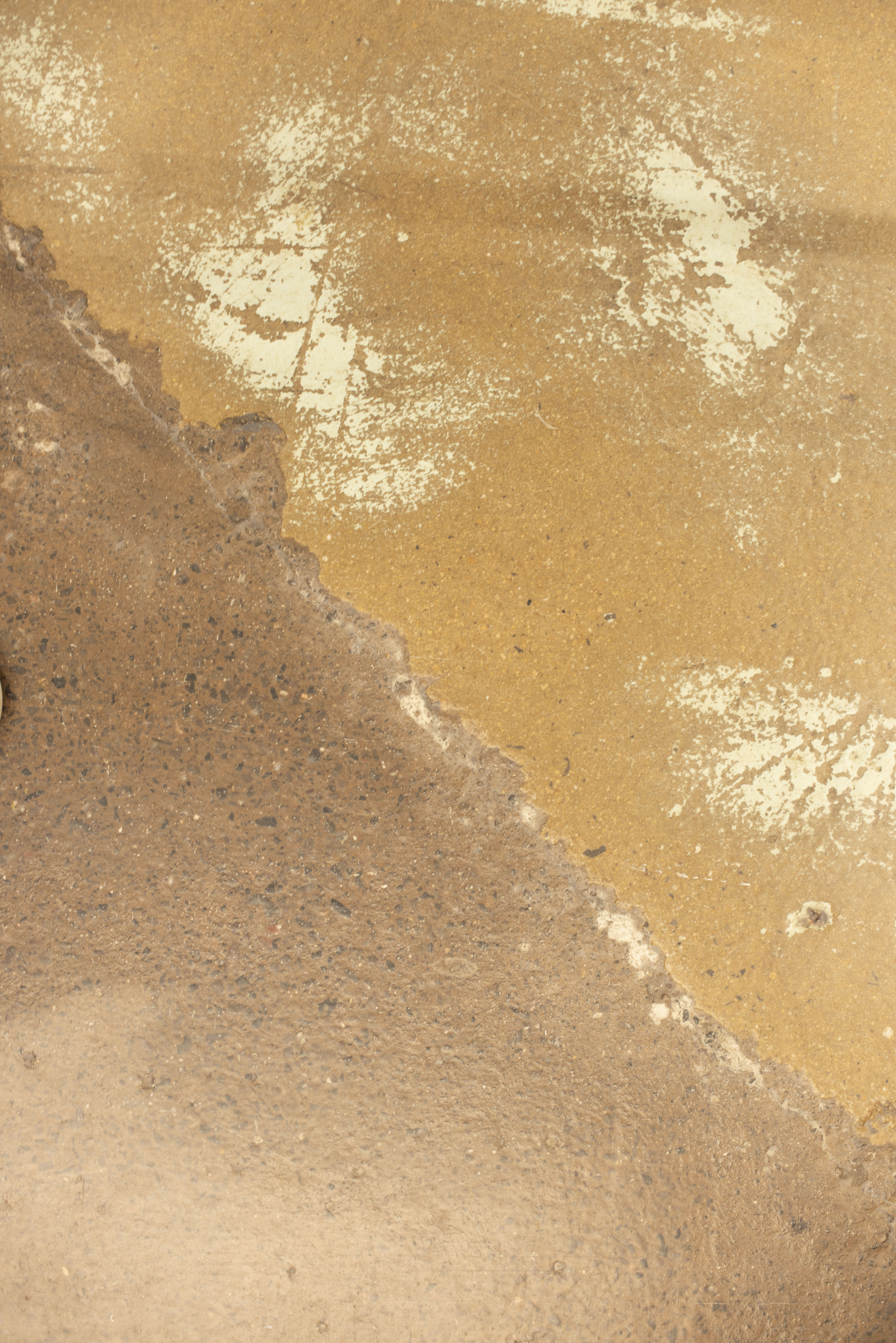
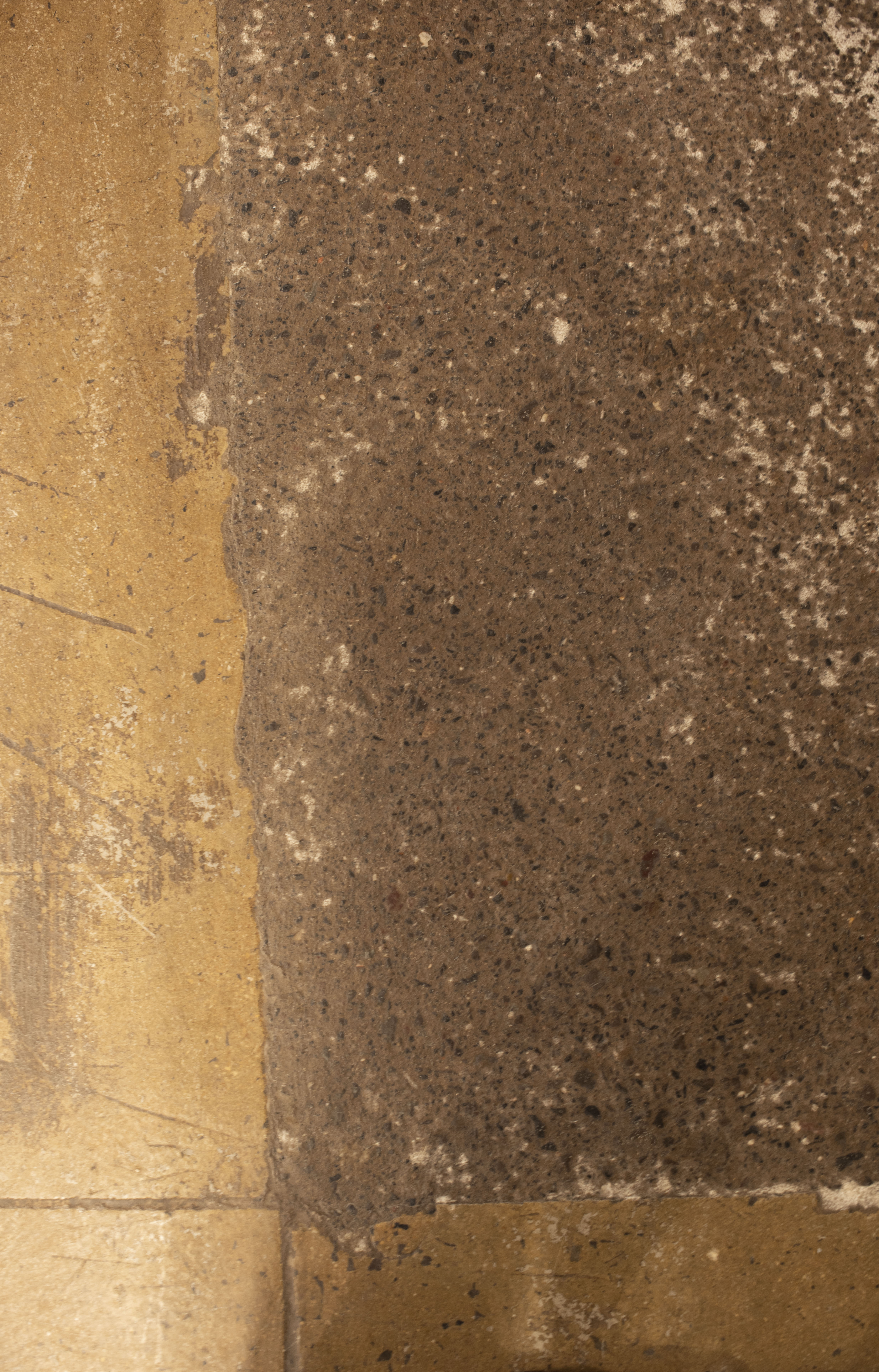
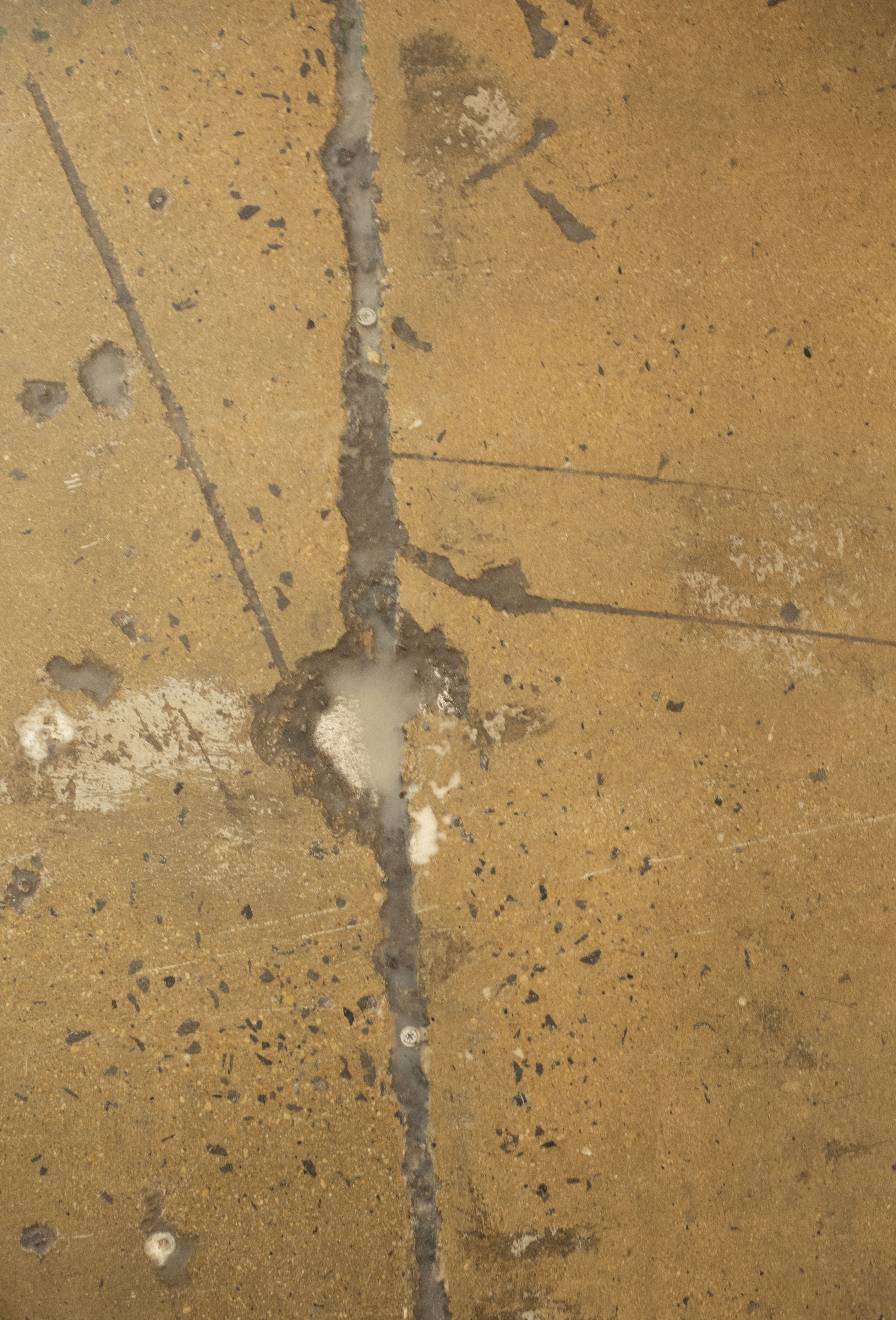
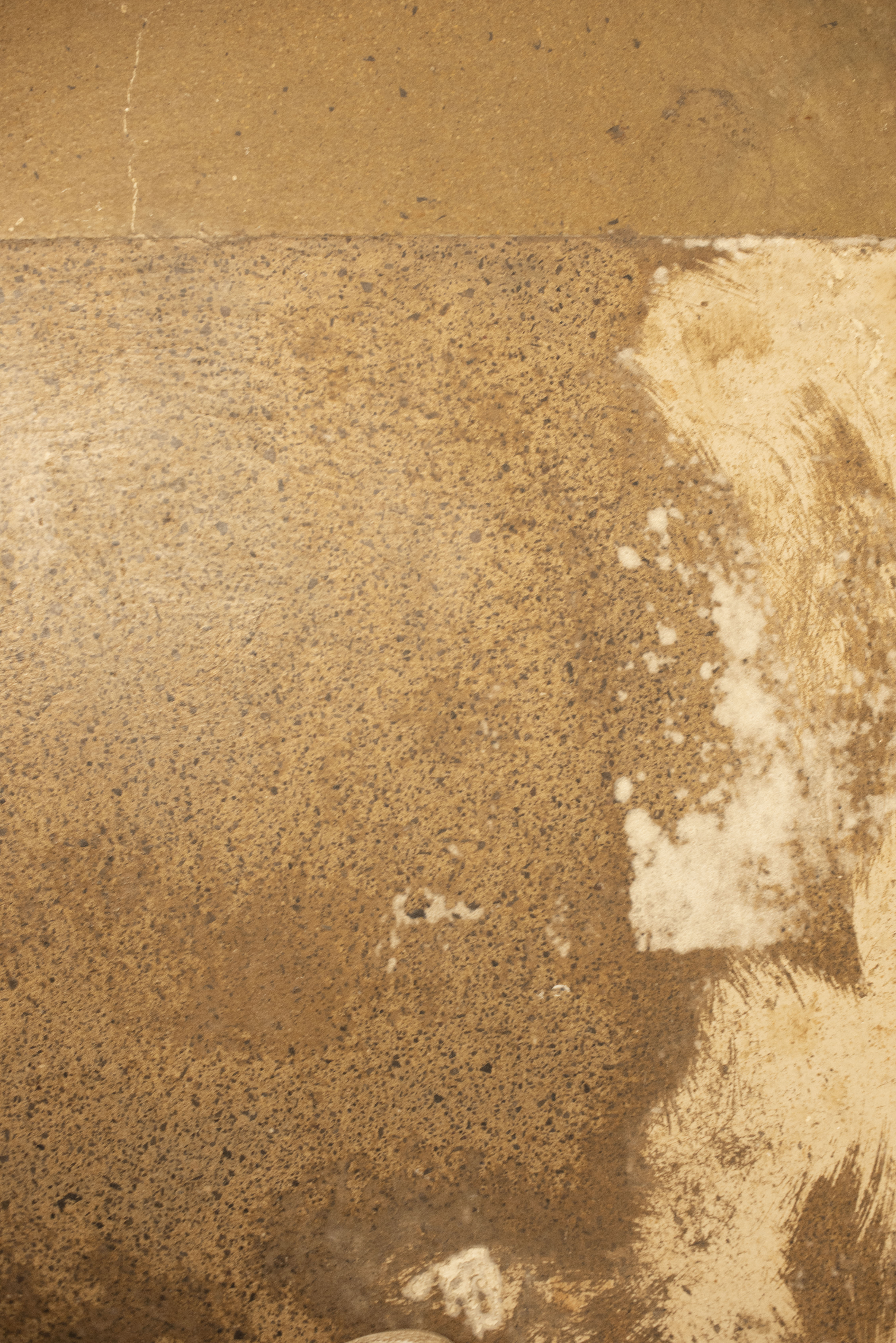
Concrete Flooring
the concrete flooring in uni is very industrial looking, it presenting cold, and hard, i know it will hurt a lot if i fall over here. they’re are cracks, uneven bumps and filaments, there are cuts where two different types intersect offering interesting geometrical shapes with a contrast in tonal differences
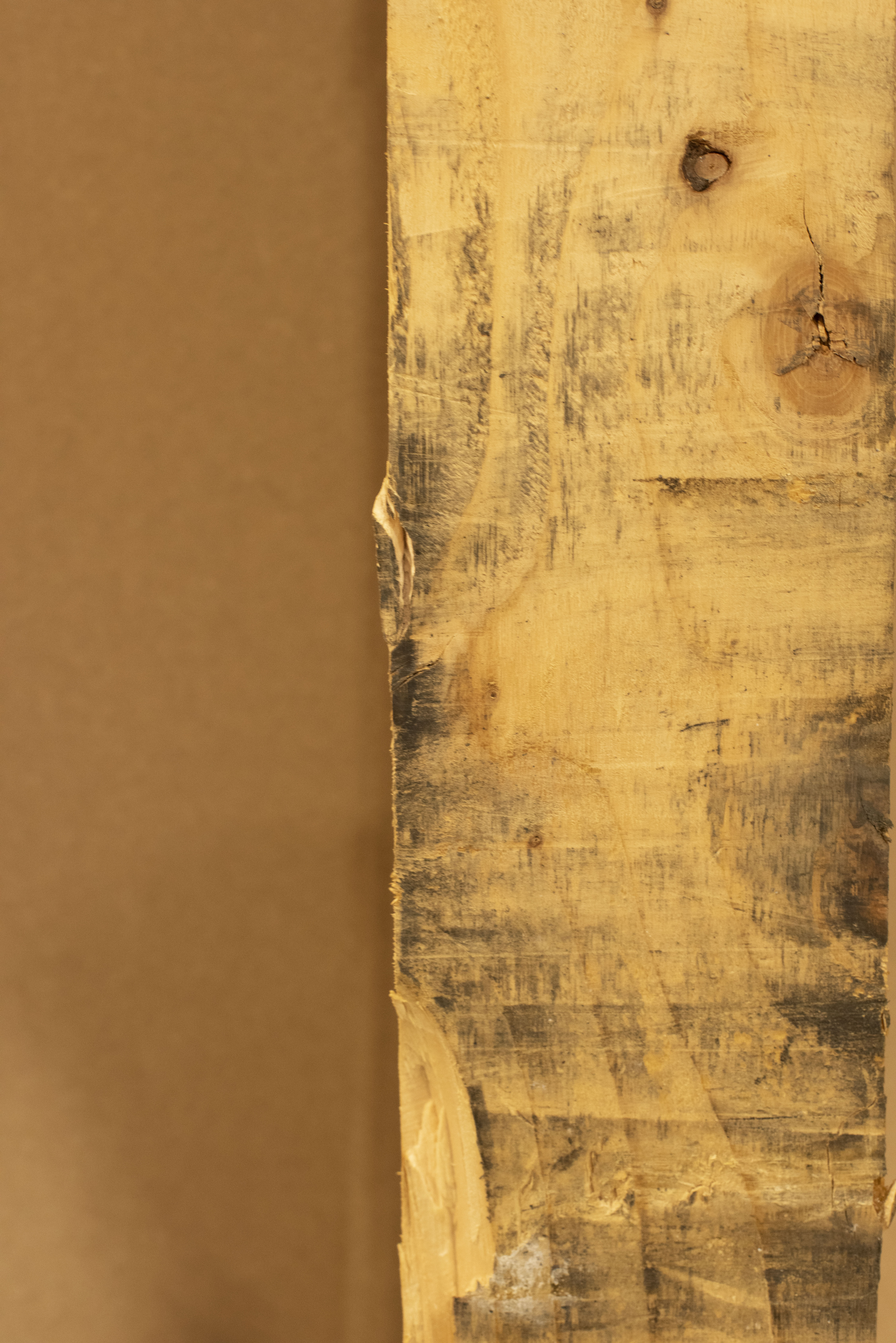
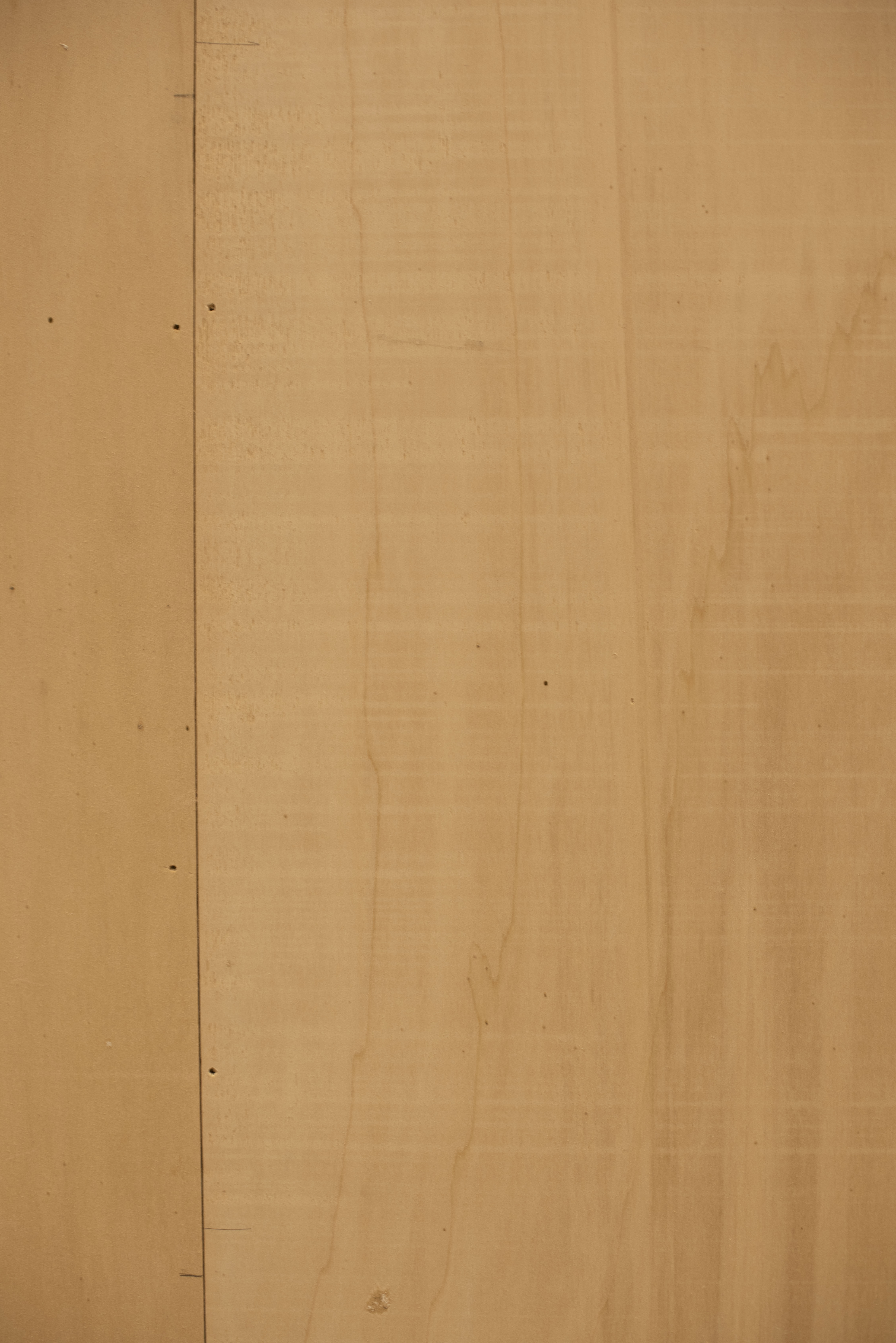
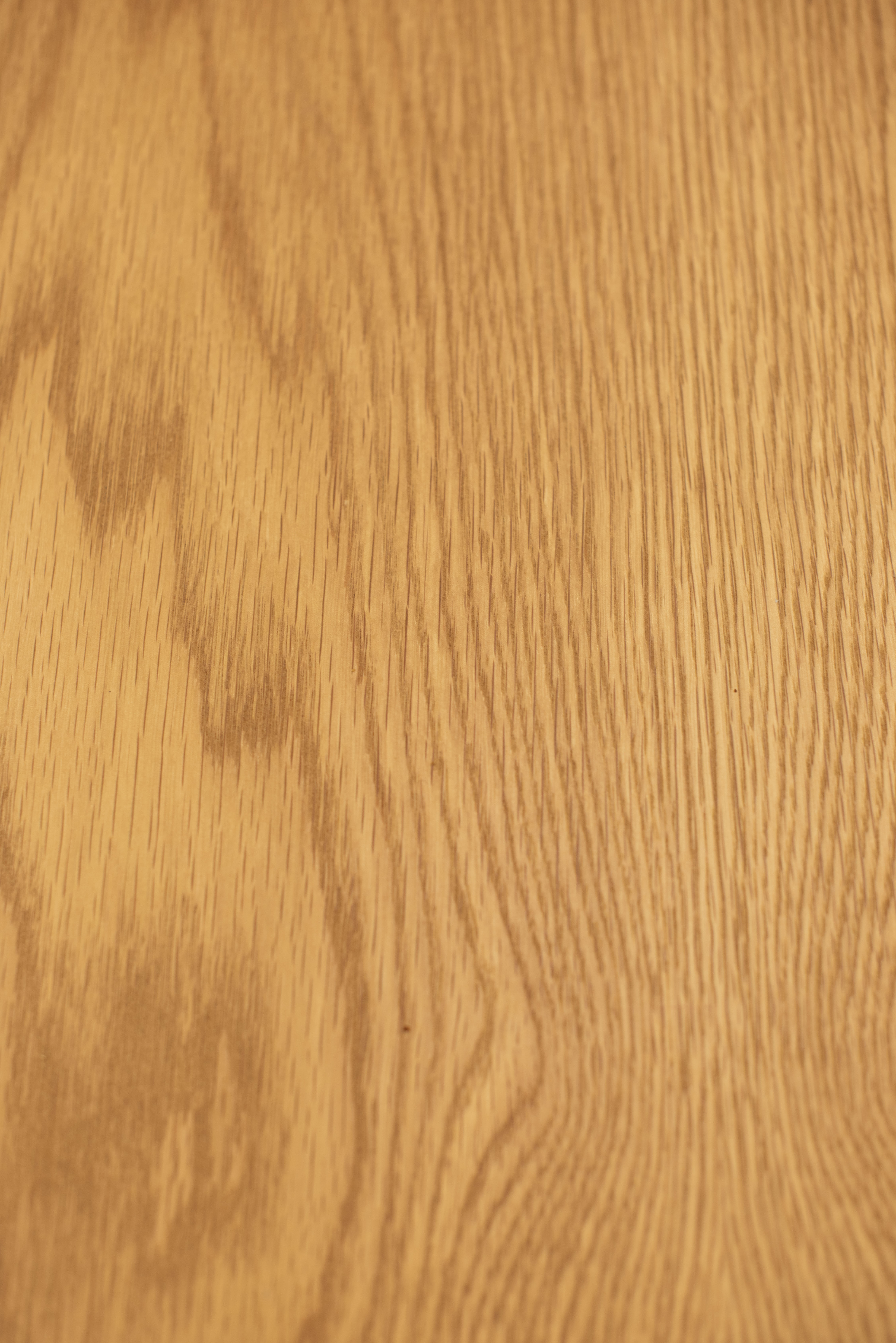
Processed Wood
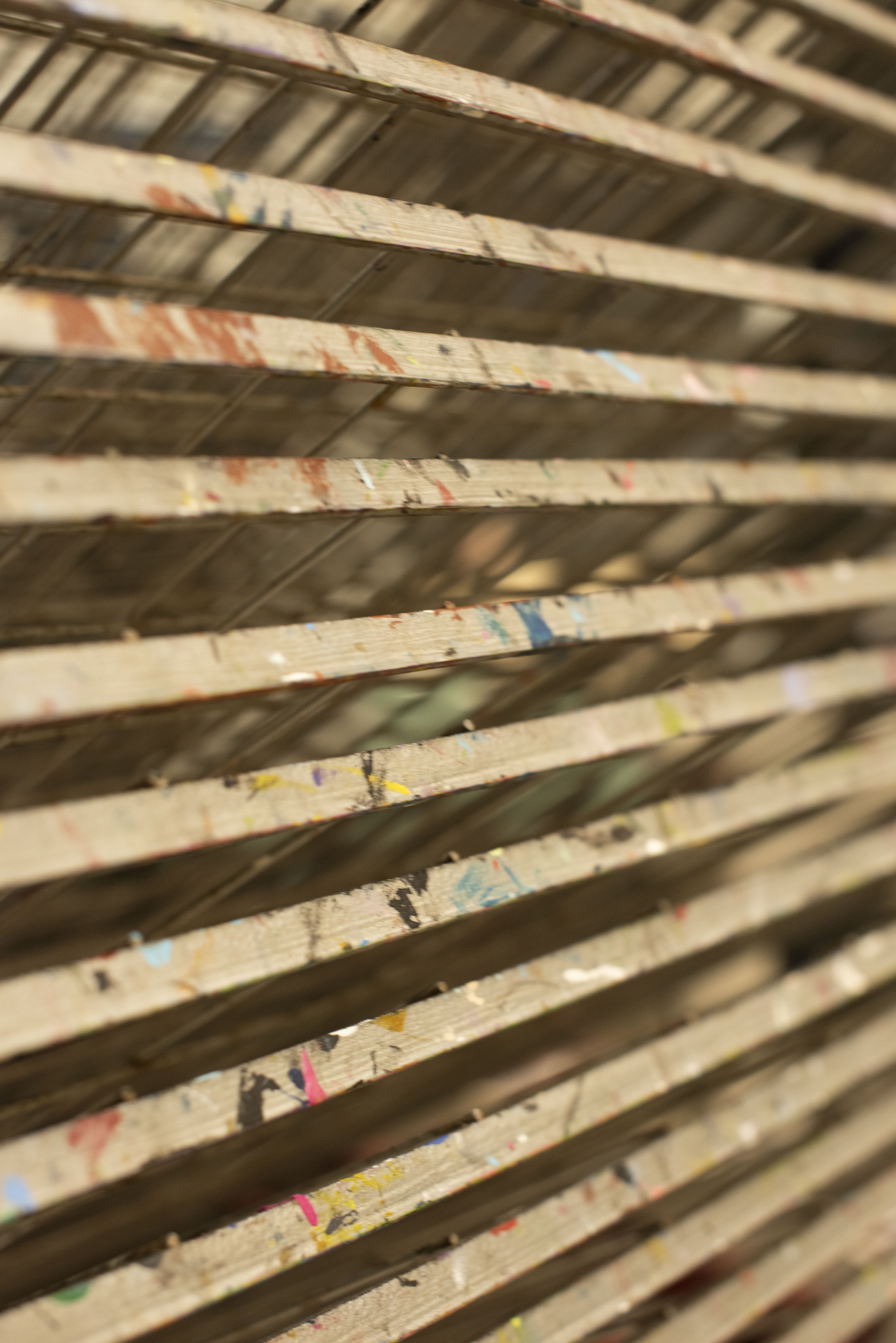
looking around there were lots wood variants, some presented more ridged and abrasive textures, displaying the direction of the grain and knots, these show a raw idea, closer to the origin of the sample. others were smooth and refined with minimal grain.
Wooden log
wanting to look more at the origin i saw raw logs displayed, the left one is of a tree outside still alive in natural daylight showing a next texture but ultimately flat in without much definition, the grain is mostly vertical without much variation.compared to the right, its taken with indoor lighting from above, seen in a workshop this cut log shows depth and twisting bark, i think i really like this as it is that half way between processed and living, i want to connote this to thoms style juxtaposing style
Metal
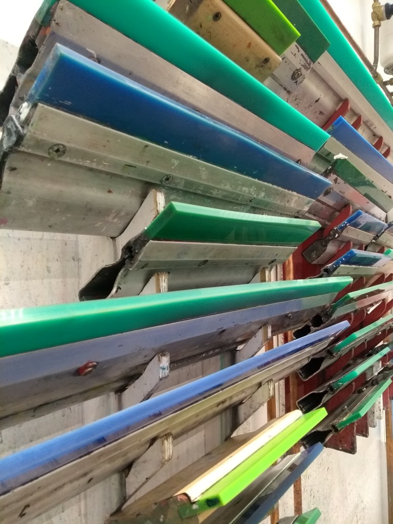
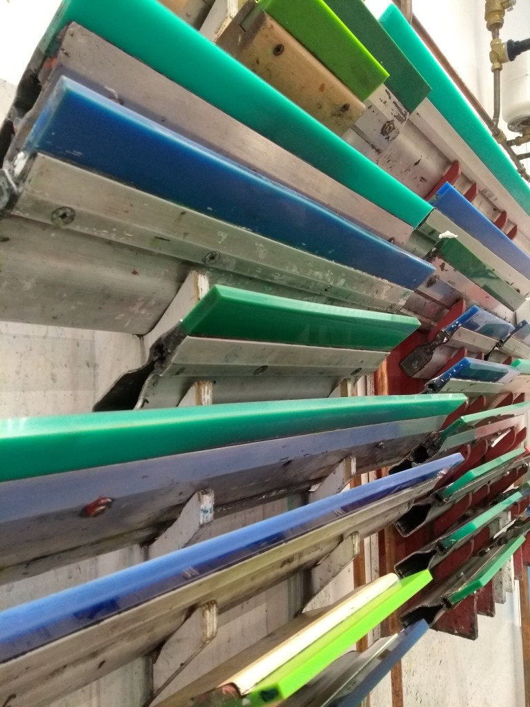
looking further into workshops i noticed a lot of metal wiring and frames, i thought the geometrical structure was fascinating, so easily malleable and yet holds its structure, each of them present different surface details some of them are tarnished with paints or aged by rust. as you look through some of the wire frames your eye starts to play tricks on you as the lines line up with each other.
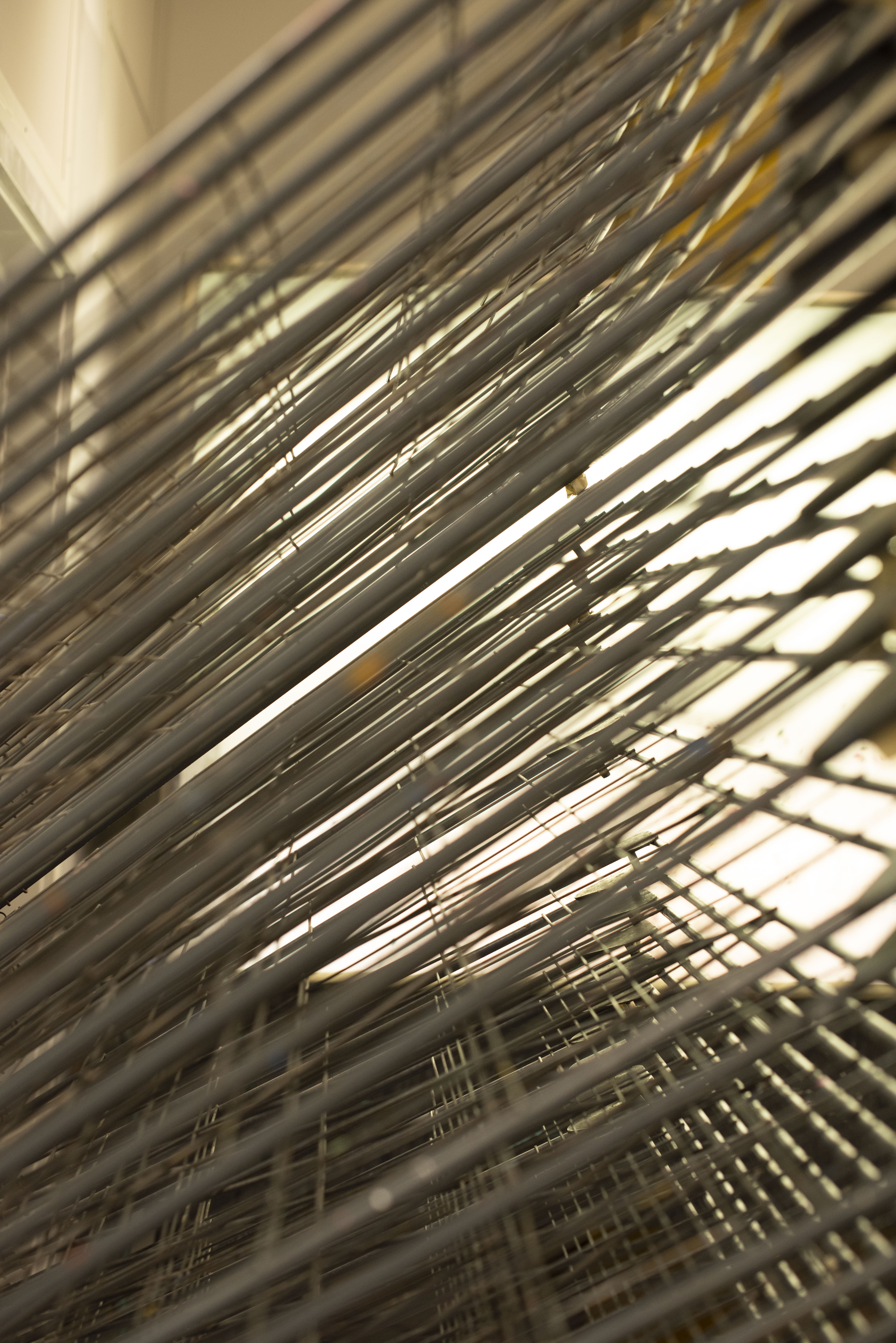
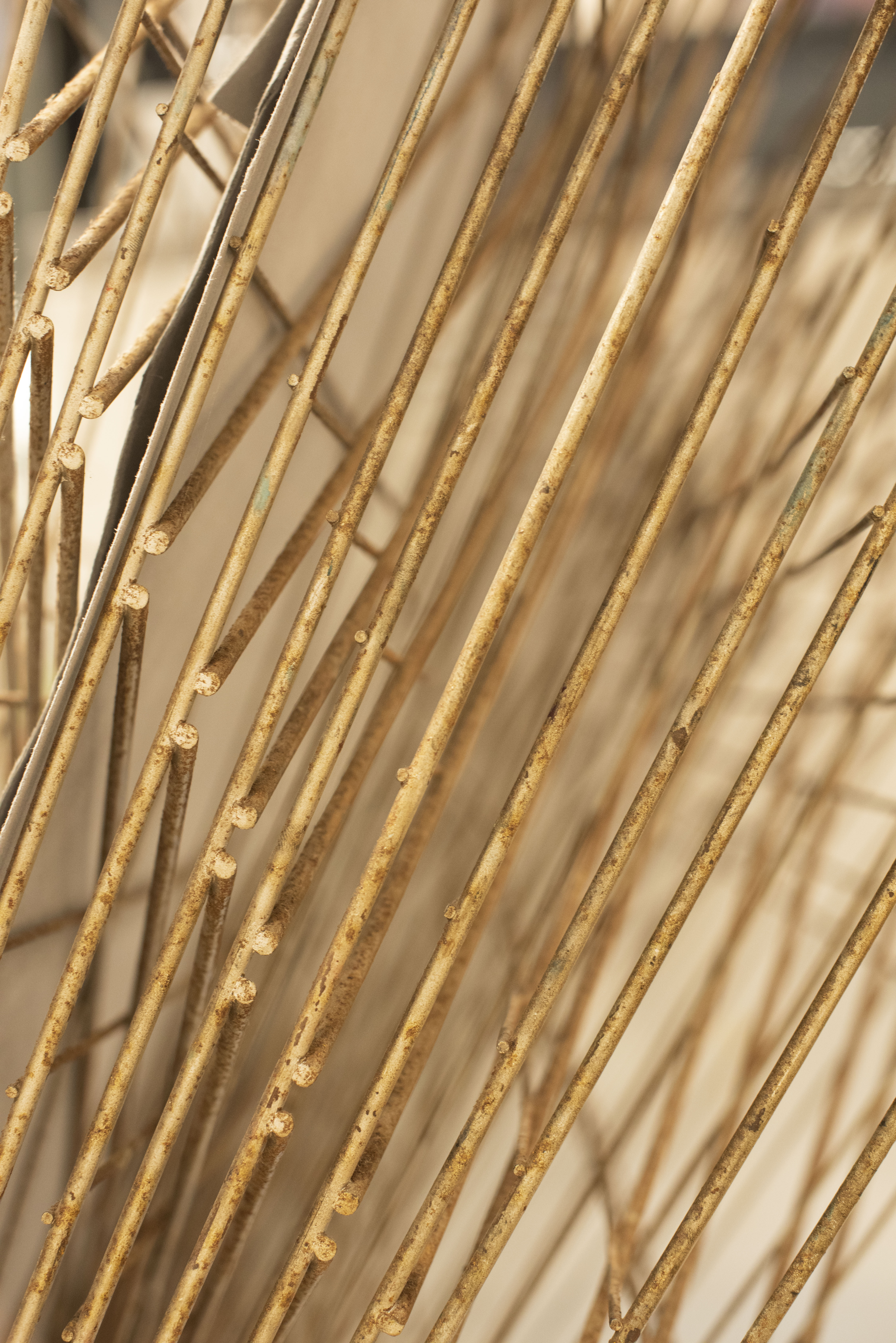
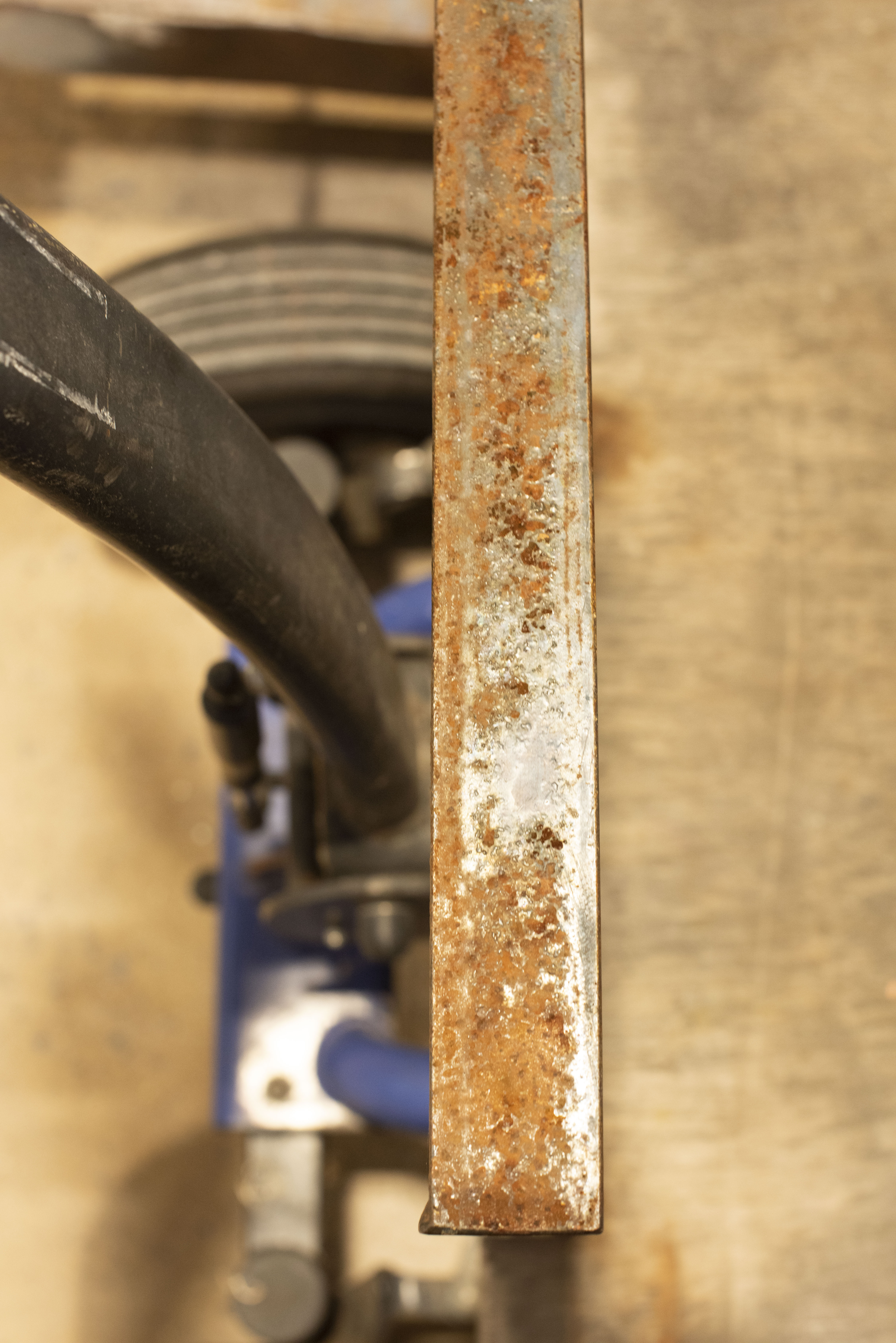
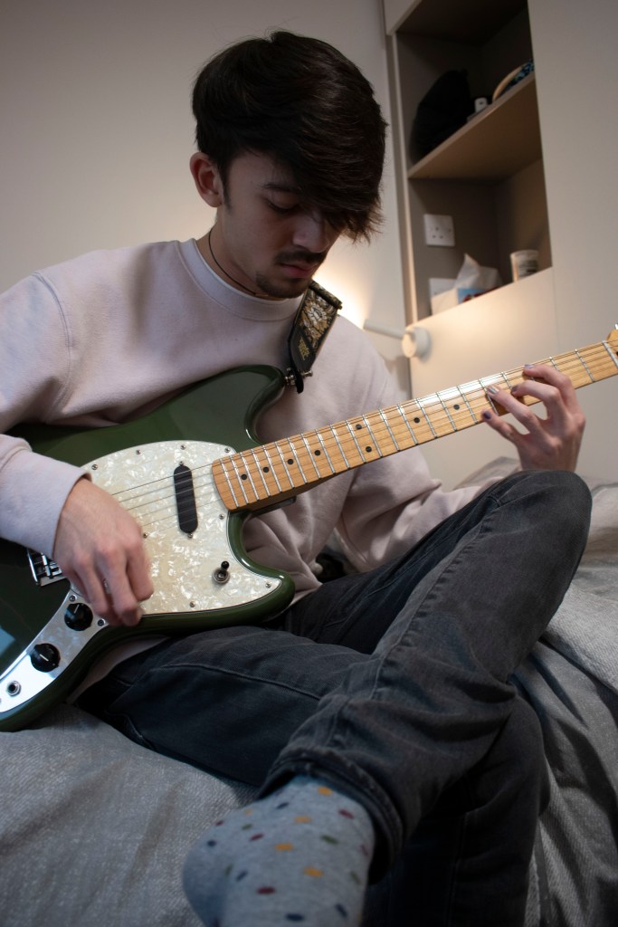
there were also some metal sheets made as stair banisters, the time worn abrasion on these is something i love, the detail in the flaking overcoat wouldnt be repeatable by a person, this could make for a really interesting back ground like thoms coat did
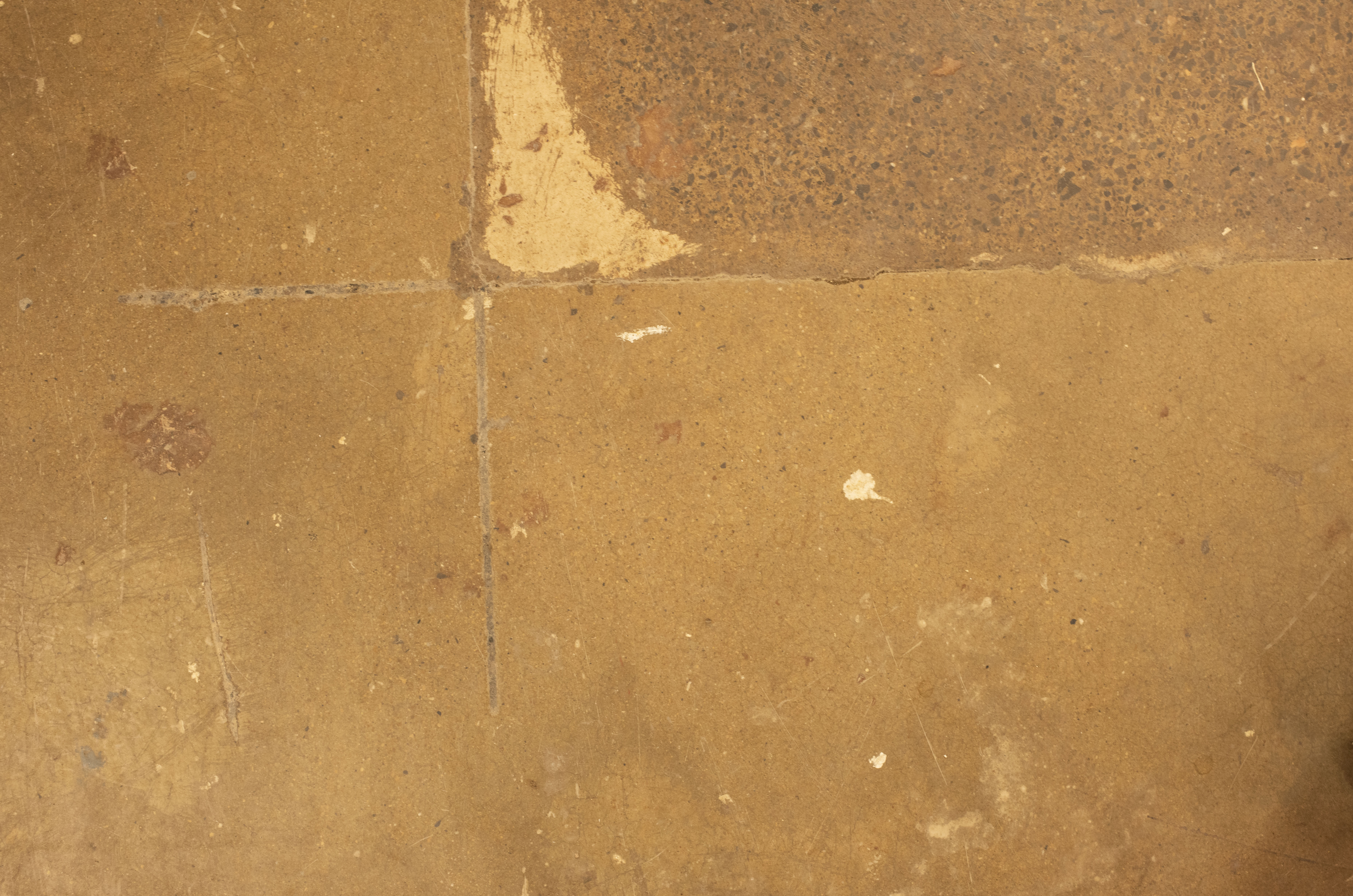
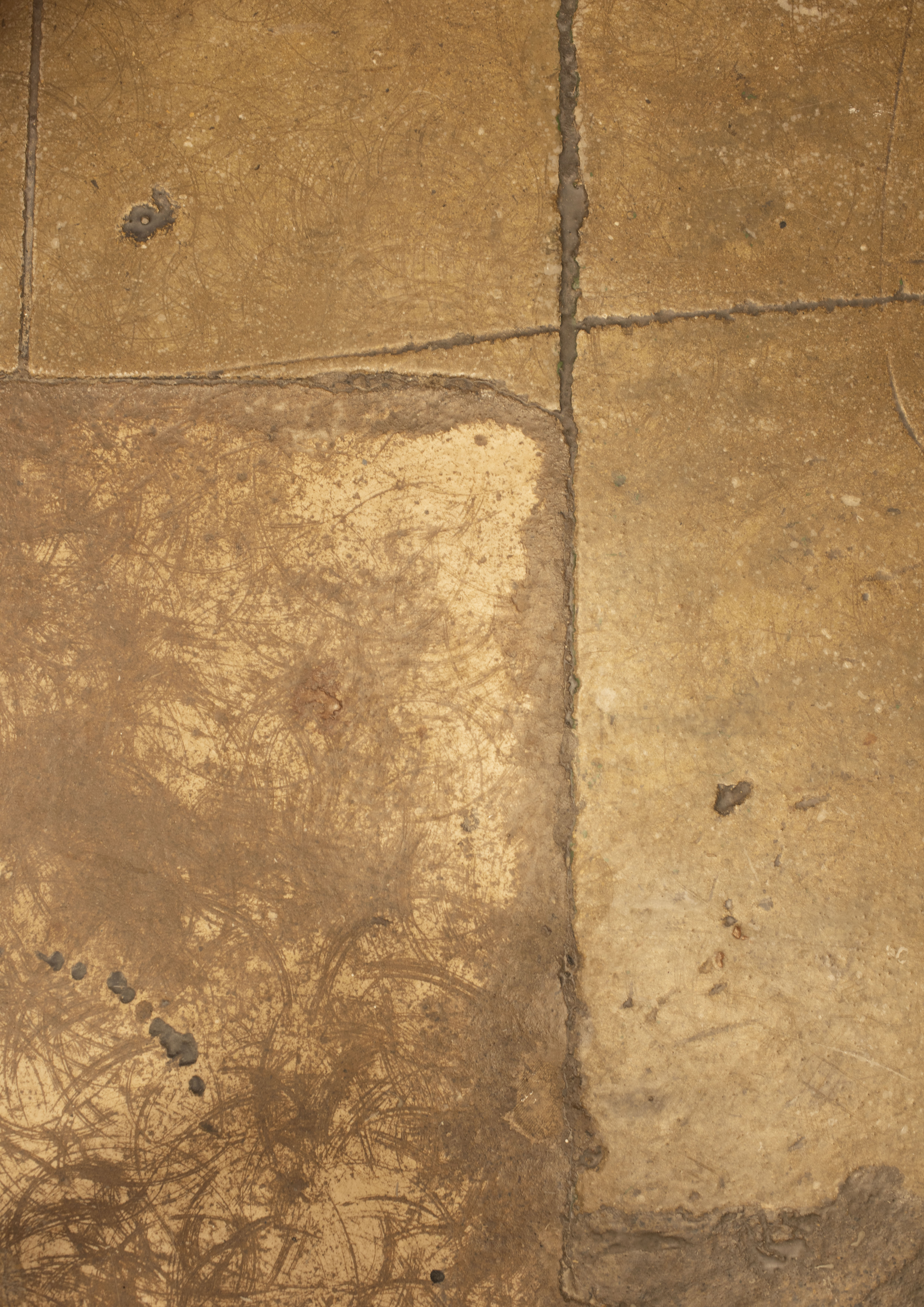
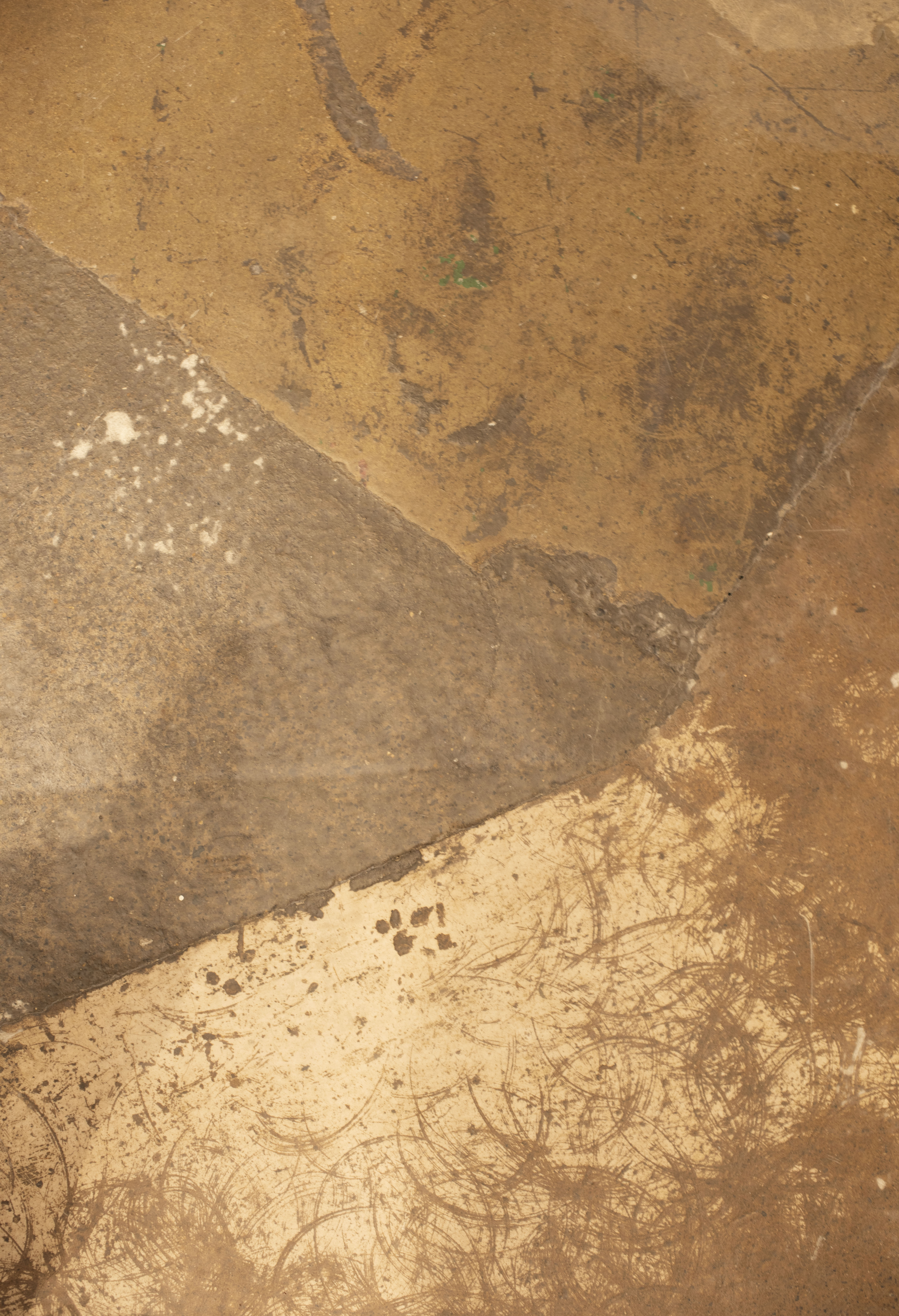
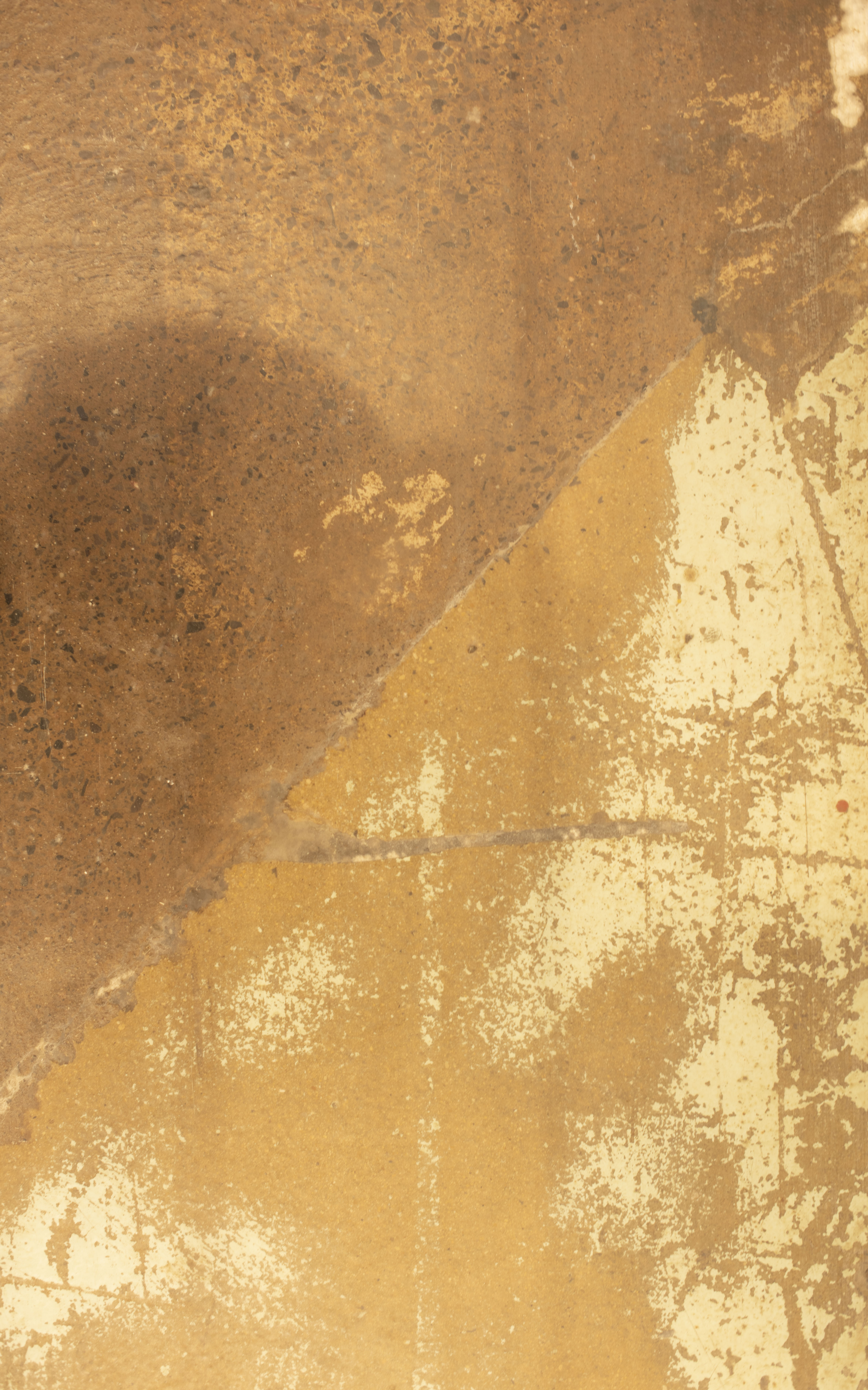
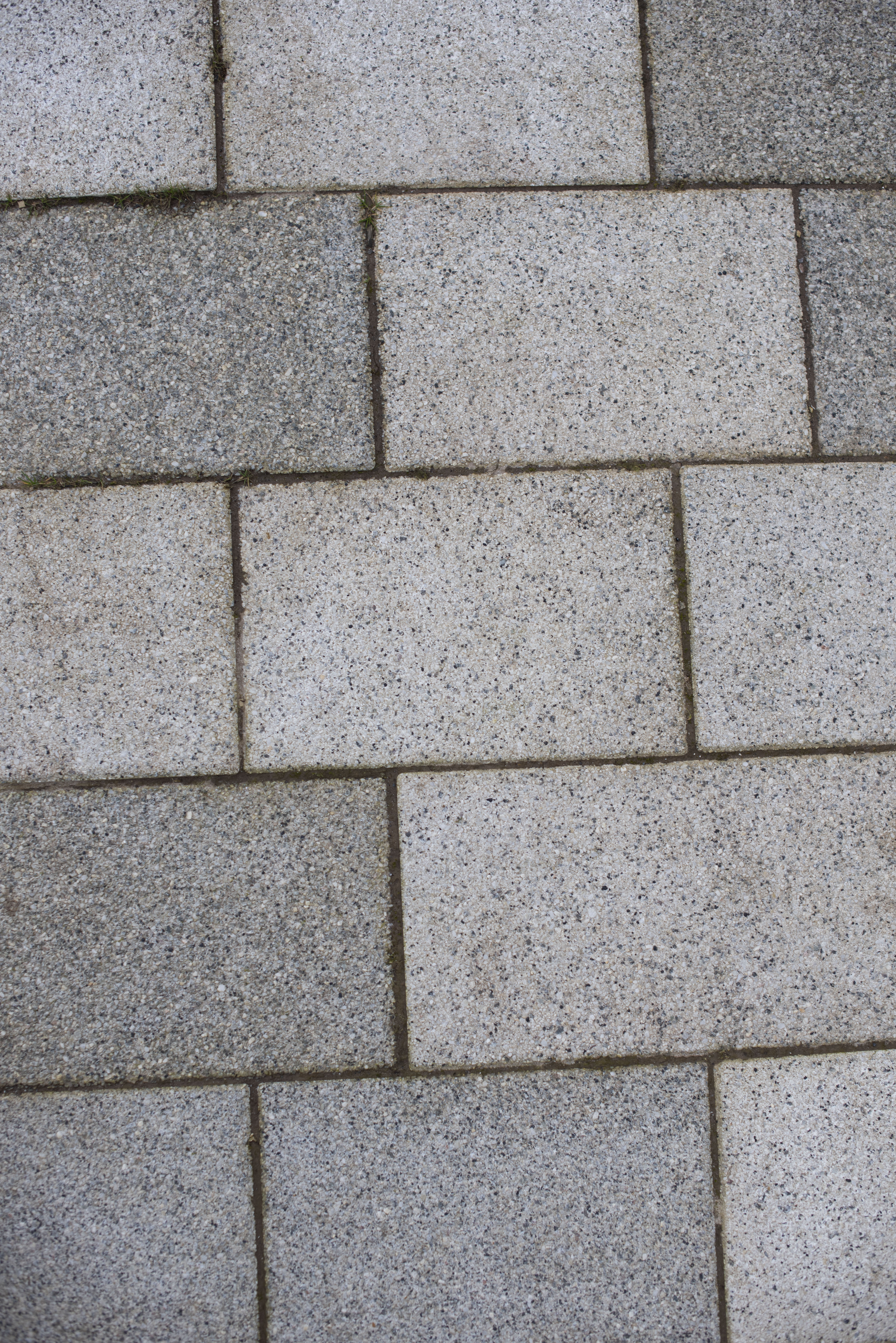
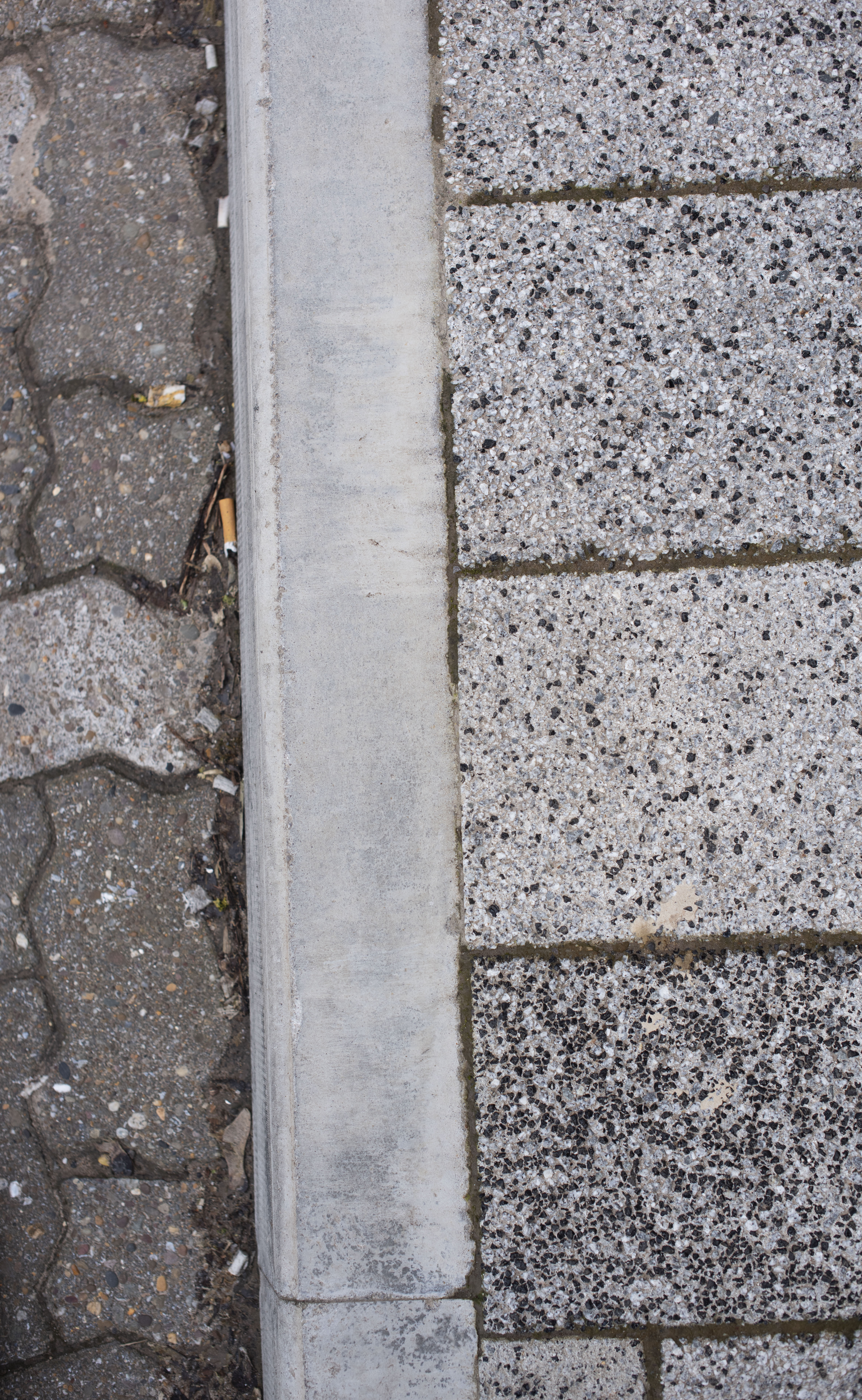
Tiled Pavement
just outside uni there are pathways for students to enter. these are man made and offer a very urban industrial feel, as theyre uniform in their nature, i dont feel i like these too much as theyre cold and ridged and not sympathetic to the world, the amount of water and sediment that goes into creating this industrial is unkind, producing significant amounts co2, and doesnt fit with the eco friendly mind set of many millennials (thoms target market) i want something more natural and chaotic
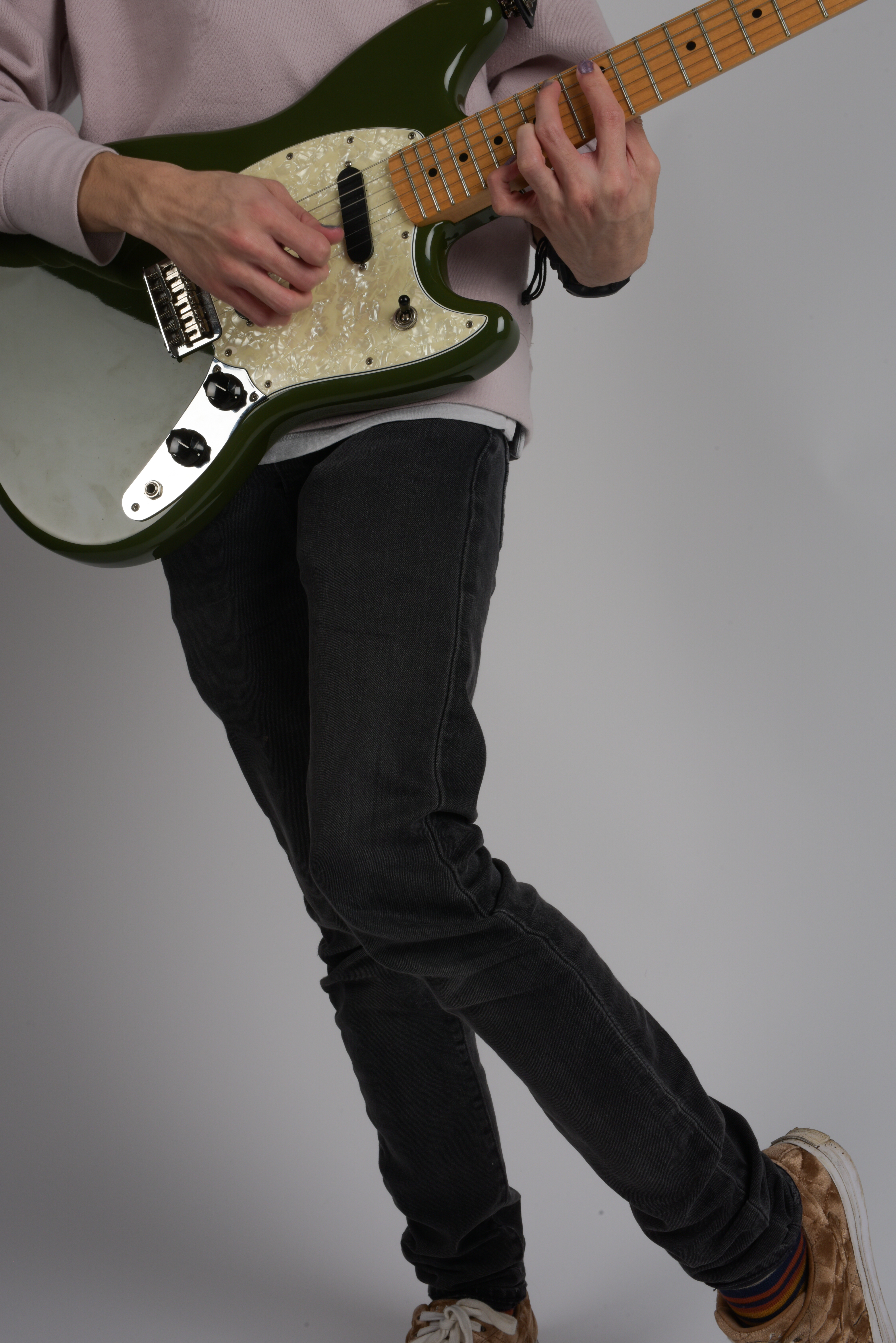
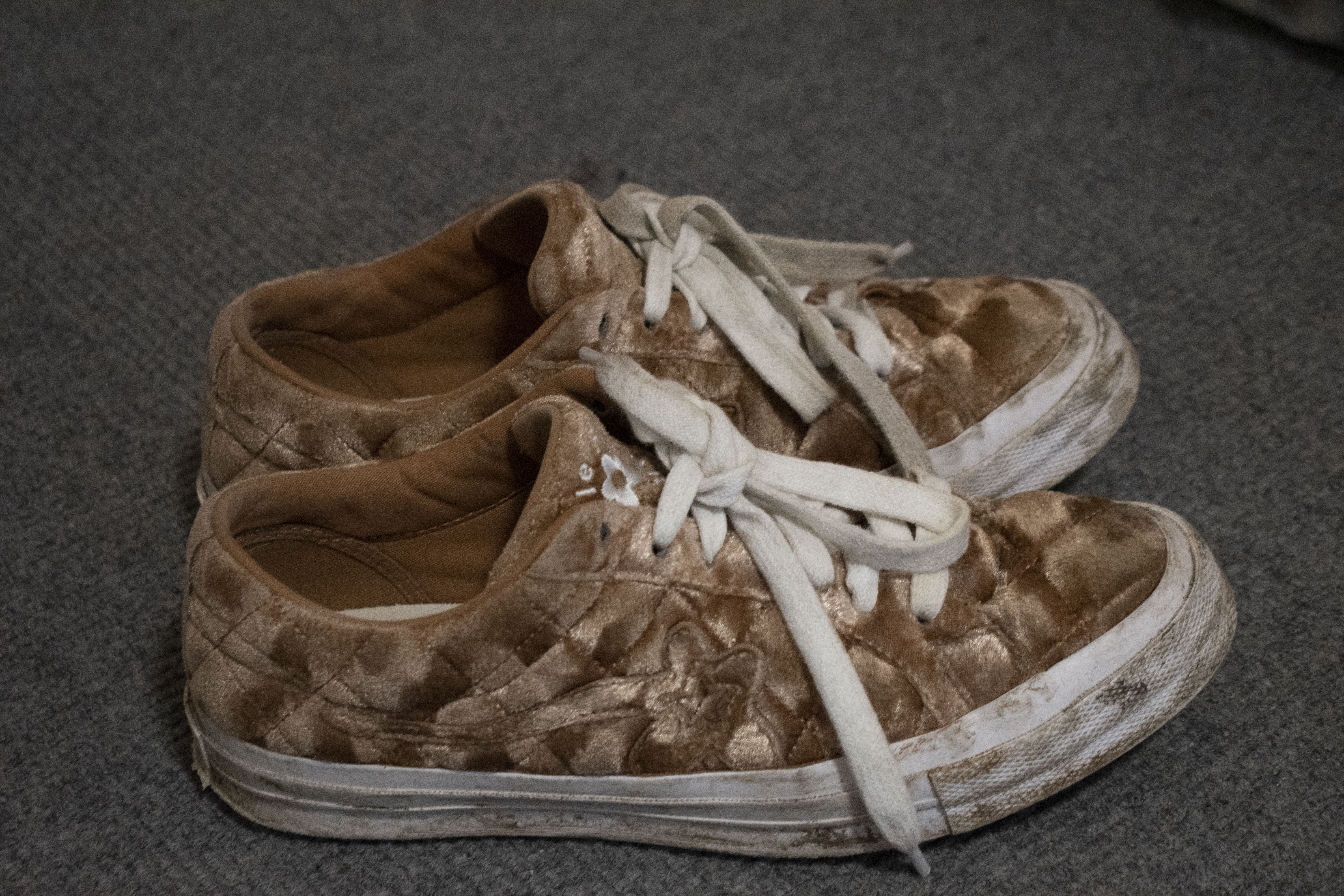
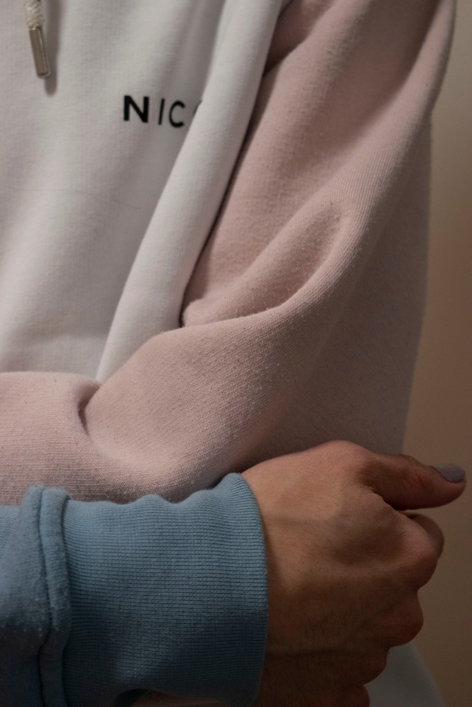
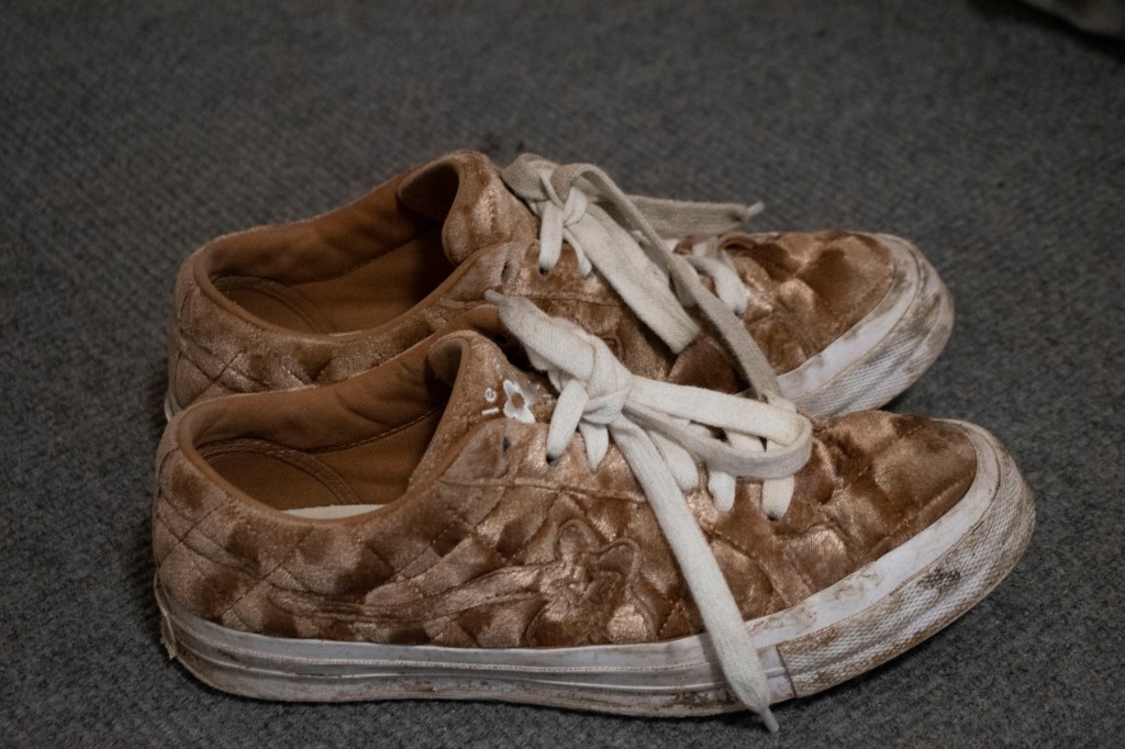
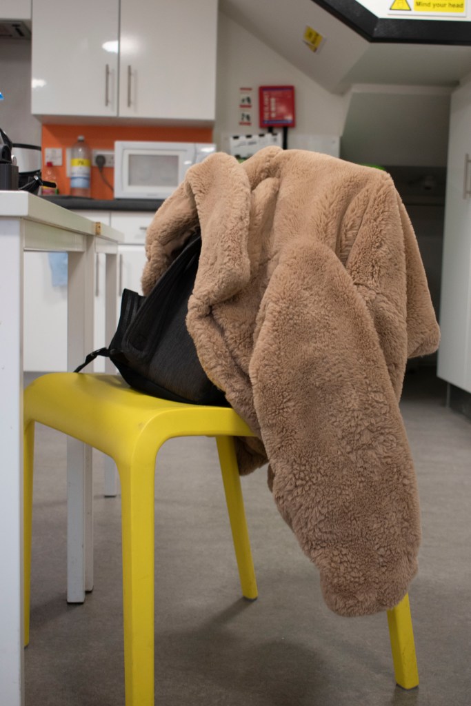
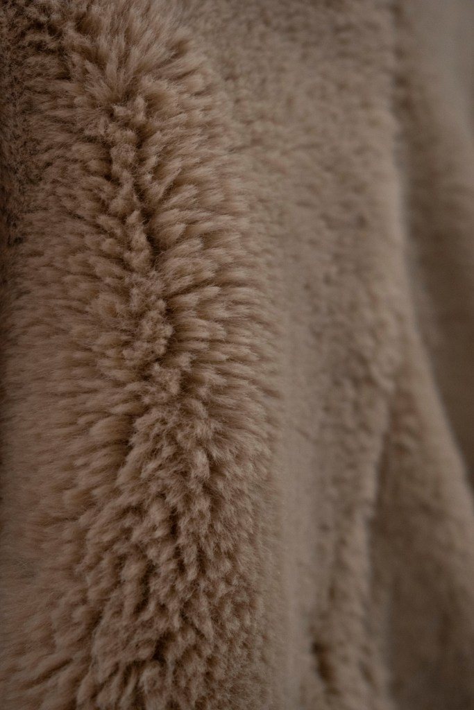
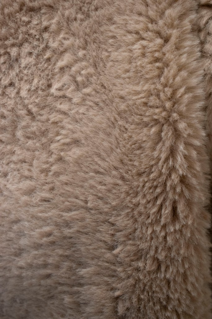
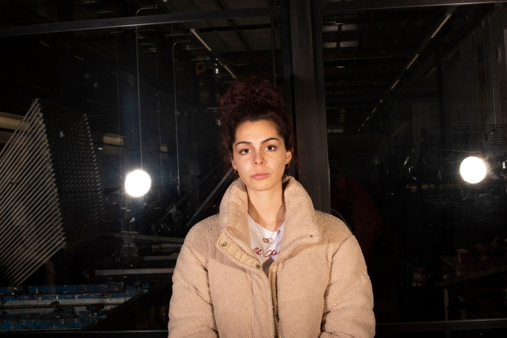
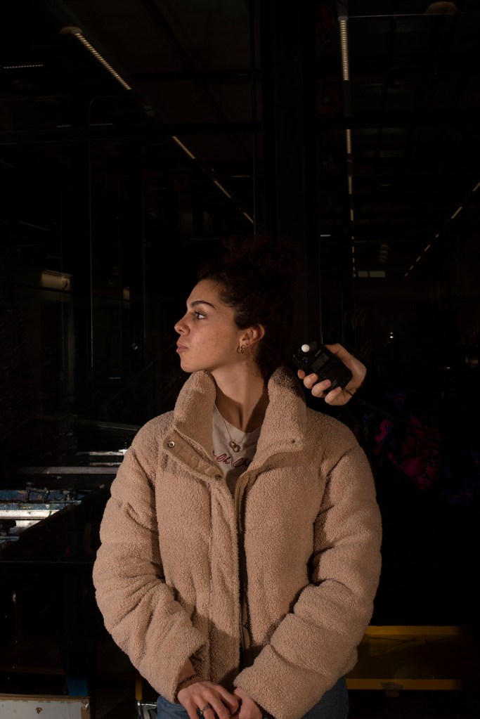
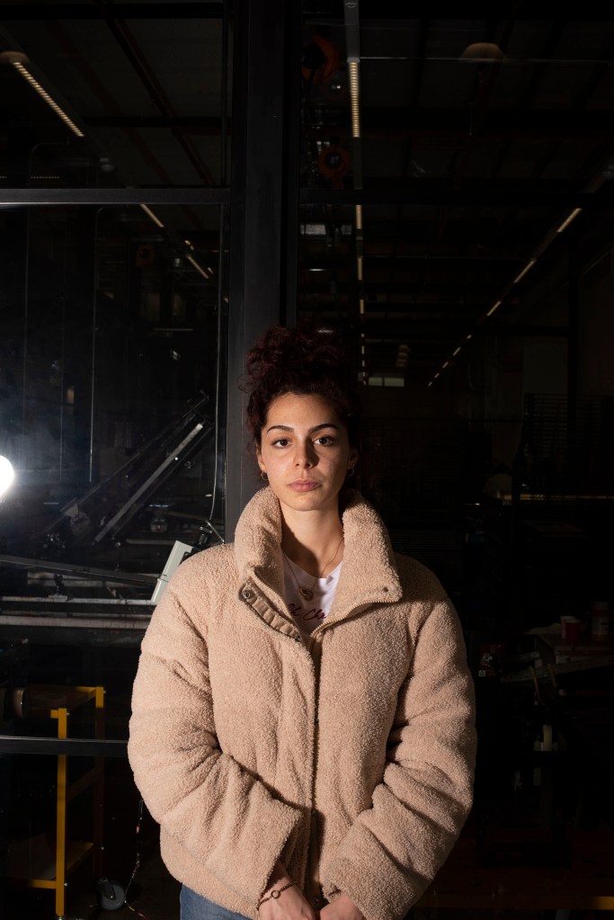
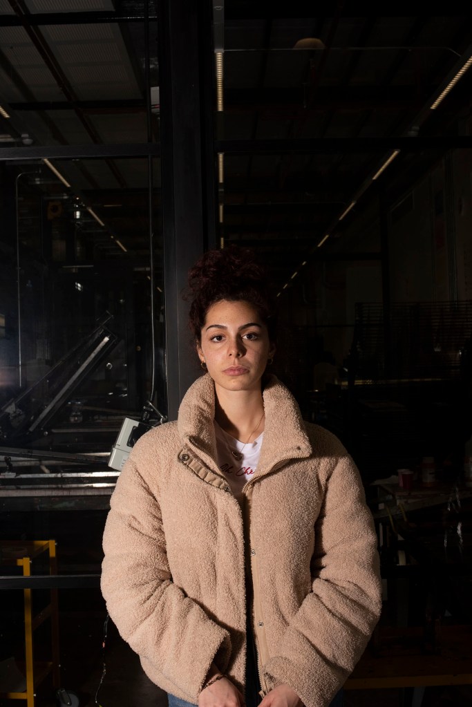
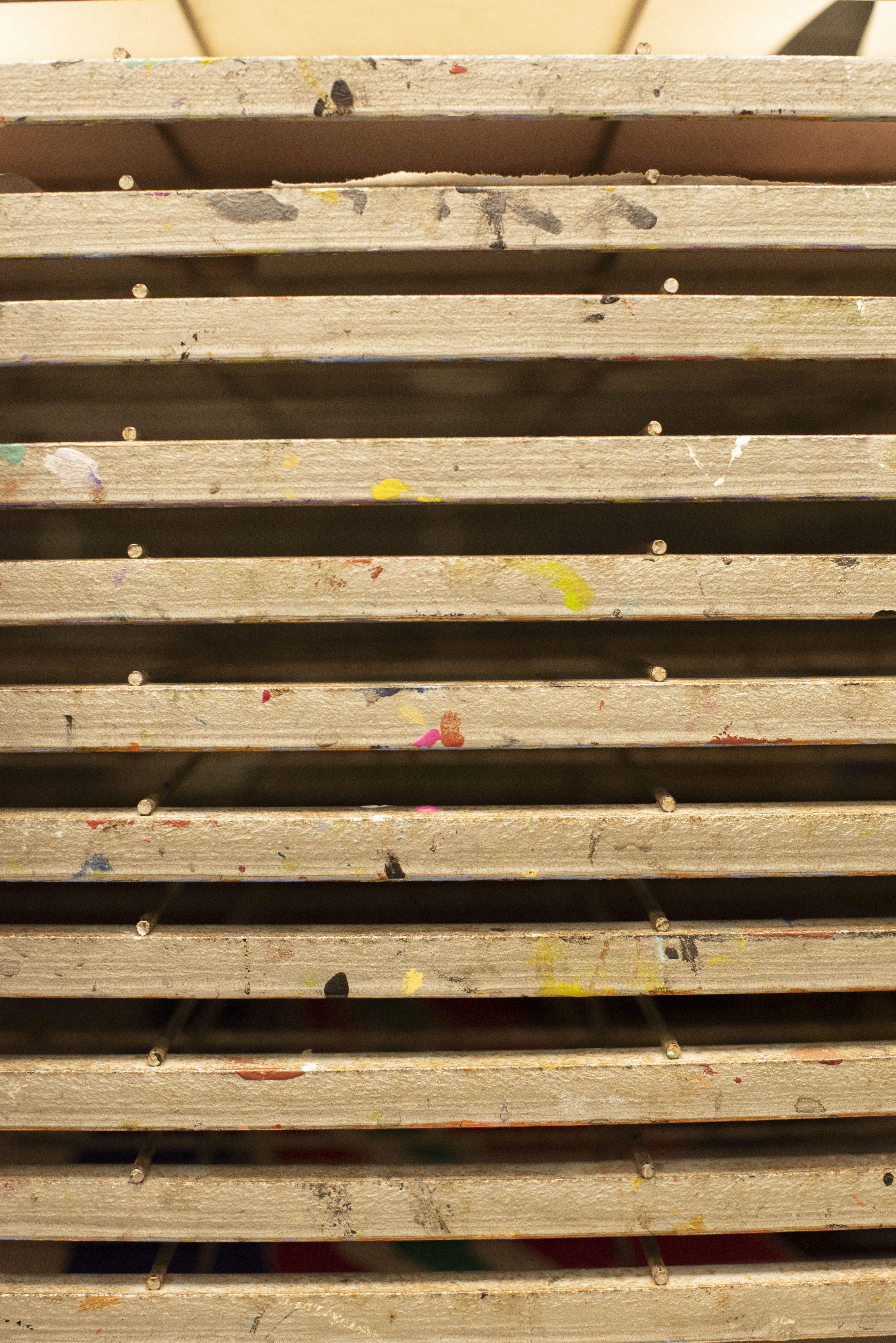
Fabric
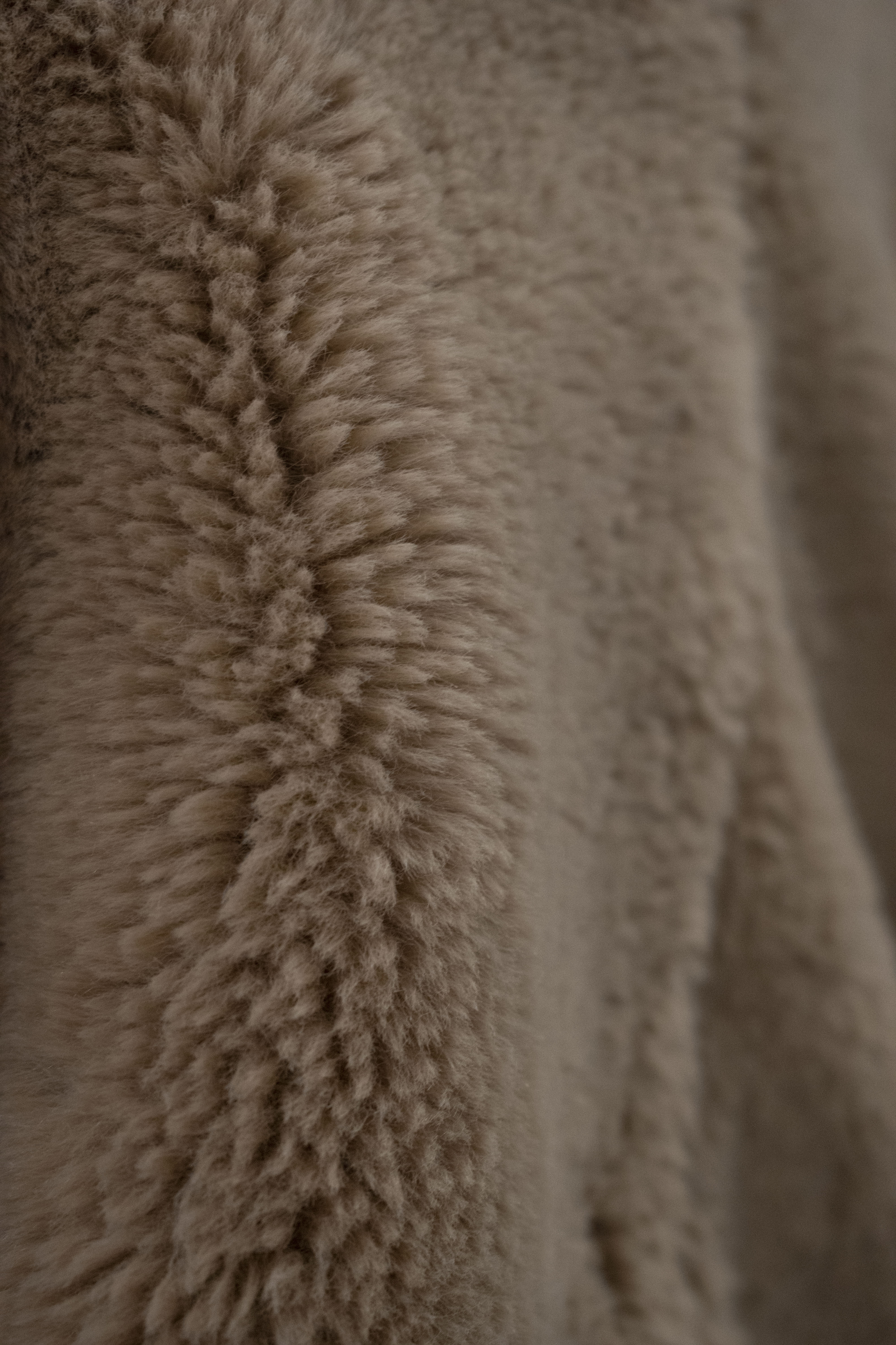
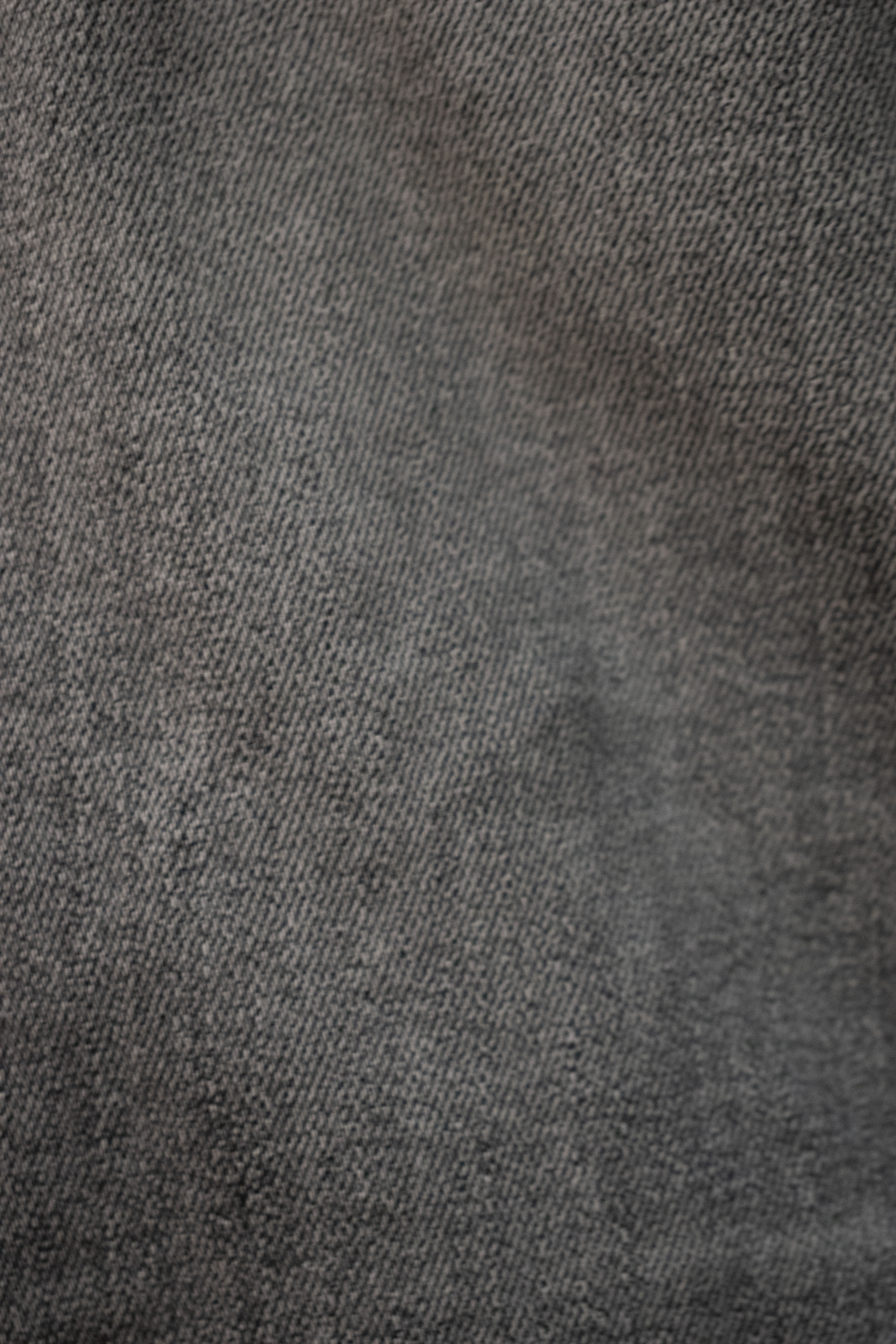
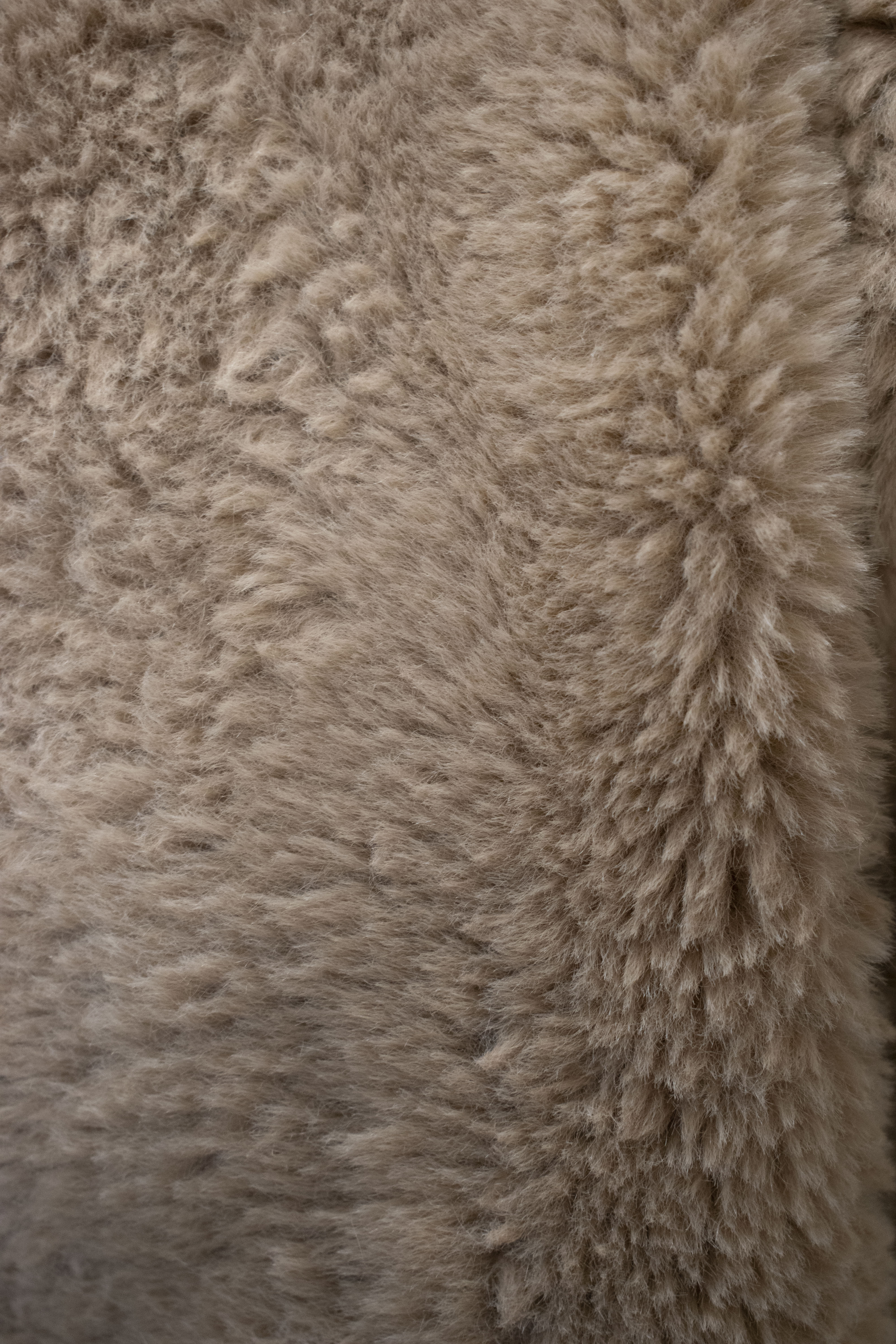
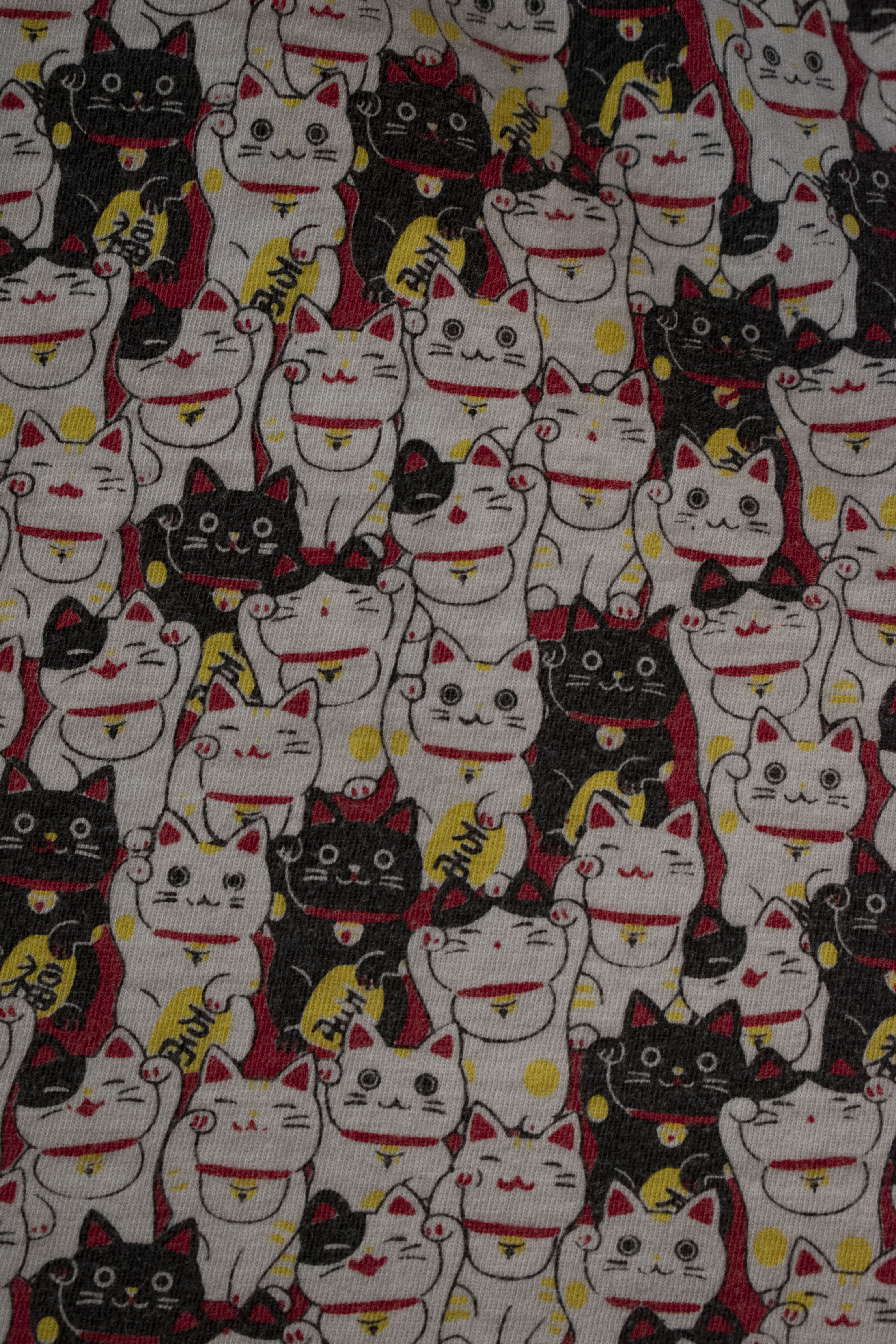
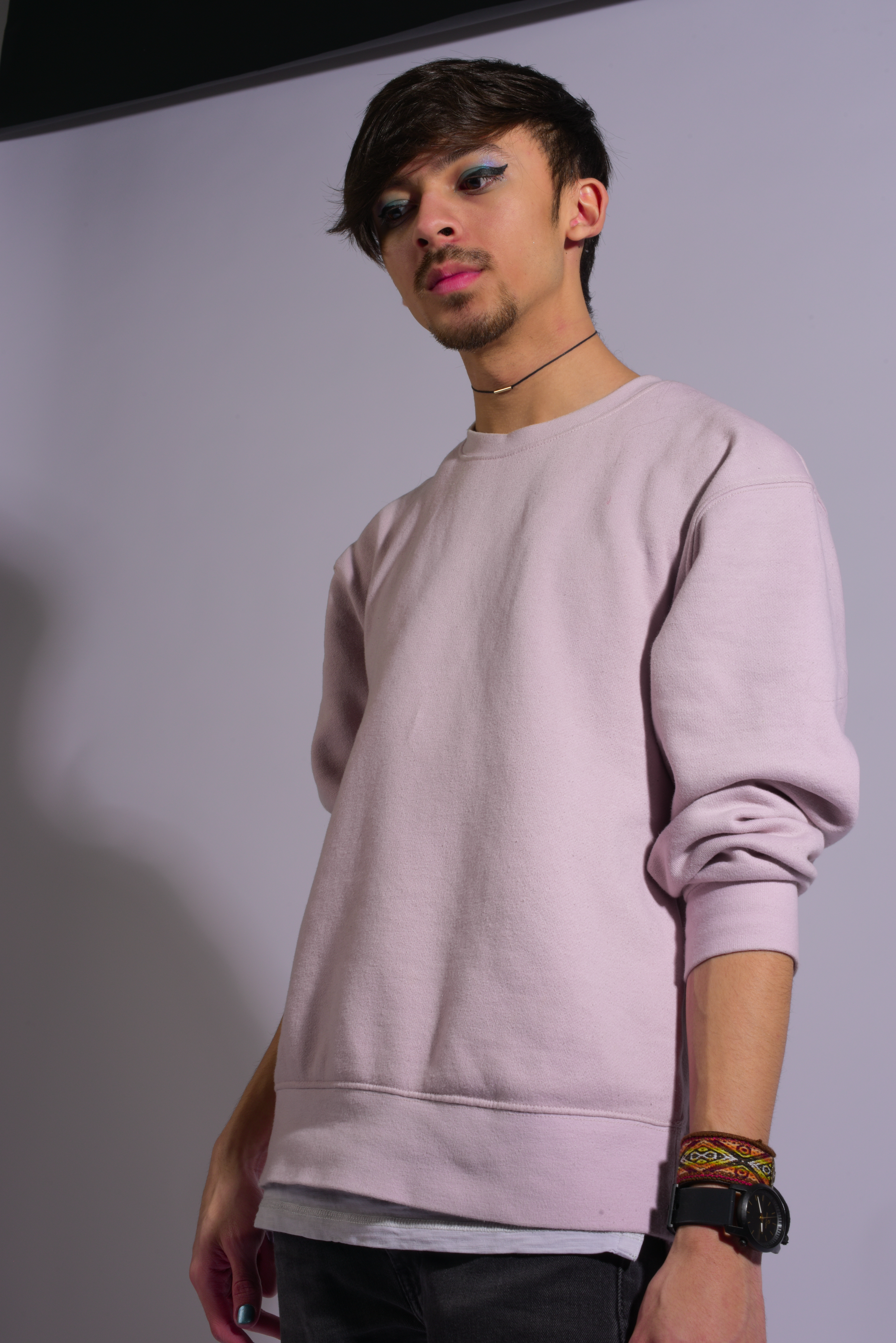
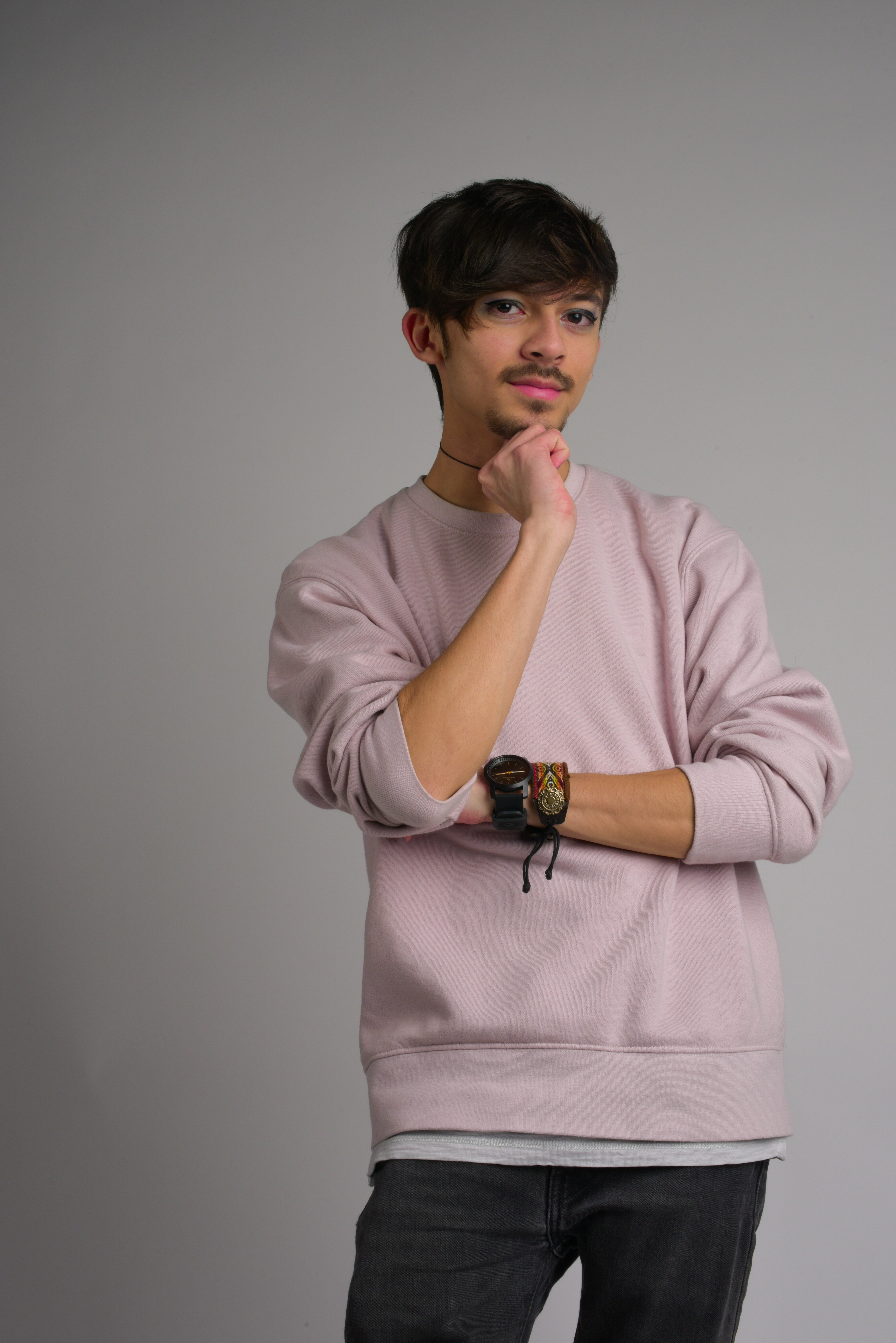
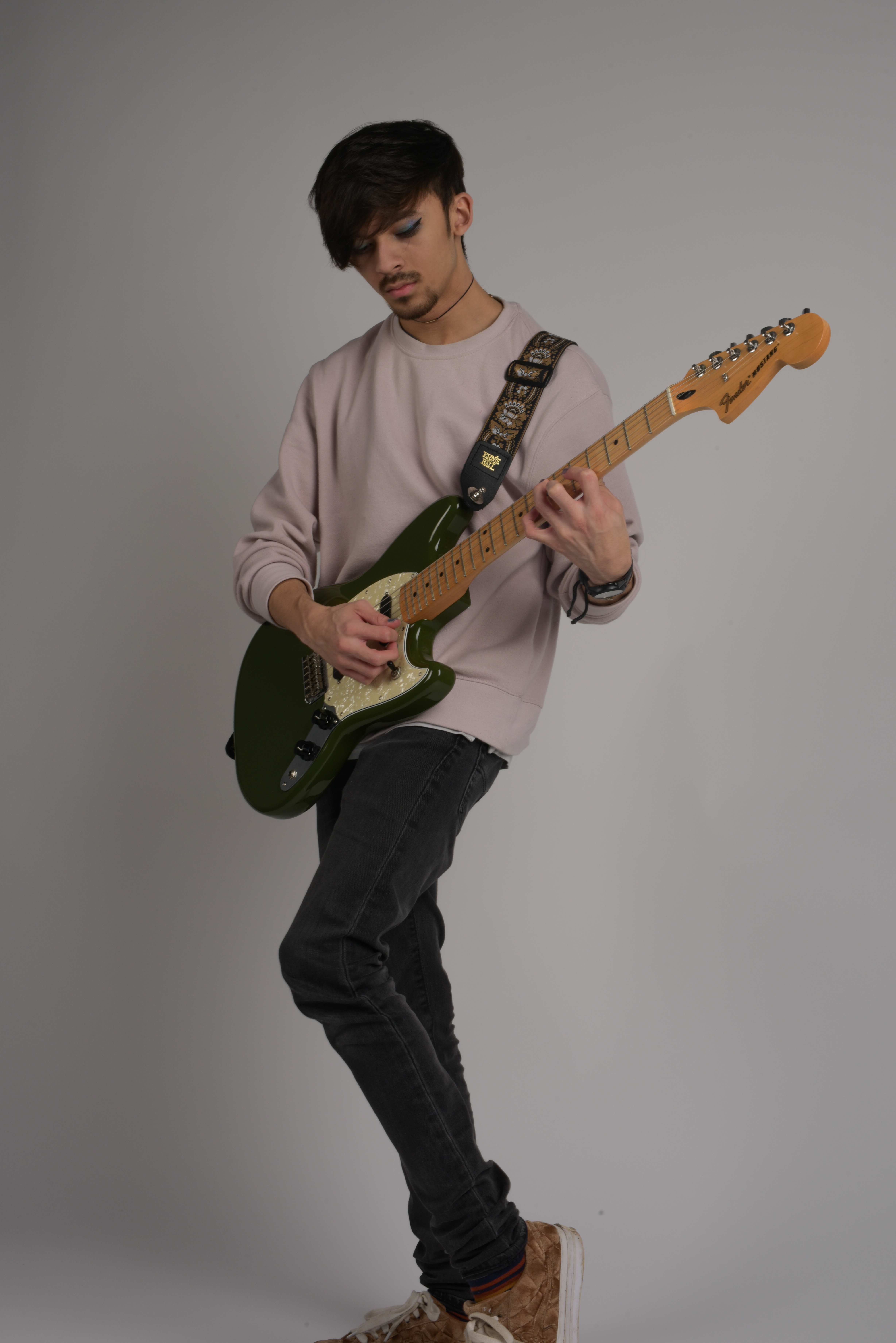
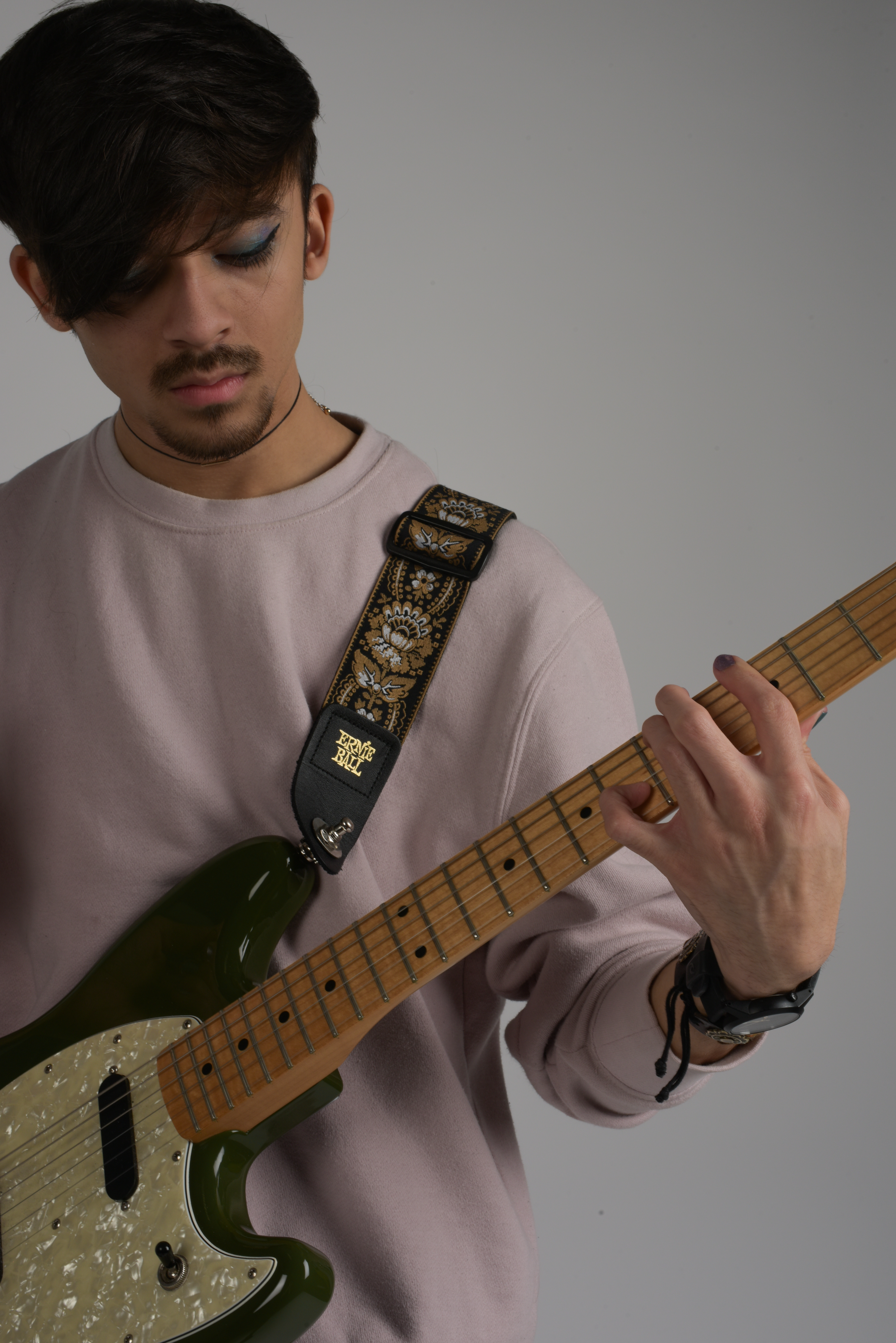
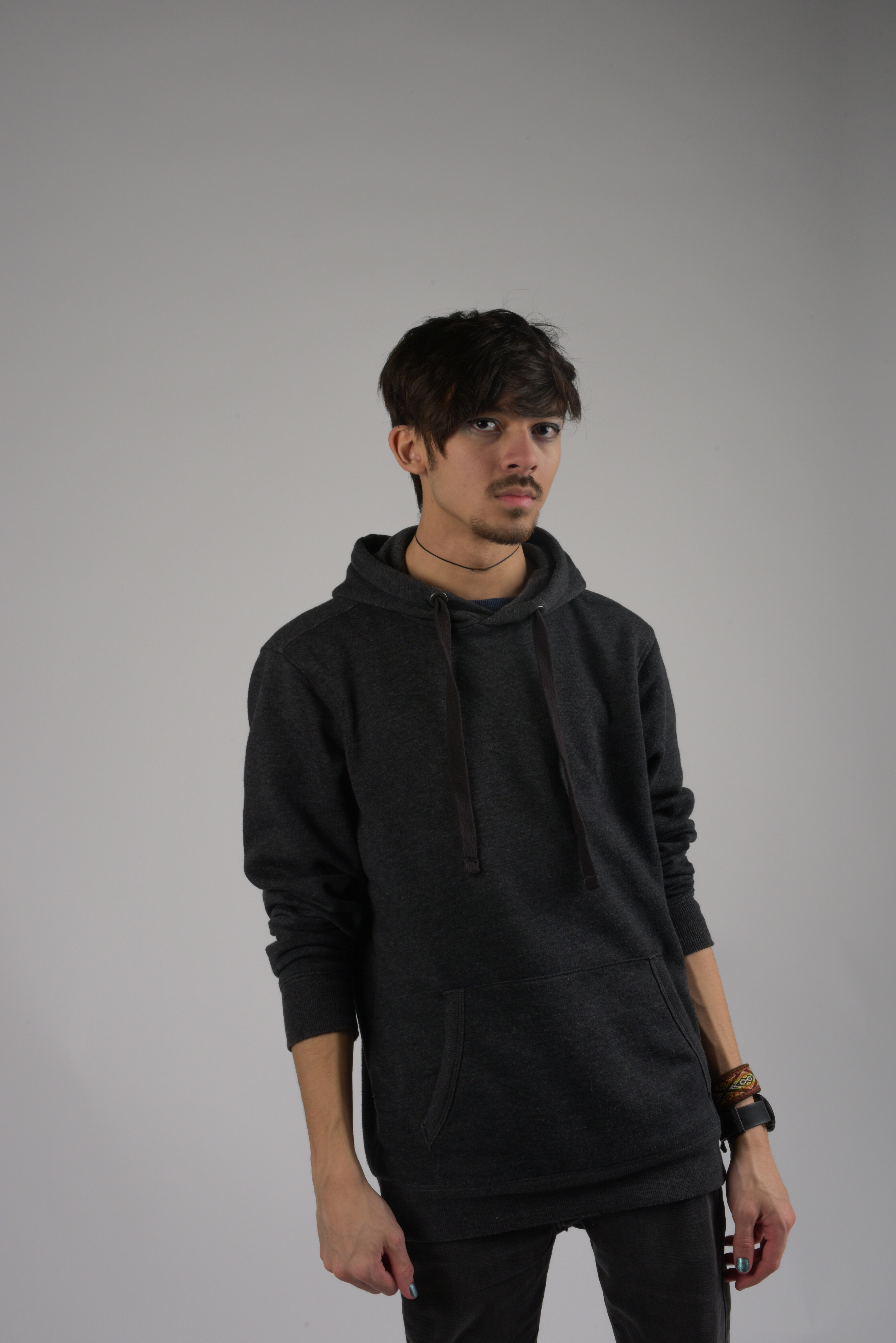
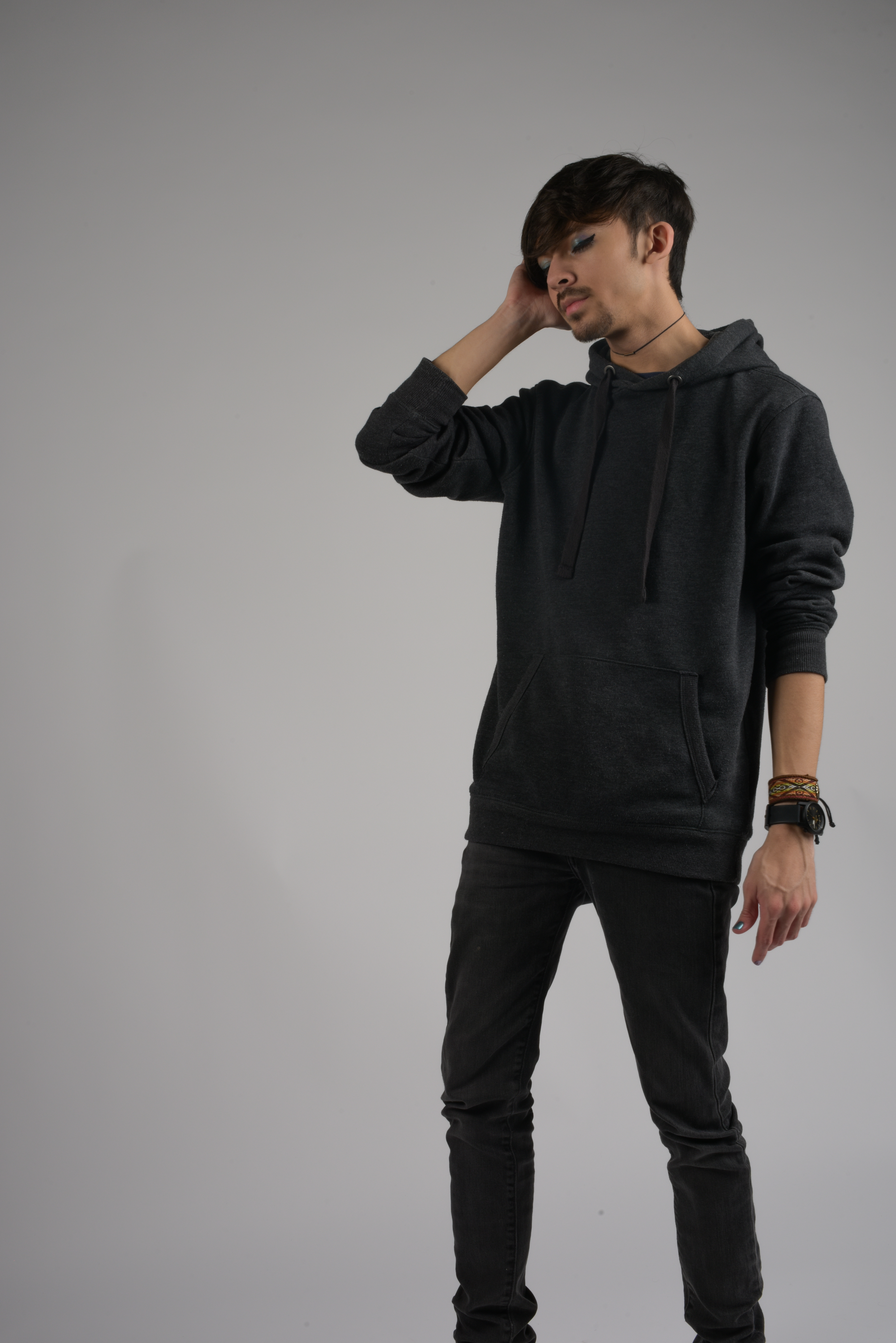
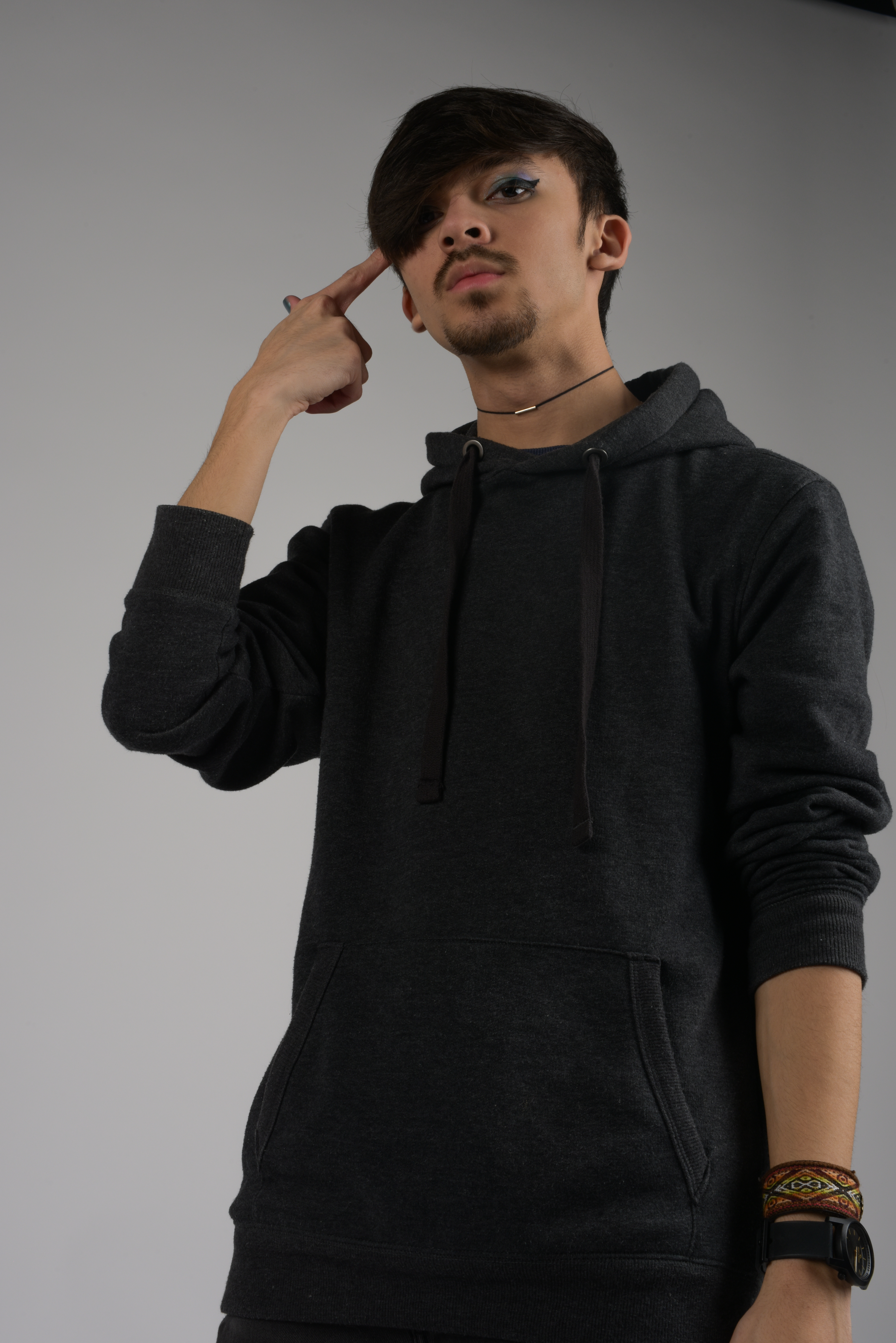
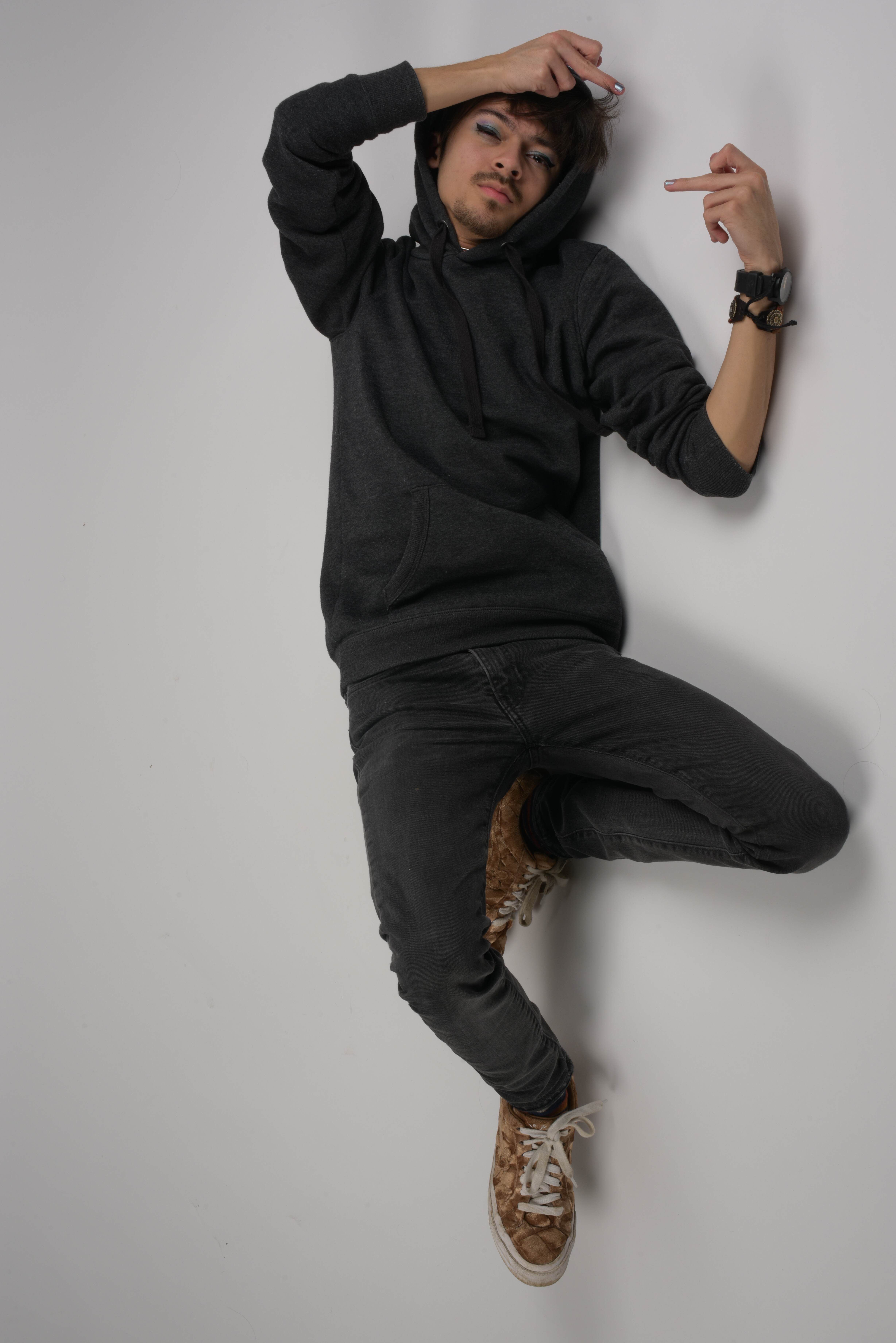
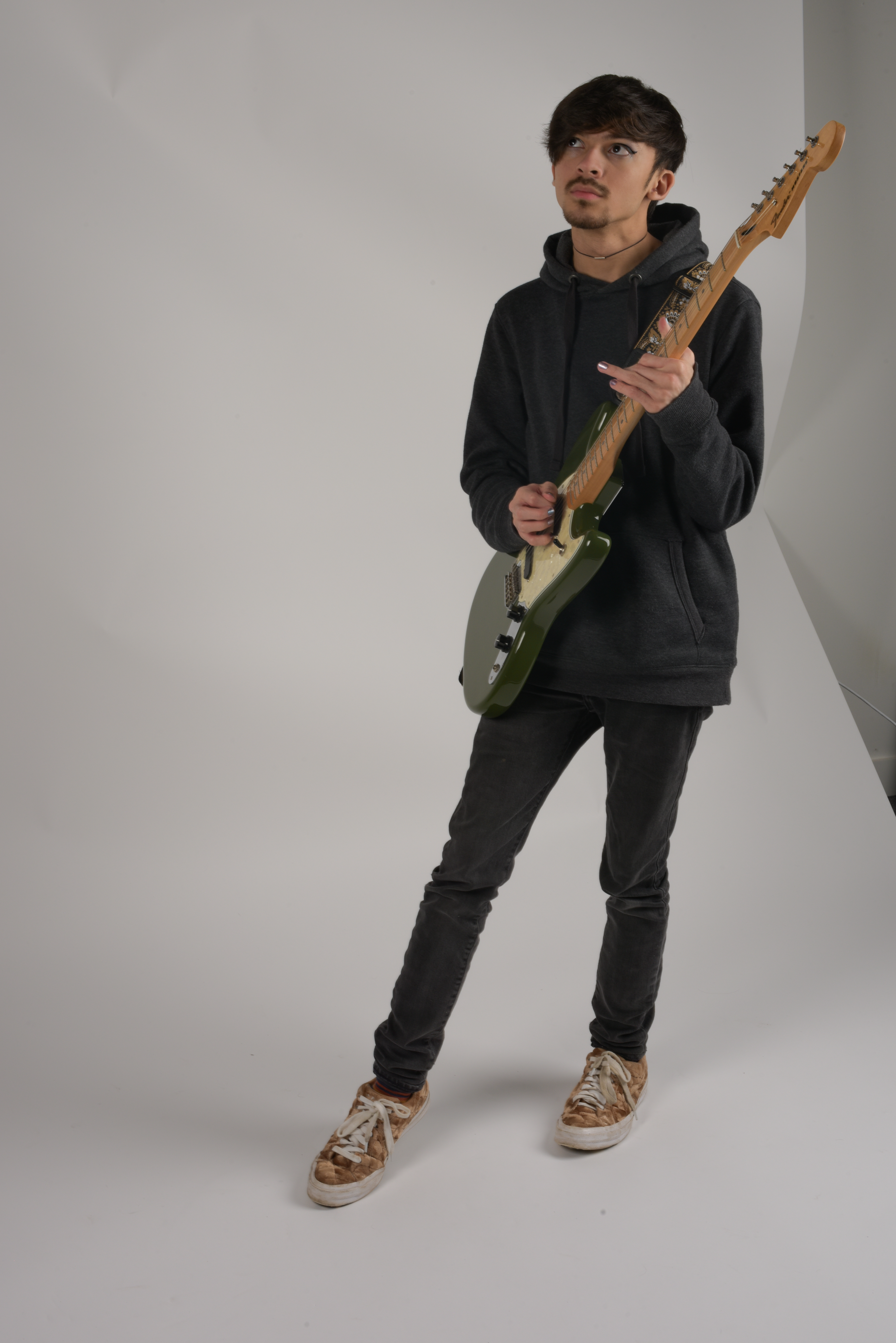
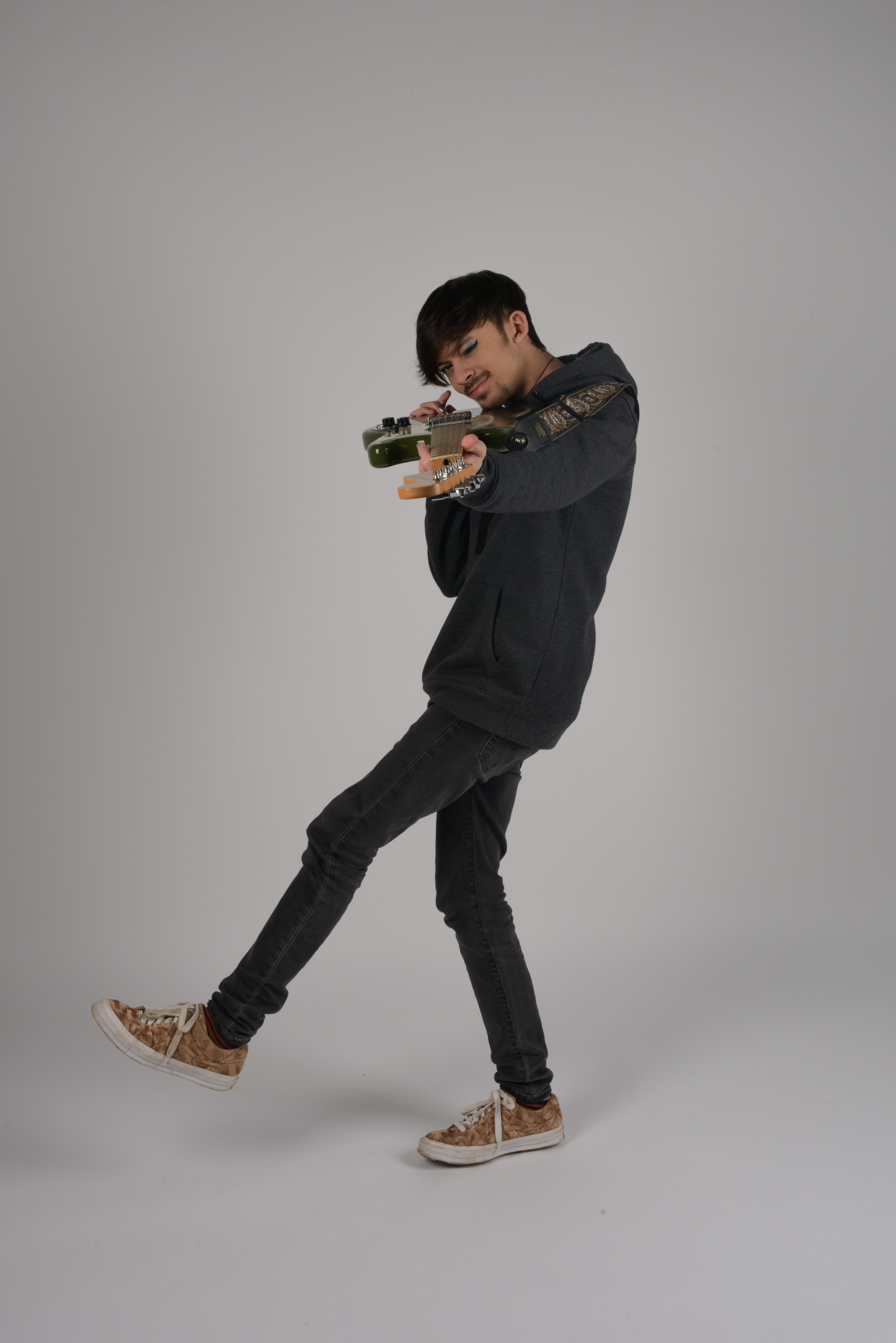
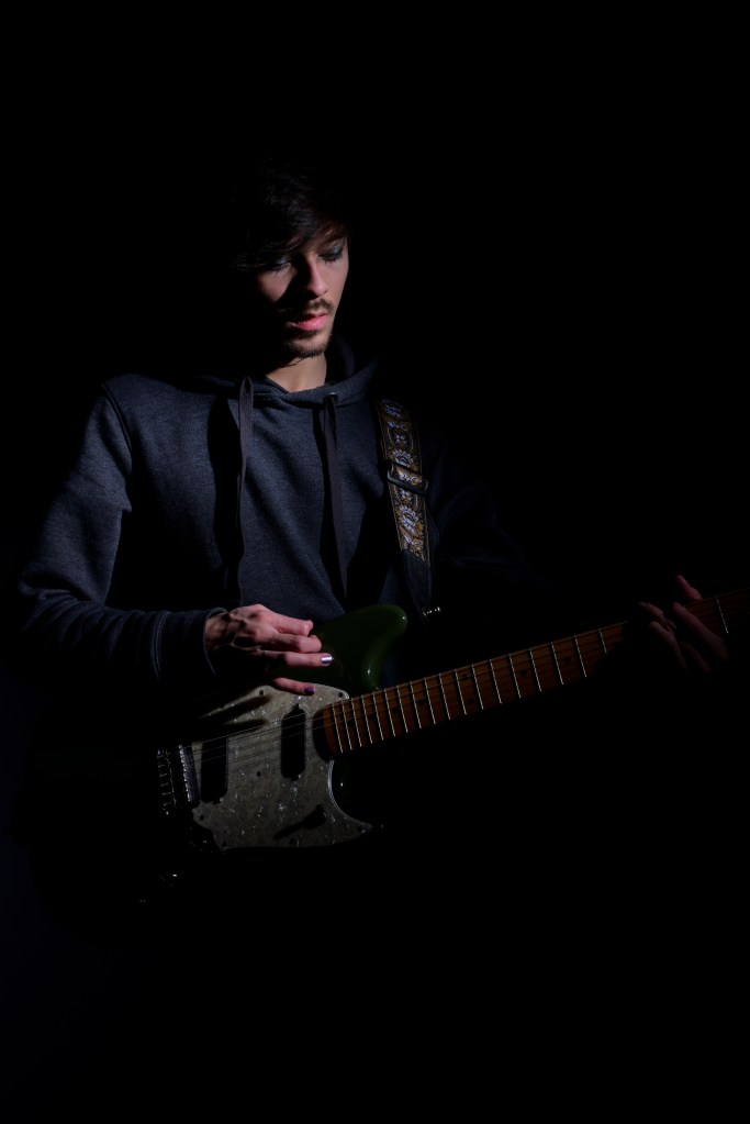
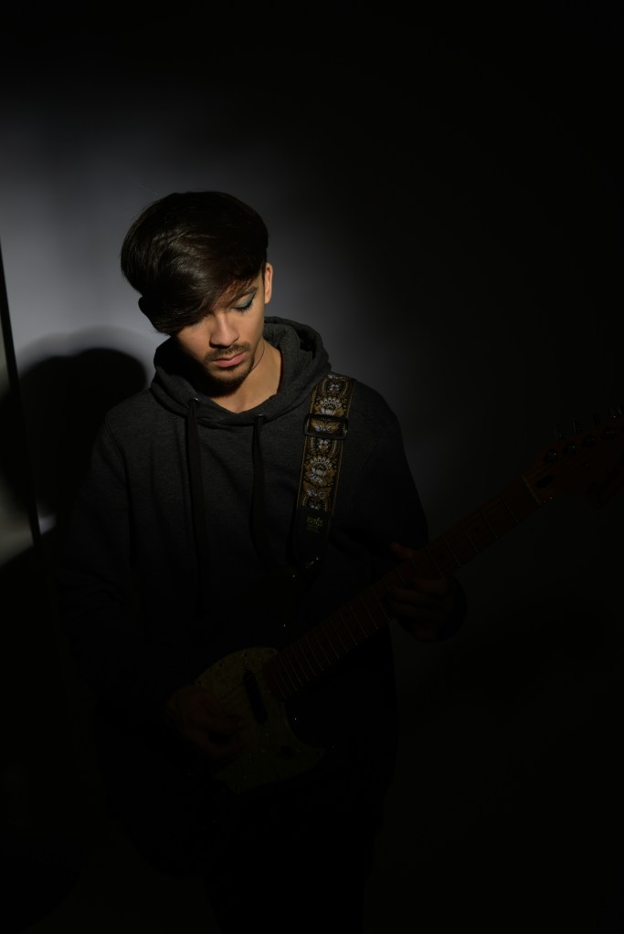
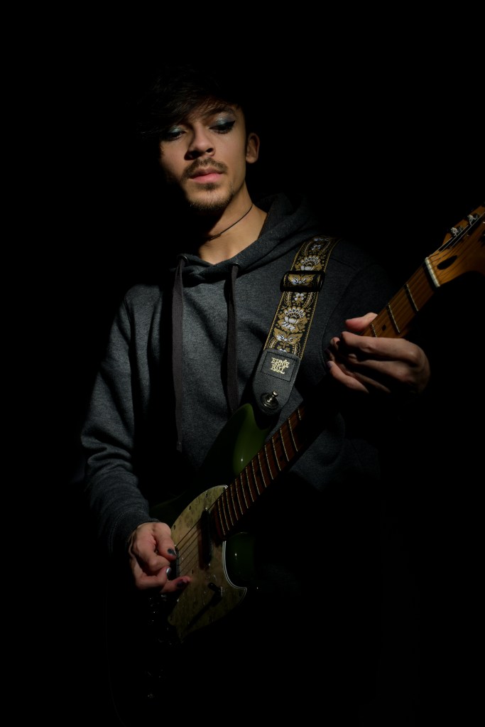
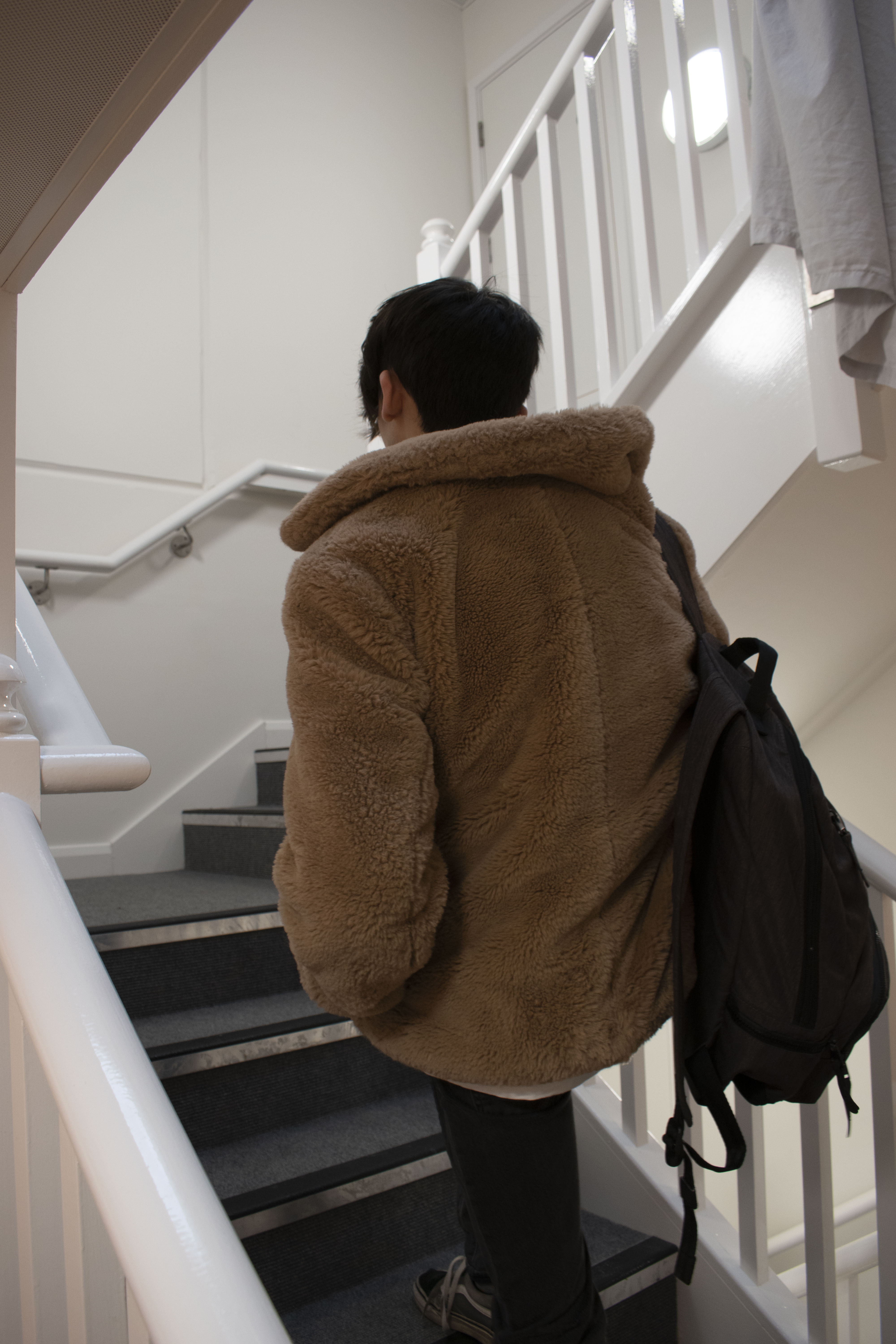
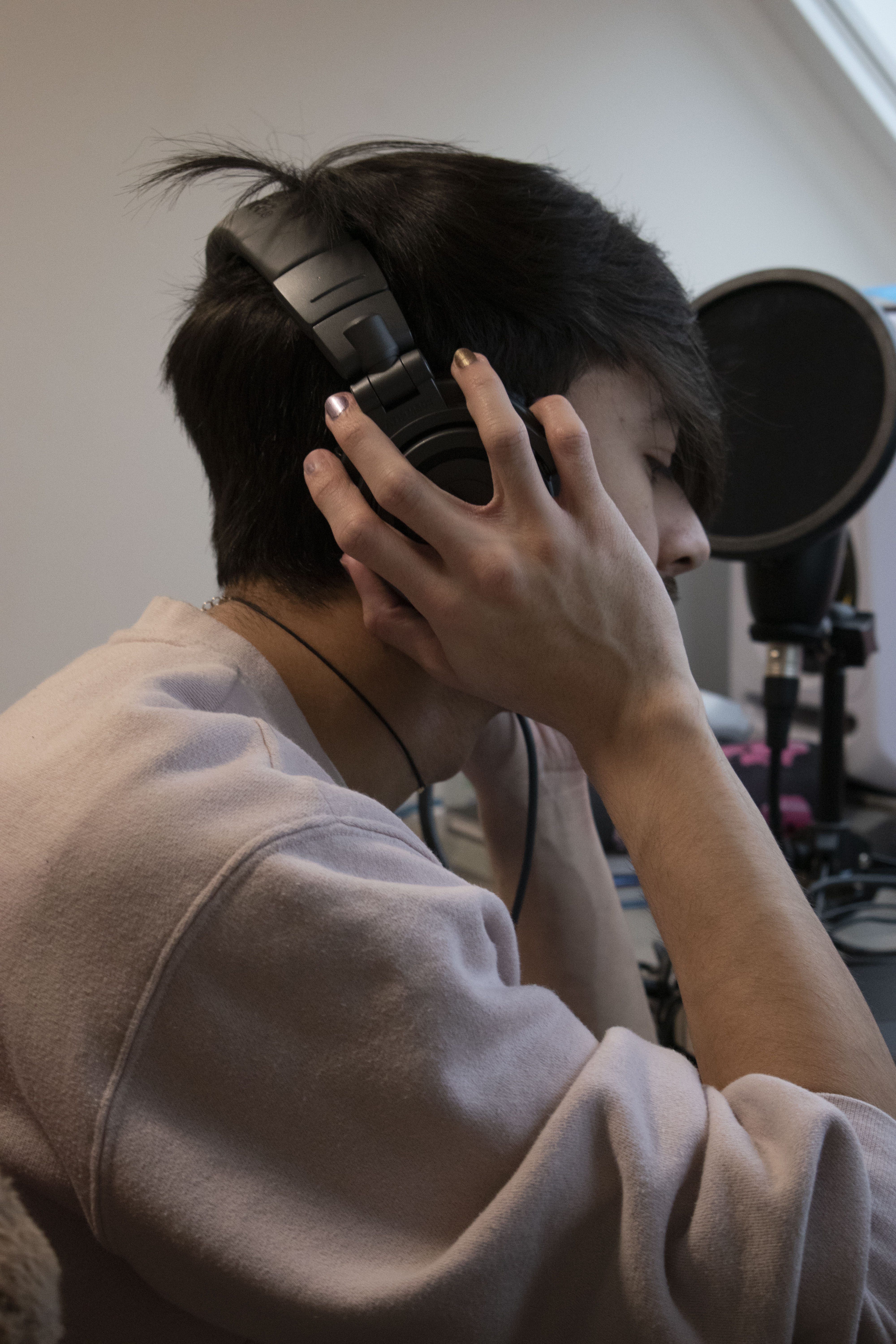
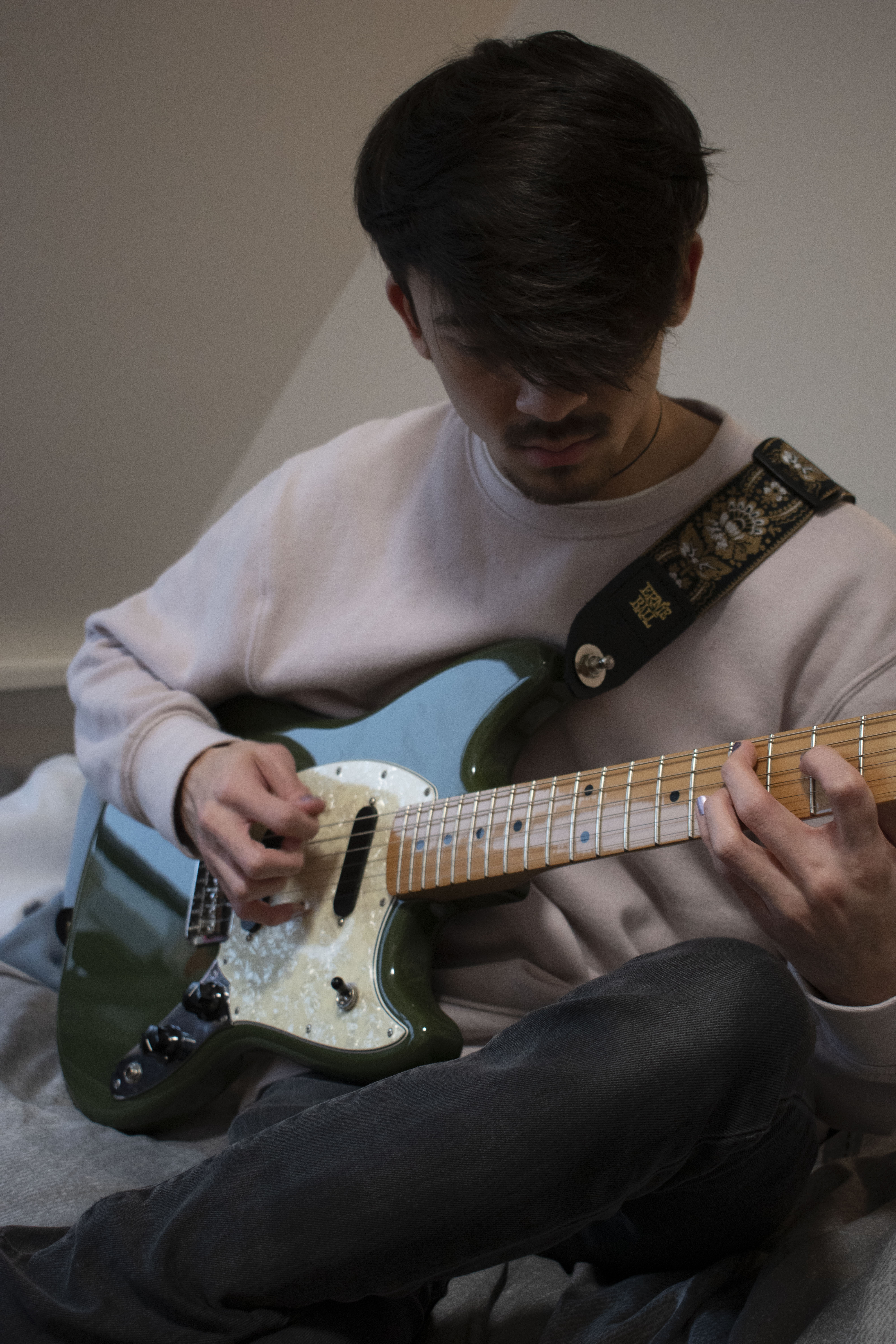
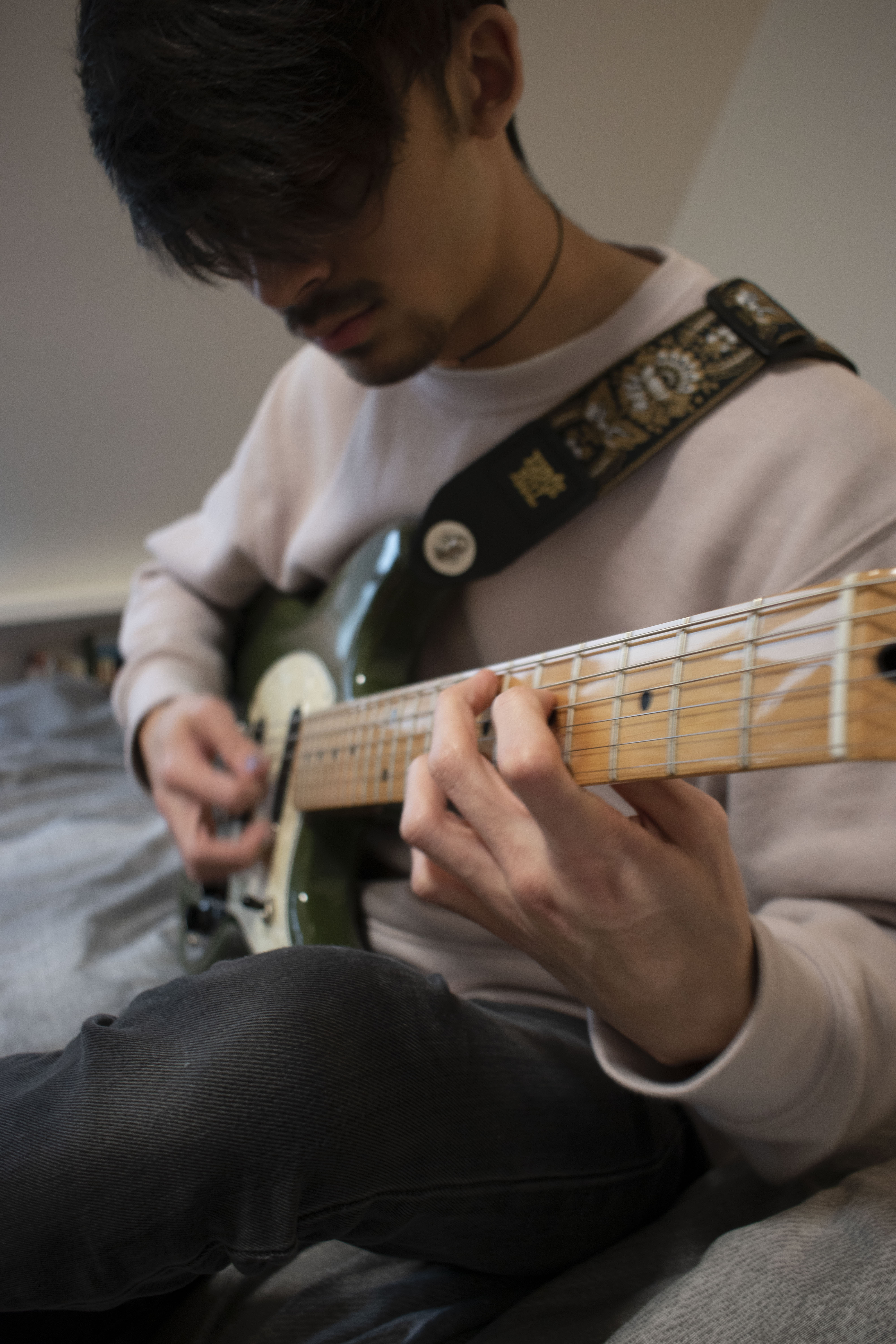
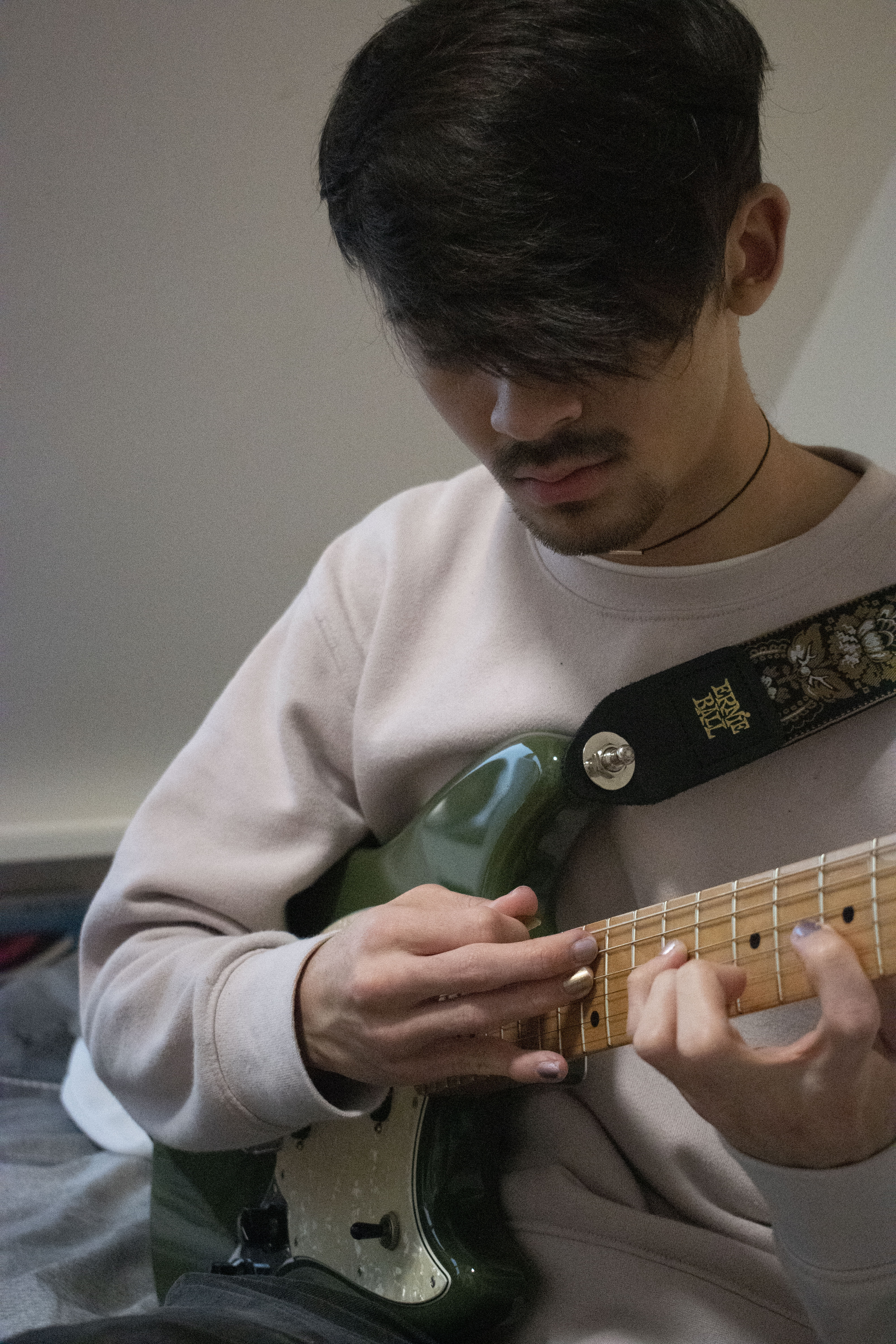
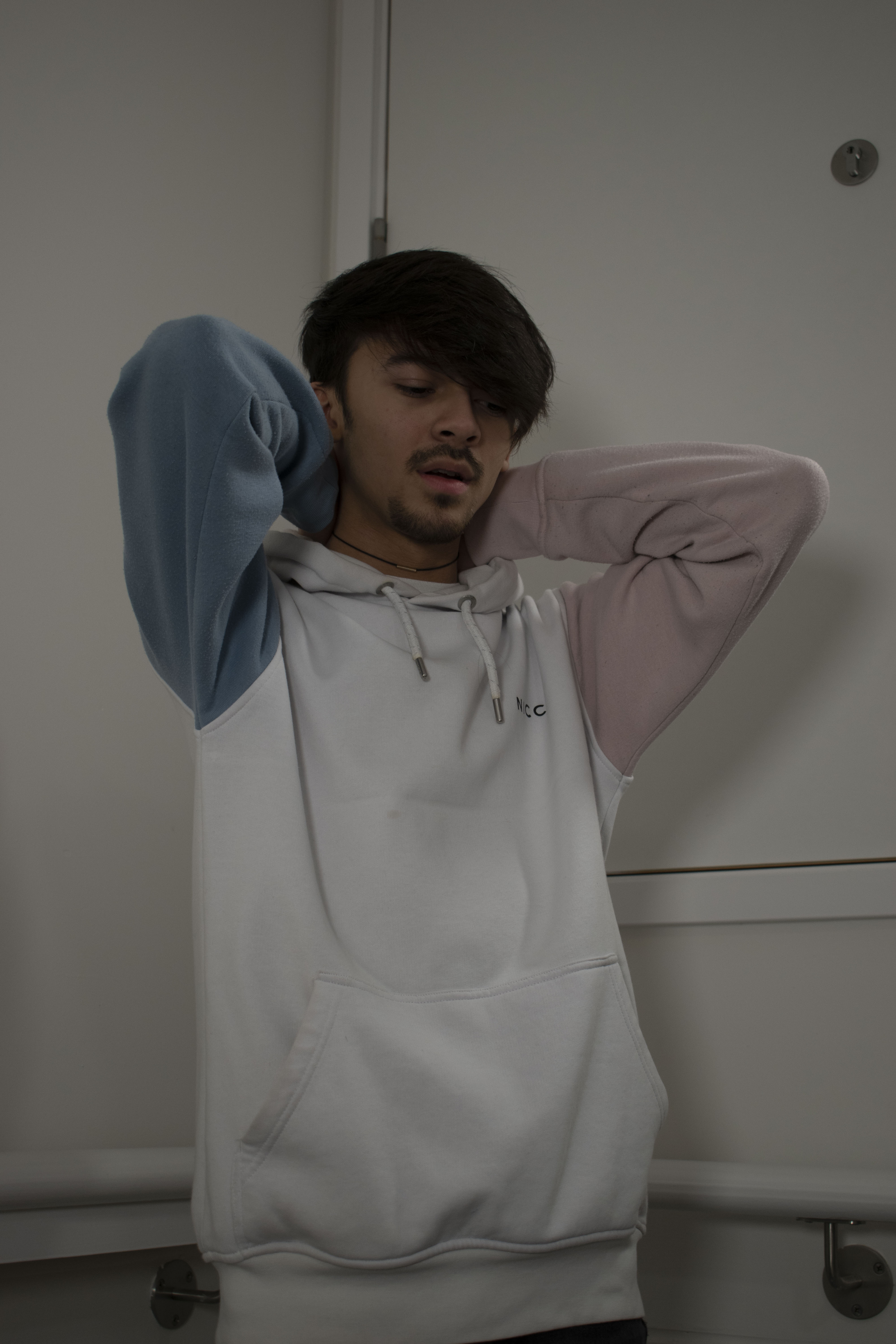
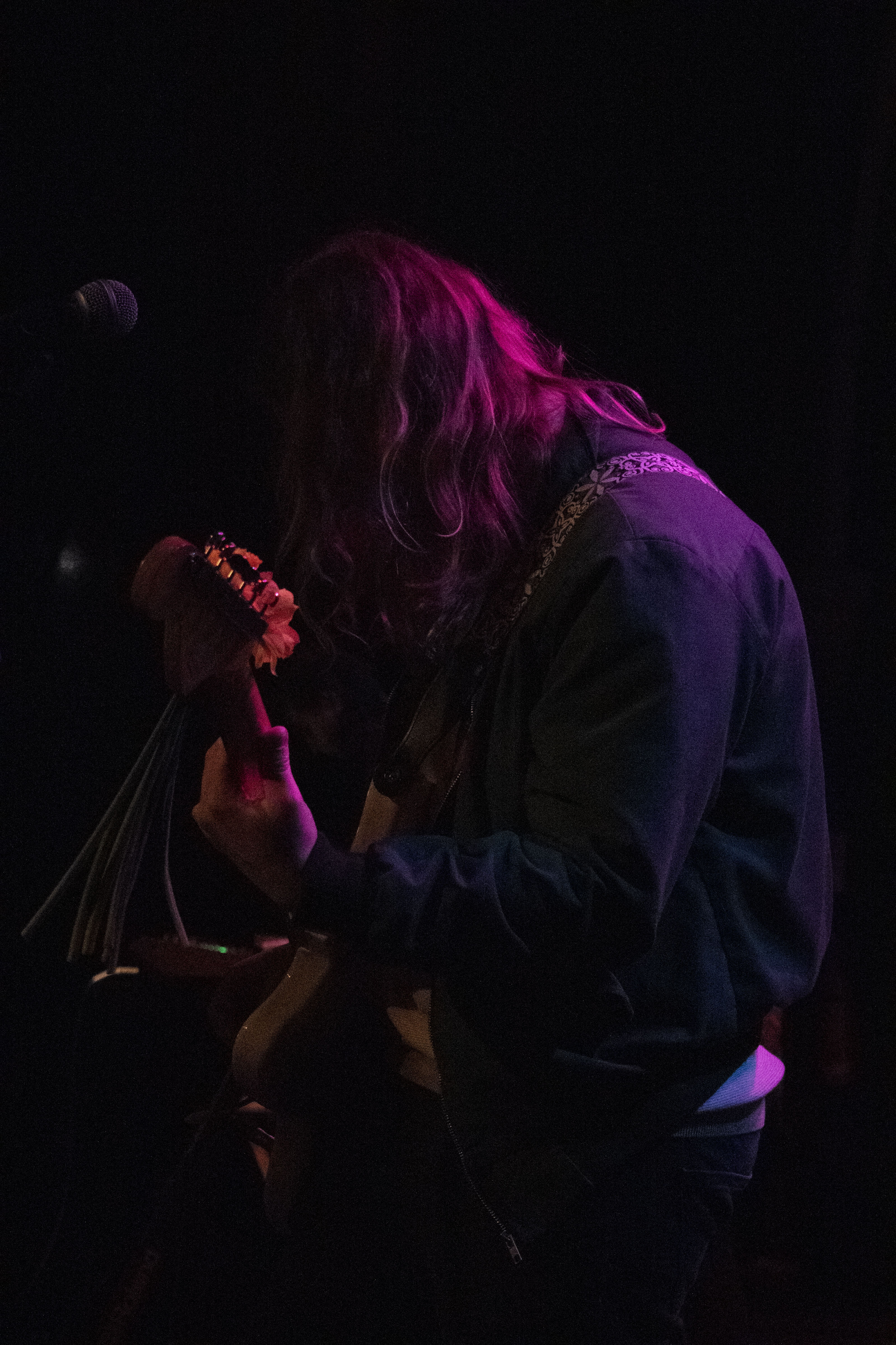
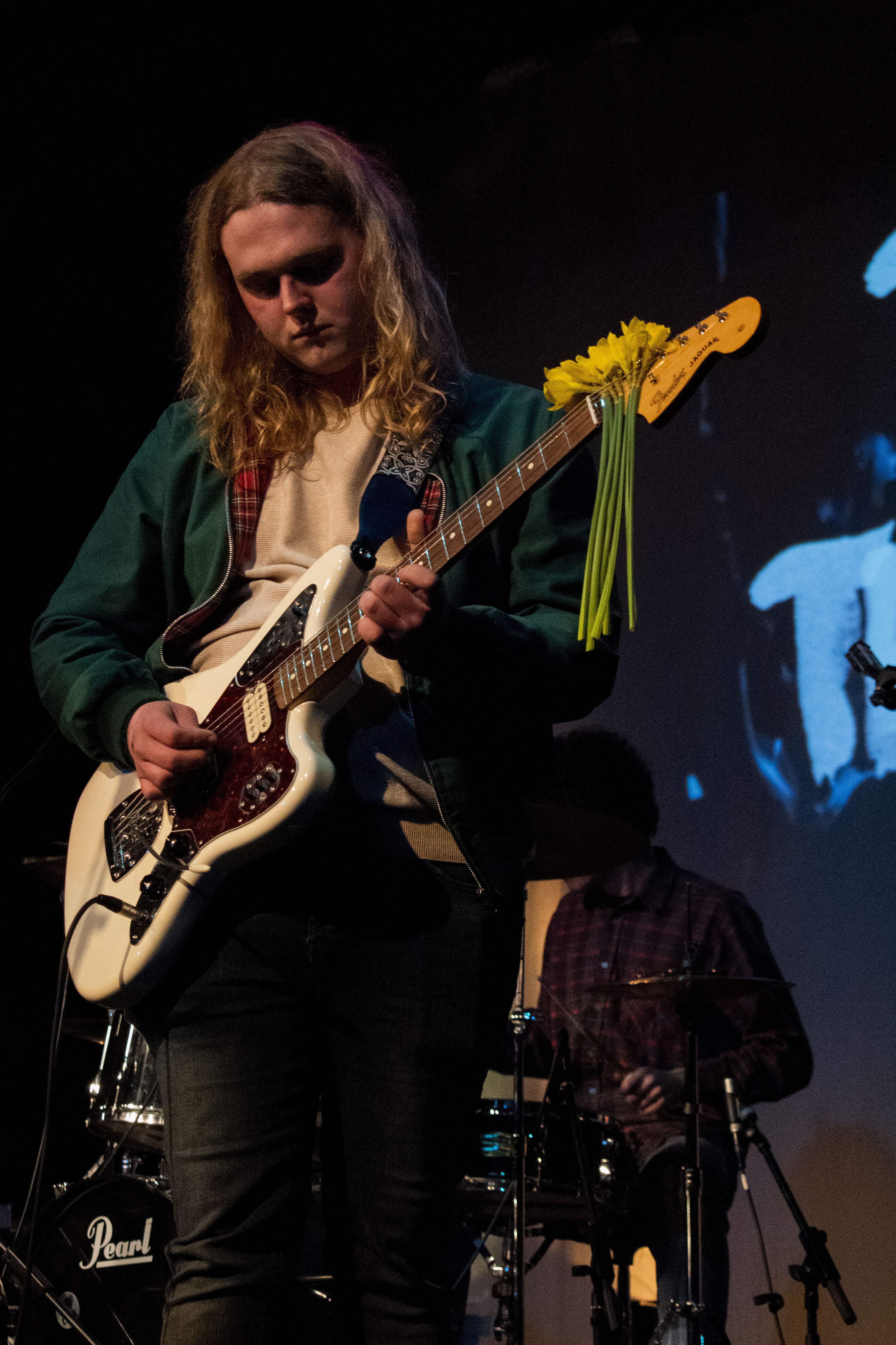
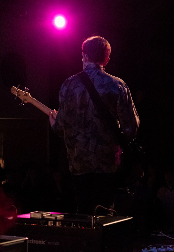
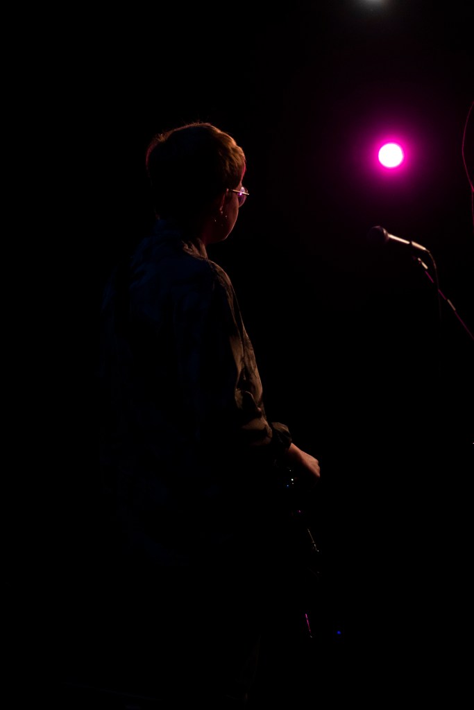
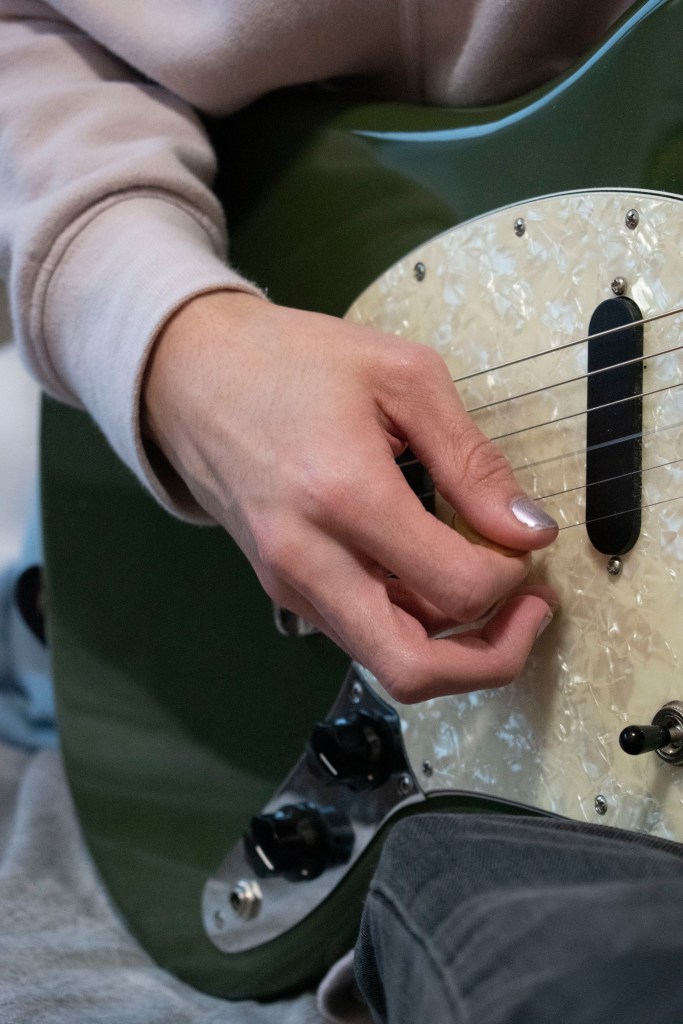
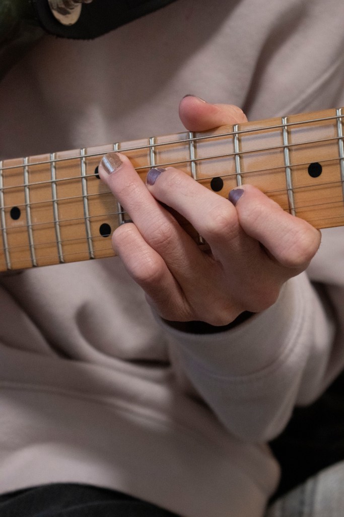
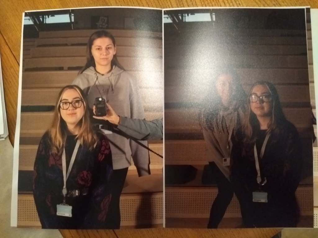
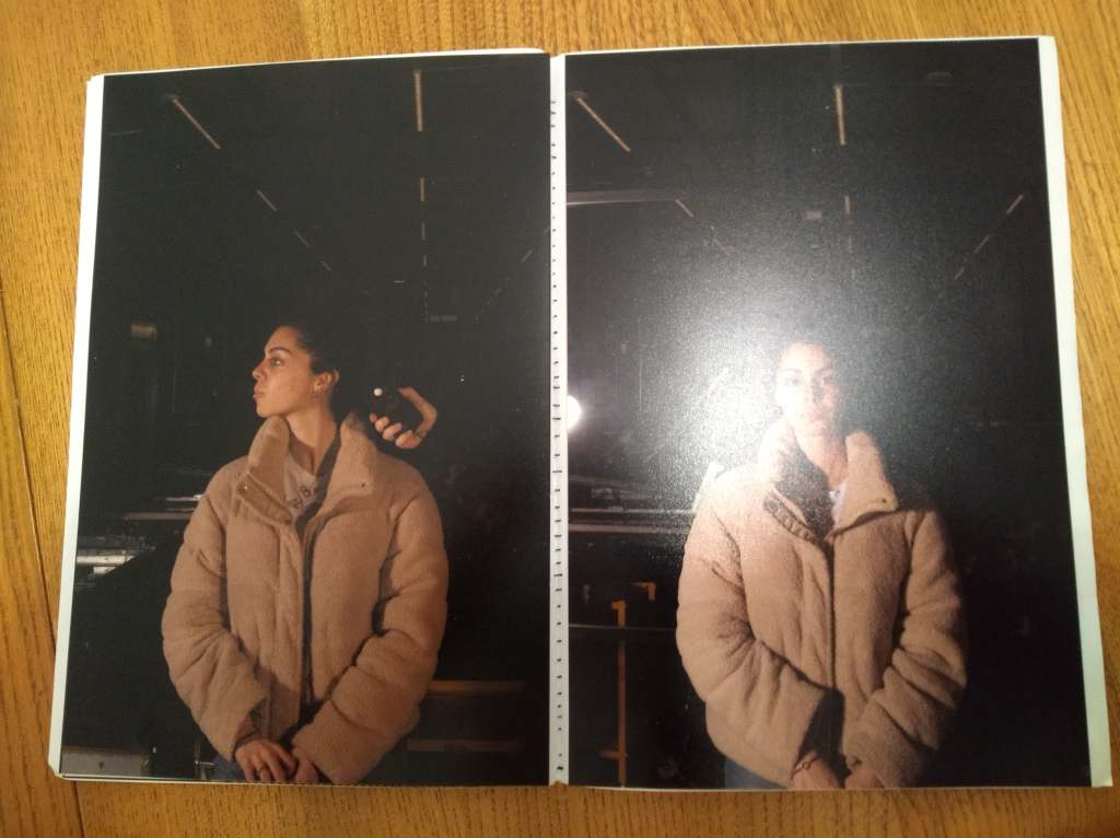
photos taken from past shoots, i felt these fit under this post, they offer such unique and personal insight into thoms textures, contrasting with each other with the fluffy jacket to the rough denim.
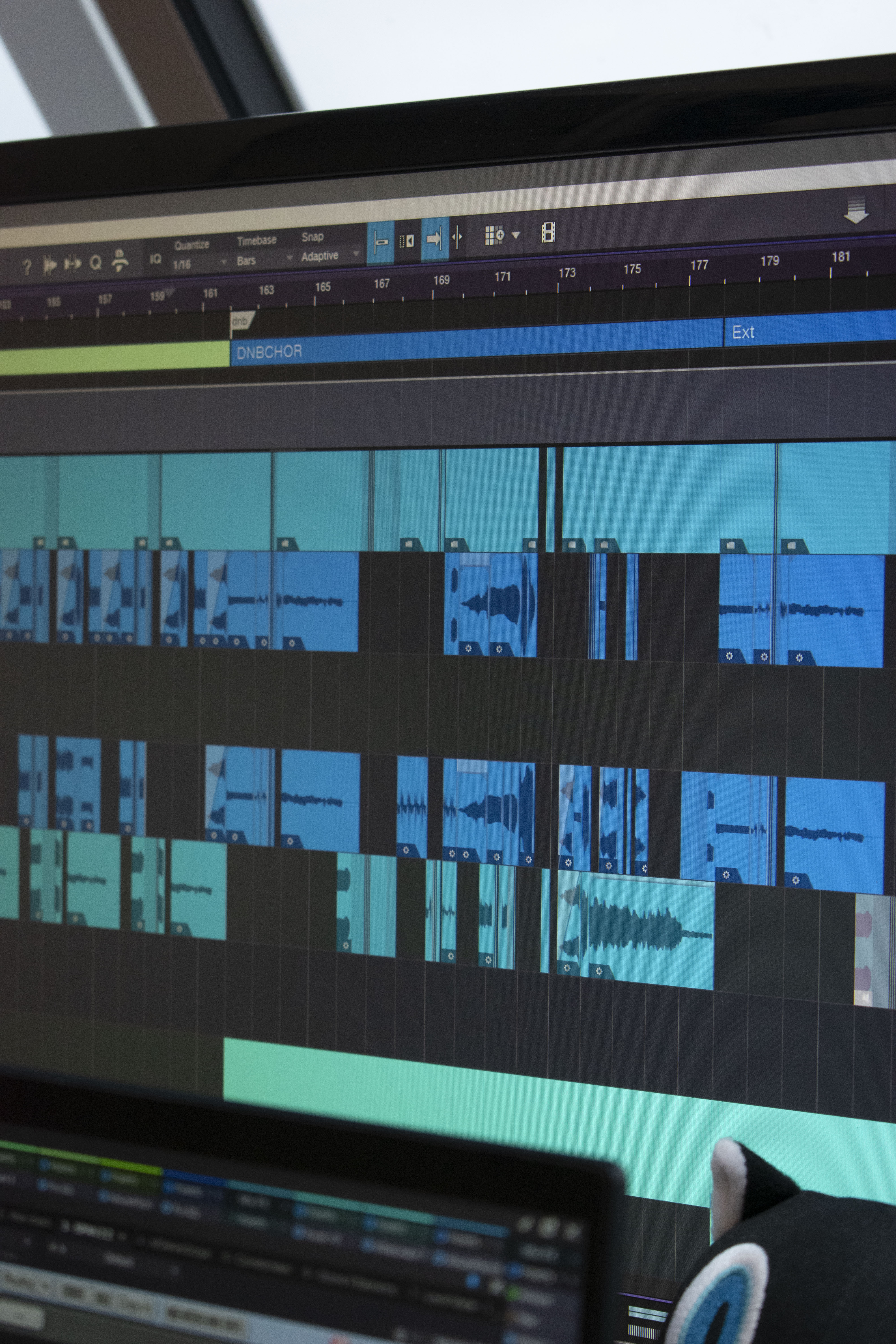
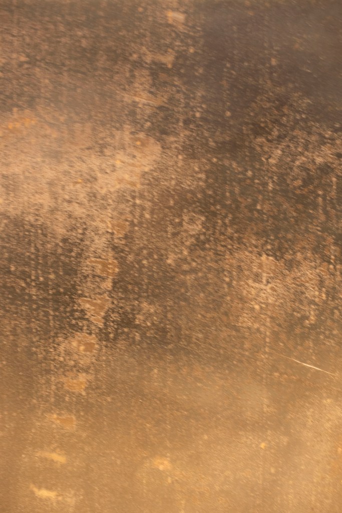
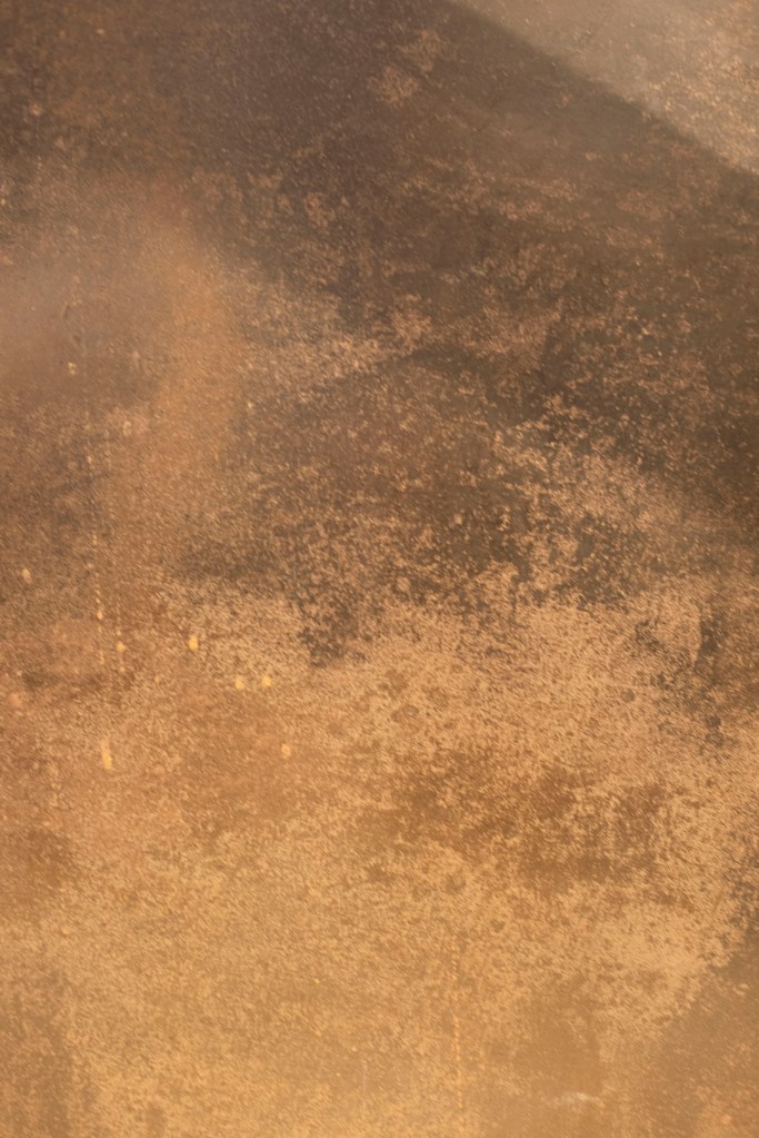
photo editing
inspired by Sara Cwynar’s glitch art, thom and i selecting the photos we liked and opened them in photoshop, i also looked up how to make glitch art on youtube and linkin to get an understand of how the process is done.
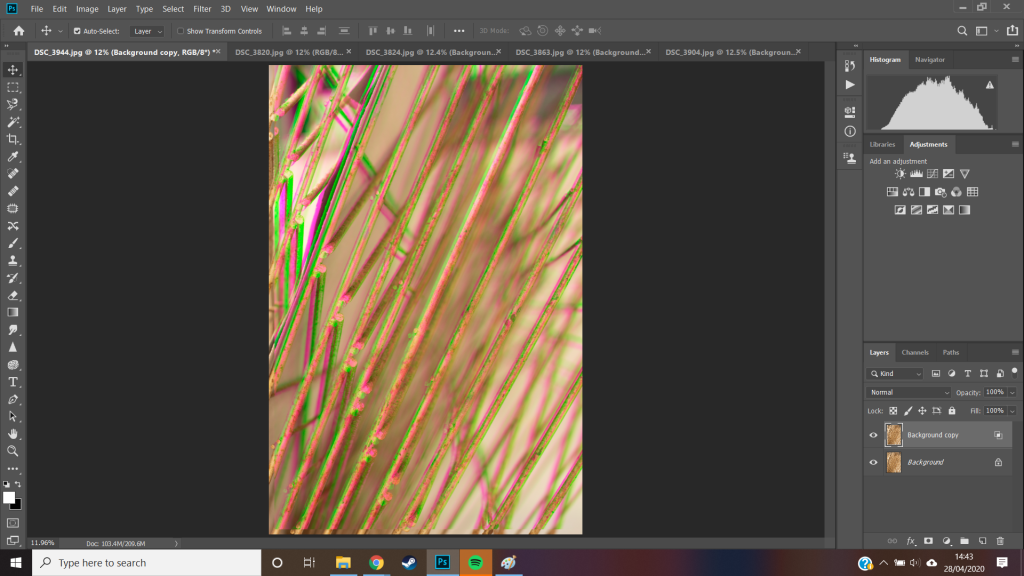
creating a second layer on my background image i dragged them slightly apart to show this shift by turning off the channel gave me this distorted effect with just the red channel.
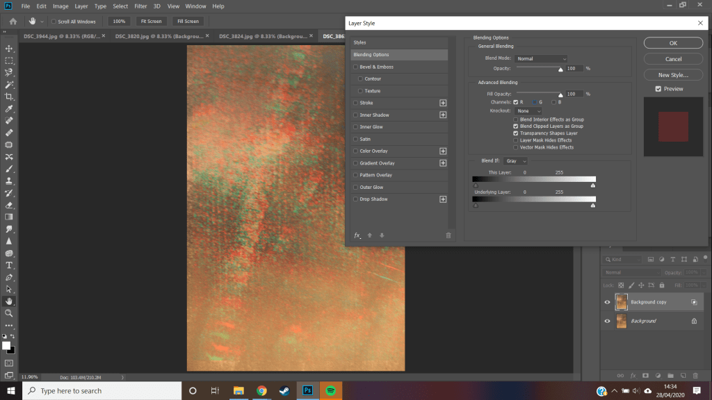
trying this with a separate image i placed a black and white filter between the two layers to increase the effect of the turning of one of the color channels, i also set the layer to be an overlay, this helped but still didnt give me the colors i was hoping to create.
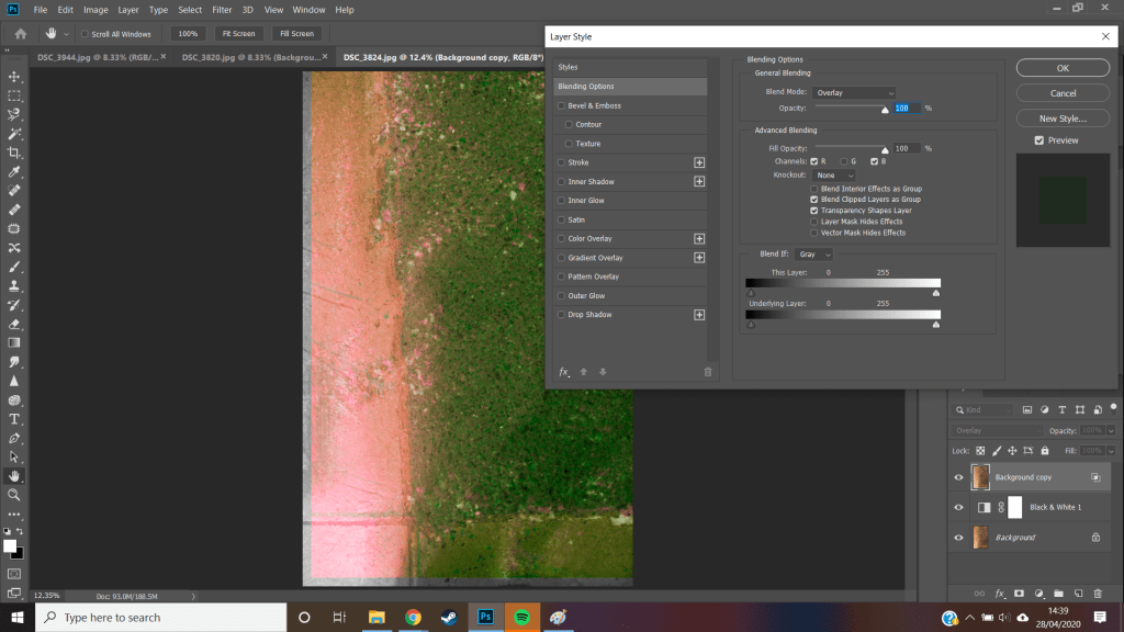
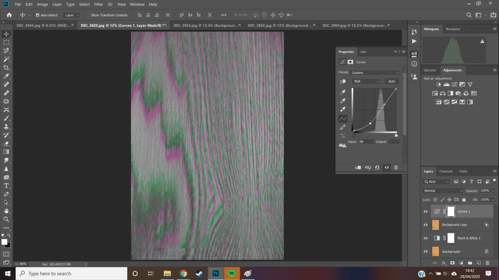
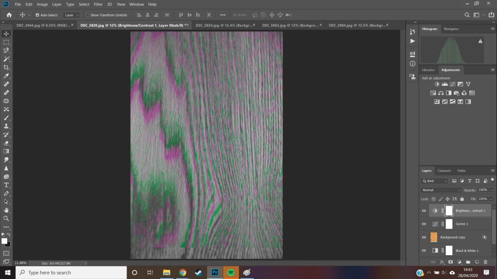
trying this again on a separate photo it worked out a lot better when i set the layer to illuminate, this got me closer to the colors i desired, to increase the contrast i also curve (this is a bad cure) but does what i want
i also added a contrast fillter to boost the definition and depth of the image, mostly happy with this image i thought i could still make better
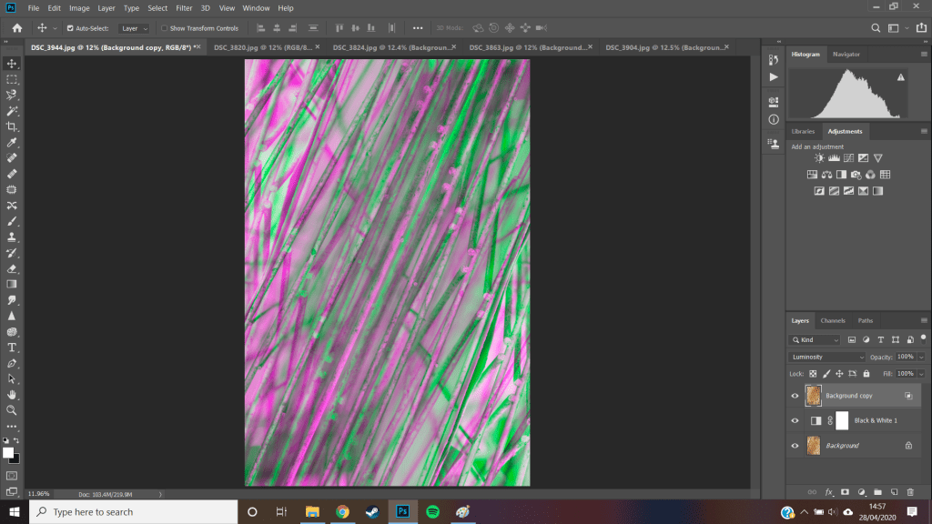
following the same steps as before, this time with better result
curious how i could take my photos further i started to transform them using the editing tools, flipping the top layer horizontally creating an interesting kaleidoscope pattern, and then later flipping it vertically. the color is created because of the difference in the layers, when layered ontop of each other they create a full color image but because of this shift they show the negative space left behind filling it with color
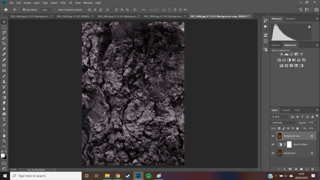
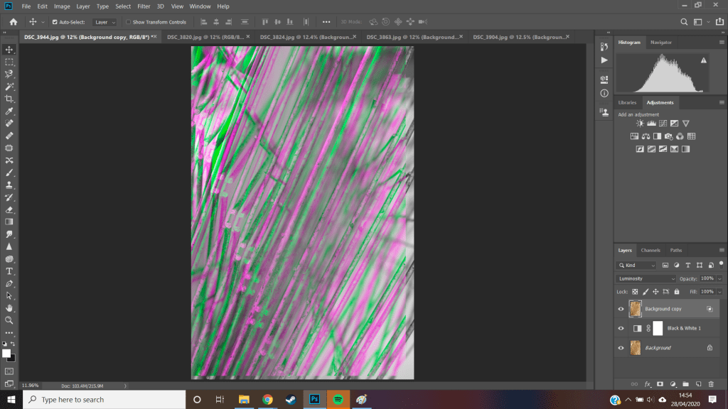
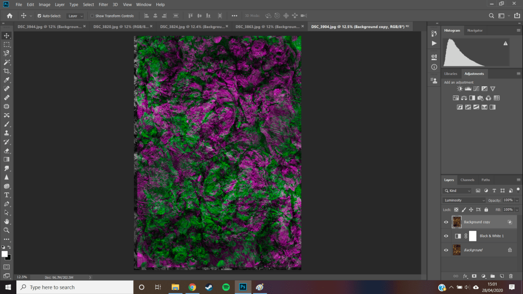
after sampling diffrent ideas i selected my next image to repeat the same process, creating multiple layers, turning off the green channel on the top layer, black and white filter in the middle

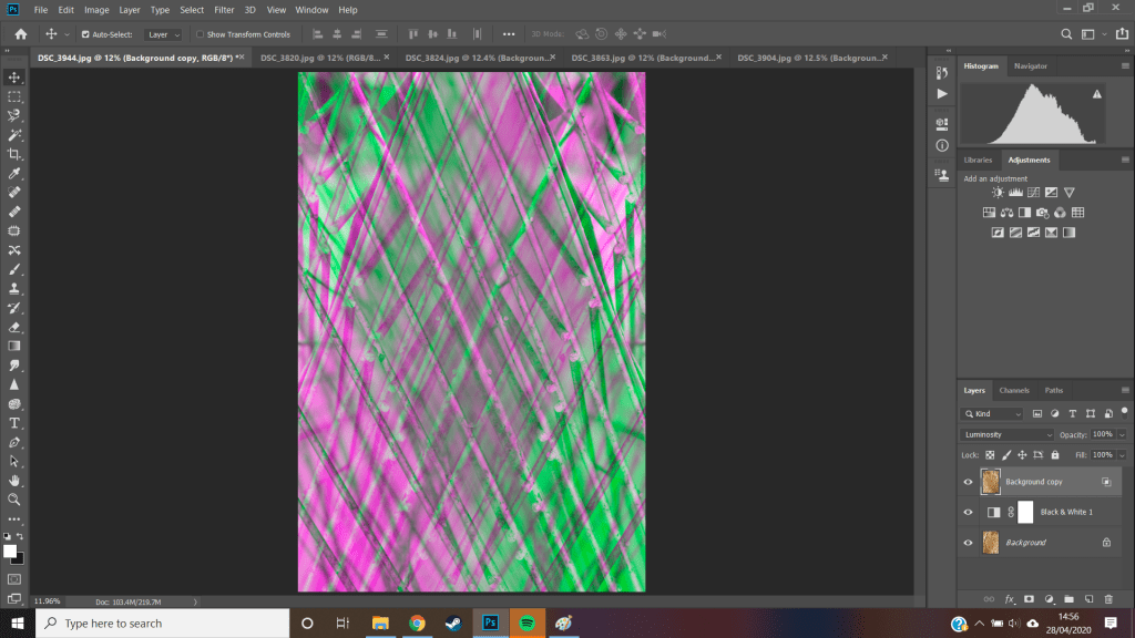
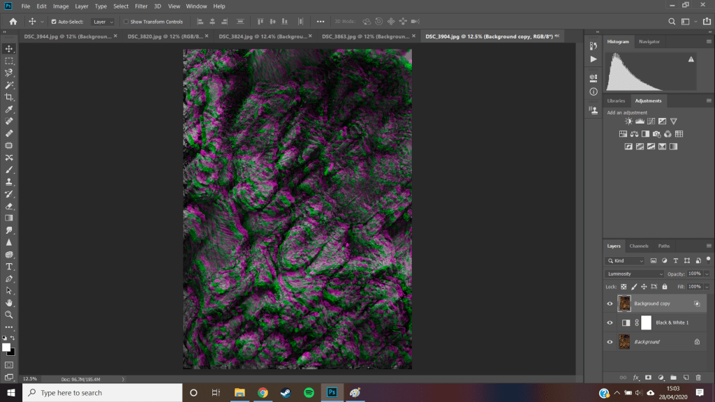
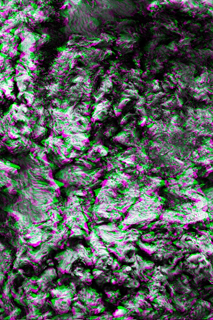
trying to flip the top layer, until i decided it was bast just slightly shifted providing the most clarity to the image without distorting it too much,it kind of reminds me of a false motion blur effect
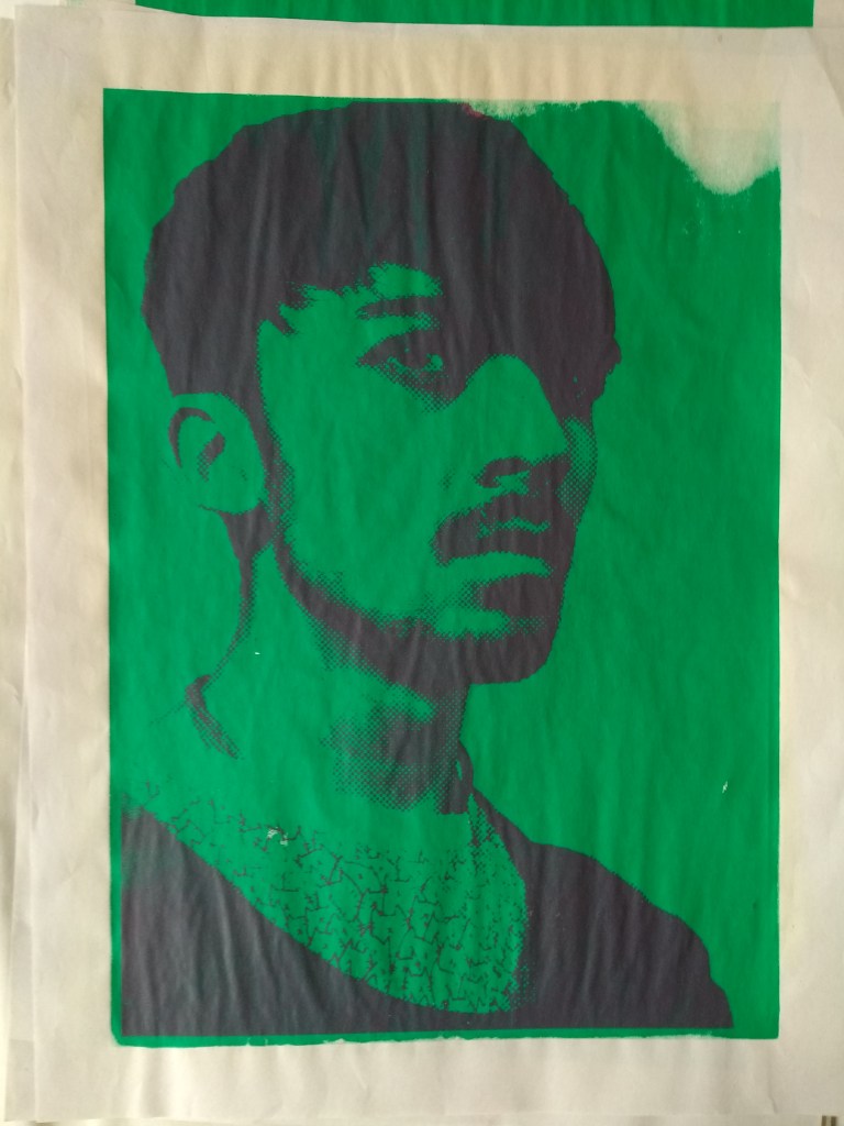
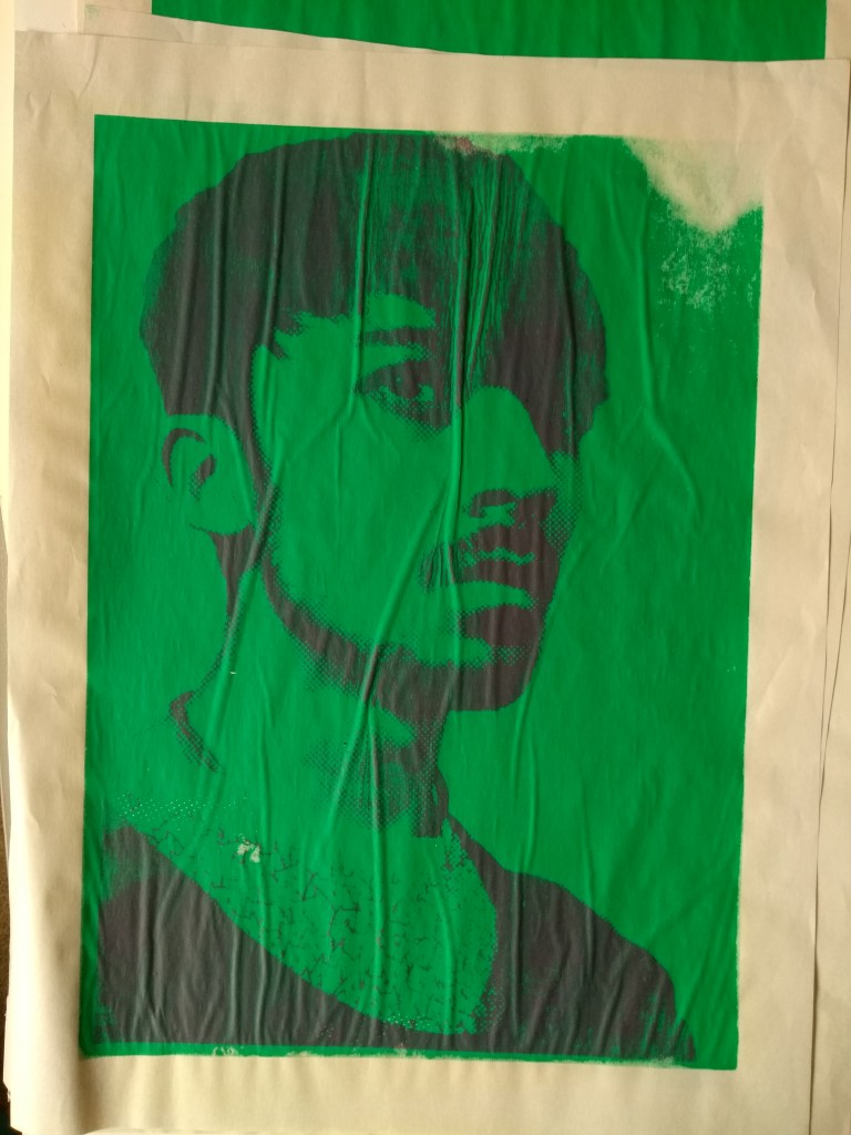
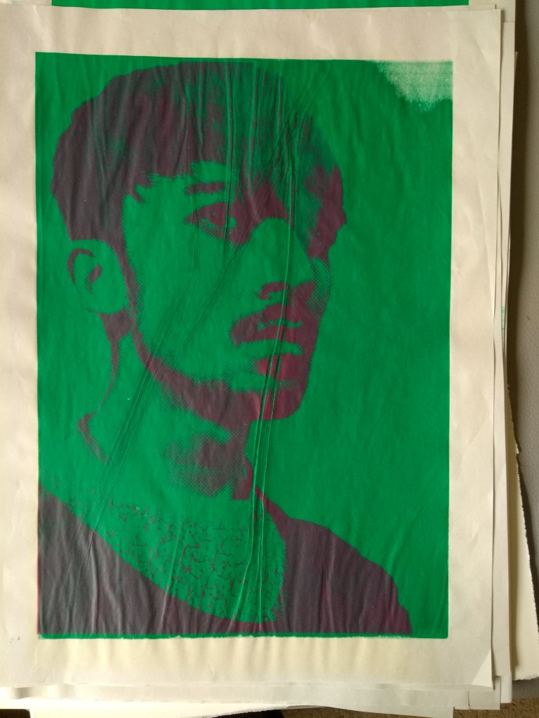
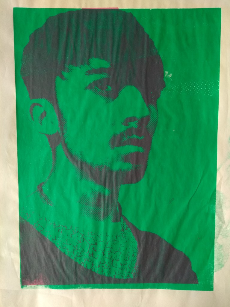
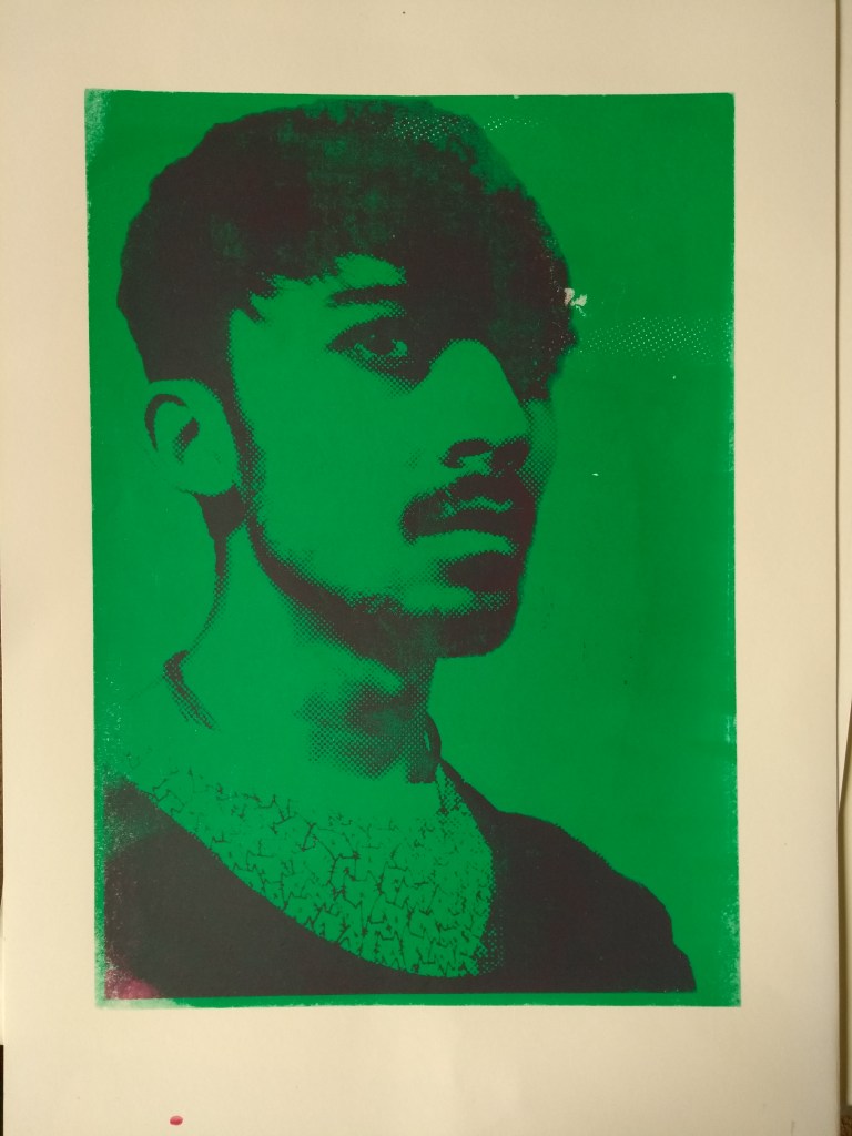
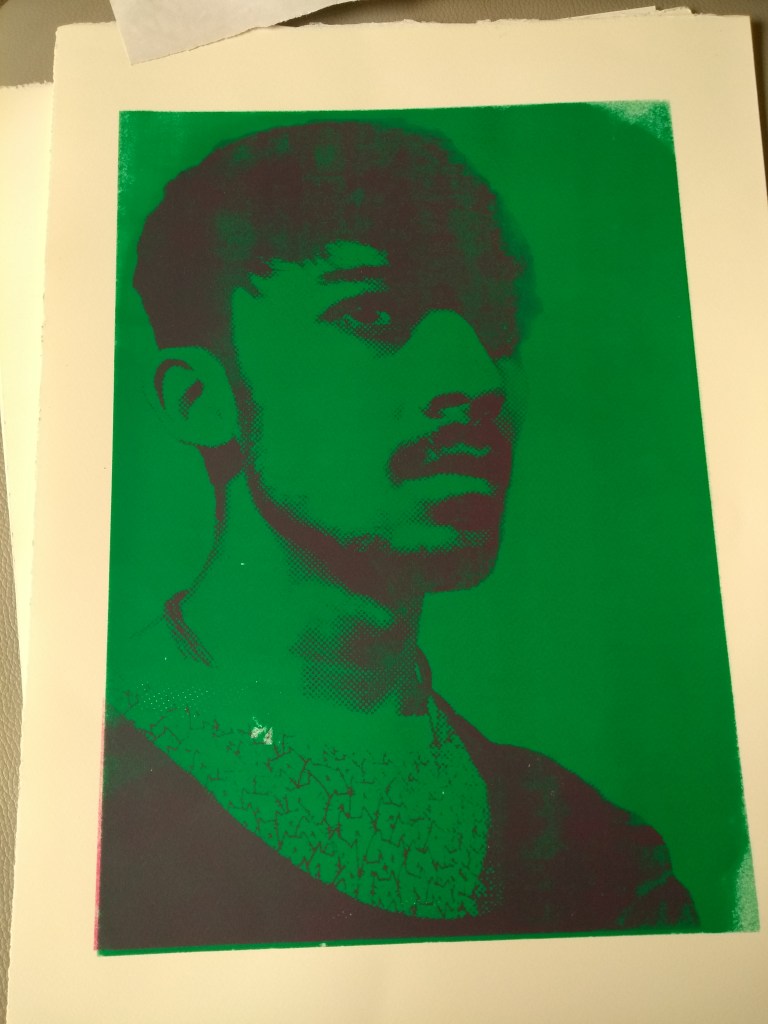
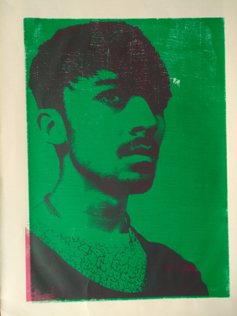
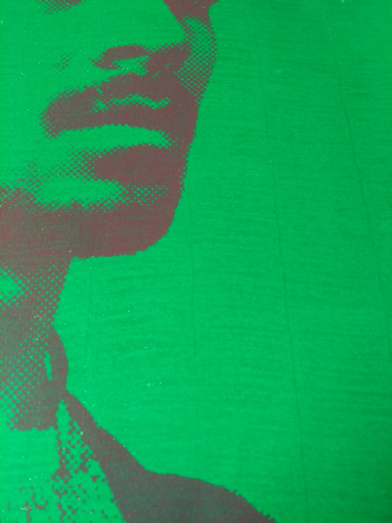
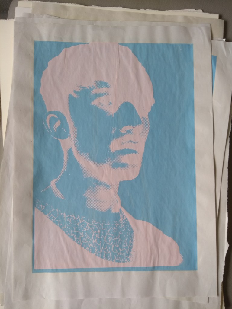
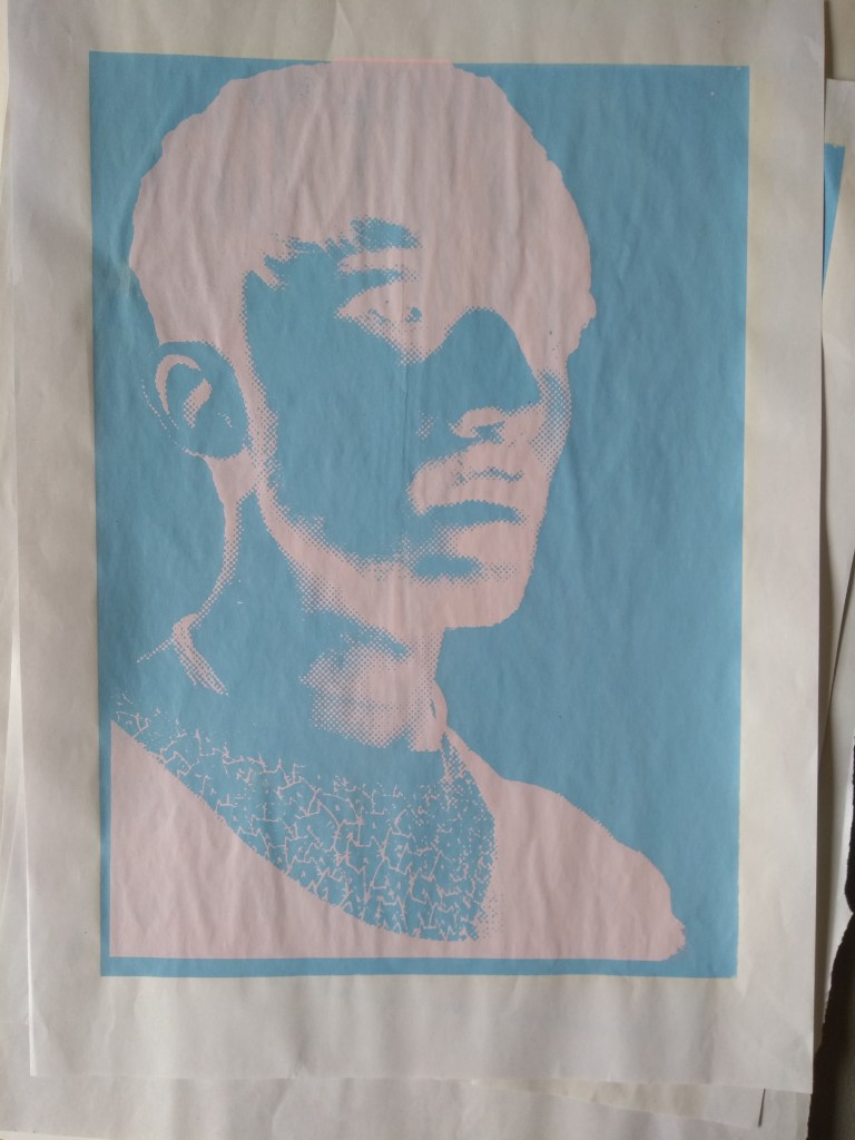
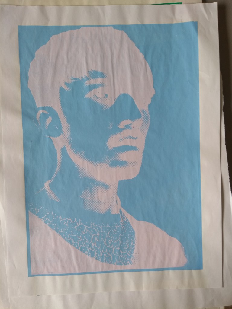
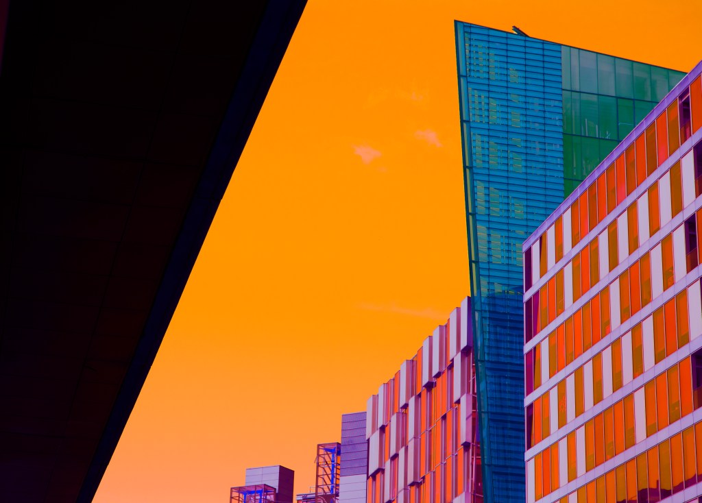
converting my image to a smart filter layer allowed me to edit my image easily, letting me turn off each filter layer as i saw fit, i started to liquefy my image to give this warped effect and added a halftone filter, introducing lines as if it was a CRT monitor, linking to thoms fascinations with old technology, this sis something thom spoke and said he wanted within his work
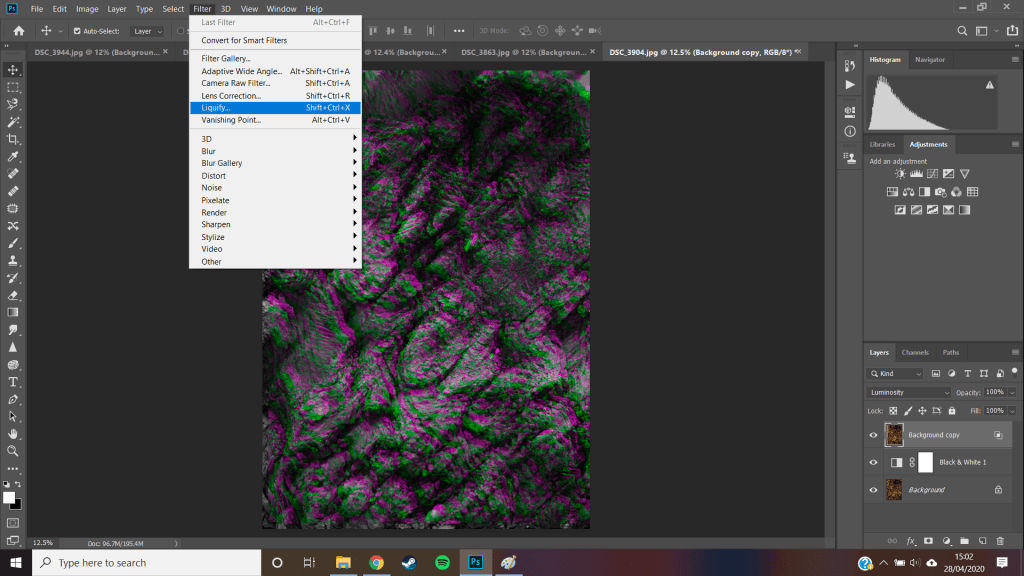
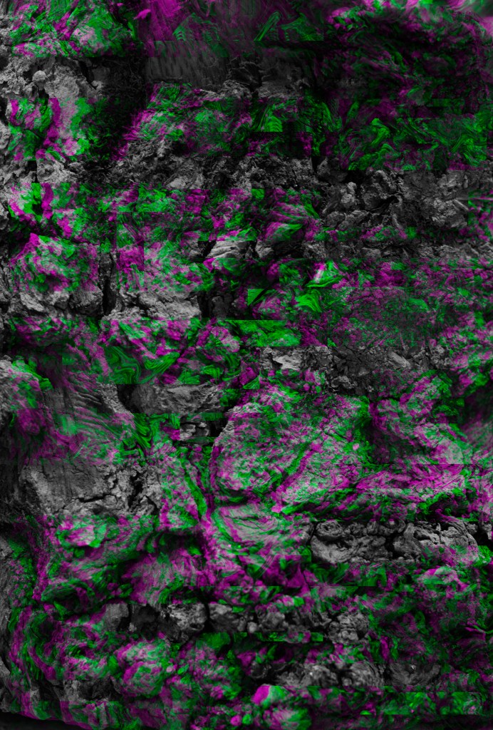
i feel this combination of the natural dying log, and the alteration digital aspect from photoshop really works to benefit thoms style, linking to his MX, showing juxtaposition and amalgamation of different textures and technology
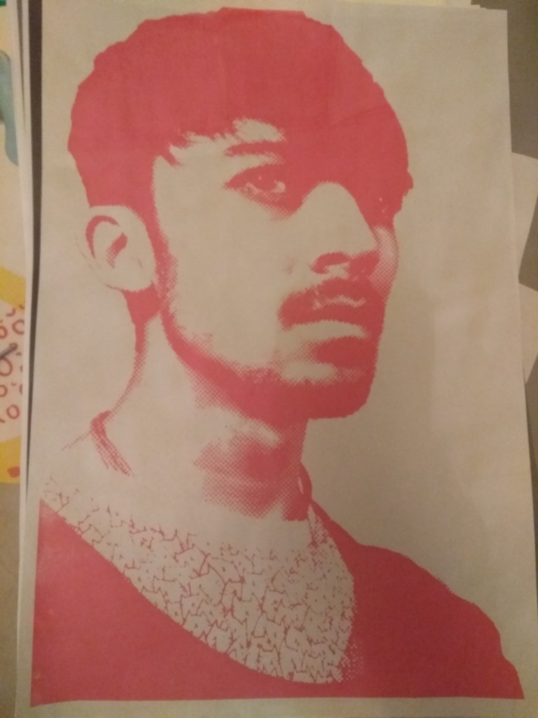
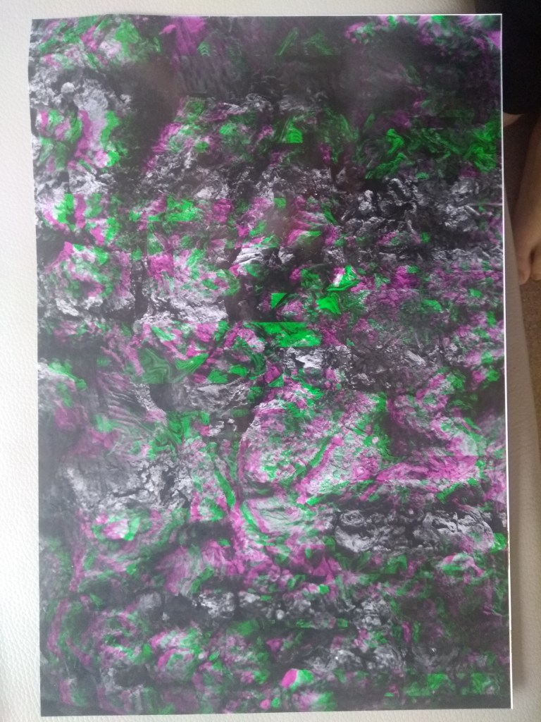
this was the last thing i created before moving back home because of the virus, i printed this onto A3 gloss inkjet paper as well as matte to see the differences between the two, i liked the gloss a lot more as it made the colors pop, this strong magenta and green was difficult for the printer as the colors are pushing limits for the ink cartridges.
gloss 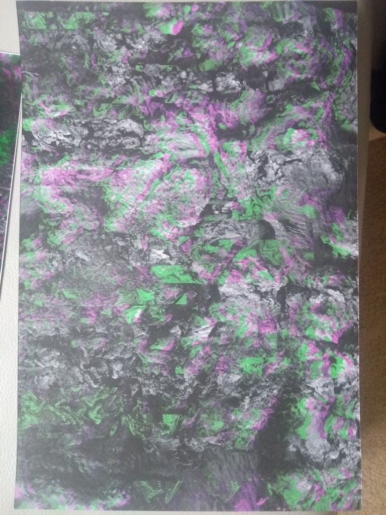
matte