04/02/20 lighting workshop

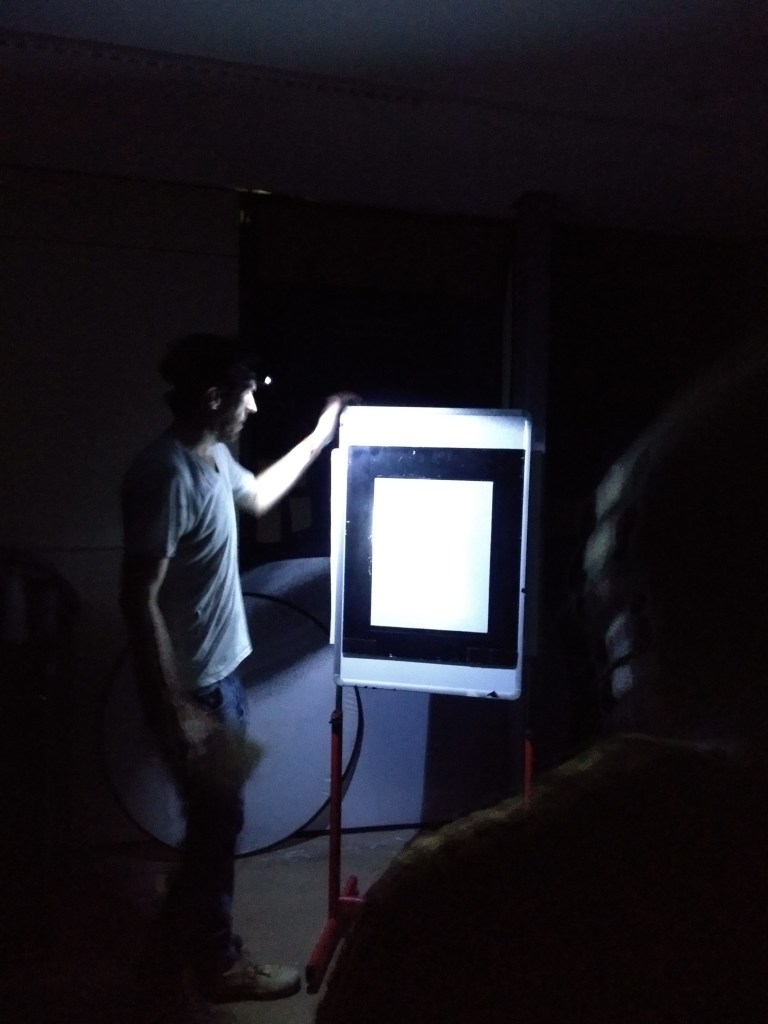
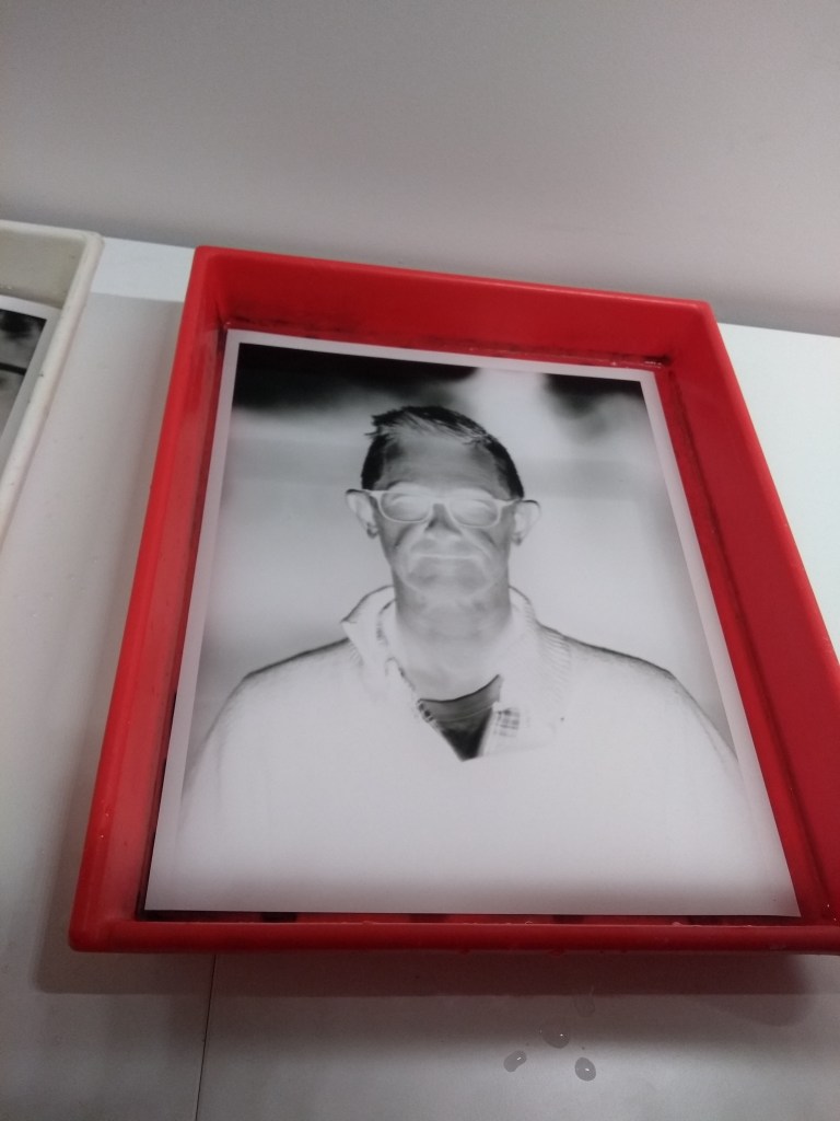
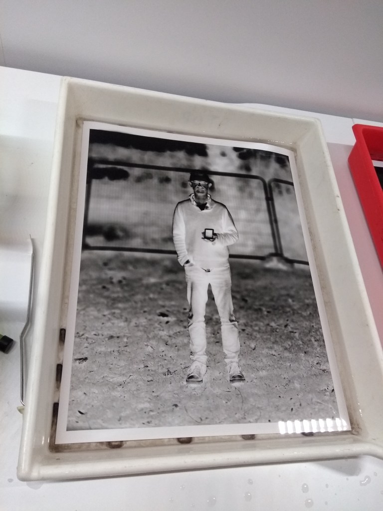
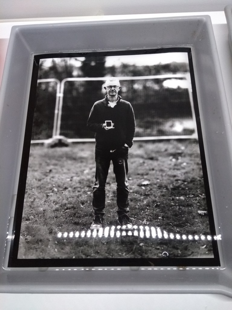
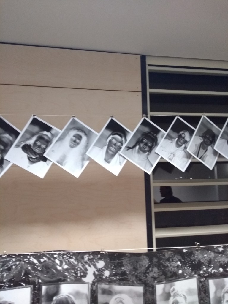
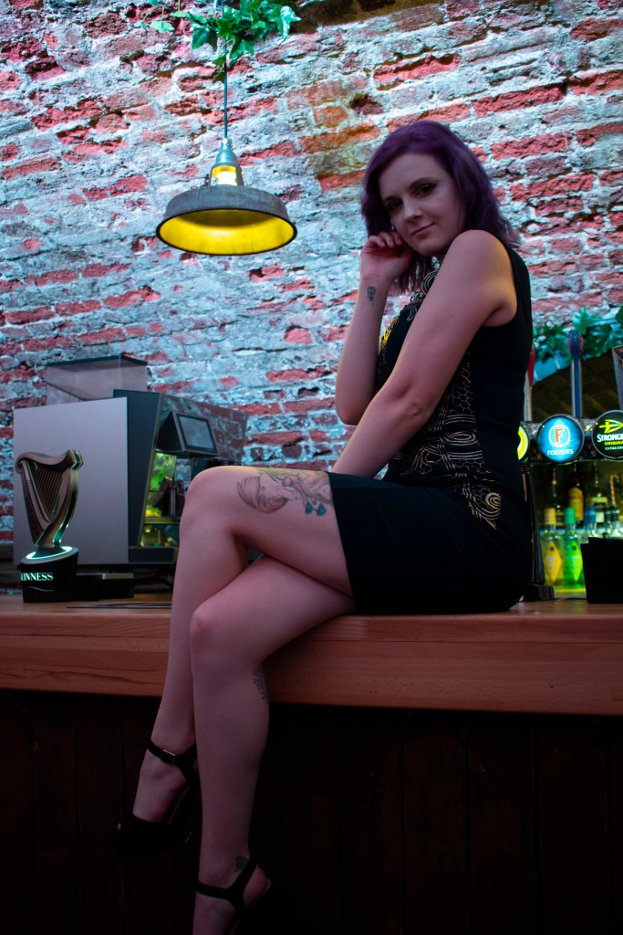
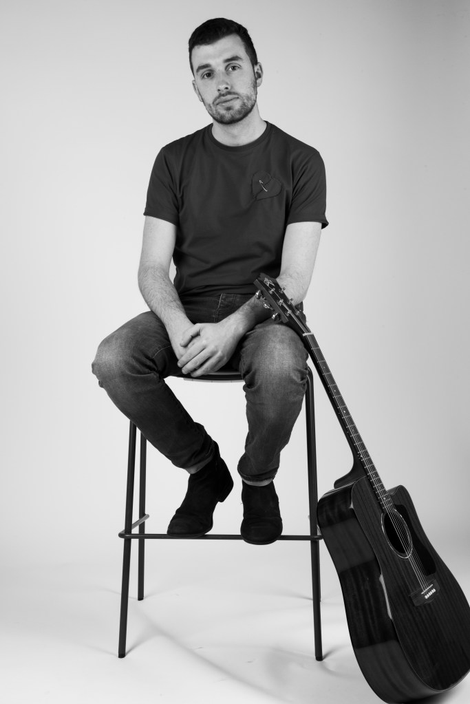
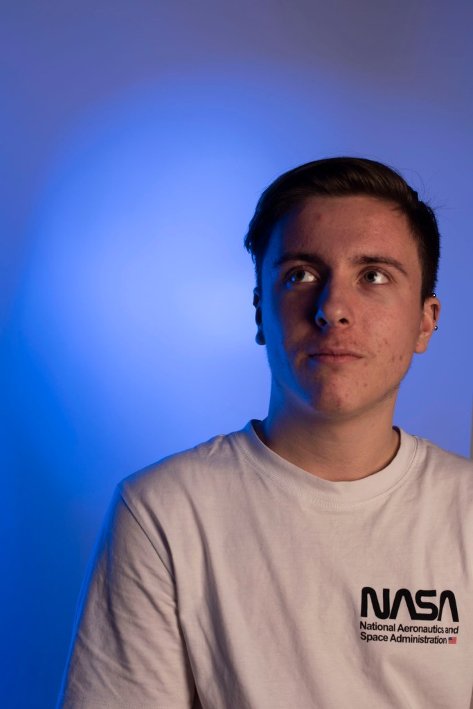
This was our first time in the lighting studio as a group and proved to be a lot of fun, we learn about the setup and deconstruction of the lights in the studio. 

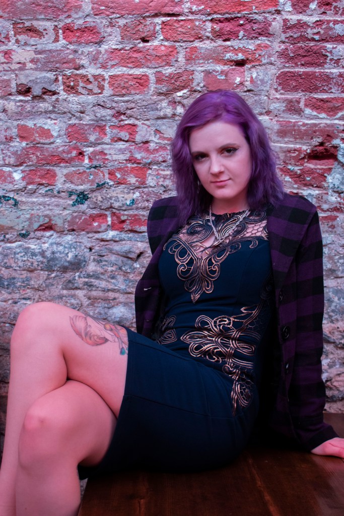
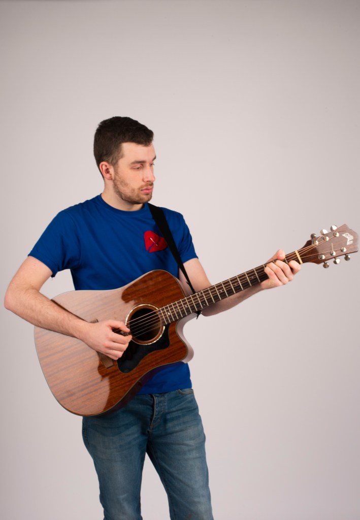
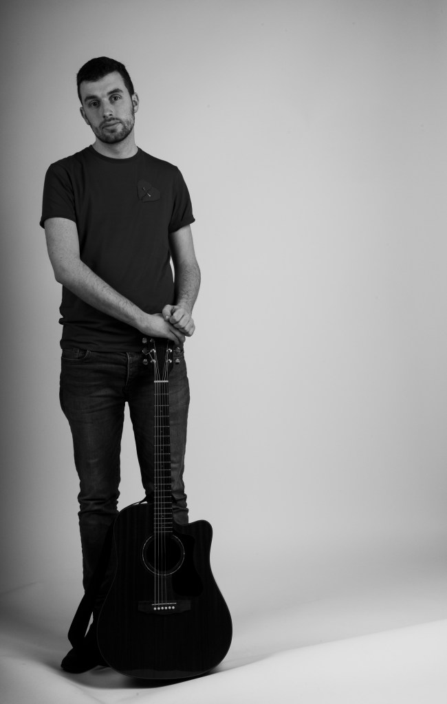
Setting up the studio lights we a tripod stands to sit spotlights on top. While we wer in the studio we got to use a range of lighting attachments, for these photos we used a silver reflective dish attachment on our muse

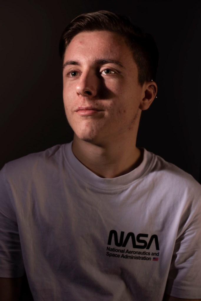
Photo 4187 was a test shot using a light meter to calibrated the cameraโ€™s setting, set for aย  shutter speed of 125, and an iso of 100. The reading showed to shoot at f5.6 but was slightly overexposed, increasing the aperture will solve this. Alternately making adjustments in Photoshop using curve tools and brightness settings might solve this but mean I would have to edit each photo from the shoot, itโ€™s better to get the lighting and aperture correct first time.ย 

4187.edit
4187
4192

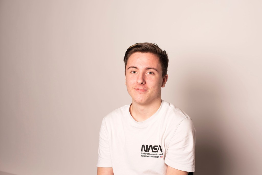
Photo 4192 adjusting the aperture to f/8 solved the lighting issue it meant the camera was accepting less light through the lens. we could have also altered the power of the lights, making the dimmer to correct this but that would require taking another light reading.ย  Using the reflective dish created soft shadows on our white backdrop

4212

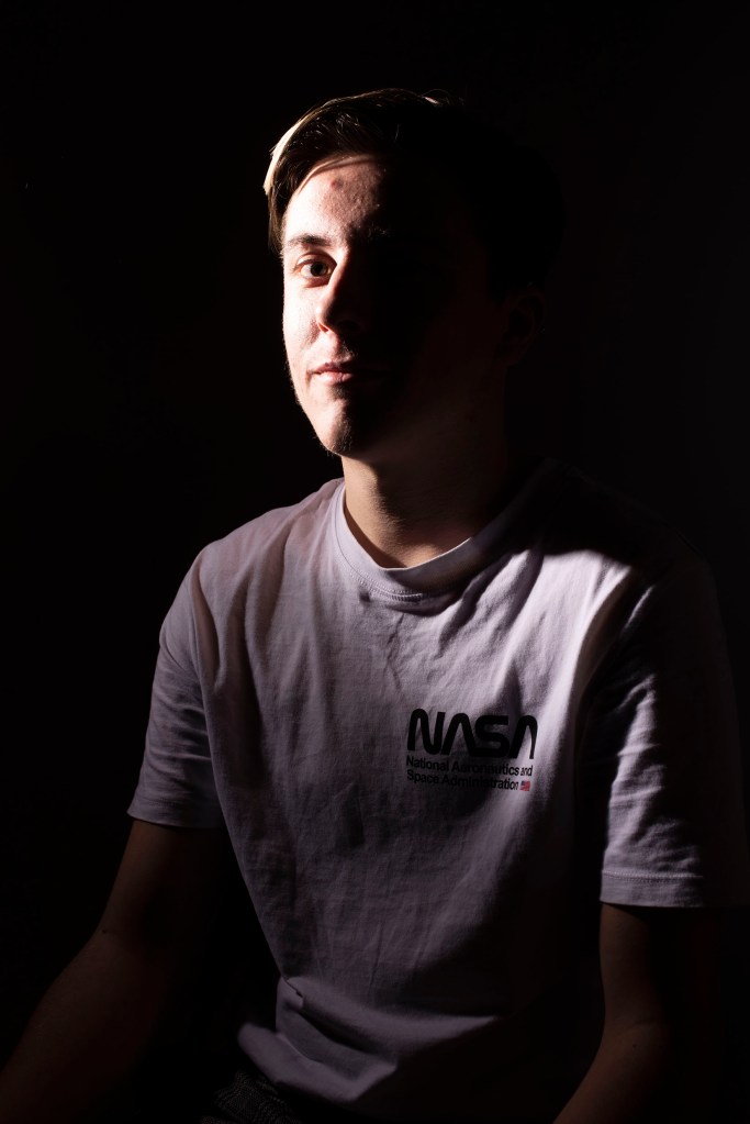
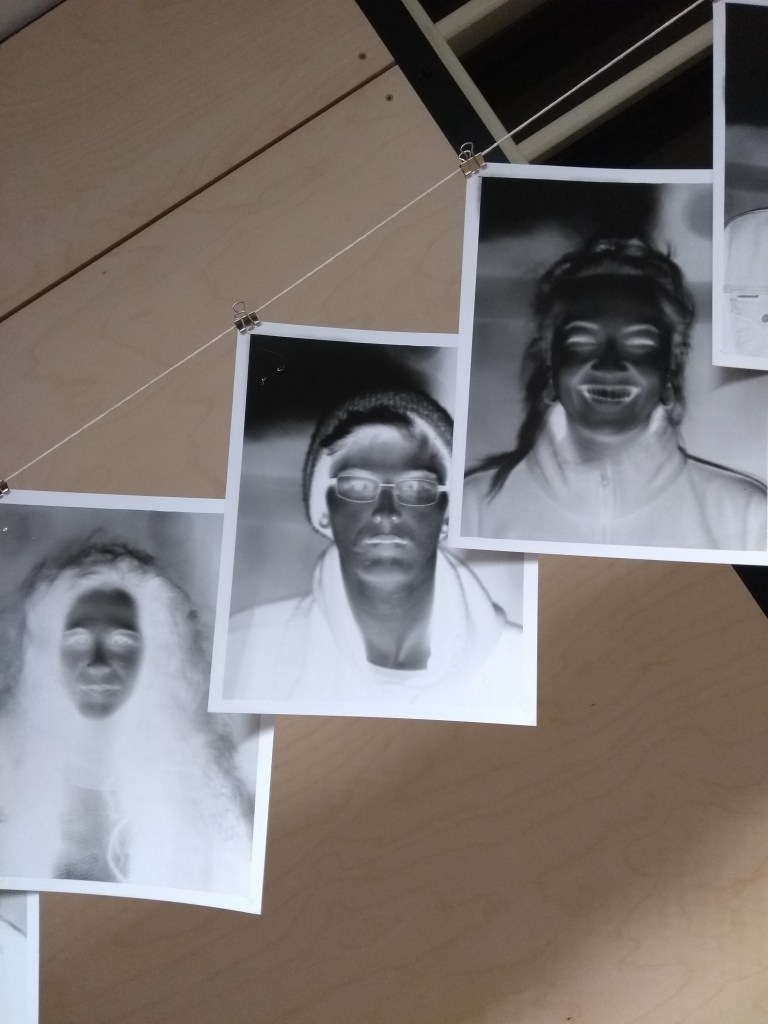
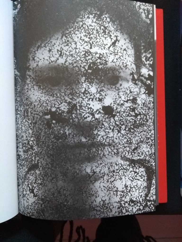
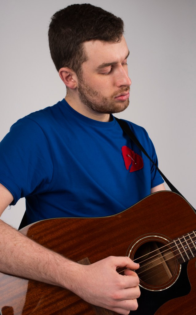
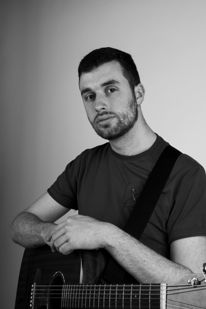
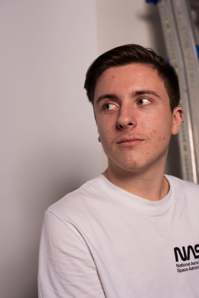
Photo 4212 moving on from the reflective dish we used a snoot with a honey combe attachment to concentrate the light on the face of our muse, dimming the lights amplified this effect displaying how the light plays and reflect on the surface of our muse, shows the whites of the shirt absorb more than the face. Noting how the nose blocks light from reaching the eye on the right, appearing mostly balck and showing little information.

4125

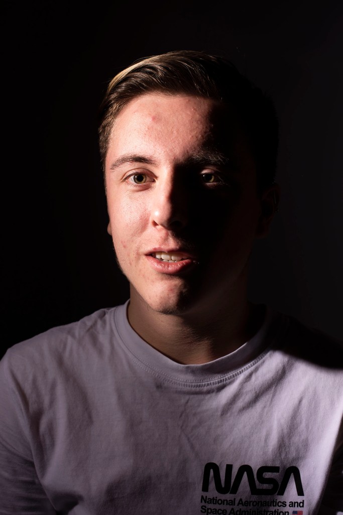
Photo 4215 we can see this again, asking our muse to turn their head slightly, the light clips over the nose lighting the right eye hinting to information on the other. Without a reflector on the right side, we are able to get this effect as there is nothing on the right side to bounce the back to muse, casting this stong shadow.ย 

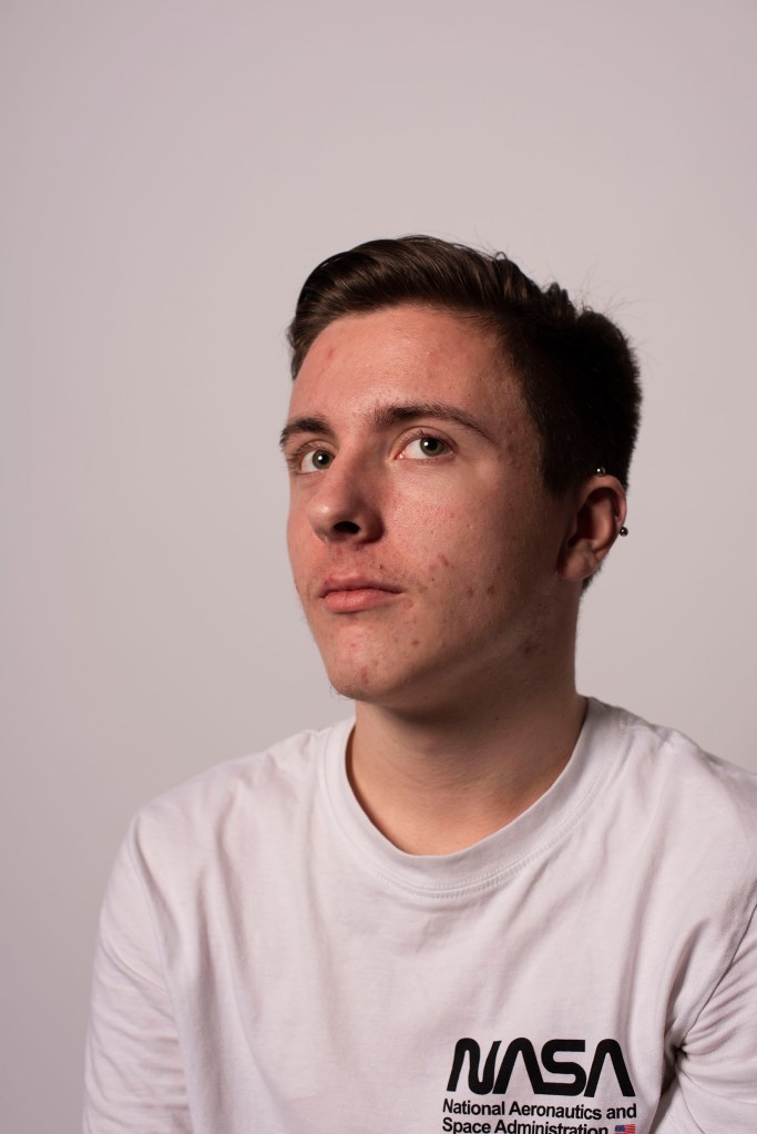
Photo 4219, shows the same but with a reflector on the right this time, bouncing the light back to our muse, lighting the other side providing information while only using one studio light set up

4219

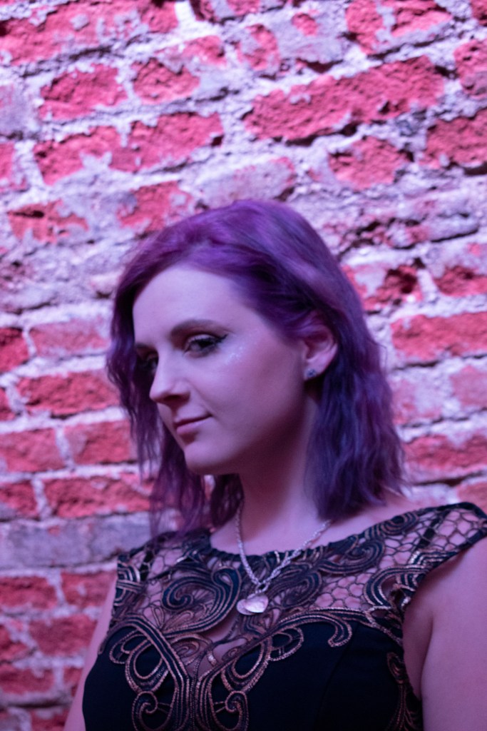
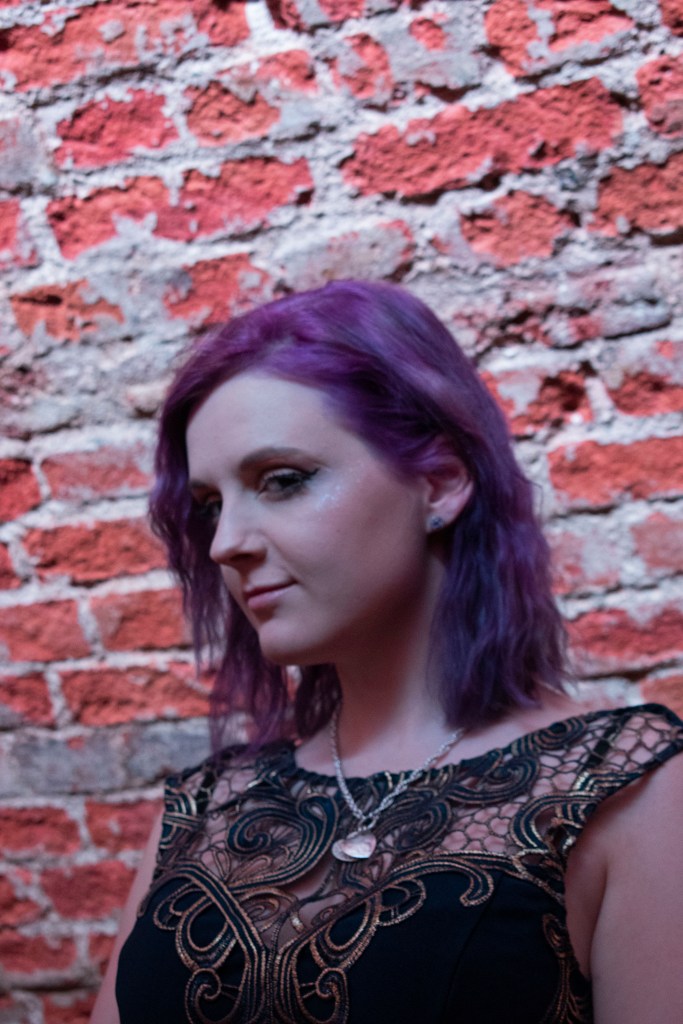
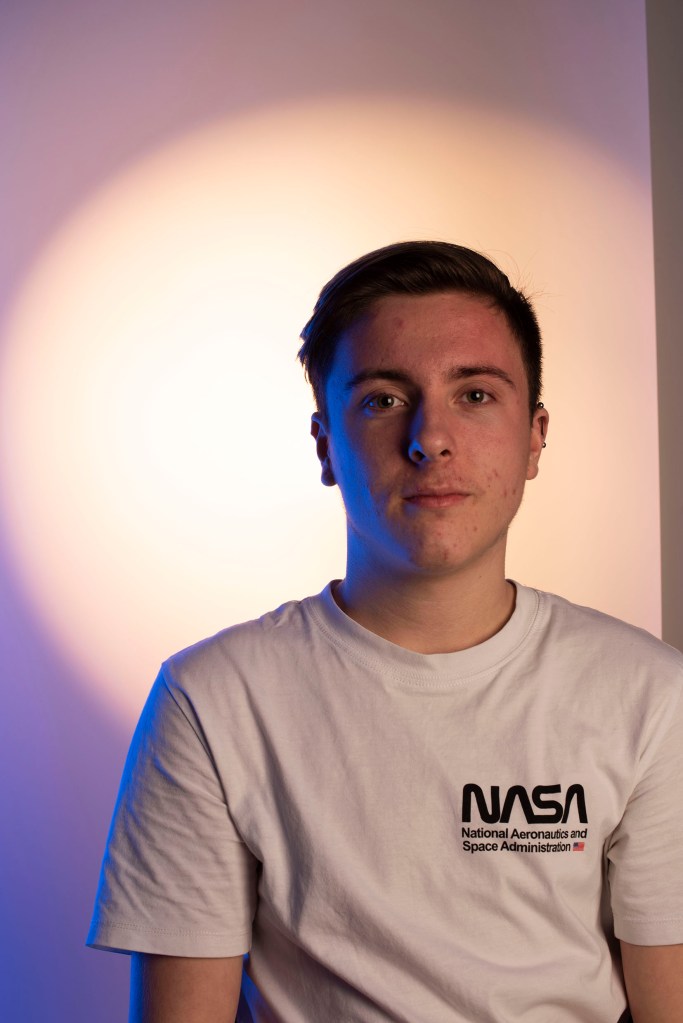
This can be seen in photos 4228 and 4230, but with the addition of a low powered bishops hat attachment aimed at the backdrop adding a gentle backfill light giving context to the location of the shoot.

4228
4230
4239

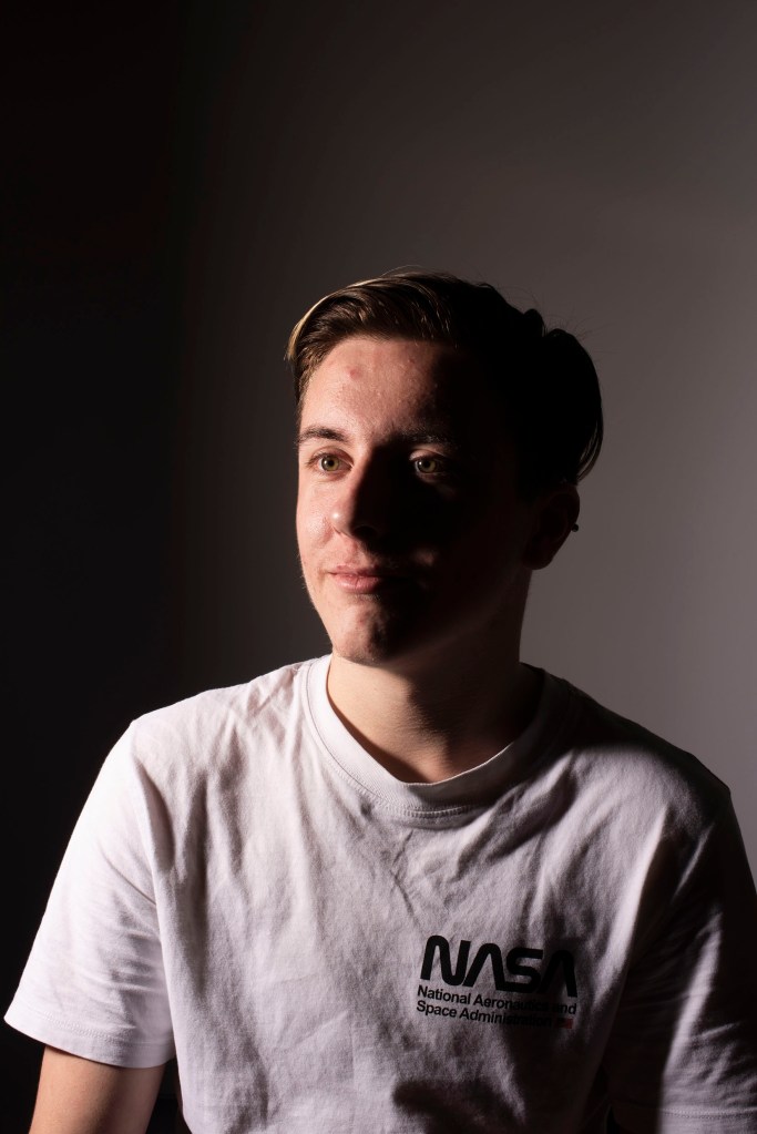
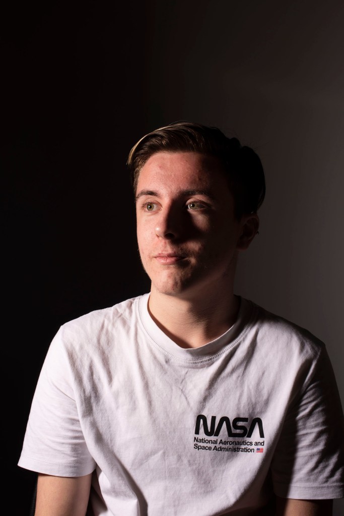
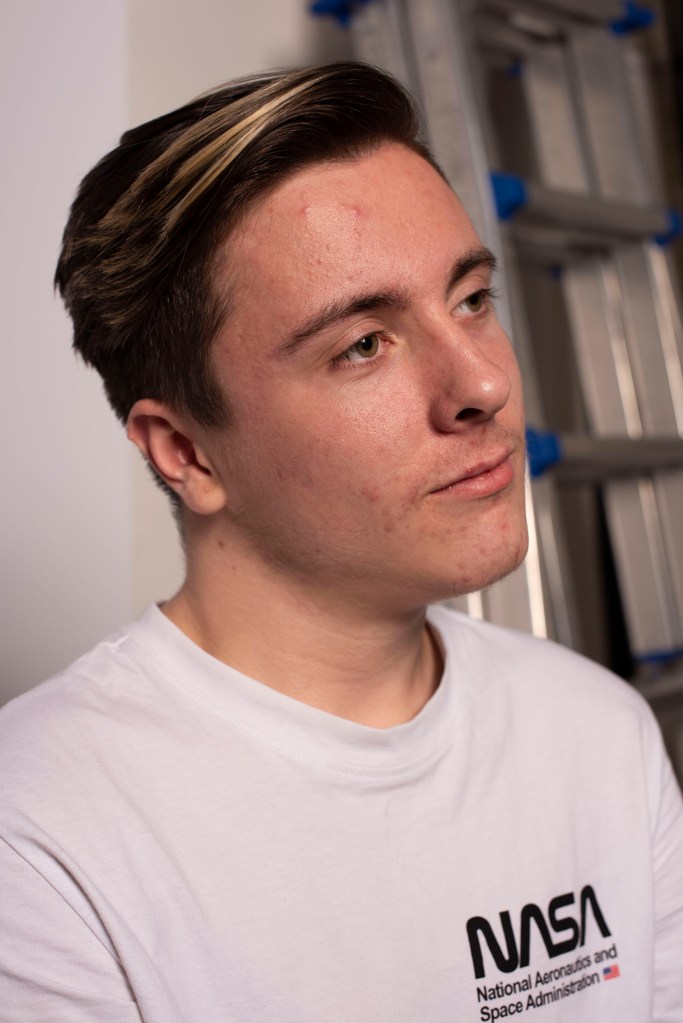
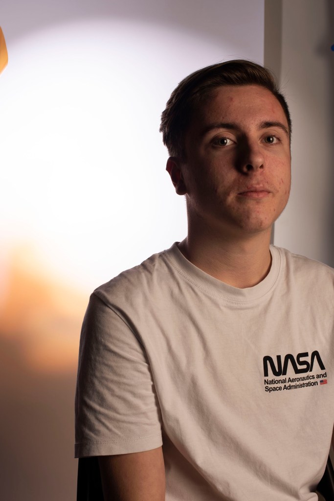
Photo 4239 introduces a second studio light with the use of a softbox, removing the snoot takes away this focus on the face and gives a more general appearance with softer lighting and shadows,ย  4240 shows this as well

4240
4243

4243, provides a similar look going as far to remove shadows cast behind my museย ย 

4246

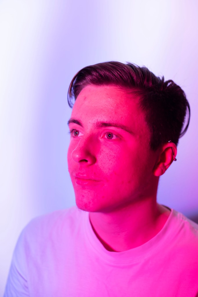
4246 introduces foil gels, a piece of colored film to go over the light to change the pure white light.ย  Here we have used a combination of blue and pink on each of the lights to give this affect. Though you can see this over powers the subject altering all of the light hitting the muse, maybe this would have been better if only one light was covered to provide clarity and definition, i also feel the exposure here could come down slightly.

4250

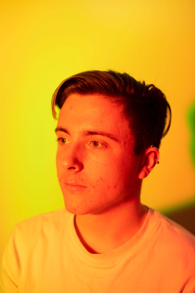
4250 opting for a yellow foil the same thing can be seen. Because there is no white light hitting our muse the whole photo appears yellow, this effect may have its place somewhere in photography but making it seem imprudent, something a lot more subtle might be desirable. 4259 shows the same but using green foils

4256
4259
4263

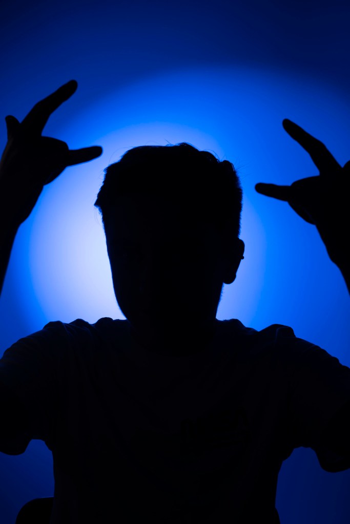
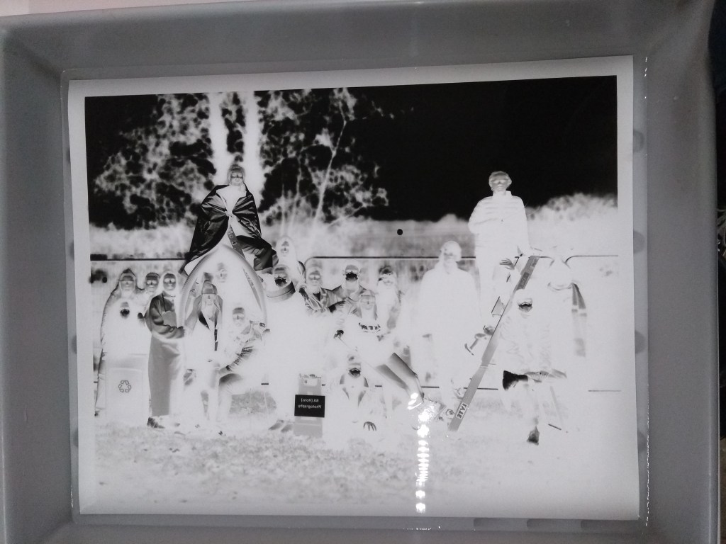
4263 shows my muse as a silhouette by lighting the background with a blue foil and removing one of the spotlights, this creates a strong contrast between the negative space.ย 

4275
4276
4279
4285

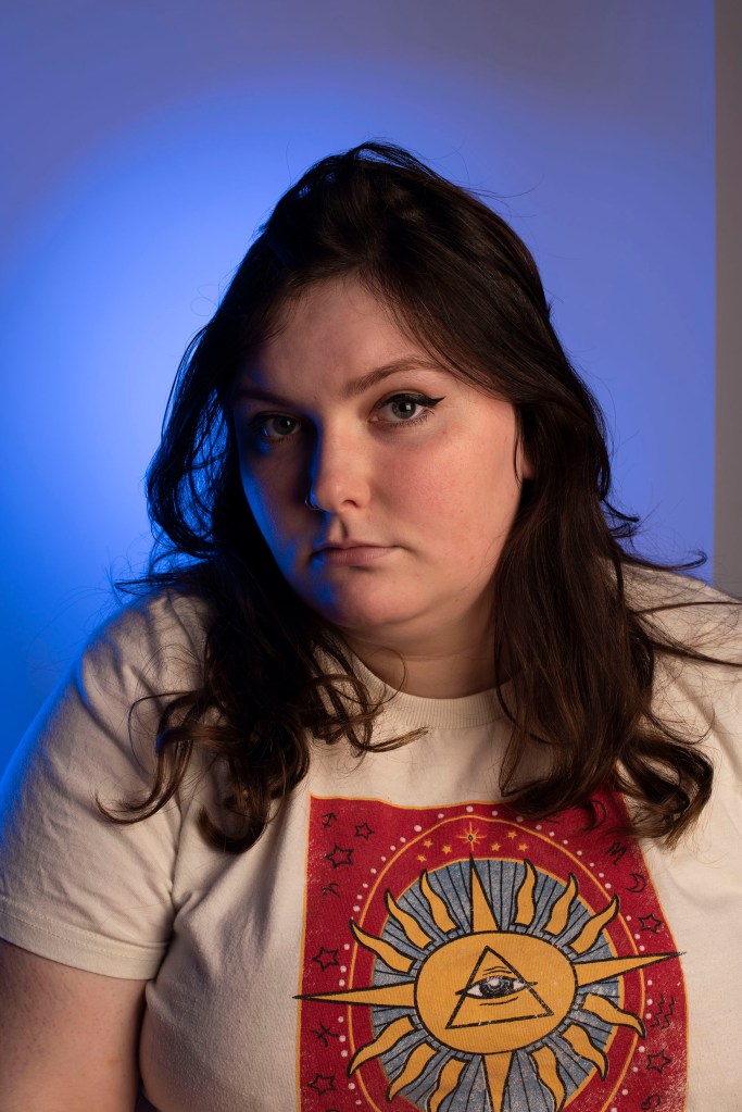
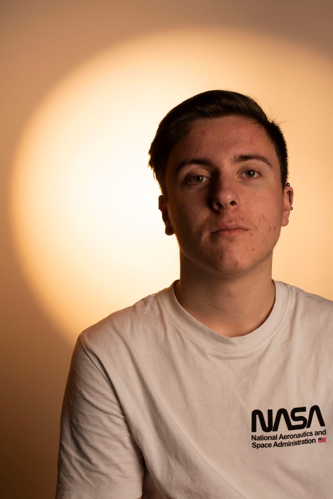
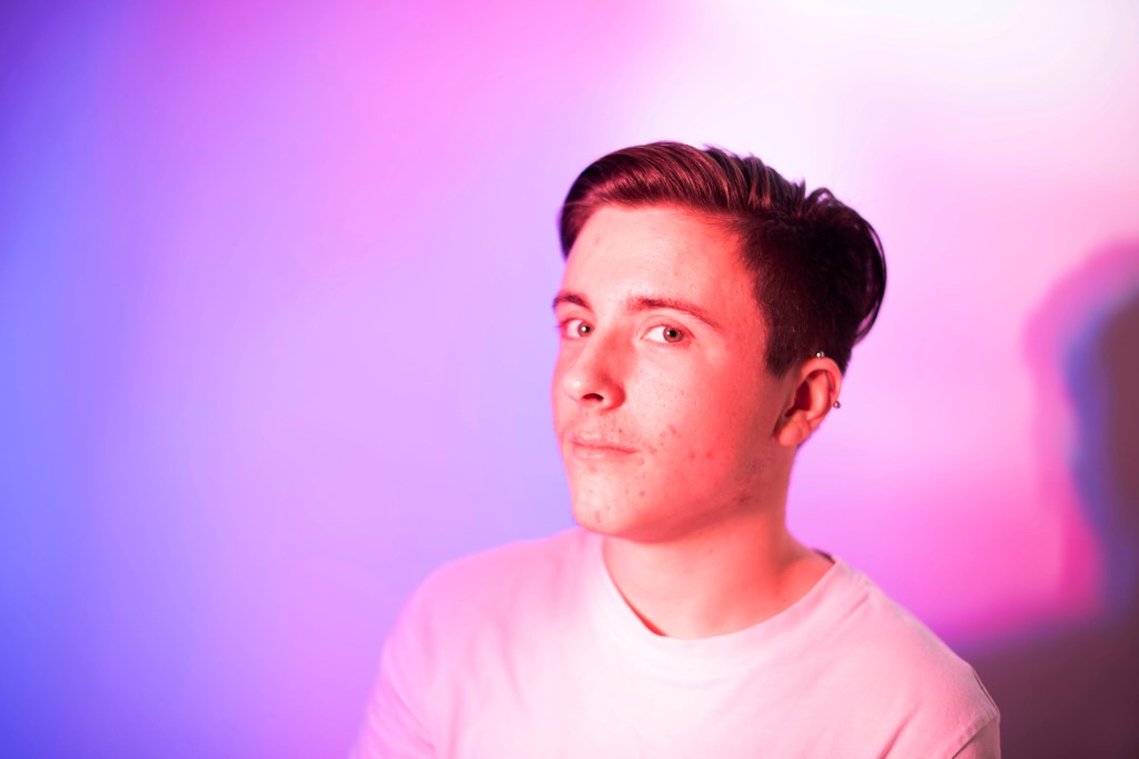
4285 aims to resolve the issues in 4250 by introducing a white spotlight pointed at our muse and pointing a blue foil at the backdrop, this shows clarity as we can make out the tones and colors of our use.

4286

4286 expands on this placing the blue foiled light slightly further away than before for a less intense effect, and includes a second spotlight with a partially covered light with an orange foil to give warmth to our muse in contrast to the blue.

4289
4291

Poster Analysis – library research

After my briefing today, I went to the library to look at examples of posters in a persuasive and aspirational context, taking note of the use of text, layout, and the meaning within visual imagery. 

โ€œA poster is a big sheet of printed paper designed to be attached to a wall or vertical surface for the only purpose to advertise or to promote something. The poster includes both typography and graphic elements perfectly mixed together to achieve a message. That message has to be clear and visually communicated direct. The more eye catching the poster, the more likely it is to make an impact on the public. โ€œ (2011) Gimenez Marc, Poster Design. 

Wanting to analyse some posters to get a better understanding of their typography, layout, and the meaning behind the photographs used, I looked at Advertising Today (2001) by Warren Bergero, for some examples 

โ€œCould the price of oil be any higher?โ€

โ€œIf you think you pay a high price, consider what our beaches, coastline, wildlife have to pay. Help us save the animals and clean the beaches. Donate what you can to โ€ฆ โ€œ (2001 advertising today, figure 21

This advert is for a charity called the World Society for the Protection of Animals (WSPA), asking their audience for a donation payment to help save animals and clean up ocean coastlines. The advert has a simple yet effective layout conveying a clear message. Splitting the space into halves for a picture, and text element allowing for a small space at the bottom for a tagline directing the audience to their PO.

The larger text element refers to the ever increasing fuel prices, posing a question to the audience making them wonder about the effects that fossil fuels have on the environment, providing a linking to the image. The font used has a serif typeface which allows WSPA to convey a sense of sophistication to their work, letting them have the authority to speak about the problems they hope to fix while being taken seriously by their audience. Using a sans typeface wouldn’t convey similar ideas    

The image shows rocks coated in this black thick sludge that consumes every environment it inhabits and is meant to be emotionally triggering to an audience to see this devastation that is being created by the carelessness of oil companies.

The small text echos the larger question, talking to the audience, calling them out directly to think about the impact on the coastal environment and the wildlife that live there, using the pronoun  โ€œyouโ€ asking them to donate to the organization.  

Warren talks about how one ad wonโ€™t change the options of the public but a leading series over time will influence their thoughts in reference to antidrug campaigns during the 1980-90s, saying at one point 92% of teens in American had seen โ€œthe fried eggโ€ ad, an advert so influential it echos in todayโ€™s pop culture, seen in Breaking season 2 episode 10. Even for myself, born after this advert aired, I understood this reference. 

A similar shift towards climate change can be seen with advertisements in todayโ€™s climate of media, with the increasing awareness by millennials.  

This poster advert is advocating for stricter gun control in the US through the use of powerful imagery, pointing the down the barrel of a gun to directly address its audience. The image is also in grayscale to provide a sense of realism and remove any color distraction, forcing us, the audience, to focus on the barrel and read the text.  

โ€œAll of those in favor of gun control raise your hand. all against, raise both.โ€

The quote makes reference to the law system in America where a jury will raise their hand to agree with an idea. but it also poses the opposition at gunpoint as a hostage threatening them to raise both of their hands. I feel this interesting use of imagery because it almost presents as a catch 22, the use of guns is trying to enforce stricter gun laws.

The text used also has a bold typeface providing weight to the font to communicate the idea of importance and urgency to the audience.

โ€œHappiness is being an organ donorโ€

โ€œFeel good knowing you can help someone long after youโ€™re gone. Card a donor card โ€œ

This advert conveying a simple message to its audience, advocating for people to become organ donors making it appear to be aspirational to become a donor, as people often worry about their life after death and what will happen to their body. Becoming a donor gives people the gratification knowing that after they die their organs will be passed on to help someone else. 

The use of the smiley face is welcoming with its easily recognizable features since the โ€™70s in pop culture as an icon. It comes in the form of a badge with a smile but only one eye to signify the donor aspect of the ad. It creates a link to aspirational the text below saying โ€œhappiness is being an organ donorโ€.ย ย 


Berger, Warren  (2001) Advertising Today, Phaidon, London

Gimenez, Marc (2011) ‘Poster Design’, Monsa, Barcelona

Image and context Brief

my aim is to –

through analytical and practical investigation, i will develop art dircetion,communition and styling skills by creating imagantive photo/graphic outcomes

through a constructive narrative i will develop themes; explore a range of graphic context and methodologies and consider effective stagnates for communicating to an intended target audience

  • explore langue of image,text, and layout
  • examine these components to shape a message and meaning within visual communication

creating narrative to a music audience. explain art directions and styling techniques and their applications the of a range of graphic contexts. try experimental methods and consider a range of visual langue and how effectively it communicates to the audience

Design

  • A3 Poster
  • A4 Look Book

Perception of Place brief

30/03/2020 โ€“ 05/06/2020

The artistโ€™s world is limitless. It can be found anywhere, far from where he lives or a few feet away. It is always on his doorstep. – Paul Strand

my assignment is to investigate and respond to my home territory, in the form of images and text, to produce a personal view of my place of isolation

it would be hard to ignore the current state of the world as this project comes at an unprecedented time with the virus currently spreading, and deaths quickly rising. At this time our surroundings and our relationship to them is greatly heightened with the current restrictions on movement in the country.

Jem Southam : standing still and paying close attention will reveal as many riches as charging around the globe

An aim of this project is to develop that level of attentiveness to imagine and communicate inventively.

From Relph, E (1976) Place and Placelessness

  1. Place involves an integration of elements of nature and culture
  2. Places are emerging or becoming; with historical and cultural change โ€“ new elements are added and old elements disappear. Thus, places have a distinct historical element.
  3. Both remembered and currently significant places are essentially concentrations of meaning and intention.
  4. The static physical setting, the activities, and the meanings constitute the three basic components of places.
  5. Basic to place is the creation of an inside that is separate to an outside. It is the difference between safety and danger, cosmos and chaos, enclosure and exposure, or simply here and there.

Copyrights and employment contract

Employment contracts

Employment contracts are for photographers working with contractor/employer who are about to undertake a legally binding contract and should contain.

  • A written statement outlining the work parameters
  • Employment terms and conditions
  • Their workerโ€™s rights
  • Responsibilities of both parties
  • Duties to be carried out

Employment terms and conditions

Both parties in the contrast must stick to the terms of the contract until it finishes unless something between the parties changes, everyone should be noted of any changes that happen.

Any legally binding terms should be clearly presented within the contract however there are multiple forms a contract my take like:

  • A written statement of employment
  • An employee handbook provided by the company
  • A written letter 
  • A verbal agreement ( in writing is preferable )

 An employment contract is required by law before accepting any job from an employer and should be provided by the employer within 2 months of the start date.  

Written Statements

A written statement is made of multiple documents outlining the contract and MUST include a principle statement consisting of:

  • Principle statement
  • The name of the business
  • The employeeโ€™s name, job description, start and end date of employment 
  • If any work prior counts towards further sustained employment 
  • How much and often the employee will be paid 
  • The work hours, stating the number of hours in a week/month, any breaks or overtime the employee may be invited to
  • Any holiday time off, including public ones
  • Where they might be work, and if they could be relocated.

Additional information that MAY be included

  • Notice for submission period length 
  • Collective agreements  between both parties
  • (if there will be) Pensions
  • How to complain about disciplinary decisions the employee doesnโ€™t agree with

The written statement DOES NOT need to include  

  • Sick pay
  • Grievance procedures (if this is included how to deal complain and deal with the situations Should also be included) 
  • disciplinary decisions   (if this is included how to complain and deal with the procedures should be included)                      

If the work is contracted to be done abroad the employer MUST state in the contract 

  • How long theyโ€™ll be abroad 
  • What currency theyโ€™ll be paid in
  • If thereโ€™s any additional benefits or pay
  • Various terms relating to arriving and leaving the UK

There are often implied terms with a contract often not written down as they should be apparent:

  • People shouldnโ€™t steal from you, nor should you steal from them 
  • The employer should provide a safe working environment and conditions for the employee 
  • There should be 5/6 weeks of paid holiday (as this is required by law employees can be forced to take this time off)
  • The employee must have the necessary requirements for the job (donโ€™t lie on your cv)

Collective Agreements

An employer may have agreements with representativeโ€™s unions allowing them to negotiate the terms of pay and working hours. 

The agreement should state who will represent the employee and how they are affected by the terms in the contract, as well as anyone else involved.

If there is a problem with your employerโ€™s written state there are 3 steps you can take to sorting it out.

  1. You can start by having an informal discussion with your employer hoping to amend the issues raised with the aim to resolve the conflict
  2. If this doesnโ€™t work itโ€™s advised to take up a grievance agist the employer, how to seek advice on this should be stated within the terms of the agreement 
  3. If this does resolve the case an employment tribunal can be made but should be done as a last resort  

While this is for contracted work by an employer, freelance photographers can present some additional terms and procedures

freelance photographers aren’t granted :

  • Sick pay
  • maternity / pertinacity leave
  • holidays

while these aren’t a given is up the the photographer themselves to dictate when they can have time off, if they can have a holiday. it should be noted if and when these things happen for tax purposes

A photographer is always on the job working and shooting

Brendon Barry

Visitor Speaker – 19th Nov https://brendanbarry.co.uk/

  • What steps did you take to get where you are today?
  • What type of photography do you do?
  • how to do you reach a wider audience, both on social media and in real life?
  • who inspires you?
  • how do you balance your business with your own life?

Brendon Barry is a contemporary photographer, self identifying his earlier works as commercial panoramic landscapes, however has branched out his ideas to make cameras out of just about anything from phone caravans to watermelons .

Growing up as a kid Brendon Barry was inspired by childrenโ€™s adventure novels and western films like Stig of the dump, The Goodies, Wallace and Gromit, and Stagecoach. fulfilling a hard working constructive mindset he has in his life now, making it rewarding for him to deconstruct objects to get a better understanding of their function.

This lead him to Plymouth university, where he would undertake his MA in Photography and The Land. in which he traveled to Lithuania for 5 days, shooting over 70 rolls of film he found himself untied from social obligations and distractions, free to take cultural landscape photos of his surroundings.


The American Road Trip

After his MA in Plymouth, Brendon planned to hike across America, inspired by the western novels and films he grew up told of this American road trips. When he found himself in chasing this dream in america he arrived with his cameras, tripods, and equipment with a large bag. Over encumbered and tired from hiking on his route he managed to buy a car from a person allowing him to travel the states easily.

Because of his MA in Plymouth Brendon was informed on such photographers like Alex Sloth, Stephen Shore, William Eggleston, and felt his own work was influenced by them, as if he were looking by their eyes, shooting satisfying documentary shots of the cultural landscapes of central america, peoples portraits, and observational still life frames. After his travels he saw this as a reason to return to the UK with a focus on his own stylization of work


16″ x 20″ Ultra Large Format Camera

seeking his identity as a photographer, he had an idea to reverse engineer a camera, by taking it apart to see how it fit together, knowing he didn’t understand how to put it back together he set out to create his own camera, prepared to face all the challenges that lay ahead.

Armed with a workshop, he created two wooden frames, and bellow of light tight cloth, fitted together to create the focal length of the lens.

Through grinding glass Brendon was able to make lens for his camera, this is a very hard task to do as it requires of how knowledge light refracts through glass, focusing an image is made easier by the use of bellows and translucent screens as there is an optical focal length. buying a magnifier glass online is a recommend route for simplicity.

In use Brendon developed black and white portraits onto 16” x 20” producing a high detailed negatives which he would later turn these into a positive print. he would go on to further explore this idea.


After forming an understanding of a how a camera works, Brendon Barry thought to himself ‘ what else can i make a camera out of? ‘ and has since made cameras and obscures out of just about everything from every day objects like blocks of wood, and junk, to food like water melons, butternut squashes, pineapple, and even bread. i think its really interesting to see once you have the core components you can start to work backwards redefining what a camera is.

Turning produce into cameras presents its own set of unique challenges, first needing to hallow out the centre for the body of the camera, and fitting a screen see the flipped image on.

fastening screws and nuts through the cheese he’s secured the screen and lens fitted with a .shutter release.


after Brandons start he hosted a workshop for the 3rd year students, fascinated by his work i asked if i could and i was surprised when he said yes. making a camera obscure out of a room has always been a dream of mine since i started practising the art. to be inside a camera to take the photo.

we started by getting duct tape and any large pieces of card we could find to ceil the room and make it light tight, here you can see everyone getting involved in the creaton of this camera obscure

once the room was fully celled we took some glorified magnifier glass lens’ and placed them up against the window with duct tape as view ports acting as the focal point for our camera

we were finally ready to turn off the lights to look for light leaks, seeing that there were few we taped those remaining gaps over, and were able to use of one the lens to see the upside down projection on a white board. it turns upside down because of the properties of light acting as a wave as it passes through the lens

using these big a3 trans at the back of the room we were able to develop and process the paper inside the camera, this makes things a lot easier as there will be no light leaking from outside sources.

here is a test photo we made of my lecturer Steven, we’re able to produce this negative print and directly on top of it we can produce a positive image with another piece of photo paper.

taking part as a group we all got to pose for our portraits to be taken, i think these are super cool


Beth and Lauren

Beth is a long term friend of mine and is a marine biologist, and does modelling on the side, she invited down to the barbarian back home to do a shoot with her and another photographer named Alan Lock-heart.

Beth has been a model for a few years now is pretty good at it, she’s even ran for calendar girls in Plymouth two years running and plans to enter again this year .

for the venue we went to Jumping Jacks, a bar where one of my friends during the day, this was convenient as the bar was empty allowing us take full advantage of the space.

in the bar there are one over head led lights that can change colors by using a remote, they was helpful as it allows us control the lighting needed for the shoot, starting with a off purple or violate. this lighting was really hard to shoot in because it altered the visual apparel of the subject and surrounding. in Photoshop i was able to try and correct this by removing some of the magenta slider and adding a hint of green to balance the photo

after this is done, i need to balance out the photo and add a small amount of yellow to that she isn’t just an off green colour, to this i also bright down the highlights and whites in the photo to allow her to pop more, rather than being washed out by the over powered lights reflecting off the wall

Trish Morrissy


26/11/2019 – https://www.trishmorrissey.com/

Trish Morrissey is a contemporary photographer, who is interested in archives of family photos and telling fictional stories through them, filling the gaps in the story with her imagination

In 2001-2004 Morrissy was interested in fake family fictions, looking at her own family archive of photos they had collected over the generations

she thought about how they only show the good parts of life, serving as propaganda for the family of a normal life. as it hides the part of the family life others might not see.


Seven Years ( 2001-2004 )

Seven years is a series of fictional family photos, created by Morrissey created this family with her sister, the title is a reference to the seven year age bap between the two sisters “aiming to deconstruct the trope of a family photograph” spanning fictionally from 1967 – 1987, each photograph has been given dates at random to follow this family fiction.

July 22nd 1972
April 16th, 1967

Morrissy acted as the director, author, and actor, staging herself and sister allowed her to a tightly controlled mise en scene, using period clothing and props from the 70’s and 80’s for a sense of authenticity.

https://www.trishmorrissey.com/works_pages/work-sy/statement.html
October 1st, 1987

Morrissy draws note to this idea of a photo within a photo, while one sister is taking a photo of the other within the picture, we see an ivy branch creeping up the tree center frame, dividing the sisters, further enforced by the contrast of their clothing, echoing the photograph


Front  (2005-2007)

Front is a series of photos taken on beaches in the UK and Melbourne as a study of family boundaries. Morrissy directed and acted in all the photos often playing the role of the mother as she would insert herself into the family temporarily. asking the mother to take the shot that was preprepared and setup by Trish.

Angela Reynish, July 31st, 2006
Katy McDonnell, October 5th, 2007

The title of this series is also meant as a double entendre as it is meant to imply that its a facade on the beachfront,

Morrissy talks about the liminal lines in between of her photos showcasing the transitional states of life, in Hayley Cole 2006, the boundaries are blurred as she sits center frame with the dad and son either side. the beaches symbolise a limbo state between the land and the sea, acting as a location in the gray area.

Hayley Coles, June 17th, 2006

Shot in 2006, the family were interested in a family reprise 10 years later, in 2016 Trish Morrissy, and the family met on the same beach, now larger family than before, which meant working to restrictions of both parties, and trying to get the same lighting as before.

https://www.trishmorrissey.com/works_pages/work-front/statement.html

A Failed Realist

A Failed Realist is a work by Trish Morrissey in collaboration with her daughter when she was four and five years old, taking a series of portrait photos of Trish and allowing her daughter to explore her creative process using face paints in a mind free from conventions.

The recreation of fictional characters is brought to life by Morressy’s daughter’s desire to retell stories responding to a film or recalling an event she witnessed she saw like Pocahantas (2011) pulled from her immediate memory after watching the film under the same title from 1995.

Ladybird (2011)

Because of the influences around her daughter in the world, she would play to the stereotypes you might expect of her gender painting ladybugs.

Pocahantas (2011)

Between the ages of four and five Morrissey’s daughter, didn’t have an understanding of the codes taught to us. Not knowing these conventions composition or colors she paints with benevolence, using red, yellow, and green for a background. Not obstructed by our ideals of how we interpret the world she is free to paint.

The Toothfairy (2011)
https://www.trishmorrissey.com/works_pages/work-tfr/statement.html

The Failed Realist

Growing older Trish Morrissey was interested in doing a reprise of “The Failed Realist”, titled “The Successful Realist” 6 years later after Cailtin’s motor skills and comprehension of the world around her has developed, now painting with a sense of realism.

Life and Death

In “Life and Death” Caitlin’s shows an understanding of separation between the two, conveying an imbalance in the world as one generation hands over the world to the next, ruined for us to clean

Clown Face

catlin

https://www.trishmorrissey.com/works_pages/work-work-successful-Real/statement.html

Ten People in a Suitcase

In 2015, Trish Morrissey got the opportunity to do a residency in Finland with Gรถsta Serlachius Fine Art Foundation

Father and son clay pigeon shooting day Sรคrkikangas
sandpit. 1975 / 2015. Mรคnttรค, Finland
Forester Hรคggman and an eight-kilogram pike.
1955 / 2015. Mรคnttรค, Finland
A person who has lost a hand in an accident.
Work safety campaign.1926 / 2015. Mรคnttรค, Finland
https://www.trishmorrissey.com/works_pages/Work-ten/statement.html

When asked โ€œ how do you advertise and promote your work?โ€

She replied โ€œ Iโ€™m admittedly not the best at self promotion with online social mediaโ€™ stating her websiteย  https://www.trishmorrissey.com/ is in need updating, however, she mentioned โ€œnetworking at events and through word of mouth are both great ways of promoting your own workโ€ ย 

Greg Johnson

Greg Johnson is a local 2rd year Commercial Music student, and singer/song writer. putting a post of Facebook on Nov 12 asking for photographers to do a shoot with him for his upcoming EP LOST. i saw this post and contacted him directly to enquire about the position.

he contacted me back stating

Hi Alex, thanks for getting in touch.

So, Iโ€™m a 2nd Year student at Bath Spa. Iโ€™m messaging regarding organising a photoshoot for one of my modules. Iโ€™m currently working on my Brand, Identity and Promotion module, whereby we have to put a face to the music we make. As Iโ€™m sure youโ€™re aware, photography is key to this.

Part of the draft plan Iโ€™ve put together is to get photos of both studio shots, as well as with the instruments I play, of guitar and piano.Iโ€™ve attached a document to this message of example photos for reference.

I therefore wondered if youโ€™d be interested. as Iโ€™d love to work with fellow Spa students, as it may be an opportunity for related coursework to be completed.
Iโ€™m flexible to work with your schedule. I’d most likely be looking to work towards the middle of December and the New Year.

If this is something youโ€™d be interested, be sure to let me know and we can go from there.

this sounded good and i was interested to work with another student collaboratively, i let him know that i was a 1st year student and that it would be useful for my online blog, i then sent him my portfolio so that he could get an idea for my work and the skills i can provide.

following this he said that i was what he was looking for, a studio shoot with high contrast photos, some in colour, some in black and white. He shared with me some inspiration photos of what he was after, this really helped as i could get an understanding of the visual aspects he was hoping for, giving me a kick board to start ideas

We also discussed dates and both of us said that we were going home for the holidays around the 16th of Dec and that ideally it would be done before then.

Greg was pleasant to work with, as he stayed motivated. he also said that he could work around my time table which was really convenient. But he didn’t always message back to me within the same day but I understand that people are busy and that it can be like that sometimes

we discussed the locations like the studio, outside or on set. maybe the use of backdrops, studio lights, possible weather conditions , and the different types of format i would bring to our shoots .

we scheduled to meet in person on the 20th of November and get some practice shots to form an idea of where to go from. however this didn’t take place as Greg had to cancel, because he felt that without a car he couldn’t transport his instruments safely, and that if we needed to go to a different location that we might need to get buses. i thought this would ok as we still had time before the 16th.

He said he would be going home at the end of November and returning on the 9th of December, I told him this gave us a smaller window that i would have liked but maybe still workable.

Over the next few days Greg became busy with work and other deadlines which meant he wasn’t able to meet up until around the 9th

I was busy the next few days unable to meet but stayed in contact explaining my situation. we exchanged some dates that would work saying that i would be free from the 11th, he said he would send me a list of location ideas he wanted and that we could use his car to get to them.

however he messaged me on the 7th at 1:30am asking i had access to the lighting studio over the next few days, i explained to him the next day that i would have a look come Monday at the schedule as it uni is closed during the weekend and that i would book us in when i could, that it would be tight because many of the other 2nd/3rd student like to book the studio

sadly come Monday i checked the schedule and my fears were true, the lighting studio was fully booked until after Christmas, i told him i was sorry i couldn’t be before the holidays however that i was happy to do some location work, but he didn’t seem to want to do off site shoots. that he’d rather spend time in the studio instead.

i said ok, and looked to book us in after the holidays , i let him know that anywhere from the 13th of January was possible as the studio was booked until then. he said that he would be able to make the 13th and we agreed to meet at 10:30am, and told him that we had the studio up until 1pm to shoot.

the holidays came and past, come the 12th i messaged him asking if we were still good to meet tomorrow at 10:30am and gave him my phone number encase he needed to contact me.

this was the same time i was coming from my holiday back home, my bus was to arrive in bath at 6am because weird bus times, this was probably poor planning on my part as it left me tired for our shoot on the 13th (now today) knowing i needed some rest before then i took a small nap to prepare myself for the day with alarms set to wake me up on time.

however this didn’t go according to plan leading Greg to phone me at 10:30am to no avail, i woke at 11am panicked, grabbed my stuff and told Greg i would be there as soon as i could. i apologised for my poor business practice when i arrived and we got on with the shoot, with coffee close to hand.

The Shoot

from 11:30am until 12:30pm it went well, i enjoyed the experience of getting to work with another creative mind and to use the studio equipment. i spoke to the technions on hand that that sorting trigger flashes, and soft box lights.

to the shoot i brought a medium format camera and my Nikon D3500, i also hired out a Nikon D810.

i couldn’t get my camera to sync up with the studio lights and trigger flash,knowing we were short on time for the session, i oped for the D810 for the rest of the session, this seemed to work better and also had a high MP at 36.2 compared to my 24.2.

the studio lights were set to a 4:3 ratio giving soft shadows

we also used some props, from the cafe i brought in a stall in as many of the photo examples Greg showed me were sat down. directing him felt a lot comfortable than in the past when its been with strangers, i felt i could take my time and compose the shots i wanted being able to take close portraits of him .

Greg also brought a guitar with him this was nice to use as a prop. I could place him around it, often i would ask him to pose in different manners, asking him to direct his gaze to different places.

when asked to review my work Greg had this to say

” theyโ€™re great! They really capture what the aim of the shoot was, in terms of promotion for my music. You were able to capture me, the brand and what I do with my music. I felt comfortable and it was easy to work with you, which is great and shows in the photos “

i would say a similar thing back to him, it was nice working with him he was very cooperative adn we worked well together to achieve a collaborative vision for is new EP coming out